Section 5.2. Design
5.2. DesignDesign has emerged as one of the world's most powerful forces. Our lives are intimately touched by architectural, environmental, industrial, and visual design. Most of the places and objects that shape our experience have been designed by intention. And the Internet has created new frontiers for interaction, information, and communication design.
In the past decade, an eclectic community of pioneers embraced the challenges of web design. Graphic designers, information architects, web producers: our titles are as diverse as our skills, and yet we face the same challenges. We must understand our medium and our users. We must keep pace with the relentless march of technology. And we must communicate our value and defend our designs over and over again. When dealing with marketing folks in particular, we find ourselves repeating the following mantra:
The debates often begin in the tug of war over home page real estate. Marketing sees the home page as a channel for positioning, promotion, and persuasion. The page overflows with logos, tag lines, photographs, brand messages, banners, and special offers, as Figure 5-2 illustrates. Search and navigation are granted a few pixels to the side, the sum total of user needs and corporate information captured in a handful of words and a query box. Figure 5-2. A typical pushy home page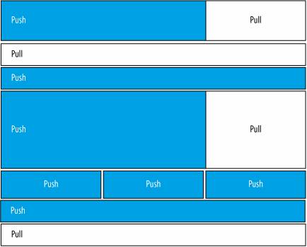 And yet, from years of research, we appreciate the immense difficulty of representing collections of content and objects with labels and keywords, as Figure 5-3 attempts. We know that even by bubbling up a few sample subcategory labels, we can dramatically enhance the scent of information. But to do that, we need more real estate. And so we must explain, educate, evangelize, and advocate. We must push for pull. It's our professional responsibility. Reaching the balance in Figure 5-4 isn't easy. Figure 5-3. Categories and sample subcategories at Yahoo! Figure 5-4. A better balance between push and pull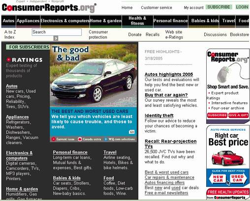 Of course, the experience doesn't begin or end with the home page. Users often start by plugging a keyword or two into Google. Ranking and presentation in the result set impacts brand perception before users even enter the site. In Figure 5-5, who would you rather be: Harvard or Stanford? Or how about Columbia, sitting in obscurity beneath the fold? Users assign most authority and credibility to the top results, and the descriptions that appear may determine whether they decide to visit in the first place. And for many who do visit, the home page is nothing more than a signpost, hastily scanned and quickly forgotten on the way to somewhere else. Visitors want products, support, data, documents, and downloads. They're not interested in our message. The only time they really notice our site is when they become lost or stuck. And it's at that very point when push is most annoying. I'm desperate for help and you're pitching an upgrade? I know what I want. How about a navigation system that lets me find it? Finally, as designers and user advocates, we must consider the myriad variables affecting presentation, such as bandwidth, screen size, resolution, and browser type. As increasing numbers of people access our sites with mobile devices, we must get better at bridging the gap between desktops and handhelds. At 175K, Duke's heavyweight home page (pictured in Figure 5-6) is definitely not worth the 51 second wait on my Treo. Figure 5-5. Business schools ranked by Google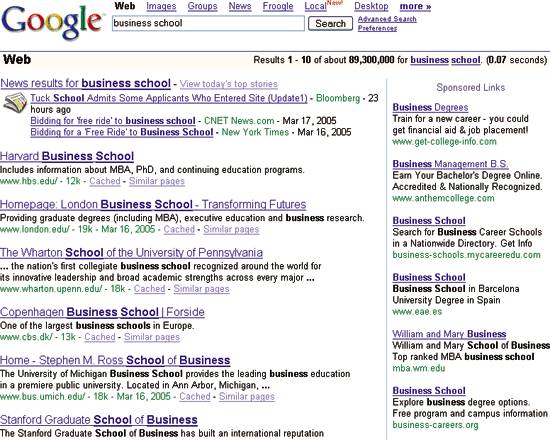 Figure 5-6. The Fuqua School of Business on a Treo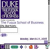 Neither is Frontier Airlines, shown in Figure 5-7, which weighs in at 272K and requires almost two minutes to load. Ironically, these home pages don't look particularly good in any browser. This is not about a tradeoff between aesthetics and accessibility. It's about bad design. In contrast, Google's 4K pages, shown in Figure 5-8, load within 10 seconds and still look sexy through the eyes of a Treo. Tastes great. Less filling. The duality of tai chi. The genius of the AND. Figure 5-7. Frontier Airlines on a Treo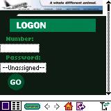 Figure 5-8. Google search results on a Treo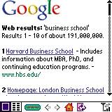 This is the philosophy that led me to create the user experience honeycomb, shown in Figure 5-9.[*] We cannot be trapped in a zero sum game that pits usability against marketing.
Figure 5-9. The user experience honeycomb in Japan Instead, we should acknowledge the rich, dynamic, interconnected blend of qualities that shape the user experience. For instance:
The honeycomb hits the sweet spot by serving several purposes at once. First, it's a great tool for advancing the conversation beyond usability. More opening move than endgame, it gets people talking about qualities absent from the diagram and catalyzes discussion about goals and priorities. Is it more important to be desirable or accessible? How about usable or credible? In truth, it depends on the site's unique mix of context, content, and users, and any tradeoffs are better made explicitly than unconsciously. Second, this model supports a modular approach to design. Let's say you want to improve your site but lack the budget, time, or stomach for a complete overhaul. Why not try a targeted redesign, perhaps starting with the "Stanford Guidelines for Web Credibility" as a resource for evaluating and enhancing the credibility of your web site.[*]
Third, each facet of the user experience honeycomb can serve as a singular looking glass, transforming how we see what we do, and enabling us to explore beyond conventional boundaries. For example, I realized some time ago that while "information architect" describes my profession, findability defines my passion. Of course, while there's value in examining these facets in isolation, it's also vital to understand the surprising ways they interact. In fact, after a decade of focus on defining the individual elements, many of the Web's leading experts have now begun to spend time in the areas of intersection and overlap. For instance, in Emotional Design, usability guru Don Norman provides solid evidence that attractive things work better, citing the surprising results of research studies in which "usability and aesthetics were not expected to correlate."[
And in Speed Up Your Site, Andy King connects the dots between file size, the psychology of flow, and the user experience, noting that the bailout rate or "percentage of users who leave a page before it loads" jumps from 6% at 34K to 30% at 40K.[§] King cites numerous studies that demonstrate the negative impact of slow-loading web pages on perceived usability, credibility, findability, and even content quality.
And then there's Jeff Veen, who loves to raise eyebrows by claiming "I don't care about accessibility," and then explaining that "when Web design is practiced as a craft, and not a consolation, accessibility comes for free."[**] And, Jeffrey Zeldman, who teaches that designing with web standards not only improves accessibility for people with disabilities but also for people with handhelds.[*] By separating structure, presentation, and behavior into independent yet interrelated layers, we can simultaneously improve usability, accessibility, desirability, findability, interoperability, and forward compatibility, while reducing costs and schedules. The genius of the AND. In their own way, each of these gurus speaks of simplicity, interdependence, and balance. Much like Lao Tzu.
|
 ] But they did, again and again, in scientifically repeatable fashion. Similarly, research led by B.J. Fogg at the Stanford Persuasive Technology Lab has shown a powerful link between credibility and desirability.] Users trust web sites that are well designed. They also trust sites that appear at the top of search results, further proof of a link between credibility and findability.
 ] Stanford Web Credibility Project, http://credibility.stanford.edu/.
EAN: 2147483647
Pages: 87