Section 24.3. Three-Column Layouts
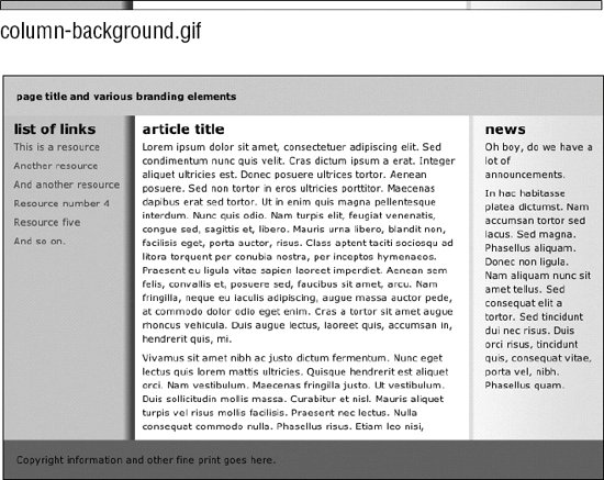
24.3. Three-Column LayoutsThree-column layouts are fundamentally the same as the previous two-column examples; they just require some extra planning for the third column. These examples use length values instead of percentages to create fixed layouts. In addition, padding, borders, and margins are added in one of the examples, requiring a fix for a well-known browser bug. Browser bugs and fixes are briefly addressed here but are covered in detail in Chapter 25. Again, these examples assume that the main content column will be longer than the side columns, which of course, is not always the case in the real world. It may be necessary to make adjustments to these examples to make them work for your content, but they are a good push in the right direction. 24.3.1. Floating Three ColumnsThis example uses floated elements to create a three-column layout (a main content column flanked by left and right sidebars) with optional header and footer (Figure 24-4). The advantage of floating is that you can set the footer to start below the longest column without knowing its height ahead of time (usually not possible). Remember that with floating, the order that the elements appear in the source document is significant. To keep this example straightforward, the content div has been moved between the sidebar divs in the source. Figure 24-4. Three-column layout using floats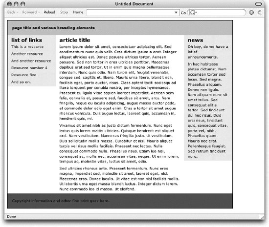 The basic structure of the markup for the layout is shown here. In this example, all of the elements have been placed in a container div so the width of the entire layout can be specified. A border has been added to the container to reveal its edges. <div > <div > Masthead and headline </div> <div > list of links </div> <div > Main article... </div>> <div > Announcements... </div> <div > copyright information </div> </div> The style sheet floats the links, main, and news div elements to the left. The result is that they accumulate against the left edge of the containing block, thus creating three columns. The clear:both property has been added to the footer to make sure it starts below all of the floated elements. Because there are no padding, border, or margin settings for each floated element, the sum of their widths is equal to the width of the outer container. Space within each content div could be added with margins or padding on the content elements (H1, p, etc.). Without further ado, the style sheet... h1, p {margin: 6px 12px ; } /* adds space between columns */ #container {width: 700px ; border: solid 1px ; } #masthead { background: #CCC ; padding: 15px ; } #links { width: 150px ; float: left; background: #EEE ; } #main { float: left; width: 400px ; } #news { float: left; width: 150px ; background: #EEE ; } #footer { clear: both; /* starts the footer below the floated content */ padding: 15px ; background: #666 ; } 24.3.2. Absolute Three-Column PositioningFinally, this section demonstrates how to create a three-column layout with absolute positioning. The examples in this section start with the same markup used in the previous examples, unless otherwise noted. Several variations will be demonstrated. 24.3.2.1. Positioning the sidebarsIn this example, only the left and right sidebars are positioned. Margins are used on the remaining main content and footer elements to make room for the resulting column (Figure 24-5). The advantage here is that it is possible to keep the footer information below the content, although the footer still does not run across the whole bottom of the page as in the float example. It should be noted that if the main content element were also positioned, it too would be removed from the document flow. This would cause the footer to float up to the top of the page. There are JavaScript workarounds for positioning a footer element below absolutely positioned elements, but they are beyond the scope of this chapter. Figure 24-5. Positioning the sidebars only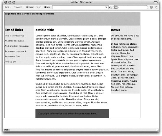 The style sheet that makes this layout happen is provided here. Comments have been inserted to point out key style rule functions. The first thing to notice is that the container div has been relatively positioned (but not moved) to establish it as the containing block for its positioned descendant elements. body {margin: 10px; padding: 10px ; } #container { position: relative; /* establishes containing block */ width: 700px; border: solid 1px; } /* border added to show container edges */ #masthead { height: 70px; background: #CCC; } #main { margin: 0 160px; } /* makes space left and right for the sidebars */ #links { position: absolute; top: 70px; left: 0px; /* positioned on left edge of container */ width: 150px; background: #EEE; } #news { position: absolute; top: 70px; right: 0px; ; /* positioned on right edge of container */ width: 150px; background: #EEE; } #footer { margin:0 160px; ; /* same as content to make room left & right */ padding: 15px; background: #666; } 24.3.2.2. Positioning three columnsIn this example, all three columns are absolutely positioned. Background colors are included for the sidebars to indicate their size and position. The resulting layout (Figure 24-6) is slightly different from the previous example. Figure 24-6. Absolutely positioning all three columns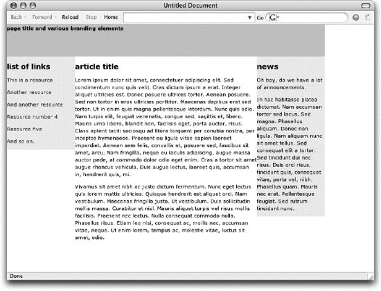 You may notice that the footer and the rule around the page have been omitted. That is because when all three elements between the masthead and footer are absolutely positioned, they are removed from the document flow. That causes the footer to rise up to just below the masthead. Similarly, the rule around the container would only enclose the masthead and the footer at the top of the page, which is not the intended effect. To avoid complications that would require JavaScript and other complicated hacks, the footer and rule have been removed from this example. This is the style sheet used to make this very basic three-column layout. Comments have been added to point out significant style rules and their functions. body: {margin: 0; padding: 0; } #container { position: relative; /* establishes the containing block */ width: 700px ; } #masthead { height: 70px ; background: #CCC ; } #main { position: absolute; top: 24.3.2.3. Centering with borders and marginsThe final three-column example improves on the previous absolute positioning example. First, padding, borders, and margins are added to the center column in a way that works for Internet Explorer 5 for Windows as well as current browsers. Then the entire layout is centered in the browser window using one of the techniques covered at the beginning of this chapter. The resulting layout is shown in Figure 24-7. Background colors have been added to the sidebar elements to reveal their size and position. The source document hasn't changed, but there are three basic changes to the style sheet as pointed out in the comments and discussed in more detail following the example. Figure 24-7. Adding padding, borders, and margins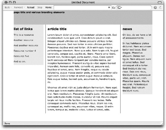 body { margin: 0px; padding: 0px; text-align: center; } /* to allow centering in IE */ #container { position: relative ; /* makes "container" the containing block */ margin: 0 auto; /* the proper CSS way to center */ width: 700px ; text-align: left; /* overrides text-align rule on body */ } #masthead { height: 70px ; background: #CCC ; } #main { position: absolute; top: The changes are as follows:
|

EAN: 2147483647
Pages: 325