Section 22.1. The Essence of Tables
22.1. The Essence of TablesIf you are familiar with table structure in HTML, then the way CSS handles tables should not be a big surprise. For reasons of backward compatibility, the CSS specification used the row-based table layout model as the starting point for additional layout models and properties for controlling presentation. CSS is broader in its scope, however, because it is designed to work with document languages other than just HTML and XHTML. The system for providing table layout capabilities for non-HTML languages is discussed in the "Table Display Values" section at the end of this chapter. The CSS 2.1 Recommendation is very detailed in its description of the defined behaviors for the table layout model. For a deeper look into the CSS table model , read the specification online at www.w3.org/TR/CSS21/tables.html. Once again, Eric Meyer's Cascading Style Sheets: The Definitive Guide (O'Reilly) is the book to turn to for making sense of the spec. This section provides a summary of some of the key concepts of the CSS table model. 22.1.1. Rows and ColumnsAt the most basic level, tables are divided into rows and columns. CSS 2.1 describes the model as row primary, because rows are identified explicitly in the document structure. Cells are always descendants of rows, not columns. Columns are merely derived based on the number of cells in the rows. The intersection of all the rows and columns in a table forms a grid and defines a basic grid cell unit. The actual cells (the boxes that contain the content) in the table may be composed of more than one grid cell, as is the case when cells are set to span rows or columns. Figure 22-1 shows the structure of the CSS table model. Figure 22-1. Table structure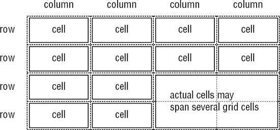 In addition to cell boxes, the CSS visual box model for tables generates (implied) boxes around rows, row groups, columns, column groups, and the table itself. These boxes correspond to the row, rowgroup, col, colgroup, and table elements in HTML. The table caption (identified with the caption element) is treated as its own box as well (as discussed later in this chapter). One last table box to be aware of is the inline table. Inline tables are block elements that can appear inline (tables are normally block-level elements). Inline tables are created by setting the display property to inline-table. They are not discussed in detail in this chapter, but are sometimes referenced in terms of property application. Only the Opera browser supports this display role as of this writing. 22.1.2. Internal Table ElementsCSS 2.1 makes a distinction between table elements and internal table elements. A table element is any part of a table (including table and caption). Internal elements are just those elements that generate a cell (such as td or th), a row (tr), a row group (rowgroup), a column (col), or a column group (colgroup). Internal table elements may have content, padding, and borders. Internal elements may not have margins and any margin settings provided will be ignored. 22.1.3. Table CaptionsHTML 4.0 introduced the caption element for providing a descriptive title to a table. CSS 2.1 assigns it special behaviors and its own property, caption-side, for positioning the caption above or below the table.
Values:top | bottom | inherit Initial value:top Applies to:Table-caption elements (caption in HTML) Inherited:Yes By default, the table caption is placed on top of the table block (top), but the caption-side property allows it to be placed below the table (bottom). Table captions are block elements, but they have some peculiarities. Figure 22-2 shows the relationship of the caption to the table body. Figure 22-2. Table and caption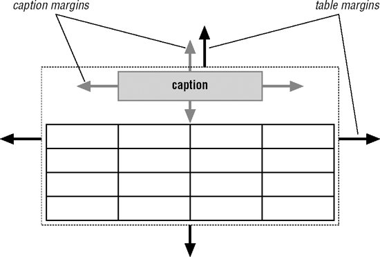 As block elements, they can be given their own properties, such as margins. However, they are also treated as children of the table element, and therefore will inherit properties applied to the table. So although it occupies a separate block with its own margins, if the color of the table is set to blue, the caption will be blue as well. The margins between the caption and table block collapse to equal the greater specified value. There is an implied or (anonymous) box that encloses the table box and the caption box. It is this anonymous box that is used when the table element is positioned with properties such as float, position, margin-*, top, right, bottom, or left. 22.1.4. Stacking OrderIn the visual formatting model for tables , the various table elements are understood to occupy separate superimposed layers. These are used to determine which backgrounds are visible. Elements are transparent by default, allowing the backgrounds of the layers "below" to show through. A background applied to a particular element will be visible if all the elements "above" it are transparent. The stacking order for table element layers is, from "top" to "bottom": cell, row, row group, column, column group, table, as shown in the diagram in Figure 22-3. Figure 22-3. Table layer order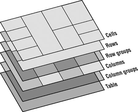 Or in other words, applying a background color in a cell will paint over any backgrounds provided in rows, row groups, and so on. This system is similar to the way in which color attributes in HTML table cells (td) override row settings (tr), which in turn override settings at the table level (table). One significant aspect of the CSS model is that table rows and row groups are given precedence over columns and column groups. |
EAN: 2147483647
Pages: 325