Section 15.5. Affecting Form Appearance
15.5. Affecting Form AppearanceThe way a form control appears in the browser depends on that browser's rendering engine. In HTML alone, there are no attributes for affecting the presentation of a form control other than specifying character lengths for text fields. We are left with the knowledge that controls will be rendered slightly differently on different browsers and platforms. Using Cascading Style Sheets to change the presentation and positioning of the form controls , you can take measures to improve the appearance of your forms. Layout tables have also traditionally been used to align form elements, but tables for layout are no longer the preferred option now that CSS is better supported. 15.5.1. Styling Form Controls with CSSAs for any HTML element, you can use Cascading Style Sheets to alter the font, colors, and size of form controls. The form element and the form control elements accept the id, class, and style attributes, so you can alter the font, size, color, and so on as you would for any other web page element. The label, fieldset, and legend elements intended for accessibility also make useful "hooks" for styling form content. Some browsers, particularly old versions, do not support resizing fields or positioning forms with style sheets, so do so with caution and test thoroughly. Cascading Style Sheets are explained in Part III. This simple example uses an inline style to create a black submit button with white text in the Impact font face (Figure 15-14): <input type="submit" value="SUBMIT" style="font-family: Impact, sans-serif; color: white; font-size: 14px; background: black" />. Figure 15-14. A submit button altered with style sheets In this example, a style sheet is used to highlight the required fields (last name and phone number) using class attributes in a minimal form (Figure 15-15): <!-- Style information in head of document --> <style type="text/css"> input.required { background-color: darkred; color: white } </style> <!-- In the form... --> <p>First Name: <br /> <input type="text" name="first" size="30"></p> <p>Last Name: <br /> <input type="text" name="last" size="30" /></p> <p>Phone Number: <br /> <input type="text" name="number" size="12" /></p> Figure 15-15. Style sheets alter the appearance of certain fields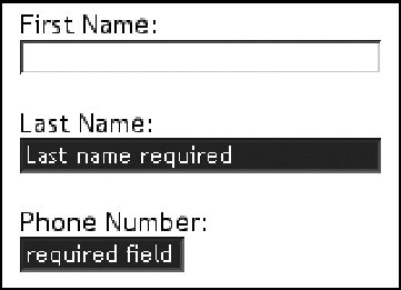 15.5.2. Aligning Form ElementsA page with lots of form elements can get ugly in a hurry. The best favor you can do for a form is to align the elements in some orderly fashion. 15.5.2.1. Layout tablesThe traditional method (and most reliable if you choose to support Version 4 browsers) is to align form content with tables, as shown in Figure 15-16. When laying out a form with a table, it usually works best to put the table element in the form element (rather than the other way around). Keep in mind that unstyled form controls will render at varying sizes depending on the user's browser and preferences, so allow for a certain amount of flexibility. If you do use tables for layout , make sure that they use minimal markup and linearize well. (See Chapter 13 for tips on layout tables .) 15.5.2.2. CSS-only alignmentYou can align form elements in a similar fashion using CSS alone, without applying layout tables, as shown in the simple example in Figure 15-17. This is the minimal and semantic markup for the form. Each component of the form uses a label and input element, except for the submit button, which has an input element only. Figure 15-16. Using a table to align a form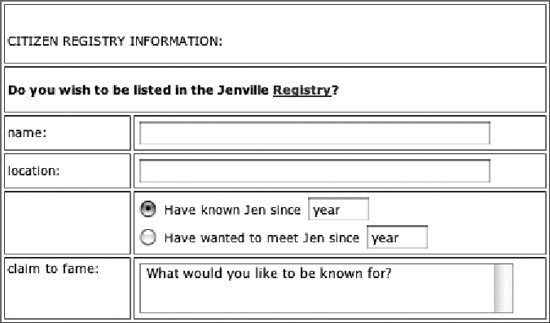 Figure 15-17. Using CSS to align a form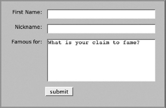 <form action="/cgi-bin/guestbook.pl" method="get"> <fieldset > <label for="first">First Name:</label> <input type="text" name="firstname" /><br /> <label for="nick">Nickname: </label> <input type="text" name="nickname" /><br /> <label for="desc">Famous for:</label> <textarea rows="10" cols="25" >What is your claim to fame?</textarea><br /> <input type="submit" value="submit" /> </fieldset> </form> The goal for this form was to have the label and inputs appear side by side, with the labels on a right alignment. This is handled by floating both the label and input elements so they are adjacent, and then changing the text-align on the label to right. A margin on the label element keeps the label text from bumping into the inputs. When using the float property, it is important to clear the following elements to make them start on a new line after the floated element. In this example, the clear property is applied to both the label and br elements for cross-browser compatibility. Note that because the submit button does not have a label, its float property is set to none and it is cleared. The style sheet used to align the form is provided here. fieldset { font-family: Verdana, Arial, Helvetica, sans-serif; font-size: 12px; background-color: #CCCCCC; padding: 12px; border: medium double #666; width: 30em; } label { width: 6em; float: left; text-align: right; margin: .5em 1em; clear: both; } input, textarea { float: left; margin: .5em 0; width: 250px; } #subbutton { float: none; width: auto; margin-bottom: 1em; margin-left: 7em; clear: both; } br {clear: both; } |
EAN: 2147483647
Pages: 325