InfoPath Controls
When filling out a form, users enter information into various elements placed on the design surface. These elements are controls that provide a graphical representation of the underlying data source elements. When a form designer places controls on the form design surfaces, these controls become bound to the underlying data source. Most controls, including the text box, check box, and list box, are bound to fields. Fields are where the entered information is saved. If a control is not bound or an error occurs within the binding, the information entered can t be saved as the underlying data source has no storage location. InfoPath provides four types of controls, as shown in Table 4.2.
| Type | Name | Description |
|---|---|---|
| Standard | Text Box | The text box control is the most commonly used control on a form. Users can enter and type any kind of unformatted text into this control. |
| Rich Text Box | Rich text boxes can contain formatted text. These controls also support image lists and tables using HTML formatting. | |
| List Box and Drop Down List | These controls present a list of Boxchoices that a user can select. These choices can come from static lists, XML Documents, Web Services, or a database. | |
| Date Picker | The date picker contains a box for users to enter data and a calendar button that allows them to select a date | |
| Check Box | Check boxes allow users to enter yes/no or true/false values. | |
| Option Button | Option buttons let users select from a set of mutually exclusive choices. Groups of option buttons are bound to one data source field, and each option saves a different value in the field. | |
| Section | Sections act as containers for other controls. They can include any of the other controls listed in the controls task pane. | |
| Repeating and Optional Controls | Optional Section | Optional sections contain other controls and are used for including additional information that is not necessary for all users who are filling out a form. |
| Repeating Section | These sections contain other controls and are used for presenting record-based data. | |
| Repeating Table | Repeating tables display information in a tabular structure where each item appears in a new row of the table. | |
| List (bulleted, numbered, and plain) | These controls provide an easy way to include simple repeating text elements. | |
| Hyperlink and Picture Controls | Hyperlink | The Hyperlink control is used to link different URL-based addresses together. They can point to any type of URL that exists either within the Internet or intranet. |
| Picture | Pictures are included in a form as static elements. They allow users to insert new pictures as part of the form. These controls can store the picture as part of the form or as an address that is loaded at runtime. These are converted to Base 64 and then stored as part of the XML data source. | |
| Ink Picture | Ink pictures allow users of the Tablet PC to create and save ink-based drawings. This control is valid only when you re using a Tablet PC. | |
| Buttons and Expression Boxes | Button | Buttons are used to execute events that are tied to executable actions within a form. |
| Expression Box | Expression boxes are read-only text controls that perform calculations based on XPATH expressions. |
| Note | Buttons and expression boxes do not modify the XML structure. These controls are presented through InfoPath using the XSLT transform for the view. |
Control Inheritance
One of the defined business processes for the Interview Feedback form is that all candidates attend a defined number of interviews for each position they are being considered for. The problem with the current form design is that these interview stages may change based on organization, department, and even position. Hard coding of these values into the InfoPath form or Web Service would require programmer intervention whenever any of these specific elements change and wouldn t allow for the process to flow dynamically. The current schema definition defines the Interview Type field as a string that is associated with the text box control. Using control inheritance, you can easily change this to a drop-down list box control that is associated to a specific set of defined values, as shown in Figure 4.20.
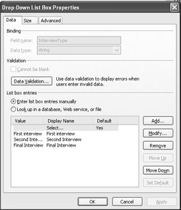
Figure 4.20: Defining the selection items for a drop-down control.
Within design mode, right-click on the control and select Change To on the shortcut menu. Then, select the appropriate control type. If the desired control type is not available, designers should check the field or group properties of the underlying data source. These properties are responsible for determining which control types are appropriate. The only exceptions are button, hyperlink, and the expression box control as they are considered special use controls. These are unable to change to any other type.
EAN: 2147483647
Pages: 111