Reactive Assistance Mechanisms
Reactive assistance mechanisms, unlike the passive mechanisms we've been discussing, are displayed only as a response to some action by a user. Intermediate or advanced users are more likely to use reactive mechanisms than beginners, who might not know how to invoke them or even that they exist. For this reason, they're not particularly good mechanisms for the kind of "what's this all about, then?" assistance that beginning users require.
Most reactive assistance is provided as some form of online help. Several paradigms for providing this type of online assistance exist, and we'll look at two in this section: traditional online help and the newer What's This tips. Although not often considered in that light, error messages are also a kind of reactive assistance, and we'll look at them at the end of this section.
Online Help
Traditional online help is essentially a transfer of printed documentation to the computer, and as almost always happens when a real-world object or activity gets computerized, this transfer makes some things easier and some things harder. Online help is more accessible than printed documentation, and the ability to display cross-referenced material with the click of a mouse is certainly a benefit. On the other hand, online help is a lot more difficult to browse, and you can't take it with you to the lunchroom when you go to get a cup of coffee.
Careful design of the help system can go some way toward ameliorating the disadvantages of online help. (It's still only as portable as the computer is, however.) Designing and writing help systems is a huge topic, most of which lies outside the scope of this book. All I can do here is give you some general guidelines, point out a few peculiarities of writing help for database systems, and refer you to the Bibliography for more detailed information.
The first and most important consideration when designing online help for your system is that no matter how tightly linked the help might be to your system, you should never consider it an integral part of the user interface. That is, your system must be able to stand on its own and never force users to resort to online help (or any other documentation, for that matter) to complete a task.
Remember that beginning users might not understand what online help contains, so they might not think to press F1 when they get confused. You should consider online help as a support for the user assistance provided within the system itself, not as a replacement for it. It's all too common for designers to think that having an online help system relieves them of the burden of making the system self-explanatory. In my experience this is a mistake and leads to ugly, unusable software.
The second consideration when designing online help is what type of support you want it to provide. Online help topics can be roughly divided into two types: task-oriented and function-oriented. Task-oriented topics tell users how to complete a specific task, such as how to print an invoice or schedule a meeting. Function-oriented topics provide detailed information regarding a specific function (such as the Print command on the File menu) or control (such as the CustomerID text box on a form). The two types correspond roughly to Users Guides and Reference Manuals in printed documentation.
Both task-oriented and function-oriented help have a role in supporting database systems. If your system supports many work processes, or if the work processes it supports are complex, task-oriented help can be of considerable assistance to users by providing a kind of roadmap to the procedures. It's still important to provide support and guidance within the system itself, though. It's not acceptable to merely present users with an alphabetical list of forms like the one in the Access Database window and rely on online help to tell them in which order the forms must be completed. (Well, it's not acceptable if you're working for me, anyway.)
Ideally, task-oriented topics should not include conceptual or introductory material. Remember, this isn't the right tool for teaching your users what the system does. The only purpose of task-oriented help topics is to provide a summary of the "how" of a procedure, not to explain the "what" or the "why."
Using multiple help topics for complex subjects will keep the topics readable on the computer screen. If the work process being explained is complex and has multiple paths, it's best not to try to explain all paths in a single topic. Just explain the simplest or most usual path in the main topic and provide links to topics explaining the variations.
Whereas task-oriented topics concentrate on the "how" of using your system, function-oriented topics concentrate on the "what" and the "why." For database systems, most function-oriented topics will refer to data items and controls rather than functions per se. Few database systems will require topics such as those provided by Access help, for example, where it's necessary to explain the precise syntax of the Mid$ function.
Systems do require topics that explain the purpose of every entity and attribute in the system and the constraints that pertain to each of them. They might also require topics to explain the use of various control types used by the system—how to navigate through a tree view control, for example, or how to pick a date using a calendar control.
In planning these data-oriented topics, it's important to think about why users would ask for help. If a user is looking at an Orders form text box with the caption "Desired Delivery Date," it's really unlikely he would press the F1 key because he doesn't understand that this is the date the customer would like the goods delivered. If this is all your topic tells users, it's worse than useless—it's an irritating waste of time.
So why might the user have pressed F1? Maybe he doesn't understand why the date is already filled in—so explain the default and how to override it. Or maybe the customer has told him to have the goods delivered "any time after the first of the month"—so explain that he should enter the earliest date or whatever rule applies in your environment. The better you are at thinking about the questions users might really be asking, the more effective your help system will be.
What's This Tips
What's This tips are much like task-oriented online help except for how they are invoked. What's This tips are invoked by clicking the question mark icon in the window's title bar and then clicking a control within the window. Figure 18-5 shows the What's This topic for the Windows In Taskbar check box in the Options dialog box in Access 2000.
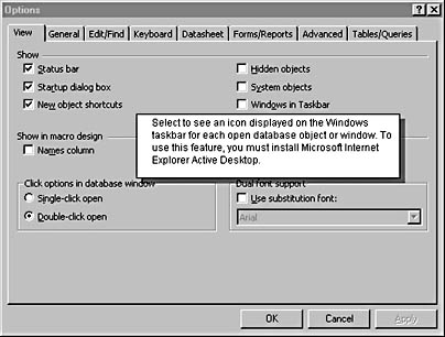
Figure 18-5. What's This tips are displayed in dialog boxes by clicking the question mark button in the title bar and clicking a control.
I like the idea of What's This tips a lot because they are so tightly integrated with the user interface of the system. I've seen novice users stumble upon What's This tips on several occasions. I've never seen novice users find online help by pressing F1 by accident, and I imagine it might be a little scary if they did, what with strange windows opening up all over the place.
For simple systems, a good set of What's This topics might be all the help you need to provide, particularly if the system doesn't support a lot of complex work processes. What's This topics must be fairly short, however, since they're displayed on top of the associated window and can't be scrolled. If you need to explain complex constraints, you simply won't have the space and you'll need to back up the What's This topic with one or more longer online help topics. (Be sure to add "Press F1 for more details" or words to that effect to the end of the What's This topic.)
The specific question a What's This topic attempts to answer is—as you've probably guessed from the name—"What is this thing?" Think of a What's This tip as a paragraph-long control caption. Because of space constraints, you usually can't be highly creative in responding to the questions you think users might be asking. But with a little thought, you can do better than just providing a reworded control label.
Describing the Desired Delivery Date as "the date on which the customer desires delivery of the goods" is just as evil in What's This tips as it is in online help. At the very least, try saying "the earliest date on which the goods are to be delivered. This value defaults to three days after the order date, but you can change this value by clicking the field and typing a new date. Press F1 for more details."
Audible Feedback
Audible feedback—using a computer tone to describe some system state—is an extremely powerful mechanism for assisting users, but designers can use its power for good or evil. The "Beep, you blew it" dialog box that's displayed when the system detects a "user error" is a prime example of using audible feedback for evil purposes. Users do not enjoy having attention drawn to their mistakes, and a beep not only draws a user's attention to the problem, it also notifies anyone within earshot. Besides, the default beep is a really annoying sound.
Turn audible feedback on its head, however, and it can be a wonderful tool. Instead of having the system blow a computer raspberry at a user when it gets confused, try having the computer emit a soft sound (I think of it as a purr) when something goes right. Say that during data entry the system is checking each field as the user exits the corresponding control. If the data complies with all relevant constraints, the system can issue a soft "I'm OK" sound. (The sound shouldn't be very loud.) If any problems occur, the system makes no sound but instead displays a message in the status bar. Silence is sufficient notification of the problem, and the user will check the screen.
The best analogy for this positive feedback technique (for which I am indebted to Alan Cooper) is the keyboard. As you press each key, the keyboard makes a soft click. You're probably not consciously aware of the sound, but if it were to stop, you'd notice it immediately and investigate the problem.
The example of the keyboard ought to calm any fears you might have regarding the cacophony of a room full of data entry operators. As I've said, the "I'm OK" sound needn't be obtrusive to be effective. I've successfully used positive audible feedback in a system designed for a call center with over 100 users in a single room.
Error Messages
Most people don't consider error messages as a means of providing assistance to users, which is a pity. But then, most error messages don't assist users, they chastise instead. Instead of treating error messages as an opportunity to point out users' faults, treat them instead as a plea for users' assistance. The system has got itself into trouble, and it needs user help in getting out.
A well-behaved person, when requesting another's assistance, doesn't make cryptic statements or issue demands. A well-behaved person doesn't try to imply that it's someone else's fault that she is confused or in trouble. A well-behaved person explains a problem as clearly as possible, requests assistance politely, tries not to impose any more than necessary, and takes pains to explain the implications of her requests.
A well-behaved computer system ought to do no less. In fact, because computer systems are deserving of less respect than people, they ought to do more. (Groveling is not inappropriate here.) When issuing "error" messages, the system has an obligation to:
- Explain the situation clearly, in terms users will understand.
- Request assistance politely, without implying that users are at fault.
- Not impose on users by asking them to do anything the system could reasonably do for itself.
- Describe the implications of any action users might take.
The system will sometimes get itself hopelessly confused, or some environmental factor such as a shortage of memory or a disk failure will at times make it impossible for the system to continue operation without assistance from the user. When these events occur, you have little choice but to display a message to the user. This is a wonderful opportunity not only to get the assistance the system needs, but also to provide the user with the information she needs to help the system stay out of trouble in the future.
By explaining the situation clearly and not using confusing jargon, the message you display to users will allow them to resolve the problem right away. Having understood the problem the first time, a user will be in a position to avoid having the same problem in the future—assuming the situation is avoidable. Invalid data entry formats are avoidable; hard disk failures generally aren't.
By explaining the implications of users' choices instead of presenting some option chosen more or less at random by a confused and disconcerted user, the system is far more likely to receive the most sensible response. Remember that a lot of things that seem perfectly obvious to you won't be obvious to the user. Don't talk down, of course, but don't be afraid of stating the obvious.
Wording the message politely and not imposing on users are just good manners. Remember when your mother told you that you'd catch more flies with honey than you would with vinegar? If users perceive your system as generally polite and helpful, they'll be inclined to forgive that one weird GPF that you never were able to track down. (Nobody's perfect.)
EAN: 2147483647
Pages: 124