Working with Charts
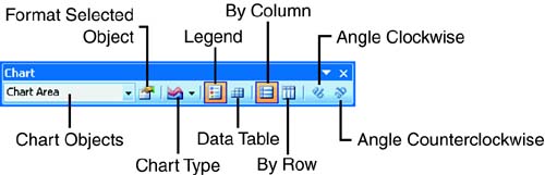
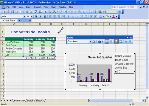
Working with ChartsNow that you know how to create a chart in Excel, you're ready to discover how you can customize and modify your charts. Excel lets you control most of the chart's elements, including the axes, chart text, and series patterns and colors. The Chart toolbar is very useful for making changes to charts. When working with charts, you frequently add data labels to a chart to further describe the data in each data series. You decide on the elements of your chart, such as whether to show or hide a legend and gridlines, select a different chart type to fit your needs, and re-order a chart's data series. Before you can change anything on a chart, you must select the chart. Click anywhere on the chart. You should see selection handles (black squares) surrounding the chart, which indicate that the chart is selected. In addition, Excel's chart commands require that you select the element on the chart that you want to change before making any changes. An element can be the entire chart, the plot area, a data series, or an axis. The command you select then applies to only the selected elements on the chart. You can select an element by simply clicking the element in the chart or by choosing a chart element from the Chart Objects list on the Chart toolbar. Excel then displays selection boxes around the element. At this point, you can customize the chart with the chart tools on the Chart toolbar or with the commands in the menu bar. Working with the Chart ToolbarAfter you create a chart, you can use various chart tools to edit and format the chart. You can use the Chart toolbar to change legends, gridlines, the x-axis, the y-axis, background, colors, fonts, titles, labels, and much more. Figure 12.5 shows the tools on the Chart toolbar. Figure 12.5. The Chart toolbar. Table 12.3 lists the tools on the Chart toolbar and describes what they do. Table 12.3. Chart Toolbar Tools
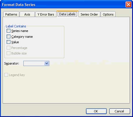
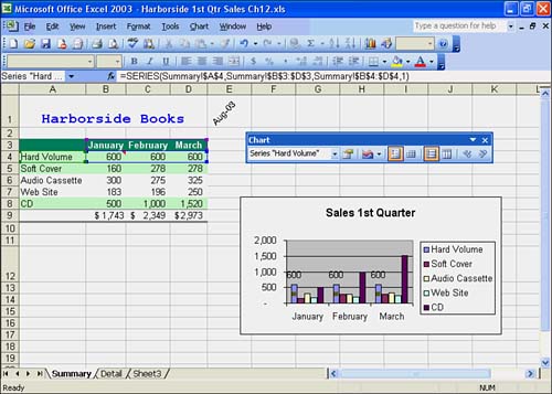
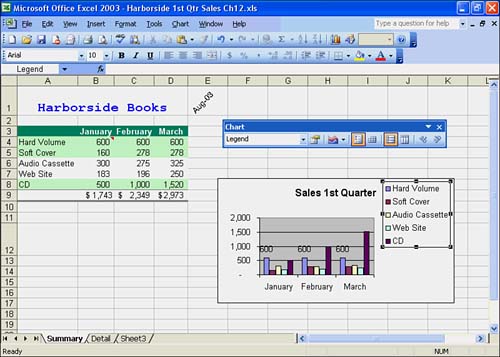
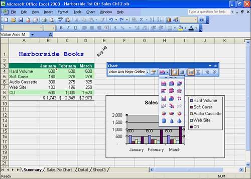
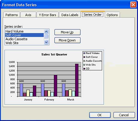
Labeling Data Elements in the ChartYou can add data labels above data series and data points on your chart. To do so, simply select the data series on the chart or in the Chart Objects list on the Chart toolbar. For example, you would choose Series "Hard Volume" in the Chart Objects list. Next click the Format Data Series button on the Chart toolbar. Excel opens the Format Data Series dialog box. Click the Data Labels tab, as shown in Figure 12.6. This tab offers data label options that include Series Name, Category Name and Value. The options that are grayed out are not available for this chart type. Figure 12.6. The Data Labels tab in the Format Data Series dialog box. Choose the Data Label type Value, and then click OK. Excel adds the data labels to your chart. Each data series bar for "Hard Volume" should show a value above it, as shown in Figure 12.7. Figure 12.7. Showing data labels as values above a data series. Deciding on the Elements of Your ChartA chart legend describes the data series and data points; it provides a "key" to the chart. By default, Excel adds a legend to the chart, and it already knows which chart labels make up the legend (the data series labels in the first column of the chart range). Keep in mind that a pie chart does not need a legend, but by default Excel inserts one, anyway. You can hide the legend, if you so desire . To do so, click the Legend button on the Chart toolbar. Excel makes the legend disappear from the chart. To display the legend, simply click the Legend button on the Chart toolbar again. The default location for a legend is on the right side of the chart. But you can change the placement of the legend by clicking on it and dragging it. Among the standard locations for the legend are the bottom, corner, top, right, and left side of the chart. Experiment to get the results you want. Figure 12.8 shows the legend in the upper-right corner of the chart. Figure 12.8. A legend in the upper-right corner of the chart. Gridlines are another chart element. A grid appears in the plot area of the chart and is useful for emphasizing the vertical scale of the data series. You can remove the gridlines by clicking on a gridline on the chart and then pressing the Delete key. Excel removes the gridlines from the chart. You can display them again by clicking the Undo button on the Standard toolbar. Figure 12.9 shows a chart without gridlines. Figure 12.9. A chart without gridlines. Selecting a Different Chart TypeExcel offers a myriad of chart types for presenting your data. You'll find that certain chart types are best for certain situations. To change to a different chart type, select your chart and click the Chart Type down arrow on the Chart toolbar. A palette of chart types appears, as shown in Figure 12.10. Click any chart type. Excel transforms your chart into that chart type. Experiment with chart types until you get the chart that best suits your needs. Figure 12.10. The Chart Type palette on the Chart toolbar. Re-ordering Chart SeriesYou can change the order of the chart series. To do so, click a data series on the chart. Click the Format Data Series button on the Chart toolbar. The Format Data Series dialog box appears. Click the Series Order tab, as shown in Figure 12.11. Choose the data series in the Series order list that you want to move and click the Move Up or Move Down button to move the series in the list. Click OK. Excel places the data series on the chart in the order you specified. Figure 12.11. The Series Order tab in the Format Data Series dialog box. |
EAN: 2147483647
Pages: 279