11.1. Visual Effects The Effect object encapsulates script.aculo.us' animation effects. It defines five core effects, implemented as classes that extend Effect.Base. At minimum, Core Effect classes implement initialize (the constructor) and update, a method that implements the effect's main action (e.g., changing opacity, moving the element). In general, client code doesn't use Core Effects directly. Instead, it uses Combination Effects, which act as wrappers to one or more Core Effects. script.aculo.us provides 16 standard Combination Effects, but it's intended that developers can easily create custom effects as well. script.aculo.us effects are time-based, as opposed to frame-based, and they will drop frames as necessary to meet the target effect duration. So in general, a one-second effect will last one second regardless of the system speed. 11.1.1. Core Effects Core Effects aren't generally used directly; rather they are used to build combination effects. Also see "Effect Options" and "Effect Instance Methods and Properties," later in this chapter.
class Opacity( element[, options] ) -
Core Effect class, extending Effect.Base. Changes the opacity (transparency) of element from from (in options, defaulting to the element's current opacity) to to (defaults to 1, for fully opaque). When the opacity reaches 0, the display attribute is not set to nonein other words, the element remains in the document flow, even though it's invisible. new Effect.Opacity('target', {to:0}); // fade out new Effect.Opacity('target', {from:0, to:1, duration:5}); // fade in
Note that this and the other Core Effects are classes, so calls should start with new, as opposed to combo effects, which are functions.
class Move( element[, options] ) -
Core Effect class, extending Effect.Base. Moves the element by the offset given by the x and y options. The mode option can be either relative (default) or absolute. In relative mode, x and y represent offsets from element's current location; in absolute mode, they represent offsets from its original location. // up and right new Effect.Move('target', {x:100, y:-50}); // down and left, slower new Effect.Move('target', {x:-10, y:10, duration:3}); // down and right, 2 seconds long, 25 frames per second, linear rate new Effect.Move('target', {x:100, y:200, duration:2, fps:25, transition:Effect.Transitions.linear});
class Scale( element, percent[, options] ) -
Core Effect class, extending Effect.Base. Scales up or down the size of element by percent, relative to its current size. In addition to the standard options, Scale( ) supports the following extra options: // increase both dimensions to 200% new Effect.Scale('target', 200); // decrease vertically to 50% new Effect.Scale('target', 50, {scaleX:false});
ScaleX
| Boolean indicating whether element will be scaled horizontally. Defaults to true. | ScaleY
| Boolean indicating whether element will be scaled vertically. Defaults to true. | scaleContent
| Boolean indicating whether the text contents of element will be scaled with the effect. Defaults to true. | scaleFromCenter
| Boolean indicating whether element will be scaled to/from its center point. Defaults to false, causing element to scale to/from its top-left corner. | scaleMode
| It may be box (default), which scales the visible area of element, or it may be contents, which scales the complete element, including parts only visible by scrolling. To precisely control the final size of element, scaleMode can be an object with two properties; e.g., { originalHeight: 400, originalWidth: 200 }. | scaleFrom
| Percentage between 1 and 100 (default) indicating the starting point for the scaling. | scaleTo
| Percentage between 1 and 100 indicating the ending point of the scaling. Defaults to the value of the percent argument. | restoreAfterFinish
| Boolean indicating whether element should be restored to its original size after the effect finishes. Defaults to false. |
class Highlight( element[, options] ) -
Core Effect class, extending Effect.Base. Changes element's background color to light yellow, then gradually changes it back to the initial color. The startcolor option can be used to override the default yellow. // one second yellow highlight new Effect.Highlight('target'); // half-second red highlight new Effect.Highlight('target', {startcolor:'ff0000',duration:.5});
Popularized by 37signals as the "yellow fade technique" (http://www.37signals.com/svn/archives/000558.php).
class ScrollTo( element[, options] ) -
Core Effect class, extending Effect.Base. Smoothly scrolls the page so element is at the top of the viewport (or as close as possible). // 1-second smooth scroll new Effect.ScrollTo('target'); // slow scroll new Effect.ScrollTo('target', {duration:5}); // go nuts new Effect.ScrollTo('target', {transition: Effect.Transitions.wobble});
class Parallel( effects[, options] ) -
Core Effect class, extending Effect.Base. Unlike the other core effects, this effect doesn't take an element, but rather an array of other effects. // Slide down and fade out new Effect.Parallel( [ new Effect.Move('target', {y: 100}), new Effect.Opacity('target', {to: 0}) ]);
11.1.2. Combination Effects Combination Effects are essentially wrappers around one or more core effect. Also see "Effect Options" and "Effect Instance Methods and Properties," later in this chapter.
class Fade( element[, options] ) -
Changes the opacity of element from from (defaulting to its current state) to to (defaulting to 0). If the opacity is 0 after finishing, element is hidden (removed from the page flow) and its opacity is restored to the original value. // one-second fade out new Effect.Fade('target') // half-second fade to 50% new Effect.Fade('target', {to:.5, duration:.5})
class Appear( element[, options] ) -
Changes the opacity of element from from (defaulting to its current state, or 0 if its display property is none) to to (defaulting to 1). Before starting, element's display property is set to the empty string, putting it in the page flow. // one-second fade in new Effect.Appear('target') // half-second fade in to 50% new Effect.Appear('target', {to:.5, duration:.5})
class Puff( element[, options] ) -
Combination of Scale( ) to 200 percent and Opacity( ) to 0. After finishing, element is hidden. Passed options are given to the Opacity( ) effect. // 1-second puff new Effect.Puff('target') // 3-second puff new Effect.Puff('target', {duration:3})
class BlindUp( element[, options] ) -
Scales the x dimension of element to 0 percent with contents of element anchored at the top, like window blinds. After finishing, element is hidden. new Effect.BlindUp('target')
class BlindDown( element[, options] ) -
Scales the x dimension of element to its native height with the contents of element anchored at the top, like window blinds. Before starting, element is made visible. new Effect.BlindDown('target')
class SlideUp( element[, options] ) -
Scales the x dimension of element to 0 percent, with the contents of element anchored at the bottom, like a garage door. Requires that the contents of element be wrapped in a container element with a fixed height. After finishing, element is hidden. new Effect.SlideUp('target')
class SlideDown( element[, options] ) -
Scales the x dimension of element to its native height with the contents of element anchored at the bottom, like a garage door. Requires that the contents of element be wrapped in a container element with a fixed height. Before starting, element is made visible. new Effect.SlideDown('target')
class SwitchOff( element[, options] ) -
Simulates an old television being turned off: a quick flicker, and then element collapses into a horizontal line. new Effect.SwitchOff('target')
class DropOut( element[, options] ) -
Simultaneously fades element and moves it downward, so it appears to drop off the page. new Effect.DropOut('target')
class Shake( element[, options] ) -
Causes element to slide left to right a few times, commonly used to indicate that an element is invalid (e.g., in a form field). new Effect.Shake('target')
class Grow( element[, options] ) -
Sets the size of element to 0 and then increases it and its contents from the center point. In addition to the standard options, the direction option can be used to specify the point the element will grow into. Possible values are center (default), top-left, top-right, bottom-left, and bottom-right. new Effect.Grow('target') new Effect.Grow('target', {direction:'top-left'})
class Shrink( element[, options] ) -
Decreases the size of element and its contents to 0, into the center point. In addition to the standard options, the direction option can be used to specify the point the element will shrink into. Possible values are center (default), top-left, top-right, bottom-left, and bottom-right. new Effect.Shrink('target') new Effect.Shrink('target', {direction:'bottom-right'})
class Squish( element[, options] ) -
Decreases the size of element and its contents to the top-left corner. new Effect.Squish('target')
class Pulsate( element[, options] ) -
Rapidly fades element in and out several timesa modern twist on the much-beloved <blink> tag. new Effect.Pulsate('target')
class Fold( element[, options] ) -
Decreases element's height to a thin line and then reduces its width until it disappears. new Effect.Fold('target')
11.1.3. Effect Options Some effects take additional options, as described under each effect. Also see "Effect Transitions," "Effect Callbacks," and "Effect Queues" later in this chapter. duration
| Duration of the effect in seconds, given as a float, defaulting to 1.0. | From
| Starting point of the transition; a float between 0.0 (default) and 1.0. | To
| End point of the transition; a float between 1.0 (default) and 0.0. | Fps
| Target frames per second rate. Max 100; defaults to 25. | Delay
| Delay in seconds before the effect starts, defaults to 0.0. | transition
| A function that modifies the current position point of the effect; see "Effect Transitions." Defaults to Effect.Transitions.sinoidal. | Queue
| Sets queuing options. Defaults to parallel. See "Effect Queues." | Sync
| If false (the default), frames will be rendered automatically. If true, frames must be rendered manually with render( ). |
11.1.4. Effect Instance Methods and Properties
finishOn -
The time in milliseconds when the effect was finished (or will finish).
startOn -
The time in milliseconds when the effect was started (or will start).
currentFrame -
The number of the last frame rendered.
options -
An object holding the options used in creating the effect. See DefaultOptions.
element -
The element the effect is applied to. When using Effect.Parallel, see effects.
effects -
An array containing the elements the effect applies to when using Effect.Parallel.
position -
A value between 0 and 1 representing the current position of the effect, e.g., 0 represents the start of the effect, 0.5 represents the effect at the halfway point, and 1 represents a completely finished effect. By default, null.
start( options ) -
Merges options with Effect.DefaultOptions. Adds the effect to the global queue, or the one specified in options.queue.scope.
loop( timePos ) -
Given the current time position (a value between startOn and finishOn, renders the effect at the appropriate position (a value between 0 and 1), according to the transition.
render( pos ) -
Transforms pos (a value between 0 and 1) according to the effect's transition function and calls update( ), which is defined in the actual effect class.
cancel( ) -
Removes the effect from its queue. // Start and immediately cancel an effect new Effect.Opacity('target', {to:0, from:1}).cancel( );
event( eventName ) -
Triggers the callback for the event named eventName. See "Effect Callbacks," later in this chapter. e = new Effect.Opacity('target', {onFoo:function( ){ alert('Bar'); }}) // alerts 'Bar' e.event('onFoo');
inspect( ) -
Returns a string representing the effect object. new Effect.Opacity('target', {from:1, to:0}).inspect( ); // => " #<Effect:#<Hash:{'position': undefined, 'element': [object HTMLDivElement], 'options': [object Object], 'currentFrame': 0, 'state': 'idle', 'startOn': 1154915939558, 'finishOn': 1154915940558}>, options:#<Hash:{'duration': 1, 'fps': 25, 'sync': false, 'from': 1, 'to': 0, 'delay': 0, 'queue': 'parallel'}>>"
11.1.5. Effect Transitions Because effects are time-based, script.aculo.us determines which frame to render based on the current system time (or "wall clock" time). For example, suppose a two-second Appear effect is scheduled to start at 2:30:00 p.m. When the Effect Queue's main loop passes that time to Effect.Base.loop as timePos, it's converted into pos, a float representing the current position in the effect's lifetimein this case, zero. At 2:30:01, the effect is scheduled to be half finished, so pos would be 0.5. The value of pos is sent to the effect's update method, which handles the actual change to the DOM; say, setting the element's opacity to 50 percent. That design suggests that script.aculo.us' effects execute at a linear rate of changei.e., a constant speed and direction, directly corresponding to wall time. Fortunately, the library provides an indirection mechanism called transitions to give you more flexibility. Each transition is a simple function that takes an argument between 0 and 1 and returns a value between 0 and 1. Effect.Base passes pos through the current transition function before calling Effect.update, giving you the ability to transform the current position. Eight standard transitions are defined: | linearEffectively leaves pos unchanged. | 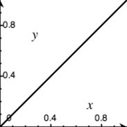 | | reverseReverses pos, so 0 becomes 1 and 1 becomes 0. | 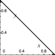 | | sinoidalSimilar to linear, but with smoother starts and finishes. | 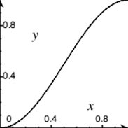 | | noneReturns 0 for any value of pos, effectively leaving the effect at its starting point. |  | | fullReturns 1 for every value of pos, effectively jumping the effect to its end state. |  | | pulseJumps between 0 and 1 five times, ending at 0. | 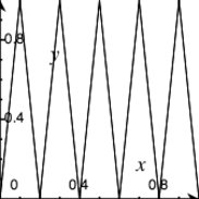 | | wobbleStarting off slow, slides between 0 and 1 four times, ending at 1. | 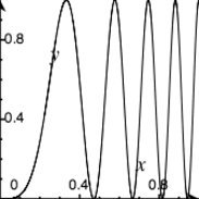 | | flicker | (Random) |
To create a custom transition, add a function to the Effect.Transitions object. For example: Effect.Transitions.slight_wobble = function(x) { return (-Math.cos(x * Math.PI *(9 * x)) / 4) + 0.5; }
11.1.6. Effect Callbacks Seven callback functions are available throughout the life cycle of an effect. Callbacks are specified in the effect's options parameter and receive a reference to the effect object as a parameter. The available callbacks are beforeStart, beforeFinish, afterFinish, beforeSetup, afterSetup, beforeUpdate, and afterUpdate. // Alert when the effect finishes rendering new Effect.Fade('target', {afterFinish:function(e){ alert('Done'); }}); // After every frame render, put the element's opacity // into its innerHTML new Effect.Fade('target', {afterUpdate:function(e){ e.element.update(e.element.getOpacity().toString( )); }});
11.1.7. Effect Queues By default, script.aculo.us effects are executed in parallel. In some cases, that doesn't pose a problemeven when creating multiple effects on the same element: new Effect.Fade('target'); new Effect.BlindUp('target');
But in other cases, it doesn't work well at all: new Effect.BlindUp('target'); new Effect.BlindDown('target');
The queue option provides for ordered effects using queues. Each queue acts as a separate scope, the default being named global. Within each scope, effects can be given a position: front or end. Effects with no given position will be executed in parallel with each other. For example: new Effect.BlindUp('target'); new Effect.BlindDown('target', {queue:'end'});
By specifying the end position for the BlindDown effect, it won't be executed until the BlindUp is finished, even though they are both in the global scope. To create independent scopes, provide an object instead of a string to the queue option. The object may contain position, scope, and limit properties. For example: new Effect.BlindUp('target', { queue:{ scope:'one' } }); new Effect.BlindDown('target', { queue:{ scope:'one', position:'end' } }); new Effect.BlindUp('target2', { queue:{ scope:'two', position:'end' } });
The scope property names the queue. The position property can be front or end. The limit property is used to set a maximum number of effects that can be in the queue at once. If there are more than limit effects in the queue, the new effect will not be added.
Effect.Queue -
Returns the effect queue named global.
Effect.Queues.instances -
A hash of queues, with the hash key being the queue name and the value being an Effect.ScopedQueue instance.
Effect.Queues.get( queueName ) -
Returns the queue specified by the string queueName, creating a new one if it doesn't exist.
class Effect.ScopedQueue -
Includes Prototype's Enumerable and implements _each, so the Enumerable methods may be used on a queue to iterate through its effects.
Effect.ScopedQueue.effects -
An array of Effect instances currently in the queue.
Effect.ScopedQueue.add( effect ) -
Adds effect to the queue. When one of the core effect classes is initialized (and unless the sync option is provided), it calls Effect.Base.start( ), which in turn adds the effect to the global queue (or a specified one), like this: Effect.Queue.add(this)
After an effect has been added to the queue, the queue's loop is started.
Effect.ScopedQueue.remove( effect ) -
Removes effect from the queue. When Effect.Base.cancel( ) is called, the effect removes itself from its queue like this: Effect.Queue.remove(this)
Effect.ScopedQueue.loop( ) -
This is the main loop for the effect queue. For each effect in effects, calls loop( ), passing the current time. Called by Effect.ScopedQueue.add( ). 11.1.8. Static Effect Methods
Effect.tagifyText( element ) -
Wraps every character in element in an individual <SPAN> tag with the position style set to relative. Depends on builder.js, which is not included in the standard Rails skeleton. el = Builder.node('div') el.innerHTML='test' Effect.tagifyText(el) el.innerHTML #=> '<span style="position: relative;">t</span><span style="position: relative;">e</span><span style="position: relative;" >s</span><span style="position: relative;">t</span>'
This allows individual characters to have effects created for them. For example: // <h1 >This is a test.</h1> Effect.tagifyText('headline'); Effect.multiple($('headline').childNodes, Effect.Opacity, { from:0, to:1, transition:Effect.Transitions.wobble });
Effect.toggle( element, effect[, options] ) -
Tests element's visibility and hides or shows it as appropriate. effect can be one of slide, blind, or appear (default), as defined in the Effect.PAIRS. // Fade or Appear Effect.toggle('target') // BlindUp or BlindDown Effect.toggle('target', 'blind')
Effect.multiple( elements, effect[, options] ) -
Calls effect on each element in elements. Effect.multiple(['target','target2'], Effect.BlindUp) Effect.multiple(['target','target2'], Effect.Fade, {duration:4})
|