Creating the Words


You always need to consider the overall look and feel of the elements (font style, background choices, and so on) in any project, to make certain they're appropriate for the project's destination. For example, readability is an important consideration when you're choosing fonts and colors. Some fonts look great and read well when displayed on a computer, television, or printed page but become more difficult to read when they're animated.

Create the title for this project with the following steps:

1.

Select the Horizontal Type tool, and set the following properties in the Character and Paragraph palettes:

Font Family: Century Gothic or a font that looks similar to the title text in the final project's movie

Size: 48 pixels

Fill Color: green (RGB: 0, 255, 0)

Alignment: Center Text

Tip

Double-click a text layer in the Timeline to select the text, and click the font family name in the Character palette (instead of the pop-up menu arrow). Then you can use the up and down arrow keys on your keyboard to go through the fonts one by one while viewing each font's appearance in the Composition window. You can also press a letter to jump to the fonts whose names begin with that letter.

Settings for the Text layers

2.

Type the word CYBER in uppercase in the Composition window, and then either press the Enter key on the numeric keypad or click the Selection tool in the Tools palette to get out of text-entry mode.

3.

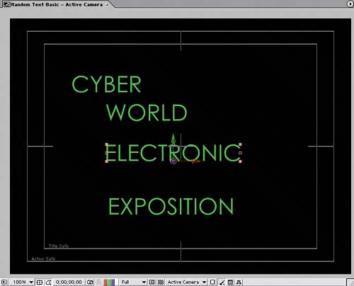
Create three more text layers for the words WORLD, ELECTRONIC, and EXPOSITION. You can put them anywhere in the composition for now; you'll reposition them in the next section.

Four separate text layers in temporary locations

Random Text Basic composition's Timeline


    Adobe After Effects 6.5 Magic
    Adobe After Effects 6.5 Magic
    ISBN: 0321267230
    EAN: 2147483647
    Year: 2005
    Pages: 236

    flylib.com © 2008-2017.
    If you may any questions please contact us: flylib@qtcs.net