Box Properties
| < Day Day Up > |
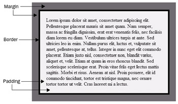
An important part of mastering CSS layout is understanding the basics of the box model. First consider that XHTML block-level elements, such as p , can be thought of as occupying rectangular boxes on the screen. The aspects of boxes that can be controlled with CSS include the following:
-
Margin properties Determine the distance between edges of an element's box and the edges of adjacent elements.
-
Border properties Determine the visual characteristics of a border surrounding an element's edges.
-
Padding properties Determine the distance inside an element between its edges and its actual content.
-
Height, width, and positioning properties Determines the size and position of the box that the element creates.
The relationship of these various box characteristics is illustrated here:
Margin Properties
Four margin properties are available to set each of an element's four margins individually. A fifth margin property allows all of the margins to be set together. Individual margins for a block element including the body itself can be set by using margin-top , margin-right , margin-bottom , or margin-left properties. The values for the margins should be a length (such as 15pt or 2em ), a percentage value of the block element's width (such as 20% ), or the value auto , which attempts to figure out the appropriate margin automatically:
body {margin-top: 20px; margin-bottom: 20px; margin-left: 30px; margin-right: 50px;} p {margin-bottom: 20mm;} div.fun {margin-left: 1.5cm; margin-right: 1.5cm;} One interesting use of margin properties is to set negative margin values. Of course, negative margins could clip the content of the block element in the browser window, if you aren't careful. Try an example such as
p {margin-left: -2em; background-color: green;} to get an idea of how negative margins work.
The last few examples show that you can set one or many margins. To make setting multiple margins even easier, a shorthand notation is available that enables page designers to set all the margins at once. Using the margin property, one to four values can be assigned to affect the block element margins. If a single value is specified, it is applied to all four margins. For example,
p {margin: 1.5cm;} sets all the margins equal to 1.5 cm. If multiple values are specified, they are applied in clockwise order: first the top margin, followed by (in order) the right, bottom, and left margins. For example,
p {margin: 10px 5px 15px 5px;} sets the top margin to 10 pixels, the right to 5 pixels, the bottom to 15 pixels, and the left to 5 pixels. If only two or three values are specified in the rule, the missing values are determined from the opposite sides. For example,
p {margin: 10px 5px;} sets the top margin to 10 pixels and the right margin to 5 pixels. The opposite sides, then, are set accordingly , making the bottom margin 10 pixels and the left margin 5 pixels.
A complete example using the margin properties is shown here. Notice that the example uses one negative margin. The background color makes it easier to see the effect.
<!DOCTYPE html PUBLIC "-//W3C//DTD XHTML 1.0 Transitional//EN" "http://www.w3.org/TR/xhtml1/DTD/xhtml1-transitional.dtd"> <html xmlns="http://www.w3.org/1999/xhtml" lang="en"> <head> <title> CSS Margin Example </title> <meta http-equiv="content-type" content="text/html; charset=ISO-8859-1" /> <style type="text/css"> <!-- body {margin: 0px;} #one {background-color: yellow; margin: 1cm;} #two {background-color: #FFD700; margin-top: 1cm; margin-bottom: 1cm; margin-right: .5cm; margin-left: -5px;} #three {background-color: #ADFF2F;} #bigchar {background-color: red; color: white; font-size: 28pt; font-family: Impact;} --> </style> </head> <body> <p id="one"> This is a paragraph of text that has margins set for all sides to 1 cm. This is just dummy text to show the effects of the margins. This is just dummy text to show the effects of the margins. </p> <p id="two"><span id="bigchar"> T </span> his is another paragraph that has negative margins on one side. Be careful not to clip things with negative margins. This is just dummy text to show the effect of the margins. This is just dummy text to show the effect of the margin. </p> <p id="three"> This paragraph has the default margins for the page, which are set to 0. This is just dummy text to show the effects of the margins. This is just dummy text to show the effects of the margins. This is just dummy text to show the effects of the margins. This is just dummy text to show the effects of the margins. </p> </body> </html> The rendering of the margin example under Internet Explorer is shown in Figure 10-9.
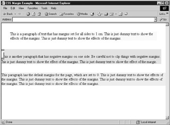
Figure 10-9: Margin example under Internet Explorer
Border Properties
Elements can be completely or partially surrounded by borders placed between their margins and their padding. The border properties control the edges of block elements by setting whether they should have a border, what the borders look like, their width, their color, and so on. Borders are supposed to work with both block-level and inline elements. However, you will not find that border properties are inherited by enclosed elements when used with block elements.
border-style
The border-style property is used to set the appearance of the borders. The default value for the property is none , which means no border is drawn, regardless of any other setting. The values for border-style include the following:
| Value | Intended Rendering |
|---|---|
| dotted | A dotted border |
| dashed | A dashed-line border |
| solid | A normal solid-line border |
| double | A double-line border |
| groove | An etched border |
| ridge | An extruded border |
| inset | An inset border, making an object look like it is set into the page |
| outset | A beveled border, making an object look raised |
A few examples of border-style rules are shown here:
h1 {border-style: solid;} p.boxed {border-style: double;} .button {border-style: outset;} The border-style property sets the borders for each of the sides of the element. Individual border styles can be controlled with border-top-style , border-bottom-style , border-left- style , and border-right-style . The border-style property also can act as a shorthand notation and can take up to four values starting from top, right, bottom, and then left. Like the margi n property, when less than four values are set, the opposite sides are set automatically. To set double borders on the top and bottom, use one of the following rules:
p {border-style: double none;} p.one {border-style: double none double none;} p.two {border-top-style: double; border-bottom-style: double; border-left-style: none; border-right-style: none;} border-width
Numerous properties are used to set the width of borders. Four properties set the width for specific borders: border-top-width , border-right-width , border-bottom-width , and border-left-width . Similar to the border-style property, the border-width property sets all four borders at once and takes from one to four values. Multiple values are applied to borders in a clockwise order: top, right, bottom, left. If only two or three values are used, the missing values are determined from the opposite sides, just as with margins and border styles. Border width can be specified by using the keywords thin , medium , and thick to indicate the given relative sizes for the border, or by using an absolute length measurement such as 10 pixels. The following examples illustrate how border widths can be set:
p {border-style: solid; border-width: 10px;} p.double {border-style: double; border-width: thick;} p.thickandthin {border-style: solid; border-width: thick thin;} .fun {border-style: double none; border-width: thick;} border-color
Borders can be assigned a color by using the border-color property. Border colors are specified using standard CSS color values. The border-color property sets all four borders and takes from one to four values. Once again, multiple values are applied to borders in a clockwise order: top, right, bottom, left. If only two or three values are used, the missing values are determined from the opposite sides. As with border widths and styles, you can set a color value for each border side individually using border-top-color , border-right-color , border- bottom-color , and border-left-color . The following examples illustrate the basic ways to set a border's colors:
p {border-style: solid; border-color: green;} p.all {border-style: solid; border-top-color: green; border-right-color: #FF0000; border-bottom-color: yellow; border-left-color: blue;} Border Shorthand
Several border properties allow any combination of width, color, and style information to
be set in a single property. The border-top , border-right , border-bottom , and border-left properties support this for their respective borders. For example, to set the top border or paragraph elements to be red, double-line style, and 20 pixels thick, use the following:
p {border-top: double 20px red;} The order of the property values to set the style, width, and color may seem arbitrary, but according to the specification, designers probably should set the style, then the width, followed by the color. Multiple properties can be combined in one rule to set the borders differently, as shown in the following example:
#RainbowBox {background-color: yellow; border-top: solid 20px red; border-right: double 10px blue; border-bottom: solid 20px green; border-left: dashed 10px orange;} Aside from a shorthand notation for each individual border side, you can use a shorthand notation for all sides by using the border property. For example, to set all borders of a paragraph to be red, double-line style, and 20 pixels thick, use the following:
p {border: double 20px red;} Note that it is impossible to set the individual border sides with this shorthand notation. The actual properties to set the various borders must be used, such as border-top or, even more specifically , border-top-style .
The following brief example shows all the border properties used so far. Notice that both compact and explicit notations are used in the example.
<!DOCTYPE html PUBLIC "-//W3C//DTD XHTML 1.0 Transitional//EN" "http://www.w3.org/TR/xhtml1/DTD/xhtml1-transitional.dtd"> <html xmlns="http://www.w3.org/1999/xhtml" lang="en"> <head> <title> CSS1 Border Example </title> <meta http-equiv="content-type" content="text/html; charset=ISO-8859-1" /> <style type="text/css"> <!-- #outer {background-color: orange; border-style: solid; border-width: 5px; padding: 10px 10px;} #one {background-color: yellow; border-style: double; border-width: medium;} #two {background-color: yellow; border-style: double solid; border-color: red green purple blue; border-width: thin medium thick .25cm;} --> </style> </head> <body> <div id="outer"> <p id="one"> This is a paragraph of text that has a red double border around it. Notice how the text creeps up on the edges. Padding values will help you avoid this problem. </p> <p id="two"> This is another paragraph that has its borders set in a very bizarre way! </p> Notice that the paragraph blocks can be within a large boxed block structure. </div> </body> </html> The rendering of the border property example under Internet Explorer is shown in Figure 10-10.
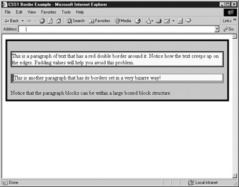
Figure 10-10: CSS border properties rendering
Padding Properties
The space between an element's border and its content can be specified by using the padding properties. An element's four padding regions can be set by using the padding-top , padding - right, padding-bottom , and padding-left properties. As with borders and margins, you can use a shorthand notation property, called padding , to set the padding for all sides at once. This example illustrates some basic uses of padding properties:
div {padding-top: 1cm;} p {border-style: solid; padding-left: 20mm; padding-right: 50mm;} The shorthand notation property padding allows a single property assignment to specify all four padding regions. It can take from one to four values. A single value is applied to all four padding areas. Multiple values are applied to padding regions in the usual clockwise order: top, right, bottom, left. If only two or three values are used, the missing values are determined from the opposite sides. So,
div {border-style: solid; padding: 1cm;} sets a region with a solid border, but with contents padded 1 cm from the border on all sides. And
p {padding: 2mm 4mm;} sets padding on the top and bottom to 2 mm and the right and left to 4 mm for all paragraphs. The following is an example showing padding and borders to help you better understand padding values:
<!DOCTYPE html PUBLIC "-//W3C//DTD XHTML 1.0 Transitional//EN" "http://www.w3.org/TR/xhtml1/DTD/xhtml1-transitional.dtd"> <html xmlns="http://www.w3.org/1999/xhtml" lang="en"> <head> <title> CSS1 Padding Example </title> <meta http-equiv="content-type" content="text/html; charset=ISO-8859-1" /> <styletype="text/CSS"> <!-- #one {background-color: yellow; border-style: double; border-width: medium; padding-left: 1cm; padding-right: .5cm;} #two {background-color: yellow; border-style: double; border-width: medium; padding-top: 1cm; padding-bottom: 1cm;} #three {background-color: yellow; border-style: double; border-width: medium; padding: 1cm 1cm; margin: .5cm 4cm;} --> </style> </head> <body> <p id="one"> This paragraph of text has padding on the left and right, but not on the top and bottom. </p> <p id="two"> This paragraph has padding, but this time only on the top and bottom. </p> <p id="three"> Be careful when using margins. They don't necessarily apply to the text within the box, but to the box itself. </p> </body> </html> See Figure 10-11 for the rendering of the padding example.
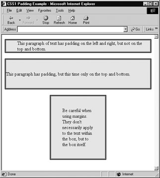
Figure 10-11: Rendering of padding example
Width and Height
The width and height properties are used to set the width and height of an element. The values for these properties can be either an absolute unit, usually pixels (for example, 300px), or a relative unit, often a percentage value (for example, 50%). Relative to what, you may wonder . Relative units are related to the size of the containing element. For example, for tags directly in the body element, the width would be directly related to the browser window width. In the case of other elements, their width would be used as the 100% measurement, which may be much less than the full browser width. The following example demonstrates the difference in the sizing of a paragraph with and without height and width set. A rendering is shown in Figure 10-12.
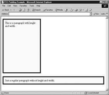
Figure 10-12: Height and width set and unset
<!DOCTYPE html PUBLIC "-//W3C//DTD XHTML 1.0 Transitional//EN" "http://www.w3.org/TR/xhtml1/DTD/xhtml1-transitional.dtd"> <html xmlns="http://www.w3.org/1999/xhtml" lang="en"> <head> <title> CSS Padding Example </title> <meta http-equiv="content-type" content="text/html; charset=ISO-8859-1" /> <style type="text/css"> <!-- p {border: solid 5px; padding: 10px; background-color: yellow; color: black;} #p1 {width: 200px; height: 300px;} --> </style> </head> <body> <p id="p1"> This is a paragraph with height and width. </p> <p> Just a regular paragraph without height and width. </p> </body> </html> Under strict CSS1, the most legitimate use of the height and width properties is setting the dimensions of included objects such as images. We will see even more use of them when positioning content regions, which is discussed in the next chapter. In either case, when sizing regions you must carefully consider one issue ”what happens when the size of an object is smaller than the contained content? The overflow property from CSS2 discussed in the next chapter should really help then.
float and clear
The float property influences the horizontal alignment of elements. It causes them to "float" toward either the left or right margins of their containing element. This is especially useful for placing embedded media objects (such as images and similar support) into a Web page. Similar floating capabilities under transitional versions of HTML or XHTML can be found with the align attribute settings. As with XHTML, the values available for the float property include left , right , or none . The value of none is the default. To imitate the markup <img id="logo" src="logo.gif" alt="logo" align="right" hspace="10" vspace="10" /> , apply a style sheet rule such as this to the element:
#logo {float: right;} The preceding example may raise a few questions. How can the hspace and vspace attributes from HTML be imitated using style sheets? You have a great deal of control over the border, margin, padding, height, and width of any object, so you shouldn't have difficulty achieving the layout that you want by setting padding to 10px all around the image. One thing that may not be obvious is how to clear the content that may flow around an object.
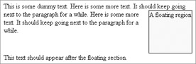
The use of floating elements creates the need to position vertically those elements that immediately follow them in an HTML document. Should the content flow continue at the floating element's side or after its bottom? If floating elements are defined on the right and left margins of the page, should content flow continue between them, after the bottom of the left element, the right element, or whichever is larger? The clear property allows this to be specified. A value of left for the property clears floating objects to the left, a value of right clears floating objects to the right, and the both value clears whichever is larger. The default value is none . Notice that this is extremely similar to the use of the clear attribute with the <br /> tag in transitional XHTML. The following code example demonstrates the use of the clear and float properties in a rather unusual manner. Instead of floating an image, we'll float a paragraph of text to one side of the screen and text around it.
<!DOCTYPE html PUBLIC "-//W3C//DTD XHTML 1.0 Transitional//EN" "http://www.w3.org/TR/xhtml1/DTD/xhtml1-transitional.dtd"> <html xmlns="http://www.w3.org/1999/xhtml" lang="en"> <head> <title> Float and Clear Control under CSS </title> <meta http-equiv="content-type" content="text/html; charset=ISO-8859-1" /> <style type="text/css"> <!-- p.aligned-right {border-style: solid; border-width: 1px; height: 100px; width: 100px; background-color: yellow; float: right;} .clearright {clear:right;} --> </style> </head> <body> <div> This is some dummy text. <p class="aligned-right"> A floating region </p> Here is some more text. It should keep going next to the paragraph for a while. Here is some more text. It should keep going next to the paragraph for a while. <br class="clearright" /> This text should appear after the floating section. </div> </body> </html> The rendering of the image alignment and text flow should look something like this:
The previous section has hinted at the great deal of control that CSS affords a designer. Perfect pixel-level positioning of objects is just a moment away, but before getting to what appears to be a designer's nirvana, let's see how we can change the very core meaning of an XHTML element using CSS.
| < Day Day Up > |
EAN: 2147483647
Pages: 252