Demonstration Application: FormPaint.exe
| I l @ ve RuBoard |
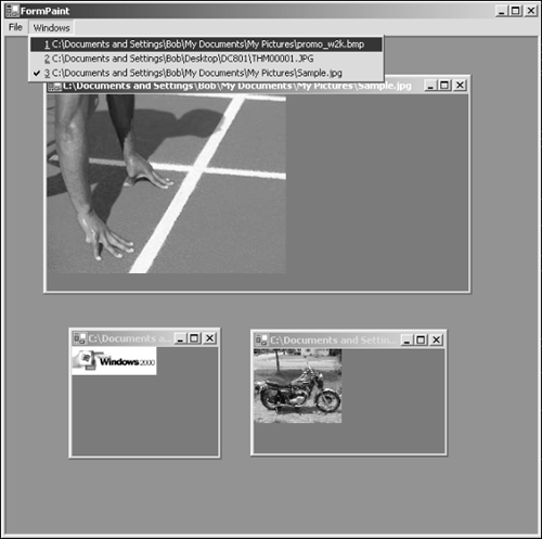
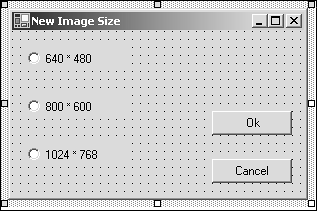
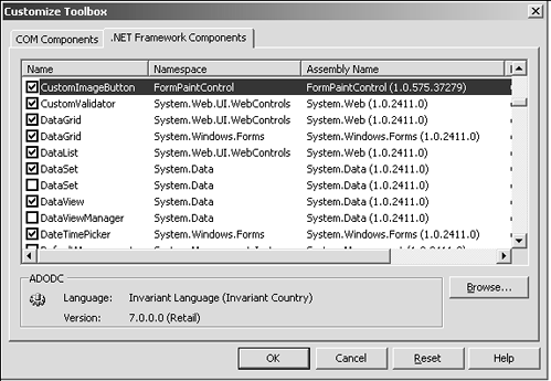
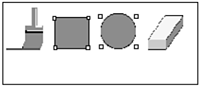
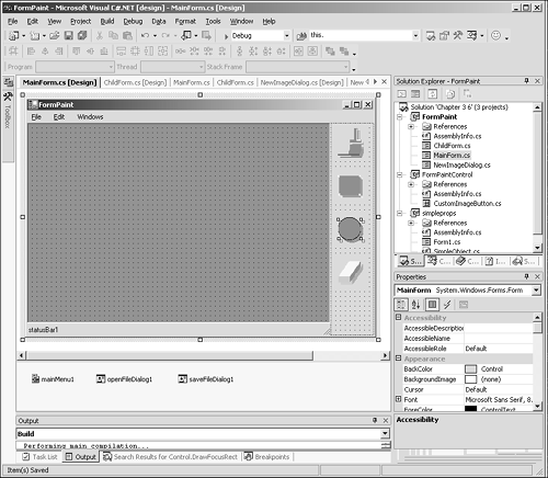
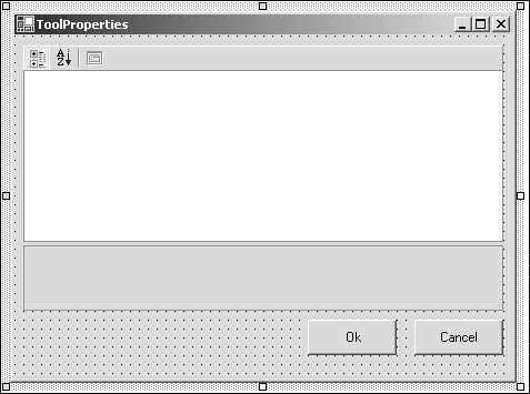
Demonstration Application: FormPaint.exeThis application puts together many of the principals we've shown you in this book and shows off some of the features of Windows Forms in a complete application context. Form Paint is a Multiple Document Interface (MDI) application that allows you to paint images with brushes and shapes . It has customized menus and shows off some of the power of GDI+ also. Part 1: The Basic FrameworkGetting started, create an application in VS.NET and immediately set the forms IsMDIContainer to true. This makes it a main parent window for other form-based documents that are hosted in it. The name , Form1 , must be changed to MainForm and the title of the window changed to FormPaint . Remember that when the name of the MainForm changes, you must also manually modify the static Main method as follows : [STAThread] static void Main() { Application.Run(new MainForm()); // change the application name } Drag a MainMenu from the toolbox onto the MainForm. Type the word &File as the menu name and add three menu items ” &New , & Open , and &Exit . Drag an OpenFileDialog and a SaveFileDialog from the toolbox onto the MainForm . These will show up in the icon tray below the form. Double-click the Open menu item in the main menu and type the following into the handler provided: this.openFileDialog1.Filter="Bitmap files(*.BMP)*.bmp"; this.openFileDialog1.ShowDialog(); Create a second menu called Windows . This will be used to keep track of the MDI child forms in the application. This is done automatically for you if you set the MDIList property of the menu to true. Next , add a new Windows Form to the project, call it ChildForm . Set the BackColor to green. Add a private Image variable called myImage to the child form and a public accessor property as follows: private Image myImage; public Image Image { set{ myImage =value;} get{ return myImage;} } Now, double-click the OpenFileDialog in the icon tray. This action will create a FileOk handler for you. Type the following into the resulting handler: ChildForm c=new ChildForm(); c.MdiParent=this; c.Image=Image.FromFile(this.openFileDialog1.FileName); c.Text=this.openFileDialog1.FileName); c.Show(); This will open a file, create a child form, and load the image into the child form. The child form now needs to display the image. Select the ChildForm design page, click the Events button in the Property Browser, and double-click the Paint event. This creates a PaintEventHandler delegate for the ChildForm and opens the editor at the correct place in the file. Type the following into the handler: e.Graphics.DrawImage(myImage,0,0,myImage.Width,myImage.Height); This is a good place to stop and take stock of the project. Compile and run the code using the F5 key. You'll see an application that lets you load and display images in multiple windows. Figure 3.6.4 shows this basic application in action. Figure 3.6.4. The basic MDI application. This portion of the program is available as FormPaint Step1 on the Sams Web site associated with this book. Part 2: Scrolling a Window and Creating New ImagesIf you've run the fledgling FormPaint program and loaded up a few images, you'll have noticed that the windows will resize. But, when they become too small to display the picture, they simply chop it off without giving you a chance to see the sides with a scrollbar. We'll correct this quickly by adding some simple code to the ChildForm . First, in the Image property set accessor for the ChildForm , we'll add a command to set the AutoScrollMinSize property to the size of the image in myImage . The following code snippet shows the added functionality on line 6. 1: public Image Image 2: { 3: set 4: { 5: myImage =value; 6: this.AutoScrollMinSize=myImage.Size; 7: } 8: get{ return myImage;} 9: } Now, whenever the client rectangle size drops below the minimum size in either dimension, the corresponding scroll bar will appear. A second change must be made to the OnPaint handler to position the scrollbars. Here, we need to offset the image by the value of the scrollbar position so that the image is painted correctly. The form also provides a property for the scrollbar positions that is shown in the following code snippet. 1: private void ChildForm_Paint(object sender, System.Windows.Forms.PaintEventArgs e) 2: { 3: e.Graphics.DrawImage(myImage, 4: this.AutoScrollPosition.X, 5: this.AutoScrollPosition.Y, 6: myImage.Width, 7: myImage.Height); 8: } On lines 4 and 5, you can see that the X and Y values of the form's AutoScrollPosition property offset the origin of the image by the correct amount. So far, the program can only load an image that exists on disk. We need to create an image, perhaps with a choice of sizes, and to allow that image to be saved to disk also. Creating the image can be accomplished as follows. Using the MainForm design page, select and double-click the New menu entry in the File menu. This will create a handler that we'll fill in later. Now, right-click the FormPaint project and choose Add, New Item. Choose a new Form and call it NewImageDialog.cs . Drag three radio buttons and two buttons from the toolbox onto the dialog. Then arrange them, as shown in Figure 3.6.5 Figure 3.6.5. Button arrangement dialog. The DialogResult properties of the OK and Cancel buttons must be set to DialogResult.Ok and DialogResult.Cancel respectively. To retrieve the setting from the radio buttons, we can add a simple property that returns a size. Hand-edit the NewImageDialog.cs code and add the following public property: public Size ImageSize { get { if(this.radioButton2.Checked) return new Size(800,600); if(this.radioButton3.Checked) return new Size(1024,768); return new Size(640,480); } } Now we can return to the handler we created earlier and fill it out to create a blank image. Find the handler in the MainForm.cs file and add the necessary code as follows: 1: private void menuItem2_Click(object sender, System.EventArgs e) 2: { 3: // To create a new file... 4: NewImageDialog dlg = new NewImageDialog(); 5: if(dlg.ShowDialog()==DialogResult.OK) 6: { 7: ChildForm c=new ChildForm(); 8: c.MdiParent=this; 9: c.Image=new Bitmap(dlg.ImageSize.Width,dlg.ImageSize.Height); 10: Graphics g=Graphics.FromImage(c.Image); 11: g.FillRectangle(new SolidBrush(Color.White),0,0, c.Image.Width,c.Image.Height); 12: c.Show(); 13: } 14: } Adding the Save FunctionsSaving the file or saving "as" a different file will be performed through the main File menu. Add a Save and Save As menu item, remembering to use the ampersand before the key-select characters ”for example, &Save and Save &As . For esthetic reasons, you might also want to move these into a sensible place on the menu and place a separator between the file and exit functions. When you've created these entries, go ahead and double-click each one in turn to create the handlers for them. The following code snippet shows the two save handlers: 1: private void menuItem6_Click(object sender, System.EventArgs e) 2: { 3: //Save the image file. 4: ChildForm child = (ChildForm)this.ActiveMdiChild; 5: child.Image.Save(child.Text); 6: } 7: 8: private void menuItem7_Click(object sender, System.EventArgs e) 9: { 10: //Save the image file as a different filename 11: ChildForm child = (ChildForm)this.ActiveMdiChild; 12: this.saveFileDialog1.FileName=child.Text; 13: if(this.saveFileDialog1.ShowDialog()==DialogResult.OK) 14: { 15: child.Image.Save(this.saveFileDialog1.FileName); 16: child.Text=this.saveFileDialog1.FileName; 17: } 18: } Lines 1 “6 are the simple save handler. The filename is already known, so a save is performed using the titlebar text of the ChildForm . Lines 8 “18 use this filename as a starting point but invoke the SaveFileDialog to allow the user to choose a new name. This behavior is fine if you can guarantee that a ChildWindow is always open from which to get the text. If you use the handlers on an empty main form, though, an exception will occur because there is no active MDI child. This problem can be overcome in one of two ways. Either write an exception handling try...catch block into both handlers or, alternatively, never allow the handler to be called if there are no MDI children. The second method is best for the purposes of this demonstration because it allows us to use the menu pop-up events correctly. You might remember from Chapter 3.1, "Introduction to Windows Forms," that the menu Popup event is fired when the user selects the top-level menu on the toolbar just before the menu is drawn. This gives us the chance to modify the menu behavior to suit the current circumstances. The following code snippet shows the Popup handler for the File menu item. 1: private void menuItem1_Popup(object sender, System.EventArgs e) 2: { 3: if(this.MdiChildren.Length!=0) 4: { 5: menuItem6.Enabled=true; 6: menuItem7.Enabled=true; 7: } 8: else 9: { 10: menuItem6.Enabled=false; 11: menuItem7.Enabled=false; 12: } 13: } The handler checks to see if there are any MDI children in the main form (line 3). If there are, it enables both the save menus on lines 5 and 6. If there are none, it disables these menus on lines 10 and 11. This part of the application is available as FormPaint Step2 on the Sams Web site associated with this book. Part 3: More User InterfaceWith the image loading, display, and saving in place, we can get on with the task of adding the rest of the user interface items that will be used to drive the program. We need a tool palette; in this case, a simple one will suffice to demonstrate principles, a status bar, some mouse handling, and a custom button class based on UserControl . Creating a Custom User ControlA big advantage to user controls in .NET is their ease of reuse. A quick side-trip into a custom control project can result in a handy component that you'll use many times in various projects. These controls play nicely in the design environment and can be shipped as separate assemblies if you want. To begin with, add a new C# control library project to the current solution. Remember to choose the Add to Current Solution radio button on the wizard dialog. Call the project FormPaintControl . You'll be presented with a wizard to choose the type of control to add. Select a new UserControl and name it CustomImageButton.cs . Listing 3.6.5 shows the full source code of the CustomImageButton control. Listing 3.6.5 CustomImageButton.cs : The Custom Image Button Class 1: using System; 2: using System.Collections; 3: using System.ComponentModel; 4: using System.Drawing; 5: using System.Drawing.Drawing2D; 6: using System.Data; 7: using System.Windows.Forms; 8: using System.Drawing.Imaging; 9: 10: namespace FormPaintControl 11: { 12: /// <summary> 13: /// Summary description for CustomImageButton. 14: /// </summary> 15: public class CustomImageButton : System.Windows.Forms.UserControl 16: { 17: private Image image; 18: private Color transparentColor; 19: private bool ownerDraw; 20: private bool down; 21: 22: [ 23: Category("Behavior"), 24: Description("Allows external paint delegates to draw he control") 25: ] 26: public bool OwnerDraw 27: { 28: get 29: { 30: return ownerDraw; 31: } 32: set 33: { 34: ownerDraw=value; 35: } 36: } 37: 38: [ 39: Category("Appearance"), 40: Description("The image displayed on the control") 41: ] 42: public Image Image 43: { 44: get 45: { 46: return image; 47: } 48: set 49: { 50: image=value; 51: } 52: } 53: 54: [ 55: Category("Appearance"), 56: Description("The transparent color used in the image") 57: ] 58: public Color TransparentColor 59: { 60: get 61: { 62: return transparentColor; 63: } 64: set 65: { 66: transparentColor=value; 67: } 68: } 69: 70: protected override void OnSizeChanged(EventArgs e) 71: { 72: if(DesignMode) 73: Invalidate(); 74: base.OnSizeChanged(e); 75: } 76: 77: public void DrawFocusRect(Graphics g) 78: { 79: Pen p=new Pen(Color.Black,1); 80: p.DashStyle=DashStyle.Dash; 81: Rectangle rc=ClientRectangle; 82: rc.Inflate(-1,-1); 83: g.DrawRectangle(p,rc); 84: } 85: 86: protected override void OnLostFocus(EventArgs e) 87: { 88: Invalidate(); 89: base.OnLostFocus(e); 90: } 91: 92: protected override void OnPaint(PaintEventArgs e) 93: { 94: Rectangle rc=ClientRectangle; 95: rc.Offset(4,4); 96: e.Graphics.SetClip(ClientRectangle); 97: if(!ownerDraw) 98: { 99: if(image==null !(image is Bitmap)) 100: { 101: Pen p=new Pen(Color.Red,2); 102: e.Graphics.DrawRectangle(p,ClientRectangle); 103: e.Graphics.DrawLine(p,ClientRectangle.Location.X, 104: ClientRectangle.Location.Y, 105: ClientRectangle.Location.X+ClientRectangle.Width, 106: ClientRectangle.Location.Y+ClientRectangle.Height); 107: e.Graphics.DrawLine(p, 108: ClientRectangle.Location.X+ClientRectangle.Width, 109: ClientRectangle.Location.Y, 110: ClientRectangle.Location.X, 111: ClientRectangle.Location.Y+ClientRectangle.Height); 112: return; 113: } 114: Bitmap bm=(Bitmap)image; 115: bm.MakeTransparent(transparentColor); 116: if(down Focused) 117: { 118: e.Graphics.DrawImage(bm, 119: rc.Location.X, 120: rc.Location.Y, 121: bm.Width,bm.Height); 122: if(Focused) 123: DrawFocusRect(e.Graphics); 124: } 125: else 126: { 127: ControlPaint.DrawImageDisabled(e.Graphics,bm, 128: rc.Location.X,rc.Location.Y,BackColor); 129: e.Graphics.DrawImage(bm, 130: ClientRectangle.Location.X, 131: ClientRectangle.Location.Y, 132: bm.Width,bm.Height); 133: } 134: } 135: base.OnPaint(e); 136: } 137: 138: /// <summary> 139: /// Required designer variable. 140: /// </summary> 141: private System.ComponentModel.Container components = null; 142: 143: public CustomImageButton() 144: { 145: // This call is required by the Windows.Forms Form Designer. 146: InitializeComponent(); 147: 148: // TODO: Add any initialization after the InitForm call 149: 150: } 151: 152: protected override void OnMouseEnter(EventArgs e) 153: { 154: base.OnMouseEnter(e); 155: down=true; 156: Invalidate(); 157: } 158: 159: protected override void OnMouseLeave(EventArgs e) 160: { 161: base.OnMouseLeave(e); 162: down=false; 163: Invalidate(); 164: } 165: 166: [ 167: Browsable(true), 168: DesignerSerializationVisibility(DesignerSerializationVisibility.Visible) 169: ] 170: public override string Text 171: { 172: get 173: { 174: return base.Text; 175: } 176: set 177: { 178: base.Text = value; 179: } 180: } 181: 182: /// <summary> 183: /// Clean up any resources being used. 184: /// </summary> 185: protected override void Dispose( bool disposing ) 186: { 187: if( disposing ) 188: { 189: if( components != null ) 190: components.Dispose(); 191: } 192: base.Dispose( disposing ); 193: } 194: 195: #region Component Designer generated code 196: /// <summary> 197: /// Required method for Designer support - do not modify 198: /// the contents of this method with the code editor. 199: /// </summary> 200: private void InitializeComponent() 201: { 202: // 203: // CustomImageButton 204: // 205: this.Name = "CustomImageButton"; 206: this.Size = new System.Drawing.Size(64, 56); 207: 208: } 209: #endregion 210: 211: } 212: } Beginning with line 1, note the added use of namespaces in the control. The default is only to use the System namespace. Line 10 defines the FormPaintControl namespace with line 15 beginning the control itself ” CustomImageButton . Lines 17 through 20 define private data members to store information used in the drawing of the control. There is an Image , a transparent color key, and two Boolean flags for an owner draw property and to decide whether the button should be rendered down or up. Public accessor properties for the relevant members ensure that the control will integrate nicely with the design environment and give some user feedback. Notice the Category and Description attributes preceding the property definitions on lines 26, 42, and 58. Line 70 defines the OnSizeChanged method. When this control is used in Design mode, it needs to paint itself whenever it's resized. It should also call the base class method to ensure that any other delegates added to the SizeChanged event will also be called. Line 77 defines a new method that draws a dotted line around the control when it has the focus. This is called from the OnPaint method. The method on line 86 ensures that the control is redrawn when focus is lost. The OnPaint method, beginning on line 92, has to contend with normal drawing of the control and drawing of the control when it's used in the design environment. This means that in the initial instance, the control will be instantiated by the designer with an empty image property. So that exceptions do not occur, the control will draw a red rectangle with a red cross in it if there is no image with which to paint. This is accomplished on lines 102 “122. Otherwise, normal drawing takes place on lines 118 “123 if the button is down or focused. Lines 127 “132 draw the button in its up position. Note the use of the ControlPaint method on lines 127 and 128 that draws a "disabled" image behind the main bitmap as a drop shadow. This method also calls the base OnPaint method to ensure correct painting when other paint handler delegates are added to the Paint event. The standard control added all lines from 138 “150, and our additions continue with the MouseEnter and MouseLeave handlers on lines 152 and 159, respectively. These make the button depress whenever the mouse floats over it. On line 167, there is an attribute to allow the Text property to be seen in the property browser. The UserControl from which this class is derived hides this property, so we need to override it (lines 170 “180) and make it visible in the browser. Notice that the implementation calls the base class explicitly. On line 169, the DesignerSerializationVisibility attribute is used to ensure that the text is stored in the InitializeComponent method. The rest of the file is standard stuff added by the control wizard and includes a Dispose method and an InitializeComponent method. Compile the control and then right-click the toolbox, select Customize Toolbox and you'll see the dialog shown in Figure 3.6.6. Figure 3.6.6. Adding the control to the toolbox. To see the CustomImageButton , you must first find the compiled DLL that contains the control. This could be <your Projects>\ FormPaint\ FormPaintControl\ Debug\ Bin\ FormPaintControl.dll Ensure that the check box is ticked and the control will appear in your toolbox. NOTE You can make this a permanent tool to use in your programs if you change to Release mode, compile the control, and then select the release version of the FormPaintControl DLL. You might also want to copy the release DLL to a place on your hard disk where it's unlikely to be erased. Using the CustomImageControlTo the MainForm , add a panel and dock it to the right side of the form. This area will be used to host our simple tool palette. Drag a status bar from the toolbox onto the form, select the Panels collection in the property browser, and click the button in the combo-box that will appear. You'll see a dialog that will allow you to add one or more StatusBarPanel objects; for now, just add one. Remember to set the StatusBar objects ShowPanels property to true. Drag four CustomImageControl objects onto the panel and arrange them vertically to make a place for selecting drawing tools. Initially, each will be displayed as a red rectangle with a cross in it. Using the property browser, add images to each of the buttons' Image properties. We selected a paintbrush, rectangle, ellipse, and eraser image for our simple tool palette. Figure 3.6.7 shows these four images. Note that the outside, unused portion of the image will be color-keyed magenta to use as a transparency key. Figure 3.6.7. The bitmap images used for the buttons. When four images, brush.bmp , rect.bmp , ellipse.bmp , and eraser.bmp are added to their buttons, the Paint method will display them for us, even in the Designer. The design should look similar to the one in Figure 3.6.8. Figure 3.6.8. The MainForm final design layout. The CustomImageControl can hold text for us so we can use this to create a simple UI integration and feedback mechanism. We'll store information in the text to annotate the button with tooltips and status bar feedback. Later, we'll use the same feedback mechanism to enhance the menus. In the Text property of the four buttons, the following text will provide more than just a button caption. The text will contain a caption, tooltip, and status bar text separated by the vertical line (character 124). For an example, the following line shows the format. Caption Text Status Bar feedback Tooltip text For each text property in turn, add the relevant line using the property browser: CustomImageButton1.Text "Apply color with a brush toolPaintbrush" CustomImageButton2.Text "Draw a rectangleRectangle" CustomImageButton3.Text "Draw an ellipseEllipse" CustomImageButton 4.Text "Erase an areaEraser" Note that none of the text entries have a caption portion, because a text caption is unnecessary. Status and TooltipsA tooltip gives added useful feedback to the user and our tool palette items have text that they can display when the mouse hovers over them, so the FormPaint program uses a simple method to display tooltip and status bar text. Taking advantage of the String classes' ability to split strings at given delimiters, we can create a simple class that will extract the tooltip, status bar, and caption text for us. Add a new C# class to the project and call it CSTSplit for caption “status “tooltip splitter. The CSTSplit class is simple and is shown in Listing 3.6.6. Listing 3.6.6 CSTSplit.cs : The Caption “Status “Tooltip Splitter 1: using System; 2: 3: namespace FormPaint 4: { 5: /// <summary> 6: /// CSTSplit divides up a given string into 7: /// peices at a "" delimiter to provide 8: /// Caption, Status, and Tooltip text. 9: /// </summary> 10: public class CSTSplit 11: { 12: string[] splitStrings; 13: 14: public CSTSplit(string toSplit) 15: { 16: splitStrings = toSplit.Split(new char[]{ ''} ); 17: } 18: 19: public string Caption 20: { 21: get 22: { 23: if(splitStrings.Length>0) 24: return splitStrings[0]; 25: return ""; 26: } 27: } 28: 29: public string Status 30: { 31: get 32: { 33: if(splitStrings.Length>1) 34: return splitStrings[1]; 35: return ""; 36: } 37: } 38: 39: public string Tooltip 40: { 41: get 42: { 43: if(splitStrings.Length>2) 44: return splitStrings[2]; 45: return ""; 46: } 47: } 48: } 49: } The constructor on line 10 splits the string provided into an array of up to three strings divided at the vertical line delimiters. The Caption , Status , and Tooltip properties (lines 19, 29, and 39, respectively) retrieve the correct string or provide a blank if no text for that portion of the string was included. The initial use for this class will be to add tooltips to the four buttons in the tool palette. This is accomplished in the constructor of the MainForm , just after the InitializeComponent call. To display the tooltips, drag a ToolTip object from the toolbox onto the MainForm design page. The ToolTip will appear in the icon tray below the main window. Then add the following code to the MainForm constructor: CSTSplit splitter=new CSTSplit(this.customImageButton1.Text); this.toolTip1.SetToolTip(this.customImageButton1,splitter.Tooltip); splitter=new CSTSplit(this.customImageButton2.Text); this.toolTip1.SetToolTip(this.customImageButton2,splitter.Tooltip); splitter=new CSTSplit(this.customImageButton3.Text); this.toolTip1.SetToolTip(this.customImageButton3,splitter.Tooltip); splitter=new CSTSplit(this.customImageButton4.Text); this.toolTip1.SetToolTip(this.customImageButton4,splitter.Tooltip); You can see that each CustomImageButton in turn is interrogated for its text, and the ToolTip property from the CSTSplit object returns the correct text that is handed to the ToolTip 's ShowTip method. Now, when the mouse rests on the control for half a second or more, a tooltip will be displayed containing the correct text. Each of these controls contain text for the status bar also. To make this text show itself, select the first CustomImageButton control in the designer and type the method name ShowStatus into the MouseEnter event in the property browser. A handler will be created that should be filled out as follows. private void ShowStatus(object sender, System.EventArgs e) { Control c=(Control)sender; CSTSplit splitter=new CSTSplit(c.Text); this.statusBarPanel1.Text=splitter.Status; } Now, compiling and running the program will show that the tooltips and status bar messages are functioning correctly. This version of the code is saved as FormPaint Step3 . Part 4: Tool Properties and ApplicationThe program is now in a state where we can begin to do real work. We need to be able to select individual properties for the tools and to apply them to the bitmap image. The Paintbrush object requires several properties, such as brush shape, color, and size. The ellipse and rectangle tool only need to define line color, fill color, and line thickness . The eraser will have a size and shape, like the paintbrush, but will always erase to white. So that we can use the PropertyGrid to select these properties, we'll create a class for each of these tools that will be used to retain the user selections. Defining the Tool PropertiesThe three tool description objects are shown in Listings 3.6.7, 3.6.8 and 3.6.9. Listing 3.6.7 PaintBrushProperties.cs : The Paintbrush Tool Properties 1: using System; 2: using System.ComponentModel; 3: using System.Drawing; 4: using System.Globalization; 5: 6: namespace FormPaint 7: { 8: 9: public enum Shape 10: { 11: Round, 12: Square, 13: Triangle 14: }; 15: 16: 17: public class PaintBrushProperties 18: { 19: private Shape shape; 20: private int size; 21: private Color color; 22: private int transparency; 23: 24: public object Clone() 25: { 26: return new PaintBrushProperties(shape,size,color,transparency); 27: } 28: 29: protected PaintBrushProperties(Shape _shape, int _size, 30: Color _color, int _transparency) 31: { 32: shape=_shape; 33: size=_size; 34: color=_color; 35: transparency=_transparency; 36: } 37: 38: [ 39: Category("Brush"), 40: Description("The brush shape") 41: ] 42: public Shape Shape 43: { 44: get{ return shape;} 45: set{ shape = value; } 46: } 47: 48: [ 49: Category("Brush"), 50: Description("The brush color") 51: ] 52: public Color Color 53: { 54: get{ return color;} 55: set{ color = value;} 56: } 57: 58: [ 59: Category("Brush"), 60: Description("The size of the brush in pixels") 61: ] 62: public int Size 63: { 64: get{ return size;} 65: set{ size = value;} 66: } 67: 68: [ 69: Category("Brush"), 70: Description("Percentage of transparency for the brush") 71: ] 72: public int Transparency 73: { 74: get{ return transparency;} 75: set{ transparency = value;} 76: } 77: 78: public PaintBrushProperties() 79: { 80: color=Color.Black; 81: size=5; 82: shape=Shape.Round; 83: transparency = 0; 84: } 85: } 86: } NOTE Notice the Shape enumeration at the beginning of this file. Listing 3.6.8 ShapeProperties.cs : The Shape Properties Class 1: using System.Drawing; 2: 3: namespace FormPaint 4: { 5: public class ShapeProperties 6: { 7: private Color fillColor; 8: private Color lineColor; 9: private bool line; 10: private bool fill; 11: private int lineWidth; 12: 13: public object Clone() 14: { 15: return new ShapeProperties(fillColor,lineColor, 16: line,fill,lineWidth); 17: } 18: 19: protected ShapeProperties(Color _fillColor, Color _lineColor, 20: bool _line, bool _fill, int _lineWidth) 21: { 22: fillColor = _fillColor; 23: lineColor = _lineColor; 24: fill = _fill; 25: line = _line; 26: lineWidth = _lineWidth; 27: } 28: 29: 30: [ 31: Category("Geometric Shape"), 32: Description("The color to fill the shape with") 33: ] 34: public Color FillColor 35: { 36: get{ return fillColor;} 37: set{ fillColor=value;} 38: } 39: 40: [ 41: Category("Geometric Shape"), 42: Description("The color to outline the shape with") 43: ] 44: public Color LineColor 45: { 46: get{ return lineColor;} 47: set{ lineColor=value;} 48: } 49: 50: [ 51: Category("Geometric Shape"), 52: Description("The width of the line") 53: ] 54: public int LineWidth 55: { 56: get{ return lineWidth;} 57: set{ lineWidth=value;} 58: } 59: 60: [ 61: Category("Geometric Shape"), 62: Description("Draw the outline") 63: ] 64: public bool Line 65: { 66: get{ return line;} 67: set{ line = value;} 68: } 69: 70: [ 71: Category("Geometric Shape"), 72: Description("Fill the shape") 73: ] 74: public bool Fill 75: { 76: get{ return fill;} 77: set{ fill = value;} 78: } 79: 80: public ShapeProperties() 81: { 82: } 83: } 84: } Listing 3.6.9 EraserProperties.cs : The Eraser Properties Class 1: using System; 2: using System.ComponentModel; 3: 4: namespace FormPaint 5: { 6: public class EraserProperties 7: { 8: private Shape shape; 9: private int size; 10: 11: public object Clone() 12: { 13: return new EraserProperties(shape,size); 14: } 15: 16: protected EraserProperties(Shape _shape, int _size) 17: { 18: shape=_shape; 19: size=_size; 20: } 21: 22: [ 23: Category("Eraser"), 24: Description("The Eraser shape") 25: ] 26: public Shape Shape 27: { 28: get{ return shape;} 29: set{ shape = value; } 30: } 31: 32: [ 33: Category("Eraser"), 34: Description("The size of the Eraser in pixels") 35: ] 36: public int Size 37: { 38: get{ return size;} 39: set{ size = value;} 40: } 41: 42: public EraserProperties() 43: { 44: shape=Shape.Square; 45: size=10; 46: } 47: } 48: } Notice that all these objects have a Clone() method. This is used when the properties are edited in a dialog box, which we'll define next, and the user has the option to click the Cancel button. If the dialog is cancelled, the clone of the object is discarded. Editing the Tool PropertiesThe editing for all tool properties is accomplished with the same dialog box. This simple form hosts a property grid that deals with all the editing of the properties within the classes. This dialog, ToolProperties , is created with the IDE as follows. Drag two buttons from the toolbar to the dialog, label them Ok and Cancel , and then set their DialogResult properties to the corresponding value. Drag and position a PropertyGrid object onto the design surface. The final result should look similar to the image in Figure 3.6.9. Figure 3.6.9. The ToolProperties dialog. This dialog needs some added behavior, so we'll add a property to set and retrieve the object that the property grid edits. The following code snippet shows this simple accessor: public object Object { get{ return this.propertyGrid1.SelectedObject;} set{ this.propertyGrid1.SelectedObject=value;} } After this accessor is in place, we can add the functionality for editing and using the properties. The MainForm must be modified to hold the properties and the tool currently in use. The code snippets that follow show these additions. The Tool structure is added to the FormPaint namespace and is used to define which tool is in use: public enum Tool { Paintbrush, Rectangle, Ellipse, Eraser } The following private members are added to the MainForm class: private Tool currentTool; private PaintBrushProperties paintbrushProperties; private ShapeProperties shapeProperties; private EraserProperties eraserProperties; The following additions are made to the MainForm constructor: paintbrushProperties = new PaintBrushProperties(); shapeProperties = new ShapeProperties(); eraserProperties = new EraserProperties(); Adding Handlers for the Tool PropertiesTo use a tool, the user will single click it. To edit the properties for a tool, the user will double-click. To do this, add a click handler to each of the four tool buttons on the main form. The following code snippet shows how to fill these out: private void ClickPaintbrush(object sender, System.EventArgs e) { currentTool=Tool.Paintbrush; } private void ClickRectangle(object sender, System.EventArgs e) { currentTool=Tool.Rectangle; } private void ClickEllipse(object sender, System.EventArgs e) { currentTool=Tool.Ellipse; } private void ClickEraser(object sender, System.EventArgs e) { currentTool=Tool.Eraser; } You can see that these handlers simply change the values of the currentTool member in the MainForm . All four buttons now need to be tied to the same DoubleClick handler. Begin by creating a handler, called OnToolProperties , for one button and filling it out as follows: private void OnToolProperties(object sender, System.EventArgs e) { ToolProperties dlg=new ToolProperties(); switch(currentTool) { case Tool.Paintbrush: dlg.Object=paintbrushProperties.Clone(); break; case Tool.Rectangle: dlg.Object=shapeProperties.Clone(); break; case Tool.Ellipse: dlg.Object=shapeProperties.Clone(); break; case Tool.Eraser: dlg.Object=eraserProperties.Clone(); break; } if(dlg.ShowDialog()==DialogResult.OK) { switch(currentTool) { case Tool.Paintbrush: paintbrushProperties=(PaintBrushProperties)dlg.Object; break; case Tool.Rectangle: shapeProperties=(ShapeProperties)dlg.Object; break; case Tool.Ellipse: shapeProperties=(ShapeProperties)dlg.Object; break; case Tool.Eraser: eraserProperties=(EraserProperties)dlg.Object; break; } } } This handler decides which of the property classes to use, hands the correct class to the editor, invokes the editor and then discards or replaces the edited property, depending on the DialogReturn value. To allow the ChildForm to access the MainForm variables , such as the current drawing tool or the brush and shape properties, we have added some accessor properties. In addition, there is an accessor that allows the ChildForm to place text in the MainForm 's status bar. This is useful for user feedback. The snippet that follows contains the final additions to the class: public Tool CurrentTool { get{ return currentTool;} } public ShapeProperties ShapeProperties { get{ return shapeProperties;} } public EraserProperties EraserProperties { get{ return eraserProperties;} } public PaintBrushProperties PaintBrushProperties { get{ return paintbrushProperties;} } public string StatusText { set{ this.statusBarPanel1.Text=value;} } Running the application now will allow you to test the tool selection and property editing. Putting Paint on PaperNow we can finally put paint on our bitmaps. This is all done by handlers in the ChildForm class. This class performs two basic operations. The first is to place a shaped blob of color wherever the mouse is when the mouse button is pressed. The other is to allow the user to place a geometric shape and size it by dragging. Listing 3.6.10 shows the full source of the ChildForm class interspersed with analysis. Listing 3.6.10 The ChildForm Class 1: using System; 2: using System.Drawing; 3: using System.Drawing.Drawing2D; 4: using System.Collections; 5: using System.ComponentModel; 6: using System.Windows.Forms; 7: 8: namespace FormPaint 9: { 10: /// <summary> 11: /// Summary description for ChildForm. 12: /// </summary> 13: public class ChildForm : System.Windows.Forms.Form 14: { 15: private Image myImage; 16: private Bitmap tempBM; 17: 18: private Pen pen; 19: private SolidBrush brush; 20: private GraphicsPath path; 21: private Point firstPoint; 22: private Point lastPoint; 23: private Size blitBounds; 24: private Point blitPos; 25: 26: private bool Drawing; 27: private bool dirty; 28: private bool fill; 29: private bool stroke; 30: 31: private Graphics myGraphics; 32: private Graphics imageGraphics; 33: 34: 35: public Image Image 36: { 37: set 38: { 39: myImage =value; 40: this.AutoScrollMinSize=myImage.Size; 41: tempBM=new Bitmap(myImage.Size.Width,myImage.Size.Height); 42: } 43: get{ return myImage;} 44: } The simple declaration of variables on lines 15 “32 is followed by the Image accessor function that assigns an image to the child form and resets the AutoScroll limits to fit the picture. This accessor also allows other methods to get the image contained in the form. 45: 46: public bool Dirty 47: { 48: get{ return dirty;} 49: set{ dirty=value;} 50: } 51: 52: /// <summary> 53: /// Required designer variable. 54: /// </summary> 55: private System.ComponentModel.Container components = null; 56: 57: 58: public ChildForm() 59: { 60: // 61: // Required for Windows Form Designer support 62: // 63: InitializeComponent(); 64: 65: // 66: // TODO: Add any constructor code after InitializeComponent all 67: // 68: Drawing = false; 69: Dirty=false; 70: Text="Untitled.bmp"; 71: } 72: The constructor on lines 58 “71 calls the all-important InitializeComponent , sets up the initial values for the flags used to determine if the drawing has been changed or if a drawing action is taking place, and sets the text of the form to untitled.bmp in case this is a new image ”not one loaded from disk. 73: /// <summary> 74: /// Clean up any resources being used. 75: /// </summary> 76: protected override void Dispose( bool disposing ) 77: { 78: if( disposing ) 79: { 80: tempBM.Dispose(); 81: if(components != null) 82: { 83: components.Dispose(); 84: } 85: } 86: base.Dispose( disposing ); 87: } 88: 89: #region Windows Form Designer generated code 90: /// <summary> 91: /// Required method for Designer support - do not modify 92: /// the contents of this method with the code editor. 93: /// </summary> 94: private void InitializeComponent() 95: { 96: // 97: // ChildForm 98: // 99: this.AutoScaleBaseSize = new System.Drawing.Size(5, 13); 100: this.BackColor = System.Drawing.Color.Green; 101: this.ClientSize = new System.Drawing.Size(808, 565); 102: this.Name = "ChildForm"; 103: this.Text = "ChildForm"; 104: this.MouseDown += new System.Windows.Forms.MouseEventHandler(this.OnMouseDown); 105: this.Closing += new The Dispose method and the InitializeComponent are added by the IDE. The only addition to Dispose is to clean up the intermediate bitmap. The handlers are added to the ChildForm on lines 104 “108. On lines 113 “116 following the ToRadians routine, simply convert from degrees to radians for use by the math routines. 112: 113: private double ToRadians(double angle) 114: { 115: return angle/180*Math.PI; 116: } 117: 118: private void CreateBrushPath(Shape s) 119: { 120: 121: path=new GraphicsPath(); 122: 123: MainForm form = (MainForm)this.ParentForm; 124: int Toolsize=3; 125: switch(form.CurrentTool) 126: { 127: case Tool.Paintbrush: 128: Toolsize = form.PaintBrushProperties.Size; 129: break; 130: case Tool.Eraser: 131: Toolsize = form.EraserProperties.Size; 132: break; 133: } 134: 135: if(Toolsize<3) 136: Toolsize=3; 137: if(Toolsize>100) 138: Toolsize=100; 139: 140: switch(s) 141: { 142: case Shape.Round: 143: path.AddEllipse(-Toolsize/2,-Toolsize/2, 144: Toolsize,Toolsize); 145: break; 146: case Shape.Square: 147: path.AddRectangle(new Rectangle(-Toolsize/2,-Toolsize/2, 148: Toolsize,Toolsize)); 149: break; 150: case Shape.Triangle: 151: Point[] points=new Point[3]; 152: points[0]=new Point((int)(Math.Cos(ToRadians(90))*Toolsize), 153: (int)(Math.Sin(ToRadians(90))*Toolsize)); 154: points[1]=new Point((int)(Math.Cos(ToRadians(210))*Toolsize), 155: (int)(Math.Sin(ToRadians(210))*Toolsize)); 156: points[2]=new Point((int)(Math.Cos(ToRadians(330))*Toolsize), 157: (int)(Math.Sin(ToRadians(330))*Toolsize)); 158: path.AddPolygon(points); 159: break; 160: } 161: } 162: The CreateBrushPath method generates a path object that is used to fill a shaped area with color. In this simple demonstration, the color can be applied as a square, round, or triangular shape. The switch statement and its cases on lines 140 “161 manage the creation of this path that is stored for use every time the mouse moves when the mouse button is pressed. Following that, on lines 163 “171, the very simple paint routine does nothing more than copy the background image to the main screen. 163: private void ChildForm_Paint(object sender, 164: System.Windows.Forms.PaintEventArgs e) 165: { 166: e.Graphics.DrawImage(myImage, 167: this.AutoScrollPosition.X, 168: this.AutoScrollPosition.Y, 169: myImage.Width, 170: myImage.Height); 171: } 172: 173: private void OnMouseDown(object sender, 174: System.Windows.Forms.MouseEventArgs e) 175: { 176: this.Dirty=true; 177: 178: if(this.MdiParent.ActiveMdiChild==this) 179: { 180: Color brushColor; 181: myGraphics = this.CreateGraphics(); 182: imageGraphics = Graphics.FromImage(this.Image); 183: 184: myGraphics.SetClip(new Rectangle(0,0,this.Image.Width, 185: this.Image.Height)); 186: 187: MainForm form = (MainForm)this.MdiParent; 188: switch(form.CurrentTool) 189: { 190: case Tool.Paintbrush: 191: brushColor=Color.FromArgb( 192: 255-(int)(255.0/ 193: 100*form.PaintBrushProperties.Transparency), 194: form.PaintBrushProperties.Color); 195: brush = new SolidBrush(brushColor); 196: CreateBrushPath(form.PaintBrushProperties.Shape); 197: break; 198: case Tool.Eraser: 199: brush = new SolidBrush(Color.White); 200: CreateBrushPath(form.EraserProperties.Shape); 201: break; 202: case Tool.Rectangle: 203: goto case Tool.Ellipse; 204: case Tool.Ellipse: 205: fill = form.ShapeProperties.Fill; 206: stroke = form.ShapeProperties.Line; 207: firstPoint=new Point(e.X,e.Y); 208: lastPoint = firstPoint; 209: pen = new Pen(form.ShapeProperties.LineColor, 210: form.ShapeProperties.LineWidth); 211: brush = new SolidBrush(form.ShapeProperties.FillColor); 212: break; 213: } 214: } 215: 216: Drawing = true; 217: OnMouseMove(sender,e); 218: 219: } The OnMouseDown handler is the first action in the drawing process. It handles two main cases. If the mouse button is pressed and the paint or eraser tool is selected, it makes a new paintbrush path of the correct size and shape then sets the brush colors and transparency. In the case of a shape tool, it stores the first point in the shape, usually the top-left corner point, and then defines the pen color and width followed by the brush color. Finally, this method calls the mouse move handler once to ensure that the first paint is applied to the paper. Following, on lines 221 “257, the mouse up handler only deals with the final painting of the desired shape ”either a rectangle or ellipse ”on the canvas. The paintbrush or eraser color is applied on every mouse move. This drawing is performed not on the screen but on the image being held in memory by the form. This image is never scrolled, so the positions of the mouse and scrollbars must be compensated for on lines 229 “232. 220: 221: private void OnMouseUp(object sender, 222: System.Windows.Forms.MouseEventArgs e) 223: { 224: 225: if(this.MdiParent.ActiveMdiChild==this) 226: { 227: Point topLeft; 228: Size bounds; 229: topLeft=new Point(Math.Min(this.firstPoint.X,e.X), 230: Math.Min(this.firstPoint.Y,e.Y)); 231: bounds=new Size(Math.Abs(e.X-firstPoint.X), 232: Math.Abs(e.Y-firstPoint.Y)); 233: topLeft.Offset(-AutoScrollPosition.X,-AutoScrollPosition.Y); 234: MainForm form = (MainForm)this.MdiParent; 235: switch(form.CurrentTool) 236: { 237: case Tool.Rectangle: 238: if(fill) 239: imageGraphics.FillRectangle(brush,topLeft.X, 240: topLeft.Y,bounds.Width,bounds.Height); 241: if(stroke) 242: imageGraphics.DrawRectangle(pen,topLeft.X, 243: topLeft.Y,bounds.Width,bounds.Height); 244: break; 245: case Tool.Ellipse: 246: if(fill) 247: imageGraphics.FillEllipse(brush,topLeft.X, 248: topLeft.Y,bounds.Width,bounds.Height); 249: if(stroke) 250: imageGraphics.DrawEllipse(pen,topLeft.X, 251: topLeft.Y,bounds.Width,bounds.Height); 252: break; 253: } 254: } 255: Drawing=false; 256: Invalidate(); 257: } 258: 259: private void OnMouseMove(object sender, 260: System.Windows.Forms.MouseEventArgs e) 261: { 262: if(!Drawing) 263: return; 264: if(this.MdiParent.ActiveMdiChild==this) 265: { 266: Graphics gTemp=Graphics.FromImage(tempBM); 267: MainForm form = (MainForm)this.MdiParent; 268: if(form.CurrentTool==Tool.Ellipse 269: form.CurrentTool==Tool.Rectangle) 270: { 271: blitPos= new Point( 272: Math.Min(Math.Min(e.X,firstPoint.X),lastPoint.X), 273: Math.Min(Math.Min(e.Y,firstPoint.Y),lastPoint.Y)); 274: blitBounds = new Size(Math.Max(e.X, 275: Math.Max(firstPoint.X,lastPoint.X))-blitPos.X, 276: Math.Max(e.Y,Math.Max(firstPoint.Y,lastPoint.Y))- 277: blitPos.Y); 278: blitPos.Offset(-(int)(1+pen.Width/2),-(int)(1+pen.Width/2)); 279: blitBounds.Width+=(int)(2+pen.Width); 280: blitBounds.Height+=(int)(2+pen.Width); 281: form.StatusText=blitPos.ToString()+" "+blitBounds.ToString(); 282: } 283: switch(form.CurrentTool) 284: { 285: case Tool.Paintbrush: 286: GraphicsContainer ctr=myGraphics.BeginContainer(); 287: myGraphics.Transform.Reset(); 288: myGraphics.TranslateTransform(e.X,e.Y); 289: myGraphics.FillPath(this.brush,this.path); 290: myGraphics.EndContainer(ctr); 291: ctr=imageGraphics.BeginContainer(); 292: imageGraphics.Transform.Reset(); 293: imageGraphics.TranslateTransform(e.X-AutoScrollPosition.X, 294: e.Y-AutoScrollPosition.Y); 295: imageGraphics.FillPath(this.brush,this.path); 296: imageGraphics.EndContainer(ctr); 297: 298: break; 299: case Tool.Eraser: 300: goto case Tool.Paintbrush; 301: case Tool.Rectangle: 302: gTemp.DrawImage(myImage, 303: new Rectangle(blitPos,blitBounds), 304: blitPos.X-AutoScrollPosition.X, 305: blitPos.Y-AutoScrollPosition.Y, 306: blitBounds.Width,blitBounds.Height, 307: GraphicsUnit.Pixel); 308: if(fill) 309: gTemp.FillRectangle(brush, 310: Math.Min(this.firstPoint.X,e.X), 311: Math.Min(this.firstPoint.Y,e.Y), 312: Math.Abs(e.X-firstPoint.X), 313: Math.Abs(e.Y-firstPoint.Y)); 314: if(stroke) 315: gTemp.DrawRectangle(pen, 316: Math.Min(this.firstPoint.X,e.X), 317: Math.Min(this.firstPoint.Y,e.Y), 318: Math.Abs(e.X-firstPoint.X), 319: Math.Abs(e.Y-firstPoint.Y)); 320: myGraphics.DrawImage(tempBM, 321: new Rectangle(blitPos,blitBounds), 322: blitPos.X,blitPos.Y, 323: blitBounds.Width, 324: blitBounds.Height, 325: GraphicsUnit.Pixel); 326: break; 327: case Tool.Ellipse: 328: gTemp.DrawImage(myImage, 329: new Rectangle(blitPos,blitBounds), 330: blitPos.X-AutoScrollPosition.X, 331: blitPos.Y-AutoScrollPosition.Y, 332: blitBounds.Width, 333: blitBounds.Height, 334: GraphicsUnit.Pixel); 335: if(fill) 336: gTemp.FillEllipse(brush, 337: Math.Min(this.firstPoint.X,e.X), 338: Math.Min(this.firstPoint.Y,e.Y), 339: Math.Abs(e.X-firstPoint.X), 340: Math.Abs(e.Y-firstPoint.Y)); 341: if(stroke) 342: gTemp.DrawEllipse(pen, 343: Math.Min(this.firstPoint.X,e.X), 344: Math.Min(this.firstPoint.Y,e.Y), 345: Math.Abs(e.X-firstPoint.X), 346: Math.Abs(e.Y-firstPoint.Y)); 347: myGraphics.DrawImage(tempBM, 348: new Rectangle(blitPos,blitBounds), 349: blitPos.X,blitPos.Y, 350: blitBounds.Width, 351: blitBounds.Height, 352: GraphicsUnit.Pixel); 353: break; 354: } 355: lastPoint.X=e.X; 356: lastPoint.Y=e.Y; 357: } 358: } The OnMouseMove method on lines 259 “358 is the work-horse routine in the program. It works in two modes, differentiating between paintbrush or eraser operations and shape drawing operations. In the former mode, the paint is applied to the bitmap using the GraphicsPath created in the OnMouseDown event. The color is placed in both the screen memory and on the internal image. This means that a paint operation is instant and affects the image immediately. This takes place on lines 285 “300 with line 289 performing the paint onscreen and line 295 placing color on the background image. The operations that take place in shape drawing are more complex. As a shape is drawn, the user might want to " rubberband " the shape around to get the size correct. This means that paint cannot be placed directly onto the background image. A double buffering technique is used where an intermediate image is used to composite an area from the background with the graphical shape. This image is then copied to the screen, and the process repeated until the mouse button is released. This technique removes any flicker caused by refreshing and repainting the shape directly on the screen. Line 269 decides if a Rectangle or Ellipse operation is underway. If so, the maximum size of the affected screen area, taking into account the start position, the current position, and the previous position of the mouse on lines 271 and 274. The area is increased by half a line width all around to compensate for the thickness of the current pen on lines 278 “280 and then the double-buffered draw for rectangles happens on lines 301 “326 and for ellipses on lines 327 “353. Also note line 281, which updates the status bar with the shape position and size. 359: 360: private void ChildForm_Closing(object sender, 361: System.ComponentModel.CancelEventArgs e) 362: { 363: if(Dirty) 364: { 365: DialogResult result=MessageBox.Show(this, 366: "This file has changed, do you wish to save", 367: "Save file", 368: MessageBoxButtons.YesNoCancel, 369: MessageBoxIcon.Question); 370: switch(result) 371: { 372: case DialogResult.Cancel: 373: e.Cancel=true; 374: break; 375: case DialogResult.No: 376: break; 377: case DialogResult.Yes: 378: this.Image.Save(this.Text); 379: break; 380: } 381: } 382: } 383: 384: protected override void OnPaintBackground(PaintEventArgs e) 385: { 386: Region r=new Region(new Rectangle(0,0,Image.Width,Image.Height)); 387: Region w=new Region(new Rectangle(AutoScrollPosition.X, 388: AutoScrollPosition.Y, 389: ClientRectangle.Width, 390: ClientRectangle.Height)); 391: r.Complement(w); 392: e.Graphics.FillRegion(new SolidBrush(this.BackColor),r); 393: } 394: 395: protected override void OnSizeChanged(EventArgs e) 396: { 397: Invalidate(); 398: base.OnSizeChanged(e); 399: } 400: } 401: } Finally, the last few methods deal with saving the file if it has been altered (lines 360 “381). This handler is called before the form closes to see if it is allowed to continue. The message box used on lines 365 “369 determines if the user wants to save or discard the image or cancel the close altogether. In the case of a cancel, the CancelEventArgs provided through the delegate call must be updated. This happens on line 373. The OnPaintBackground override is provided to eliminate flicker. With a green background and the default settings, the whole bitmap is over-painted with green before the image is redrawn. This caused a nasty flicker unless the steps taken here are used. This method calculates the region of screen outside of the image by using the complement of this area and the area covered by the image (lines 386 “391) and only repaints the piece required. The OnSizeChanged override of the base class method in lines 395 “399 ensures that the background is correctly repainted by just invalidating the window. The image in Figure 3.6.10 shows FormPaint working, albeit with some abysmal artistic talent. Figure 3.6.10. The working FormPaint application. |
 System.ComponentModel.CancelEventHandler(this.ChildForm_Closing); 106: this.MouseUp += new System.Windows.Forms.MouseEventHandler(this.OnMouseUp); 107: this.Paint += new System.Windows.Forms.PaintEventHandler(this.ChildForm_Paint); 108: this.MouseMove += new System.Windows.Forms.MouseEventHandler(this.OnMouseMove); 109: 110: } 111: #endregion
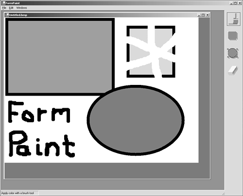
| I l @ ve RuBoard |
EAN: 2147483647
Pages: 204