Flylib.com

Books Software


Copying and Pasting Filters


Copying and Pasting Filters

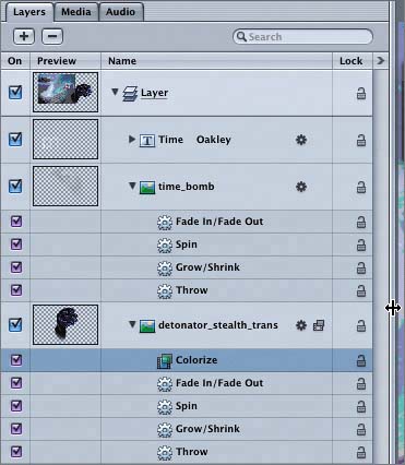
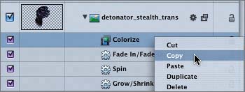
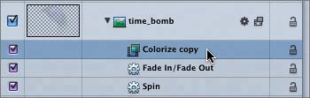
Now that you've brilliantly colored (pun intended) the Detonator watch, it's time to add a splash of color to the Time Bomb watch. Instead of starting from scratch, you can copy and paste the Colorize filter that you've already adjusted. The easiest place to copy and paste filters is on the Layers tab.

You can copy and paste filters using the Edit menu, shortcut keys, or contextual menus. Let's use contextual menus on the Layers tab to copy the Colorize filter on the detonator_stealth_trans object and paste it onto the time_bomb object.

1.

Press Cmd-4 to open the Layers tab in the Project pane.

2.

Drag the right edge of the Project pane toward the right to extend the Layers tab until you can clearly see the filenames of the objects.

The Colorize filter is located below the detonator_stealth_trans object on the Layers tab.

3.

On the Layers tab, Ctrl-click the Colorize filter to open the contextual menu for that particular filter.

4.

Select Copy from the contextual menu to copy the filter.

You have copied the filter and its settings into memory.

5.

On the Layers tab, Ctrl-click the time_bomb object and select Paste from the contextual menu.

A filter named Colorize copy appears on the Layers tab below the time_bomb object.

6.

Press Cmd-4 to close the Layers tab.

7.

Press Cmd-S to save your progress.


Evaluating the Colorized Objects

You've successfully colorized both of the watches in your project. The only problem now is that they are both the exact same color . Why is that a problem? Remember that your goal is to attract attention to the watches. If you view the current project, your eyes will probably be attracted to the first watchbut when the second watch appears with the same color, your attention is likely to shift to anything moving that is a lighter color than the watches .

This feels like a good time for another rule.

Rule #4: Too much of anything, including a specific color, will tend to lose attention rather than gain it. Okay; this rule may not be as obvious as the others. I'll give you two analogies to help make my point.

Have you ever walked into a room that had signs plastered all over the walls? Because there were so many, your mind likely registered them more as decoration or clutter than signs, and you didn't read them all. On the other hand, when you walk into a room with only one or two signs on the walls, they likely catch your attention and register as important enough to read, even if they aren't meant for you. What's the moral of this story? Less is more.

Here's another example. Have you ever been to a national park with gorgeous mountain scenery? When you see the first mountain, your attention is transfixed by the majestic beauty of it all. Three hours later, after you've seen the tenth majestic view, your attention is more likely to be drawn to a squirrel, a butterfly , or a poorly dressed touristanything different. Why? It's not because you don't appreciate beauty; it's because the novelty of the scenery has worn off and your mind tends to look for something new and different.

One of the most important skills in creating effective motion graphics is focusing attention where you want it to go. The first blue watch in your composite works because of the way it moves and uses color. The second watch, on the other hand, feels redundant and almost camouflaged because it's the same color as the first watch.

One way to catch attention and keep it on the second watch is to use a complementary color.