Creating Custom Graphs
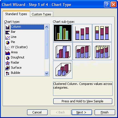
| Luckily, Excel can produce professional-looking graphs from your worksheet data. You don't need to know a lot about graphing and charting unless you want to create extremely sophisticated Excel graphs. Instead you can use Excel's Chart Wizard to produce great-looking graphs quickly and easily. When you click the Chart Wizard toolbar button, Excel displays the first Chart Wizard dialog box, as shown in Figure 10.1. Figure 10.1. Excel's Chart Wizard creates graphs for you. Choosing the Chart TypeTable 10.1 describes each of the chart types that Excel's Chart Wizard can generate. You select an appropriate chart type from the list on the Chart Wizard's first page. To preview the chart, click the Press and Hold to View Sample button. Excel then analyzes your worksheet data and displays a small sketch of the chart in the Sample box. The chart is only a preview of your final worksheet's chart, but a preview is all you need in most cases to know whether the chart is appropriate.
Table 10.1. Excel Chart Options
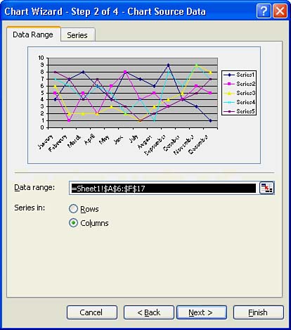
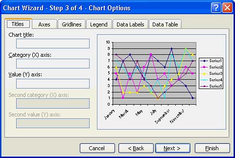
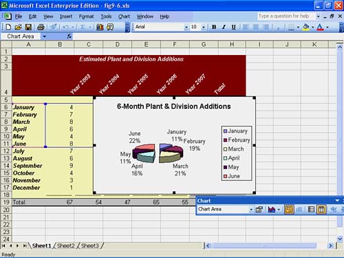
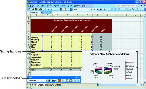
Selecting Data for Your GraphA data series is a single group of data that you might select from a column or row to chart. Unlike a range, a data series must be contiguous in the row or column with no cells in between. Often, a series consists a time period, such as a week, month, or year. One person's weekly sales totals (from a group of several salespeople's weekly totals) can also form a series. Some graphs, such as pie charts, graph only a single series, whereas other graphs show comparisons between two or more data series. As you look over your chart, if one of the series looks extremely large in comparison to the others, Excel is probably including a total column or row in the graph results. Generally, you want to graph a single series (such as monthly costs) or several series, but not the totals; the totals throw off the data comparisons. Therefore, if you see extreme ranges at the beginning or end of your graph, select only the data areas (not the total cells) from the Chart Wizard's second screen, shown in Figure 10.2. Figure 10.2. Be sure to select only data areas for your graph. Options on the Chart Wizard's second screen provide a way for you to determine exactly what data is to be charted. In a worksheet with a lot of data, Excel cannot be expected to select data automatically. Not only must you inform the Chart Wizard of the data range (or series), but you also need to tell the Chart Wizard which direction the data series flows by clicking either Rows or Columns from the Chart Wizard's second screen. To change the range that the Chart Wizard is to use, click the Collapse Dialog button located to the right of the default Data range, select a different range, and then click the Expand Dialog button. When you click the Next button to see the third Chart Wizard screen, shown in Figure 10.3, Excel enables you to enter a chart title that appears at the top of the resulting chart as well as axis titles that appear on each edge of your chart. Figure 10.3. Enter titles that you want to see on the chart. You find other tabs in the Chart Wizard's third screen that enable you to control the placement of the legend and a data table . The legend tells the chart's reader what series each chart color represents. A chart's bars and lines appear in different colors to represent the different series being plotted. You can also control the placement of the legend. As you select from the various legend placement options, the thumbnail picture of your chart updates to reflect your selection. When you click on the Data Labels tab, you can determine how the Chart Wizard selects and places labels on your chart. For example, in addition to a legend, you might want to display the labels next to each piece of a pie chart, as Figure 10.4 illustrates. The Chart Wizard's charting options on the third step's tabbed pages change depending on the type of chart you selected. You might want to try different combinations of legends and labels until you find one that you prefer. Figure 10.4. The Chart Wizard can place legends and labels where you want them to appear. Click Next to see the final Chart Wizard screen, in which you determine exactly where and how to place the generated graph. Excel can create a new worksheet for the graph or embed the graph inside the current worksheet as an embedded object. Each placement has advantages; you might want the chart's data to appear next to the chart, or you might want to use the chart by itself. You can, in turn , embed the chart object in the other Office products, as you will learn in Part VII, "Combining the Office 2003 and the Internet." Modifying the GraphClick the Finish button to see your resulting graph. If you have chosen to embed the graph inside your current worksheet, you might have to drag the graph's sizing handles to expand or shrink the graph. In addition, you can drag the graph anywhere you want it to appear on your worksheet. Excel displays the Chart toolbar right below the graph in case you want to change it. Figure 10.5 shows a chart embedded as an object in the worksheet, along with the toolbar with which you can modify the graph. Figure 10.5. The worksheet, graph, and Chart toolbar all appear together so that you can make necessary changes. If your graph does not display data the way you prefer, you can click the Chart toolbar buttons to change the graph's properties. You can even use the Chart toolbar to change the chart type (from a line chart to a bar graph, for instance) without rerunning the Chart Wizard. If you need to make more extensive graph changes, rerun the Chart Wizard. In addition to using the Chart toolbar, you can often change specific parts of your graph by right-clicking the graph and choosing Chart options on the pop-up menu. If you point to your chart's title and right-click your mouse, for example, Excel displays a pop-up menu from which you can choose Format Chart Title to display the Format Chart Title dialog box. When you single-click a graph's element, such as the legend or a charted data series, Excel displays sizing handles so that you can resize the element. If you double-click an element, Excel displays the Format dialog box for that element, allowing you to select the formatting options you want. The mouse makes quick work of the chart's placement as well. You can click and drag within the chart area to move the chart to another location in your worksheet ( assuming that you chose to embed the chart in the worksheet at the Chart Wizard's final step). You can also move the chart inside its own enclosing box to make more or less room for the legend. |
EAN: 2147483647
Pages: 272