Finer Points of Chart Formatting
So far, the discussion on chart formatting has been limited to what can be accomplished in the Chart Expert. However, Crystal Reports provides more granular formatting options by way of in-place chart formatting. In-place formatting allows you to select individual parts of the chart, such as chart or axis titles, individual chart elements, or the chart legend, and perform additional formatting functions.
| Caution | While in-place chart formatting reduces the number of steps required to format individual chart elements, it also makes it easier to inadvertently move or resize an individual chart element when you mean to move or resize the entire chart. Pay close attention to what has been highlighted (the entire chart, or an individual chart element) before you move or resize with your mouse. |
One of the first chart formatting options that you should become familiar with is the Auto Arrange Chart option. Once you ve selected a chart, you may choose this option either from the Chart pull-down menu or by right-clicking on the chart and choosing it from the pop-up menu. This option will use default placement, sizing, and formatting for chart elements. If you haven t done any individual element formatting since you ve created the chart, this option very well may not do anything at all. However, if you ve changed positions of certain items (such as the chart title, legend, or axes titles), you may see them snap back to other positions that you didn t intend. Don t worry too much about this behavior ”if you don t like the changes that Auto Arrange makes to the chart, you may undo its effects with Edit Undo from the pull-down menus , the Undo toolbar button in the Standard toolbar, or by pressing CTRL-Z.
Conditional Chart Formatting
While you can pick individual chart elements, such as an individual pie wedge, or an individual bar, and change the color (discussed later in the chapter under Changing Colors and Shades of Chart Elements ), your change will always affect the same wedge or bar in each chart, regardless of what the value of that element is. In other words, if you change the pie wedge for Colorado, which happens to be the second wedge in the chart, to a light blue color , the second wedge in the chart will be light blue no matter what data populates the chart. If the data changes so that Colorado becomes the fourth wedge, the second wedge will still be formatted as light blue.
Crystal Reports includes a Conditional Formatting option in the Chart Expert. This option, which is available only for certain chart types, is available by clicking the Format button in the Color section of the Options tab (see Figure 12-7). This button, which will be enabled only if the chart type allows conditional formatting, will display the Chart Color Format Expert, shown in Figure 12-11.
This dialog box is similar to the Highlighting Expert used to conditionally format textual elements on the report (the Highlighting Expert is discussed in Chapter 9). By choosing either the On Change Of field that the chart is based on or the summary field used to determine the weight of the chart element, you can conditionally set the color of the chart element.
For example, Figure 12-11 shows a condition set up to change the color of the chart element (in this case, the wedge of a donut chart) to Teal if the value shown by the wedge exceeds $100,000. To set this condition, click the New button, which will add a new condition to the Item list. Then, choose the field you want to base the condition on and the comparison operator (such as equal to, greater than, and so forth) from the first two drop-down lists of the Value Of section. Type the value you want to compare to in the text box in the same section. Then, choose the color you wish the chart element to display if the condition is true from the color list on the lower right. Any chart elements that meet the condition will be given the chosen color.
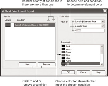
Figure 12-11: The Chart Color Format Expert
You may add as many conditions as you wish by clicking the Add button multiple times. If you have multiple conditions that may conflict, such as a condition that looks for a value between 100 and 1,000, and another condition that looks for a value greater than 500, you can set the priority of the conditions by using the up and down arrows at the top of the item list. Conditions toward the top of the item list take priority.
Once you click OK on the Chart Color Format Expert and then click OK to close the Chart Expert, the chart will apply the chosen color to elements that meet the condition, regardless of which actual element (second, fifth, and so forth) appears.
Customizing Charts with Chart Options
While you can control a good deal of chart formatting from within the Chart Expert, there will probably be many times when you wish to have more detailed control over chart appearance. Crystal Reports allows you either to select individual elements of the chart (such as the title, individual bars or pie wedges, the legend, and so forth) and apply formatting to them, or to make more specific changes that affect the overall chart appearance.
To perform generalized formatting on the entire chart, choose Chart Chart Options from the pull-down menus or right-click the chart and choose Chart Options from the pop-up menu. A submenu will appear with various chart-formatting options.
Depending on the type of chart you re using and the formatting option you choose, different dialog boxes will appear with different options. Some dialog boxes can be quite complex, with both vertical and horizontal sets of tabs to provide a wide array of options.
Notice the thumbnail miniature picture of the chart in the dialog box. As you make changes to the dialog box, you ll see the changes immediately reflected in the thumbnail. When you click OK, the chart will reflect the changes.
| Tip | Any changes you make to a chart using Chart Options will apply to only that one instance of the chart back on the Preview tab. If, for example, you choose a chart in the Canada group header and customize it with Chart Options, the other charts in the USA and Mexico group headers won t be affected. If you want to have these changes propagate to all other chart instances, right- click the chart and choose Apply Changes to All Charts from the pop-up menu, or choose Chart Apply Changes to All Charts from the pull-down menus. |
Various customization options are available, depending on the type of chart you ve chosen, the number of data elements the chart is showing, and so forth. Some of the more useful capabilities are discussed in the following sections.
Changing Colors and Shades of Chart Elements
When you create a chart in the Chart Expert, your only choices on the Options tab for affecting chart colors are the Color and the Black and White radio buttons , and the Format button for conditional color selection.
By choosing the Color radio button, you have no control over what individual colors or shades the chart elements will have. The ability to completely customize element colors and shades is a feature available with Chart Options.
Begin by selecting the element you wish to color. This can be an individual bar, pie slice, or line. Note that it may look as though you ve selected only a part of an element ”for example, just one side or just the top of the bar. Whenever you change the color, however, it will apply to the entire element.
To change the color of the element, right-click and choose Chart Options Selected Item from the pop-up menu, or choose Chart Chart Options Selected Item from the pull-down menus. The Formatting dialog box appears, as shown in Figure 12-12.
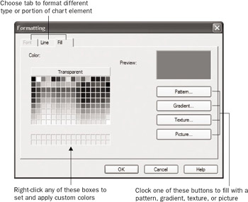
Figure 12-12: The Formatting dialog box
You change not only the color of the chosen chart element, but also the pattern displayed in the element. By default, all charts created with the Chart Expert contain solid colors. However, you may want to replace the solid color with a graduated color, a pattern, or maybe even a picture. You may change the solid color to use for the element by choosing a predefined color from the palette. If you want to use a color that s not in the standard palette, right-click one of the gray boxes below the standard palette. A Custom Color dialog box appears, in which you can choose a custom color. Then, click the button you just modified to apply the custom color to the chart element.
To apply a pattern, gradient, or texture, or to fill the chart element with a picture, choose one of the corresponding buttons on the right side of the Formatting dialog box. For example, clicking the gradient button displays a dialog box showing preset color gradients. If you click the Advanced Options button, the gradient dialog box displays an extra section that lets you design your own gradients.
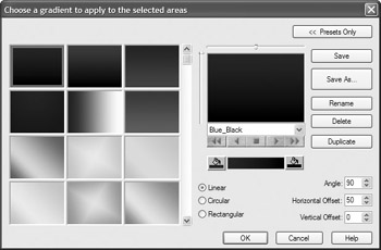
Either choose one of the preset gradients or use the dialog box options to customize your own gradient. When you click OK, the solid color previously appearing in the Formatting dialog box will be replaced by the selected gradient.
Click OK on the Formatting dialog box to apply your selected color, pattern, gradient, or picture to the chart element.
| Tip | Often, gradients and patterns, or even certain solid background colors, can add visual appeal if applied to the whole background of the chart. To do this, select the entire chart, making sure no individual chart elements are selected. Then, right-click or use the Chart menu options to format the selected item. Color and gradient/pattern options you choose will then apply to the chart background. |
Customizing and Moving Chart Titles, Labels, and the Legend
When you add a title, labels, and legend to your chart with the Options and Text tabs of the Chart Expert, Crystal Reports places them in specific locations, using specific colors and alignment. If you choose to display a legend on your chart, you have only a few predefined locations on the Options tab where you can place it. Also, if you choose the Auto Arrange Chart option discussed earlier, chart elements will be repositioned to default locations.
However, chart titles and labels are all objects that you can select by pointing and clicking within the chart in either the Design or Preview tab. Once you ve selected an object (as denoted by the sizing handle blocks on all sides), you can reposition the text simply by pointing inside the text frame and dragging it to a new location. To resize the object, position the cursor on one of the sizing handles and narrow or stretch the object. Then, use the Chart Options Selected Item options described earlier to display the Formatting dialog box. You may choose alternate colors, fonts, alignment, and other text- related options on the Font tab of the Formatting dialog box.
If you want to move the legend to a specific place on the chart, just drag it (you can t resize it) to its new location. You can actually select and format three different parts of the legend: the frame, the textual items, and the symbols. Select each piece and use the Formatting dialog box to change them. Note that if you change certain properties of the symbol, the associated chart element (bar, pie slice, and so forth) changes along with it.
Changing 3-D Viewing Angles
Some of the more impressive chart types that Crystal Reports can create are 3-D charts. There are several types of 3-D charts, some of which actually chart only one data item, such as the 3-D bar, pie, and doughnut charts, and others that chart two data items, such as 3-D riser and 3-D surface charts.
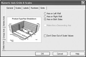
Once you create these types of charts, you have a great deal of control over the three-dimensional appearance of the chart. For example, if you choose a single doughnut chart, Crystal Reports gives it a certain 3-D appearance by default. Using choices from Chart Options, you can completely change the viewing aspects of the chart. To make these selections, choose Chart Options General from the pop-up or pull-down menus. The Chart Options dialog box will appear.
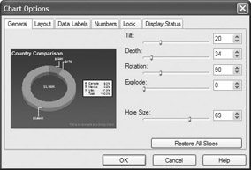
The General tab contains various sliders and spin boxes that allow you to change all visual aspects of the 3-D doughnut chart.
Dual-data-item 3-D charts, such as the 3-D riser and 3-D surface charts, have even more whiz-bang 3-D capabilities. Not only can you choose from a variety of viewing angles right on the Chart Expert s Options tab when you create the chart, but you also can perform almost unlimited 3-D customizations using Chart Options.
Select the 3-D riser chart you want to adjust. Then, choose Chart Options Viewing Angle from either the pull-down or pop-up menus. The Choose a Viewing Angle dialog box appears. If you click the Advanced Options button, the dialog box displays an extra section that lets you completely customize the viewing angle, rather than just choosing presets, as shown in Figure 12-13.
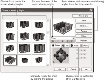
Figure 12-13: The Choose a Viewing Angle dialog box
This dialog box offers numerous options for changing the 3-D appearance of the chart. You can simply choose from any of the 12 built-in angles by clicking one of the 12 boxes on the left side of the dialog box, or choose from a large number of saved angle definitions by clicking the drop-down list or forward/backward buttons below the main thumbnail. You can also manually change all kinds of 3-D viewing aspects of the chart by making manual adjustments on the Rotate, Pan, Walls, and Move tabs. You ll see the main thumbnail in the middle of the dialog box change as you choose alternative viewing options.
You may be confused by the prompt to name and save a viewing angle that you ve customized when you click OK. If you make manual changes to the viewing angle with options on the tab, rather than choosing one of the built-in presets or named angles, you ll be prompted to save the settings before you apply them. While you can replace an existing named angle, or create a new one, before you actually apply the viewing angle to the chart, you don t have to. Just click the Cancel button on the Enter 3D Viewing Angle Preset name dialog box. The changes will still be applied to the chart.
Choosing Additional Chart Types
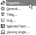
Although the Chart Expert contains many different types and variations of charts (bubble, scatter, and so forth), the Format Chart option contains even more (provided you selected the Custom Charting option when you installed Crystal Reports). To look at the available additional chart types, select the chart that you want to potentially apply a new chart type to. Then, choose Chart Options Template from either the pull-down or pop-up menu. The Choose a Chart Type dialog box will appear.
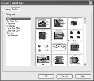
This dialog box contains two tabs: the Gallery tab and the Custom tab. The Gallery tab mostly contains the standard chart types that you find in the Chart Expert. You can choose some variations of these with the various options that appear, and then view the results of your choices in the thumbnail at the top of the Gallery tab.
If you click the Custom tab, you ll see a list of chart categories on the left. When you click each category, a large assortment of chart thumbnails from within that category appears on the right. Scroll down through the different thumbnails until you find a custom chart type that appeals to you. Select it and click OK. The new chart type will be applied to the selected chart. If you want to customize the look of the chart further, use any of the techniques discussed earlier in the chapter.
| Note | You must have chosen the Custom Charting option when you installed Crystal Reports for these additional chart types to be available. If they re not available, rerun Crystal Reports setup and choose the Custom Charting option. |
Saving and Reusing Chart Templates
If you have a particular set of Chart Option settings you d like to use on more than one chart, you can save the settings in a chart template. You can then apply the template to another chart that you create or edit.
To save a template, make any desired changes to your chart, such as changing label positions, element colors, perhaps the legend position, and any other settings you want to make. Then, either choose Chart Save as Template from the pull-down menus or right- click on the chart and choose Save as Template from the pop-up menu. A Save As dialog box will appear where you can give your chart a name (the template will be saved with a .3tf file extension).
| Tip | By default, templates are saved in \Program Files\Common Files\Crystal Decisions\2.5\ChartSupport\Templates\User Defined folder. If you need to delete a user -defined template, use Windows Explorer to navigate to that folder and delete the templates (or you can delete them directly from the Save Template As dialog box when saving a new template). If you wish to point your copy of Crystal Reports to an alternate location for Chart Templates, use the Registry Editor and look for the ChartSupport key in HKEY_LOCAL_MACHINE/Software/Crystal Decisions/10.0/Crystal Reports/ChartSupportPath. Use the Registry Editor only if you are sure how it works. |
To apply the saved template to a new chart, use the steps described in the preceding section, Choosing Additional Chart Types. Notice that the last category on the Custom tab is User Defined. When you choose that category, the collection of thumbnails consists of all the templates you ve saved. Choose the thumbnail that you wish to apply to your current chart. When you click OK, the template settings will be applied to the existing chart.
EAN: N/A
Pages: 223