| On Day 5, you examined the various ASP.NET server controls, but not the three complex list controls: the Repeater, DataList, and DataGrid server controls. These are called list controls because they take collections of data and loop through them automatically. They're similar to other controls, such as DropDownList and ListBox, but they offer much more complex functionality. They act as containers for other controls that actually display the data, such as labels. These controls are very powerful and save developers a lot of manual work. Each of the server controls in the next few sections has its advantages and disadvantages, as you'll see when we examine the controls. Essentially, the trade-offs are functionality and complexity; one control gives you more features, but is also more complex to use. The controls are presented in order of complexity. Repeater Server Control The Repeater ASP.NET server control is a container that loops through data. It doesn't have a predefined display you must specify its layout using template controls. It provides a highly customizable interface. If you don't specify a layout, the control won't be rendered. Templates are controls that allow you to use HTML tags and text, as well as other controls, to control the display of data in rich Web controls. You must use templates with a Repeater control, which supports the following types of templates: ItemTemplate This template is required by the Repeater control. It produces one row of output for each data row. You use other server controls to display the actual data by binding them to the appropriate fields. AlternatingItemTemplate This is the same as the ItemTemplate, but it renders for every other data row. This allows you to specify different style settings, such as alternating row colors. HeaderTemplate and FooterTemplate These templates render HTML immediately before and after all the data rows have been rendered. A typical use would be to open and close tables with <table> and </table> tags. SeparatorTemplate These templates render items between each data row for example, the HTML tags <br>, <p>, or <HR>. These templates have no particular format or syntax you simply use them as containers for your display. Let's take a look at a typical example, shown in Listing 9.8. You'll use tblUser, the same database table you created for yesterday's lesson. Listing 9.8 A Typical Repeater Control 1: <%@ Page Language="VB" %> 2: <%@ Import Namespace="System.Data" %> 3: <%@ Import Namespace="System.Data.OleDb" %> 4: 5: <script runat="server"> 6: sub Page_Load(Sender as Object, e as EventArgs) 7: 8: 'set up connection 9: dim myConnection as new OleDbConnection _ 10: ("Provider=Microsoft.Jet.OLEDB.4.0;" & _ 11: "Data Source=c:\ASPNET\data\banking.mdb") 12: 13: 'open connection 14: dim myCommand as new OleDbDataAdapter _ 15: ("select * from tblUsers", myConnection) 16: 17: 'fill dataset 18: dim ds as DataSet = new DataSet() 19: myCommand.Fill(ds, "tblUsers") 20: 21: 'select data view and bind to server control 22: Repeater1.DataSource = ds.Tables("tblUsers"). _ 23: DefaultView 24: DataBind() 25: end sub 26: </script> 27: 28: <html><body> 29: <ASP:Repeater runat="server" > 30: <HeaderTemplate> 31: <table> 32: <tr> 33: <td bgcolor="#cccc99" width=200><b>Name</b></td> 34: <td bgcolor="#cccc99" width=200><b>Phone</b></td> 35: </tr> 36: </HeaderTemplate> 37: 38: <ItemTemplate> 39: <tr> 40: <td> <%# Container.DataItem("FirstName") %> 41: <%# Container.DataItem("LastName") %> 42: </td> 43: <td> <%# Container.DataItem("Phone") %> </td> 44: </tr> 45: </ItemTemplate> 46: 47: <AlternatingItemTemplate> 48: <tr> 49: <td bgcolor="#cccc99""> 50: <%# Container.DataItem("FirstName") %> 51: <%# Container.DataItem("LastName") %> 52: </td> 53: <td bgcolor="#cccc99"> 54: <%# Container.DataItem("Phone") %> 55: </td> 56: </tr> 57: </AlternatingItemtemplate> 58: 59: <SeparatorTemplate> 60: <tr> 61: <td colspan="2" align="center"> 62: - - - 63: </td> 64: </tr> 65: </SeparatorTemplate> 66: 67: <FooterTemplate> 68: </table> 69: </FooterTemplate> 70: </ASP:Repeater> 71: </body></html> Figure 9.7 contains the output for Listing 9.8 when viewed through a browser. Figure 9.7. The Repeater control (with templates) in action.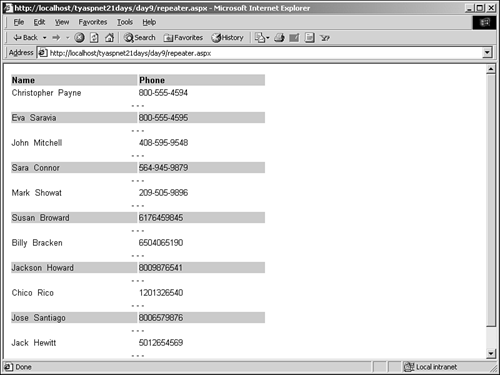
 | The Page_Load event handler has been copied directly from yesterday's lesson (Listing 8.1). Again, it contains a few objects that I won't cover until tomorrow. You set up and open your database connection on lines 8 15, fill a DataSet on line 19, and bind a DataView to your Repeater on line 22. |
Note that there are two ways you can bind data to the Repeater control (as well as the DataList and DataGrid controls that you'll see later today). The first method is the one shown here: You assign the DataSource property of the control to a DataView, which tells the control the table and data to display. Another method is simply to assign the DataSet to the control, and use the DataMember property to tell it what data to display. For example, you could replace lines 22 23 with the following: Repeater1.DataSource = ds Repeater1.DataMember = "tblUsers" Then you would simply call DataBind. Both examples are functionally equivalent; both methods will work, and you'll be using them interchangeably throughout today's lesson. The reason for having two methods is that the second allows you to easily use a DataSet to bind data, rather than having to worry about creating a DataView. The first method lets you bind data with different types of objects. Next, in the body of your page, you declare the Repeater control on line 29. Your header template simply creates an HTML table and prints out headers for the columns "Name" and "Phone". Next, your item template binds three data fields to the page. Container.DataItem is the collection of data fields for the current control's parent the Repeater, in this case. You bind the "FirstName", "LastName", and "Phone" fields to this template, and the Repeater control will automatically loop through the records and render these fields on the page. Your alternating item template does exactly the same thing, except it specifies a different background color for the table rows. Your separator template on line 59 simply creates a new HTML row with a few dash marks to introduce separations between the rows (if alternating colors weren't enough). And finally, your footer template simply closes the HTML table. This is followed by the closing </asp:Repeater> tag. That's it! You can see how the Repeater control allows you to display data easily, while giving you complete control over the way it's presented. The Repeater control also has two events that you can respond to: ItemCreated and ItemCommand. ItemCreated is raised immediately before a new item or template is created. You could use this to set the style properties programmatically at run-time, for example. Its syntax is as follows: sub_name_ItemCreated(Sender as Object, e as _ RepeaterItemEventArgs) The RepeaterItemEventArgs contains one property, Item, which is the item that was just created. For example, Listing 9.9 shows a code snippet that handles this event. Listing 9.9 Handling the Repeater's Events 1: sub Repeater1_ItemCreated(Sender as Object, e as _ 2: RepeaterItemEventArgs) 3: dim type as String 4: select case (e.Item.ItemType) 5: case ListItemType.Item 6: type = "Item" 7: case ListItemType.AlternatingItem 8: type = "AlternatingItem" 9: case ListItemType.Header 10: type = "Header" 11: case ListItemType.Footer 12: type = "Footer" 13: case ListItemType.Separator 14: type = "Separator" 15: end select 16: 17: ... 18: Label1.Text = Label1.Text & "A Repeater " & type & _ 19: " has been created <br>" 20: end sub 21: ... 22: <asp:Repeater runat="server" 23: OnItemCreated="Repeater1_ItemCreated"> 24: ... 25: </asp:Repeater> 26: <asp:ListBox runat="server"/> The label would then list, in order, the types of templates that were created. The ItemCommand event is raised whenever a server control inside the Repeater control fires an event. The contained control "bubbles" the command up to the Repeater. For example, if you place a button or link control inside one of the templates, you can detect when a user has clicked it and react accordingly. In each control, you can set a Command property that contains a string that will be bubbled up so your handler can determine a course of action. Note that you can also simply respond to that control's event directly, without having to go through the Repeater's ItemCommand event. However, the Repeater generates these controls dynamically, so you'll have to discover their individual names somehow or reference them through a collection. Note The Repeater control only presents data it doesn't allow users to edit or modify the actual data source. If you want to allow users to do this, you can use the DataList or DataGrid Web controls. They'll be examined in the next two sections.
DataList Server Control The DataList control is very similar to the Repeater control, except that it allows user interaction and data modification. You can use this control with templates to list items just as you would with the Repeater. However, the DataList supports two additional types of templates: SelectedItemTemplate This template contains additional elements that will be rendered only when the user selects an item in the Datalist control. Typical uses would be to change style properties to reflect a row selection, or to expand the item like a hierarchical listing (parent-child). EditItemTemplate This template specifies the layout of an item when it's in edit mode. Let's take a look at an example. Again, you'll be using the same Page_Load event you used yesterday and in Listing 9.8, so that code is omitted. Listing 9.10 shows the DataList control itself (note that you'll have to change line 22 to reference the new of the DataList control instead of the Repeater). Listing 9.10 A Typical DataList Control 1: <asp:DataList runat="server" 2: SelectedItemStyle-BackColor="#cccc99" 3: repeatlayout="table" 4: repeatdirection="horizontal" 5: DataKeyField="UserID"> 6: 7: <ItemTemplate> 8: <asp:LinkButton runat="server" 9: Text='<%# Container.DataItem("FirstName") & " " & _ 10: Container.DataItem("LastName") %>' 11: CommandName="Select" /> 12: <p> 13: </ItemTemplate> 14: 15: <SelectedItemTemplate> 16: <%# Container.DataItem("FirstName") & " " & _ 17: Container.DataItem("LastName") %><br> 18: Phone: 19: <%# Container.DataItem("Phone") %> 20: <br> 21: Address: 22: <%# Container.DataItem("Address") %> 23: <br> 24: <%# Container.DataItem("City") %>, 25: <%# Container.DataItem("State") %> 26: <%# Container.DataItem("ZIP") %> 27: <br> 28: </SelectedItemTemplate> 29: </asp:DataList> Note Don't forget to enclose the DataList in <form> tags! Otherwise, the events you define for it won't do anything.
| On lines 1 5, you declare your DataList control using many of the properties for server controls that were discussed on Day 5. SelectedItemStyle-BackColor defines the background color for the SelectedItemTemplate, when it's visible. DataKeyField is the name of the field to use as the primary key of the data. This key will serve as a unique identifier and is helpful when you're identifying rows in your list. |
In the item template beginning on line 7, you simply create a LinkButton control (line 8) that's bound to the "FirstName" and "LastName" data columns. When this link is clicked, it generates and passes the command "Select" to the DataList. Finally, the selected item template simply displays some data-bound information. Whenever an item (or data row) is selected in the DataList, this template will be shown for that particular row. But first, you have to define the method to handle the link-clicks (see Listing 9.11). Listing 9.11 Handling Click Events for a DataList 1: sub DataList1_ItemCommand(Sender as object, e as _ 2: DataListCommandEventArgs) 3: DataList1.SelectedIndex = e.Item.ItemIndex 4: DataList1.DataBind() 5: end sub Add this procedure to the code declaration block of Listing 9.10, and add the following property to the DataList: OnItemCommand="DataList1_ItemCommand" This procedure handles any events that are bubbled up to the DataList container control, including the Click event of the LinkButton. It takes a special type for the event arguments, DataListCommandEventArgs, which contains the following properties: CommandArgument The argument property of the command CommandName The name of the command CommandSource Gets the source of the command Item Gets the item selected in the DataList The method you defined sets the SelectedIndex property of the DataList control to the item the user selected and calls the Databind method. When you click on one of the items in the DataList, the result is that the SelectedItemTemplate for the selected item is displayed, as shown in Figure 9.8. Figure 9.8. The results of the DataList control.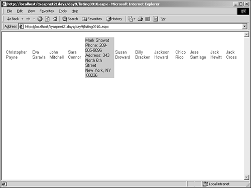
Note Note that the SelectedItemTemplate will take the place of whatever is displayed for an item. In this case, you display the first and last names of your users. This is covered up when the preceding template is shown, so you simply repeat this information in the template, as shown on lines 16 17.
Editing Items The DataList control also allows you to edit displayed items. It contains special commands that you can use to signal ASP.NET to put an item into edit mode. Listing 9.12 is a modification of Listing 9.10 that shows all the special commands available. Listing 9.12 Editing Selections in a DataList 1: <asp:DataList runat="server" 2: SelectedItemStyle-BackColor="#cccc99" 3: repeatlayout="table" 4: repeatdirection="horizontal" 5: OnItemCommand="DataList1_ItemCommand" 6: OnEditCommand="DataList1_EditCommand" 7: OnCancelCommand="DataList1_CancelCommand" 8: OnUpdateCommand="DataList1_UpdateCommand" 9: OnDeleteCommand="DataList1_DeleteCommand" 10: DataKeyField="UserID"> 11: 12: <ItemTemplate> 13: <asp:LinkButton runat="server" 14: Text='<%# Container.DataItem("FirstName") & _ 15: " " & Container.DataItem("LastName") %>' 16: CommandName="Edit" /> 17: <p> 18: </ItemTemplate> 19: 20: <EditItemTemplate> 21: <asp:LinkButton runat="server" 22: CommandName="Cancel" 23: Text="Cancel" /> 24: <asp:LinkButton runat="server" 25: CommandName="Update" 26: Text="Update" /> 27: <asp:LinkButton runat="server" 28: CommandName="Delete" 29: Text="Delete" /> 30: </EditItemTemplate> 31: </asp:DataList> | This listing won't work yet. You have to define the methods to handle its events first you'll get to that in a moment. When users click each item, a menu of choices will be displayed, thanks to the EditItemTemplate on line 20. Let's first examine the code in this listing. |
On line 16, you change the "Select" command of the Linkbutton to "Edit". This is a special command reserved by ASP.NET that automatically raises the DataList's EditCommand event. You must then declare the handler for this event as follows: sub DataList1_EditCommand(Sender as object, e as _ DataListCommandEventArgs) DataList1.EditItemIndex = e.Item.ItemIndex DataList1.DataBind() end sub Add this method to the code declaration block. You simply set the EditItemIndex property of the DataList to the selected item, which then displays the EditItemTemplate, beginning on line 20, and turns on edit mode for that item. Typically, you allow an item to be put in edit mode to enable the user to edit fields, which in turn updates the data store. You'll examine this in more detail tomorrow. You built three new link buttons that contain three more special commands: Cancel, Update, and Delete. These link buttons are shown on lines 21 29. When these commands are bubbled up, they raise the DataList's CancelCommand, UpdateCommand, and DeleteCommand commands, respectively. You build these handlers just as you did for EditCommand: sub DataList1_CancelCommand(Sender as Object, e as _ DataListCommandEventArgs) DataList1.EditItemIndex = -1 DataList1.DataBind() end sub sub DataList1_UpdateCommand(Sender as Object, e as _ DataListCommandEventArgs) ' update data store DataList1.DataBind() end sub sub DataList1_DeleteCommand(Sender as Object, e as _ DataListCommandEventArgs) ' delete from data store DataList1.DataBind() end sub Add these methods to your code declaration block as well. To take an item out of edit mode, you simply set the EditItemIndex to -1. To actually update or delete data from the data store, you have to build methods manually. Remember to always call the DataBind method again, or else the DataList won't be updated to reflect any events or changes. Finally, you can view this listing from the browser now that all your event handlers are defined. Figure 9.9 shows what happens when you click on an item and turn on edit mode. Figure 9.9. Placing an item in edit mode.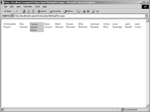
Clicking on the Update and Delete buttons currently doesn't do anything, but clicking on Cancel takes the item out of edit mode and places it in select mode. This produces a figure similar to Figure 9.8. DataGrid Server Control The DataGrid control is similar to both the DataList and Repeater controls, except that it provides even more functionality. This control uses columns to display data in a grid layout. By default, the DataGrid generates a column for every field in the data store. However, you can specify the fields to display manually, as well as how to display them. You can define the following types of columns: Bound columns These allow you to specify which columns to display and in what order, and allow you to format style attributes. These columns are the default used by the DataGrid. Button columns These columns display buttons for all the items on the grid, for which you may define custom functionality. A typical example is an Add to Shopping Cart button. Edit command columns Allow you to edit items. Replace all bound columns with modifiable fields. Hyperlink columns Display data as hyperlinks. Templated columns You can use templates, as with Repeater and DataList controls, to define custom formats for the columns. The DataGrid control automatically chooses a type of column based on the data being presented, but it's easy enough to change the default behavior. Listing 9.13 shows an example. Listing 9.13 DataGrid Example 1: <asp:DataGrid runat="server" 2: BorderColor="black" 3: GridLines="Vertical" 4: cellpadding="4" 5: cellspacing="0" 6: width="450" 7: Font-Names="Arial" 8: Font-Size="8pt" 9: ShowFooter="True" 10: HeaderStyle-BackColor="#cccc99" 11: FooterStyle-BackColor="#cccc99" 12: ItemStyle-BackColor="#ffffff" 13: AlternatingItemStyle-Backcolor="#cccccc" 14: AutoGenerateColumns="False"> 15: 16: < Columns> 17: 18: <asp:TemplateColumn HeaderText="Name"> 19: <template name="ItemTemplate"> 20: <asp:Label runat="server" 21: Text='<%# Container.DataItem("FirstName")& _ 22: " " & Container.DataItem("LastName") %>'/> 23: </template> 24: </asp:TemplateColumn> 25: 26: <asp:BoundColumn HeaderText="Address" 27: DataField="Address"/> 28: 29: <asp:BoundColumn HeaderText="City" DataField="City"/> 30: 31: <asp:BoundColumn HeaderText="State" 32: DataField="State" /> 33: 34: <asp:BoundColumn HeaderText="Zip" DataField="Zip" /> 35: 36: <asp:HyperlinkColumn HeaderText="Edit" text="Edit" 37: NavigateURL="edit.aspx"/> 38: 39: <asp:ButtonColumn HeaderText="Delete?" text="X" 40: CommandName="delete" 41: ButtonType="PushButton"/> 42: 43: </Column> 44: 45: </asp:DataGrid> Listing 9.13 demonstrates the various properties of the DataGrid and how to create your own columns for the data. Using the same Page_Load event as Listing 9.10 (with the name changed from the ListBox to the DataGrid) produces the result shown in Figure 9.10. Figure 9.10. The DataGrid control in action.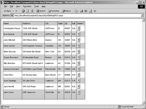
| This control has a lot of properties you can manipulate. Lines 2 13 simply set up properties that you should already be familiar with. Line 14 tells this DataGrid that you want to set up your own columns, which you'll proceed to do in the next section. If you set AutoGenerateColumns=True, the DataGrid would generate its own columns and you wouldn't have to specify custom ones. AutoGenerateColumns causes the DataGrid to use all data source columns available, so you might prefer to define your own columns; by doing so, you can limit what the user sees. |
Note If you set AutoGenerateColumns=True and still provide custom column definitions, the DataGrid will render both. It will display all columns plus the additional ones you define. This means you could end up with multiple copies of the same column. For example, using Listing 9.13 but changing AutoGenerateColumns to true on line 14 generates Figure 9.11. Figure 9.11. AutoGenerateColumns=True causes all columns to be displayed, plus the custom columns you've defined.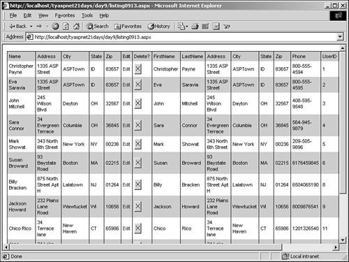
To define your custom columns, you must add them to the Columns collection of the DataGrid control. This can be done either programmatically at run-time or at design time, as you've done here. Using the <Columns> tag, you start defining the custom columns on line 16. TemplateColumn, HyperlinkColumn, BoundColumn, and ButtonColumn are all ASP.NET controls used specifically for the DataGrid control. In Figure 9.10, you saw the output of the different types of columns. These columns are fairly simple and only contain a few properties you haven't seen yet. The BoundColumn control uses the DataField property to bind to a column in your data store. The ButtonColumn control displays a LinkButton control by default, but you can use the ButtonType property to specify a different type, as shown on line 41. The HyperLink column on line 36 simply redirects to a different page (note that unless you've created the file edit.aspx, this link won't work). Feel free to play with the settings on the DataGrid. You'll find that this control is very useful for displaying data from databases, and it allows you to customize nearly every aspect of its display. Editing Items The DataGrid control also makes it easy to allow users to edit entries. Simply create an EditCommandColumn, and ASP.NET handles much of the display mechanism on its own. Let's modify Listing 9.13 a bit to include an edit command column. See Listing 9.14. Listing 9.14 DataGrid Example with Editable Columns 1: <asp:DataGrid runat="server" 2: ... 3: ... 4: AutoGenerateColumns="False" 5: OnEditCommand="DataGrid1_Edit" 6: OnCancelCommand="DataGrid1_Cancel" 7: OnUpdateCommand="DataGrid1_Update" > 8: 9: <Columns> 10: 11: ... 12: ... 13: 14: <asp:EditCommandColumn 15: EditText="Edit" 16: CancelText="Cancel" 17: UpdateText="Update" 18: ItemStyle-Wrap="false" 19: HeaderText="Edit" /> 20: 21: </property> 22: 23: </asp:DataGrid> | Because you've created a new EditCommandColumn, you can delete the previous HyperlinkColumn on line 36 of Listing 9.13. You can also remove the delete ButtonColumn on line 39 because the EditCommandColumn will add one for you. Leaving everything else the same, you tell the DataGrid which methods will handle its Edit, Cancel, and Update events on lines 5 7. On line 14, you declare your EditCommandColumn, which will display a LinkButton with the text "Edit". When the user clicks this link, you enter edit mode for the selected item, and each bound column changes to a text box that the user can modify. Figure 9.12 shows what happens when you click this new Edit button. |
Figure 9.12. The EditCommandColumn allows you to modify bound columns in a DataGrid.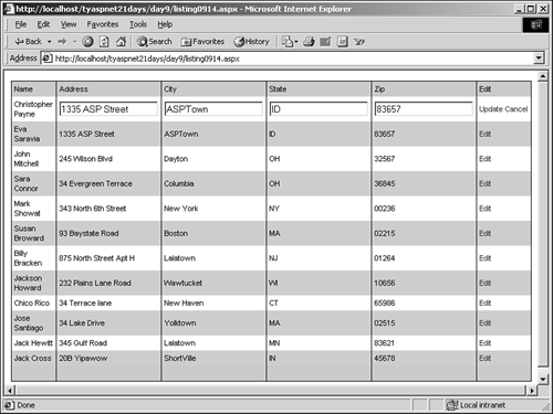
Note Only BoundColumns change into modifiable fields! The rest, such as TemplateColumns, retain their original interface. Make sure that any columns you want the user to edit either are BoundColumns or contain textboxes for editing.
EditCommandColumn also automatically displays the Update and Cancel links. You can define methods to handle these events as well: sub DataGrid1_Edit(Sender as object, e as DataGridCommandEventArgs) DataGrid1.EditItemIndex = e.Item.ItemIndex DataGrid1.DataBind() end sub sub DataGrid1_Update(Sender as object, e as DataGridCommandEventArgs) 'do updates DataGrid1.DataBind() end sub sub DataGrid1_Cancel(Sender as object, e as DataGridCommandEventArgs) DataGrid1.EditItemIndex = -1 DataGrid1.DataBind() end sub These methods are similar to those for the DataList control. Sorting The DataGrid control doesn't have intrinsic support for sorting data rows, but it enables you to build such functionality by providing built-in events and displays. When you turn sorting on, by default the DataGrid turns every column header into a LinkButton that users may click to sort by that column. You'll have to build your own sorting mechanism, but at least ASP.NET provides you with the basics. You can also specify custom sorting, in which you define the columns that the user can sort by, and even provide custom sorting links. To turn sorting on, simply add AllowSorting="true" to the declaration of the DataGrid. Then build a method named SortCommand to handle the sorting events: sub DataGrid1_SortCommand(Sender as Object, _ e as DataGridSortCommandEventArgs) ' sort the data using the SortField property ' of the eventargs DataGrid1.DataBind() End Sub The SortField property of the DataGridSortCommandEventArgs parameter tells you which column was clicked. You can use this information to sort your data accordingly, whether by sorting a DataView (which will be covered tomorrow) or by changing your SQL command. You'll look at sorting data programmatically in much more detail tomorrow. Note If you want to use the default sorting mechanism, you must allow the DataGrid to generate its columns automatically set AutoGenerateColumns= True. Otherwise, sorting won't work as expected. Figure 9.13 shows an example of turning on sorting with AutoGenerateColumns=True. Figure 9.13. When AllowSorting=True, all headers turn into links to sort by.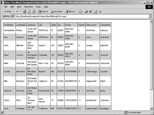
To use custom sorting, turn on sorting and specify a SortField for each column that you want to make sortable. For example, if you want to allow users to sort the list by address, you could use the following code: <asp:BoundColumn HeaderText="Address" DataField="Address" sortField="Address" /> Paging Paging is the capability of the DataGrid to divide the data into multiple pages if there are too many records to display on one page. This was once a complex task that developers had to build themselves, but ASP.NET now handles it for you. When paging is set up, ASP.NET divides the returned results into the number of pages you specify and provides buttons for the user to navigate the list. It then uses the CurrentPageIndex property of the DataGrid to determine which page should be displayed currently. When the user clicks on a button to go to the next page, the entire data set is re-created and the process starts over. This can result in long load times for your pages if you have large amounts of data. Therefore, the DataGrid control allows you to define custom paging procedures, which may not suffer from such conditions. To turn paging on, set AllowPaging=True (this is true by default), and set the PageSize property to the number of records you want to display at once. You can also specify the style of the paging buttons to display by using the PagerStyle property. The two built-in styles are the Next and Previous buttons and the numeric page numbers. Let's modify the previous listing to include paging, shown in Listing 9.15. Listing 9.15 Adding Paging Capabilities to the DataGrid 1: sub DataGrid1_PageIndexChanged(Sender as Object, e as DataGridPageChangedEventArgs) 2: DataGrid1.CurrentPageIndex = e.NewPageIndex 3: DataGrid1.DataBind() 4: end sub 5: ... 6: ... 7: <asp:DataGrid runat="server" 8: ... 9: AllowPaging="true" 10: PageSize=2 11: PagerStyle-Mode=NumericPages 12: PagerStyle-PageButtonCount = 2 13: OnPageIndexChanged="DataGrid1_PageIndexChanged" > You first define a new method, DataGrid1_PageIndexChanged, to handle the paging events. The DataGrid won't automatically change the page for you, so you have to do so yourself as shown on line 2. The DataGridPageChangedEventArgs contains the property NewPageIndex, which tells you the page number the user has clicked on. Simply set the DataGrid's CurrentPageIndex to this value, rebind the data to the control, and ASP.NET handles the rest. In your DataGrid control, you add five new properties. Line 9 turns paging on (this is the default), and line 10 specifies that you want to display two records per page. Line 11 sets the paging mode to display numeric page numbers. This property can be either "NumericPages" or "NextPrev", which display the next and previous buttons. On line 12, you tell the grid to only display two page-navigation numbers at once this property is only valid if the mode is NumericPages. If there are more pages than this value, the user will see a clickable ellipsis. Finally, you declare the handler for the PageIndexChanged event. Figure 9.14 shows the paging features in action. Figure 9.14. Paging with the DataGrid control.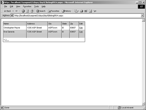
If you don't want to use the built-in paging buttons, you can create custom ones. Simply set the PagerStyle-Visible property to false and place your own buttons where you like (for instance, in the header or footer). You'll have to create your own navigation methods to handle these events as well move between pages by changing the CurrentPageIndex property in your code. The DataGrid also allows you to use manual paging for tighter control over the process. This involves getting deeper into the mechanisms of ADO.NET, so we'll leave this topic for tomorrow. Summary of Data Binding Controls Now you know why you skipped over these three controls on Day 5 they're quite complex! These controls make it very easy to display dynamic data using any type of data source, which was once one of the greatest difficulties facing ASP developers. With so many options, and with all the controls sharing a lot of the same features, it may be confusing to decide which one to use and where. Table 9.2 summarizes the options and provides suggestions on which controls to use in your situation. Table 9.2. Summary of Data Binding ASP.NET Server Controls | Control | Features/When to Use | | Repeater | Simple, read-only output with no inherent support for selecting or editing. No inherent look; must be defined manually using templates. No inherent paging mechanism. You should use this control when you only have very simple data to display. This control is very helpful for use with one-dimensional arrays and collections, and it's highly efficient and lightweight for use just about anywhere. | | DataList | Provides a default, customizable table display. Editable content. Single and multiple selections. Optional multiple columns. Paging not inherent. A more advanced version of the Repeater, this control provides more functionality, allowing you to select and edit items. Use this control if you need to display simple data that may require user interaction, or for any two-dimensional data in general. A typical use would be to display a Windows Explorer type file hierarchy. | | DataGrid | Provides a default, extensively customizable grid display. Editable content, including deletion. Single and multiple selections. Paging supported inherently. Support for customized functionality. This control is the powerhouse of the list controls. It provides a full-featured set of display capabilities, complete customization capabilities, and powerful paging, sorting, and editing functionality. Use this control when you want to allow user interaction with the data, or when you need its data organizing power. Usually recommended for data from complex databases. A typical use for this control would be as part of a shopping cart in an e-commerce application where users can update, remove, and add items directly. It might seem like a good idea to use this control all the time, but it carries a lot of overhead and might not be ideal for situations requiring small, fast display. | Let's build an example to solidify your understanding of data binding and these controls. You'll build a simple DataGrid application that sets its background colors to values stored in a DataSet a "row colorizer," if you will. This may not sound like much, but it encapsulates a lot of what you learned today. Figure 9.15 shows you what this sample should look like. Figure 9.15. Your completed Row Colorizer application.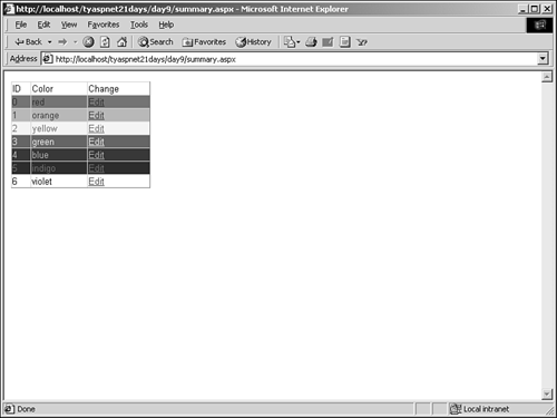
The first step is figuring out how you're going to get your data. Let's use a custom DataSet so you don't have to deal with any databases just yet. You can use this DataSet to fill your DataGrid. Let's examine the code that creates the DataSet. Listing 9.16 shows a method that you'll be adding to in a moment. Listing 9.16 Creating Your DataSet with the Colors of the Rainbow 1: function CreateDataSet as DataSet 2: 'create an array of colors 3: dim i as integer 4: dim arrColors() as String 5: if ViewState("Colors") is nothing then 6: arrColors = new String(7) {"red", "orange", _ 7: "yellow", "green", "blue", "indigo", "violet"} 8: ViewState("Colors") = arrColors 9: else 10: arrColors = ViewState("Colors") 11: end if 12: 13: 'create an empty dataset 14: ds = new DataSet("MyDataSet") 15: 16: 'create a new table and columns 17: dim dTable as New DataTable("Colors") 18: dTable.Columns.Add("Color", GetType(String)) 19: dTable.Columns.Add("ID", GetType(Int32)) 20: 'add table 21: ds.Tables.Add(dTable) 22: 23: 'add rows 24: for i = 0 to 6 25: dim dr as DataRow = dTable.NewRow() 26: dr(0) = arrColors(i).ToString 27: dr(1) = i 28: dTable.Rows.Add(dr) 29: next 30: 31: return ds 32: end function Save this listing in the file summary.aspx, in the code declaration block (you'll be adding other methods and UI elements to this file shortly). This should look similar to Listing 9.1 the first DataSet you built today. You're using the colors of the rainbow (red, orange, yellow, green, blue, indigo, violet) for your data. Look at lines 5 11. It might look scary, but don't worry: It's not! Imagine a typical situation with the row colorizer. A user visits the page and sees several rows in a DataGrid, all different colors. These colors are stored in an array you've created. Each time the page loads, the array is created anew and the DataGrid uses it to set the colors. Then the user tries to edit the colors in the grid, and changes the first row to blue instead of red. However, the result won't be as expected. When the user submits the form again, the array will be created anew, and the DataGrid will use it instead of the new value. This is because the Page_Load event, which is responsible for creating the array, executes before the method that handles the DataGrid's update event. Therefore, your update method doesn't add new data; it only reinserts the old. Figure 9.16 illustrates this process. Figure 9.16. Your update event won't receive the correct data.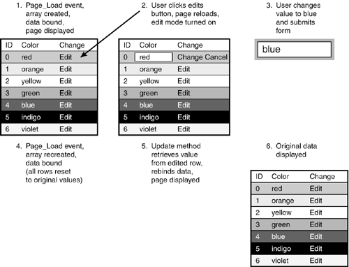
You might be wondering whether you could just not bind the data in step 4. Wouldn't that solve the problem? Unfortunately, no. If the data is not bound, the DataGrid won't contain any data, and subsequent methods won't be able to access the values. Consequently, not binding the data in step 4 would cause an error to occur. Therefore, you need to store your color array in a place where it won't be reinitialized to the original values each time the page is submitted. The state bag is the answer (see Day 5, "Beginning Web Forms," for more information). The first time you create your array, you store it in the state bag. Subsequent page loads and method calls will now refer to this array, which is initialized only once. Your update method can modify values in the array in the state bag, and everything will work beautifully. Let's look at the code, and this will make more sense. Line 5 checks whether there is already an array in the state bag. If there isn't as should be the case upon first viewing of the page you instantiate your array on lines 6 and 7. If the state bag already contains an array, meaning that the array was already created (and perhaps modified), you simply retrieve it. On lines 13 29, you create a DataSet and add DataTables and the information from the array to it. You should be familiar with this task by now. Rather than creating seven rows manually, you instantiate an array with the values on line 2 and use a for loop to add them to the DataSet, as shown on lines 24 29. Finally, you return the DataSet to whatever method called this function. Presumably, this calling method will bind the DataSet to the DataGrid. Let's take a look at the declaration for the DataGrid, shown in Listing 9.17. Listing 9.17 Your Rainbow DataGrid 1: <html><body> 2: <form runat="server"> 3: <ASP:DataGrid runat="server" 4: AutogenerateColumns="false" 5: width="200" 6: OnEditCommand="dgColors_Edit" 7: OnCancelCommand="dgColors_Cancel" 8: OnUpdateCommand="dgColors_Update" 9: OnItemCreated="ChangeColor" > 10: 11: <Columns> 12: <asp:templateColumn headertext="ID"> 13: <ItemTemplate> 14: <asp:Label runat="server" 15: Text='<%# Container.DataItem("ID") %>'/> 16: </ItemTemplate> 17: </asp:templatecolumn> 18: 19: <asp:BoundColumn datafield="Color" 20: headertext="Color" /> 21: 22: <asp:EditCommandColumn headertext="Change" 23: EditText="Edit" 24: UpdateText="Change" 25: CancelText="Cancel" /> 26: </Columns> 27: </ASP:DataGrid> 28: </form> 29: </body></html> Add this listing to the end of summary.aspx. This is a standard DataGrid with handlers defined for the Edit, Cancel, Update, and ItemCreated events. Note that the second column, the BoundColumn, contains the color from the DataSet that will be editable. The EditCommandColumn will automatically display all the links to allow the user to edit, update, and cancel. Listing 9.18 shows the rest of the code declaration block for this page. Listing 9.18 The Completed summary.aspx 1: <%@ Page Language="VB" %> 2: <%@ Import Namespace="System.Data" %> 3: <%@ Import Namespace="System.Data.OleDb" %> 4: 5: <script runat="server"> 6: dim ds as DataSet 7: dim blnSet as Boolean = false 8: 9: sub Page_Load(Semder as Object, e as EventArgs) 10: ds = CreateDataSet 11: blnSet = true 12: if not Page.IsPostBack then 13: BindGrid 14: end if 15: end sub 16: 17: sub BindGrid() 18: dgColors.DataSource = ds 19: dgColors.DataMember = "Colors" 20: DataBind() 21: end sub 22: 23: sub ChangeColor(Sender as object, e as DataGridItemEventargs) 24: dim intIndex as Integer = e.Item.ItemIndex 25: 26: if blnSet then 27: if intIndex > -1 then 28: e.Item.BackColor = Drawing.Color.FromName _ 29: (ds.Tables("Colors"). _ 30: Rows(intIndex)("Color")) 31: e.Item.ForeColor = Drawing.Color.FromName _ 32: (ds.Tables("Colors"). _ 33: Rows(6-intIndex)("Color")) 34: end if 35: end if 36: end sub 37: 38: sub dgColors_Edit(Sender as object, e as DataGridCommandEventargs) 39: dgColors.EditItemIndex = e.Item.ItemIndex 40: BindGrid 41: end sub 42: 43: sub dgColors_Cancel(Sender as object, e as DataGridCommandEventargs) 44: dgColors.EditItemIndex = -1 45: BindGrid() 46: end sub 47: 48: sub dgColors_Update(Sender as object, e as DataGridCommandEventargs) 49: dim strColor as String = Ctype(e.Item.Cells(1). _ 50: Controls(0), TextBox).Text 51: 52: ds.Tables("Colors").Rows(e.Item.ItemIndex) _ 53: ("Color") = strColor 54: ViewState("Colors")(e.Item.ItemIndex) = strColor 55: 56: dgColors.EditItemIndex = -1 57: BindGrid 58: end sub 59: </script> This listing contains all the code for summary.aspx except the HTML and CreateDataSet function. On lines 6 7, you declare two variables that will be used throughout your page: a DataSet and a Boolean value, which you'll get to in a moment. The Page_Load method, beginning on line 9, fills the DataGrid from line 6 with data from the CreateDataSet function. If the page has not been posted back on itself, the controls on the page are bound with a custom function, BindGrid, which you'll examine soon. This method also does one more thing: It sets the blnSet variable to true. This variable tells you when the data has been created it is initially set to false on line 7 because the CreateDataSet method hasn't been executed. After this method executes, you set this variable to true. You'll come back to it in a moment. Next, on line 17, is the BindGrid method, which simply assigns the DataSource and DataMember properties of the DataGrid and calls DataBind. Let's examine the methods on lines 38, 43, and 48 before returning to the ChangeColor method on line 23. The first two methods, dgColors_Edit and dbColors_Cancel, simply set the turn on and off edit mode, and rebind the data. The first method sets the EditItemIndex property to the item the user selected, whereas the second method sets it to -1 to turn off edit mode. The data is then rebound so that the changes will take effect. The dgColors_Update method on line 48 is a bit more complex. First, you grab the changed value from the event arguments of the DataGrid on line 49. The value is stored in the first control, in the second cell of each row, written as Item.Cells(1).Controls(0). Because this returns a generic object, you must cast it as a text box and then use the Text property to grab the value. On line 52, you update the value stored in the corresponding row of the DataSet. Literally, ds.Tables("Colors").Rows(e.Item.ItemIndex)("Color") means the value stored in the "Color" field at the data row corresponding to the row the user selected on the DataGrid, in the table "Colors", in the variable ds, which happens to be your DataSet. (That's long-winded, but it proceeds in a logical manner.) You set this value to the changed value from the DataGrid, and do the same thing for the array of colors you've stored in the state bag on line 54. This is so that the next time the DataGrid is created, it will use the updated value instead of the original one. Then you take the item out of edit mode, and finally rebind the DataGrid. Now the changes that users make to the values will be persisted, but you're not done yet! You have to color each row according to the corresponding value in the DataSet. To do this, you'll use the Item_Created event of the DataGrid, which fires immediately before every item on the grid is created. The event handler for this method is described next. The ChangeColor method on line 23 is executed every time a new row is created in the DataGrid. Therefore, with seven items in the colors array, this method will be executed at least seven times each time the page is requested. Line 24 retrieves the index number of the row in the DataGrid in question, for easier access later. Lines 26 35 are responsible for changing the color of each row to the corresponding value in the DataSet. There are a few caveats to this section, so let's examine it more closely. On line 26, you examine the blnSet variable again. The reason is simple: Recall that this variable indicates whether or not the DataSet has been created. The code on lines 27 34 accesses rows in the DataSet, and if the DataSet hasn't been created yet, you'll have some problems. Therefore, you must check whether the data is ready for access. Wait a second. Doesn't the Page_Load method always execute before this event? And isn't the Page_Load method responsible for creating the data? In that case, theoretically, the data should always be created before the ChangeColor method executes, so why the check? Normally, this would be true, but DataGrids aren't average server controls they do things a bit differently. When you first view a DataGrid, or when you click on the Edit button, things work the same as with other server controls: The Page_Load method executes first, followed by event handlers in no particular order, including the handler for the ItemCreated event. At this stage, you won't have any problems. However, when you click the Update, Cancel, or Delete button, the data in the DataGrid is bound again before the Page_Load method executes. This means that, in this case, the ChangeColor method executes seven times before the Page_Load method executes and creates the DataSet. During these seven executions, you can't access the data because it hasn't been created yet. Thus, the check on blnSet on line 26 is to handle just this scenario. Using some well-placed Response.Write methods, Figures 9.17 and 9.18 show the order of execution when the edit and cancel command buttons have been clicked, respectively. Figure 9.17. With the edit method, the Page_Load method executes first.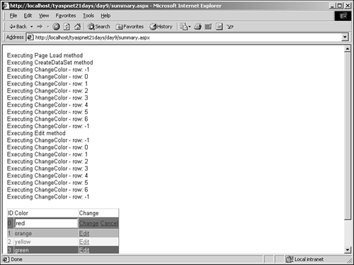
Figure 9.18. With the cancel, update, and delete commands, the data is rebound before the Page_Load event.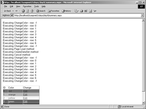
Let's move onto line 27. This check ensures that you are manipulating valid items in the DataGrid you'll examine this in more detail later. Line 28 sets the background color for each row in the DataGrid using the BackColor property. Essentially, what you want to do is grab the color stored in the row that the user has selected. Unfortunately, the process isn't as simple as it sounds because the BackColor property accepts only a System.Drawing.Color object, and the value in the data store is a string. Therefore, you must cast appropriately. Unfortunately, you cannot cast directly from a string to a color you have to go about it in a different way. Note e.Item.ItemIndex will return -1 for headers and footers, and the corresponding index number for all other rows.
The Color object has a method, FromName, that takes a string that represents a valid color name, such as "Red" or "Green". It will convert this string into a Color object for you. Therefore, on line 29, you pass the FromName method the color name stored in your DataSet, and get back a valid Color object. Now you have your color for the row that the user selected. On line 28, you set the BackColor property of the current row (represented by the DataGridItemEventArgs.Item property) to that color. When you view this output, the words tend to blend into this colored background, so you decide to change the foreground color as well. On lines 31 33, you do the same thing to return the color for the foreground. You know that a contrasting color will show up well, so you use the formula 6 - ItemIndex to return the composite color. (Note that you also could have used e.Item.Count - e.Item.ItemIndex, but because you know the count and it will never change, you hard-code the value.) You set the foreground color on line 31, and you're done! You now have a beautiful rainbow-colored DataGrid (shown in Figure 9.12) that users can manipulate. They can change the values in the data store, and the corresponding row's color change as well. Note If you specify a color not contained in the Color object, such as "bluegreenviolet" or "reddd", the application will throw an error. Later, you might want to add a routine to verify that the user's entry is an actual color by using the IsKnownColor method of the Color object.
Let's examine this code a bit further. The ItemCreated event fires before an item is actually created. You can verify this by examining DataGrid1.Items.Count during the ChangeColor method. This property returns the actual number of items in the grid. The first value it returns, which is when the ItemCreated event fires for the first time, is 0. Therefore, you can't actually set the color of the row during the ItemCreated event because it hasn't been created yet. Trying to do so using the following syntax will produce an error: dgColors.Items(intIndex).BackColor = whatever Going strictly by the index value to determine which row was created won't be accurate especially because it returns -1 twice in this example. This is the reason for the if statement on line 27 in Listing 9.18: You want to make sure that you don't try to set the color for a row that isn't even there. However, the ChangeColor method knows which row we're currently working on, whether or not it has actually been created. That's why the code on lines 28 33 works; ASP.NET is smart enough to give you a reference to the row even though the event fired before the row is created. This bit of information isn't critical to know, but it may help if you ever come across this situation. | 