Case Study 8.1 Solution Using Expert Choice
| The MIS director's IT dilemma is a relatively simple case, with a three-level hierarchy, that we are using to illustrate how AHP works. The decision-maker(s) must make judgments about the relative importance of each objective in paired comparisons with each of the other objectives. They also must judge the relative merits of the alternatives with respect to each of the objectives. This is called relative measurement as opposed to absolute measurement, such as arbitrarily assigning a priority to each of the objectives, or stating that an alternative is 'high,' 'moderate,' or 'low' and then arbitrarily assigning priorities to 'High' 'Moderate', and 'Low.' AHP uses hierarchic or network structures to represent a decision problem and then develops priorities for the alternatives based on the decision-makers' judgments throughout the system.[7] The end product of the process is a prioritized ranking of the alternatives available to the decision-maker(s). We will illustrate the process using Expert Choice software as well as explain some of the subtleties of the AHP process. Later, we also illustrate two approximate solution methods without Expert Choice. The Expert Choice step-by-step solution for Case Study 8.1 is illustrated next. Step 1: Brainstorm and Construct a Hierarchical Model of the ProblemThe first step in the AHP process is to construct the decision hierarchy. Level 1 of any such hierarchy (see Figure 8.3) is a statement of the overall goalin this case, "Select the Best Upgrade Path." The goal statement is rather general. Additional specificity is achieved by articulating objectives and subobjectives. Figure 8.3. A Three-Level Hierarchical Model of the MIS Director's IT Dilemma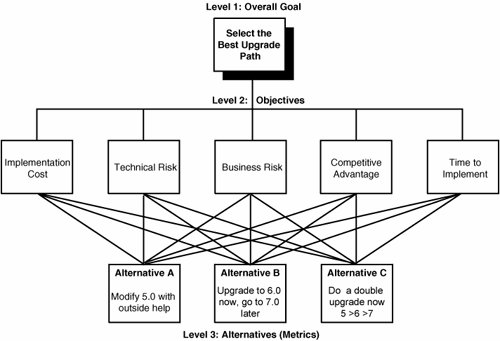 We will keep this example simple by including only one level of objectives and not doing a thorough top-down and bottom-up evaluation. Instead, we will just include the obvious objectives suggested by Table 8.1(low) Implementation Cost, (low) Technical Risk, (low) Business Risk, (high) Competitive Advantage, and (low) Time to Implement. (It really is not necessary to specify the low, moderate, and high labels. We will ask which alternative is preferable with respect to each of the objectives. It is obvious that, when considering cost, risk, and time to implement, the alternative that has a lower cost, risk, or time is preferable to one with a higher cost, risk, or time. An alternative with a higher competitive advantage is preferable to one with a lower competitive advantage.) The third "level" of the hierarchy, as illustrated in Figure 8.3, contains the three decision alternatives:
Step 2: Derive Ratio Scale Priorities for the ObjectivesSome people will favor Alternative A, some will favor Alternative B, and some will favor Alternative C. The worst thing to do is to decide by voting. A well-known book by Fisher and Ury called Getting to YES[8] makes strong arguments for focusing on interests rather than positions. However, when confronted with difficult choices, most people focus on positions (what we call alternatives), debating why their favored alternative is better than someone else's. The debate can be never-ending and often not very productive. In contrast, a rational decision can be defined as one that best achieves your objectives, or, in Fisher and Ury's terminology, interests. This can be done by determining the relative importance of each objective (and subobjective in the general case) as well as determining the relative preference of each alternative with respect to each objective. Although we often recommend doing the latter first, for reasons that will be explained shortly, we will first derive the priorities of our objectives using a process of pairwise comparisons. Instead of arbitrarily assigning priorities to our objectives, we will derive them using relative pairwise comparisons. This process is more accurate and more defensible. (It does not mean that the results are any more "objective." The relative importance of objectives is subjective, but it does mean that they will more accurately reflect the insight, knowledge, and experience of those doing the evaluation.) If we were to use absolute measurement and say that the Implementation Cost objective equals .7 on a scale of 0 to 1, how would we justify this? What does .7 mean to us or to someone else? Instead, we will ask which is more important, Implementation Cost or Technical Risk? (much like an optometrist asks with which eye you can see an image more clearly). But we also ask for a ratio of intensity, not just a direction. This intensity can be expressed numerically, verbally, or graphically. Expressing the intensity of a judgment in the form of a numerical ratio is exact, but it might not be reasonable when comparing high-level objectivesthe importance of which are often, if not always, qualitative and subjective. For example, if we were to say that Competitive Advantage is 4.5 times more important than Implementation Cost, how do we justify such a judgment? Why not 4.4 or 4.6 or 6.0? If we were to express the ratio using words, such as "Competitive Advantage is strongly more important," it is easier to support such an inexact judgment. But how do we quantify such a judgment? Saaty developed a "verbal" scale (see Table 8.2)[9] and a process of calculating ratio scale priorities from a set of verbal judgments based on what is essentially ordinal input. These priorities can be astoundingly accurate if there is enough variety and redundancy in the cluster of items being compared, even if there is some inconsistency in the judgments. Research and experience have confirmed the nine-point scale as a reasonable basis for discriminating between the preferences for two items.[10]
Figure 8.4 shows a pairwise verbal judgment expressing that Technical Risk is moderately more important than Implementation Cost. The grid shown at the bottom of Figure 8.4 shows the pairwise comparison for each pair. The judgments are represented numerically, according to Saaty's fundamental verbal scale (refer to Table 8.2). However, you shouldn't say that Technical Risk was judged to be three times as important as Implementation Cost. The evaluator did not say three times, but said "moderate". "Moderate" to the evaluator might not mean three times. A black entry in the grid indicates that the objective in the cell's row is more important than the objective in the cell's column. A red entry indicates that the objective in the cell's column is more important than the objective in the cell's row. (These entries are actually inverse judgments, such as 1/5, when the eigenvector[11] calculation is performed. This explanation is more easily grasped in the manual solutions presented later in this chapter.) Figure 8.4. Pairwise Verbal Judgments for the Importance of Objectives in the MIS Director's IT Dilemma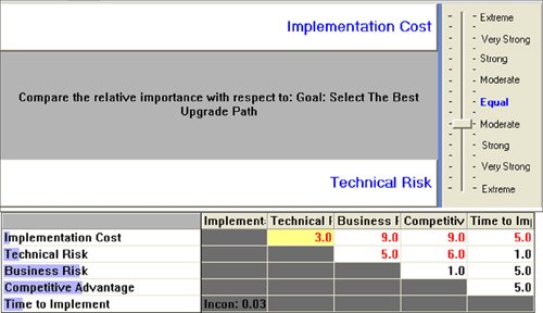 Figure 8.5 shows the priorities resulting from this set of judgments. The priorities are a function of the entire set of judgments, not any one judgment. Notice that the ratio of priorities for any pair of objectives is not the same as the numerical value of the verbal judgment. This is to be expected, because the words are essentially an ordinal scale, whereas the priorities are ratio scale measures. Expert Choice has many other options for making such judgments, such as being able to compute priorities when some of the judgments are missing. The inconsistency ratio (.03 in this case) is the ratio of the inconsistency index (as defined by Saaty) to the average inconsistency index of sets of random judgments for a similar-size matrix with the same number of missing judgments. The inconsistency ratio is not relevant unless it is larger than about 10% or so, in which case the judgments should be reviewed. Reasons for a high inconsistency ratio include lack of information, lack of concentration, clusters with elements that differ by more than an order of magnitude, and realworld inconsistencies. Figure 8.5. Derived Objective Priorities and Inconsistency Ratio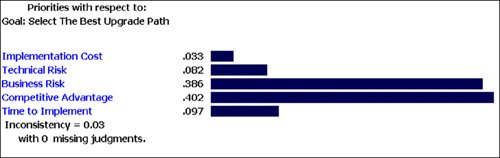 When there is not enough redundancy or variety (for example, when there are only two elements in a cluster), or when the evaluator feels that the resultant priorities do not represent what he or she has in mind, pairwise graphical judgments can be made. The evaluator pulls two bars until the ratio of their lengths best describes his or her judgment of the relative importance of the objectives being compared (see Figure 8.6). Figure 8.6. A Pairwise Graphical Judgment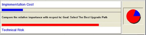 Step 3: Derive Priorities for the Alternatives with Respect to Each ObjectiveThis step involves making pairwise comparisons of the relative preference of the alternatives with respect to each objective. The judgments, derived priorities, and global priorities of the alternatives with respect to the specific covering objective are shown in Figures 8.7 through 8.11. Figure 8.7. A Pairwise Comparison Matrix, Derived Priorities, and Global Priorities for the Alternatives Vis-à-Vis Implementation Cost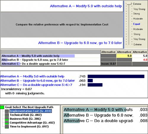 Figure 8.8. A Pairwise Comparison Matrix, Derived Priorities, and Global Priorities for the Alternatives Vis-à-Vis Technical Risk Figure 8.9. A Pairwise Comparison Matrix, Derived Priorities, and Global Priorities for the Alternatives Vis-à-Vis Business Risk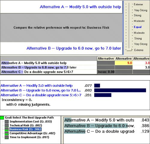 Figure 8.10. Judgments and Priorities for the Alternatives Vis-à-Vis Competitive Advantage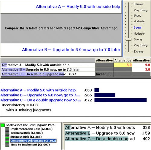 Figure 8.11. A Pairwise Comparison Matrix, Derived Priorities, and Global Priorities for the Alternatives Vis-à-Vis Time to Implement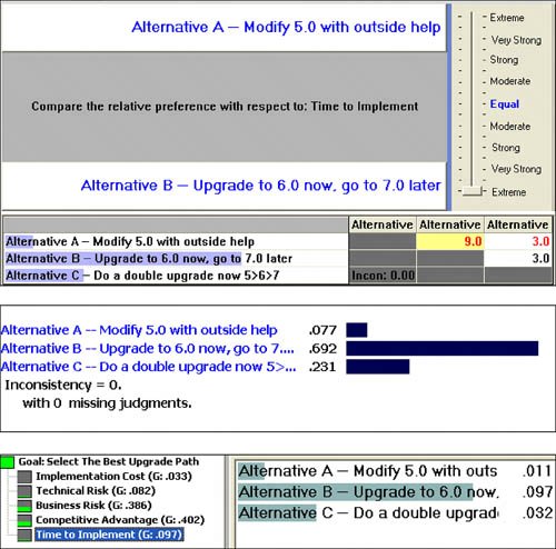 Local and Global PrioritiesThe G designation in Figure 8.7 stands for "global." Expert Choice can display both local and global priorities. Local priorities add up to 1 in any cluster. Global priorities of elements in the hierarchy add up to their parent's priority. Thus, the priorities of the objectives under the goal add up to 1. Distributive and Ideal Synthesis ModesAHP originally had only one synthesis mode, which we now call a distributive synthesis. This mode is fine for prioritization where there is "scarcity." This can occur in forecasting applications where the consideration of a new possible outcome means that existing outcomes must be less probable, and in elections (as was the case in the last few U.S. presidential elections). However, the distributive synthesis mode can result in the reversal of ranks when alternatives are added to or removed from consideration. There was much debate in the literature about this. AHP was modified to include an ideal synthesis that precludes rank reversal and is appropriate when no scarcity exists.[12], [13] Because this choice decision has no scarcity, the ideal mode is appropriate, and instead of the global priorities of the alternatives adding up to the global priority of the parent or covering objective, you can see in Figure 8.7 that the global priority of the most preferred alternative under the covering objective has the same priority as the covering objective priority (.033 in this case). The other alternatives have priorities determined by the ratios of their local priority to that of the most preferred alternative. For example, the priority of Alternative B is (.063/.743) · .033, or about .0028, which is displayed as .003. When the global priorities are added up for the alternatives under all the covering objectives, they are renormalized so that they add up to 1. Step 4: SynthesisThe overall synthesis results in the priorities shown in Figure 8.12. Alternative B is clearly the most preferred overall. Figure 8.12. Ideal Mode Synthesis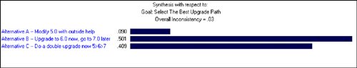 Expert Choice has numerous sensitivity plots. Figure 8.13 shows a dynamic sensitivity plot. Although it's not dynamic on a printed page, when displayed on a computer screen, it allows the user to drag bars on the left pane. You can see, if any of the objectives were to increase or decrease, how the lengths of the alternative priority bars change in the right pane. Even on the printed page, you can see the relative priorities of the top-level objectives as well as the alternatives. Figure 8.13. Dynamic Sensitivity Analysis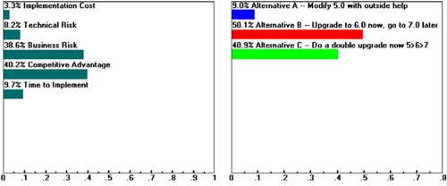 The performance sensitivity plot shown in Figure 8.14 shows not only the objectives' relative importance (represented by the heights of the histogram bars), but also how well each alternative performs relative to each of the objectives. The overall results are shown on the right. The performance sensitivity plot is the best way to visualize the decision's trade-offs. For example, Alternative C, which is second overall, performs best with respect to Competitive Advantage. So if the relative importance of this objective were to increase, so would the overall priority of Alternative C. Similarly, because Alternative B, which is best overall, is also best with respect to Business Risk, a decrease in the importance of Business Risk would decrease the overall priority of Alternative B. This is also shown in the gradient sensitivity plot shown in Figure 8.15. Figure 8.14. Performance Sensitivity Analysis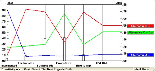 Figure 8.15. Gradient Sensitivity Analysis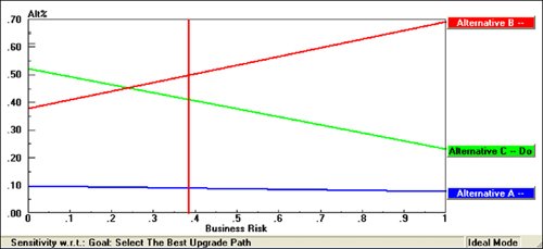 Dragging the bars in any of the sensitivity plots causes an immediate and corresponding change to all the other sensitivity plots. For example, if the vertical line in the gradient sensitivity plot shown in Figure 8.15 were dragged to the left so that the priority of Business Risk is decreased to about 10 percent, the bars would automatically change in the dynamic sensitivity plot (see Figure 8.16), showing that Alternative C would become the preferred alternative. Figure 8.16. Dynamic Sensitivity Analysis After Decreasing Business Risk to About 10%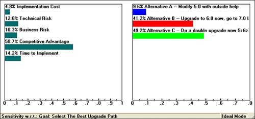 |
EAN: 2147483647
Pages: 394