| Take it from someone who used to write Windows applications in the 'C' language: Writing message pumps and window procedures isn't a lot of fun. Microsoft did try to mask some of the tedium with a variety of technologies, including "Message Crackers" and "MFC." It was Visual Basic that finally succeeded in burying the complexity under a programmer-friendly logical system. The .NET Framework uses a system that is quite similar to that of older Visual Basic implementations, having the WndProc call custom event handlers written by you. It bundles up all this power and simplicity in a technology called Windows Forms. All of its classes appear in the System.Windows.Forms namespace. Many of these classes implement specific types of windows, such as ordinary main windows, buttons, text boxes, drop-down combo box lists, and so on. If you really want to, you can still access the message pump and the various WndProc routines. Each window-specific class includes a WndProc method that you can override and craft yourself. The message pump is found in the System.Windows.Forms.Application.Run method. You could commandeer any of these components and control the whole ball of wax yourself, but you'll soon find out that the Windows Forms development process is so pleasant, you will work hard to forget what "message pump" even means. Forms and Controls In .NET, as in older versions of Visual Basic, windows are grouped into "Forms" and "Controls." But they are still all windows, built from the same core components. If you don't believe me, check out the classes for the various forms and controls in .NET. Both forms and controls derive from the common System.Windows.Forms.Control class, which abstracts the core Windows "window" functionality. Some of the controls supplied with .NET (and also with the older Visual Basic) don't actually implement on-screen window elements. These controlssuch as the "Timer" controlinclude no user interface experience, but do provide a programming experience that is similar to that of the visible controls. I'll list the specific controls a little later in this chapter, and indicate which ones are not user interface controls. Designing Windows Forms Applications Creating a Windows Forms application in Visual Basic is easy. Let's try it. Start Visual Studio and select New Project . . . from the File menu. The New Project form appears, as shown in Figure 7-2. Figure 7-2. Visual Studio's New Project form 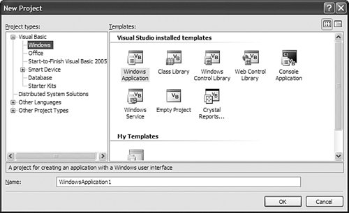
Give the project any name you want in the Name field, and then click OK. The new project has a single form ("Form1") all ready for you to use. At this point, Visual Studio has already added about 250 lines of source code to your application. If you click on the "Show All Files" button in the Solution Explorer panel (described way back in Chapter 1, Figure 1-13) and open the various files in the project, you can see the code for yourself. Some of the most interesting code is in the "Form1.Designer.vb" file, slightly edited here. Partial Public Class Form1 Inherits System.Windows.Forms.Form 'Required by the Windows Form Designer Private components As System.ComponentModel.IContainer 'NOTE: The following procedure is required by 'the Windows Form Designer 'It can be modified using the Windows Form Designer. 'Do not modify it using the code editor. <System.Diagnostics.DebuggerStepThrough()> _ Private Sub InitializeComponent() components = New System.ComponentModel.Container() Me.AutoScaleMode = _ System.Windows.Forms.AutoScaleMode.Font Me.Text = "Form1" End Sub End Class
All of the code that implements a form's behavior appears in the Form class in the System.Windows.Forms namespace. This project's initial form, Form1, inherits from that base form, receiving all of Form's functionality and default settings. Any custom design-time changes made to Form1's user interface, such as adding child controls, are added to the InitializeComponent procedure automatically as you use Visual Studio. Check out the routine periodically to see how it changes. Most programs will have multiple forms. How does .NET know which of your forms should appear first when your program first runs? You indicate the starting location through the project's properties, via the Startup Form field on the Application tab (see Figure 7-3). (The project properties window appears when you select the Project  Properties menu command in Visual Studio, or when you double-click on the "My Project" item in the Solution Explorer.) Properties menu command in Visual Studio, or when you double-click on the "My Project" item in the Solution Explorer.) Figure 7-3. The startup options for a Windows Forms application 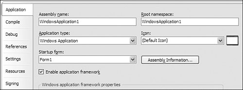
When a .NET application begins, the Framework calls a method named Main somewhere in your code. You indicate which form's Main routine is used through the Startup Form field. It includes a list of all forms; just choose the one you want. But wait, you haven't added a Main method to any of your forms? No problem. Visual Basic will write a simple Main routine on your behalf that will display the indicated form. If you want to add a custom Main routine to your form, or to some other non-Form class in your application, that's no problem. If you uncheck the Enable application framework field on that same properties form, the Startup Form list changes to include any class in your application with a compatible Main routine. But the application framework, new with Visual Studio 2005, enables a lot of cool functionality, and all without any work on your part, so disable it only when you need precise control over the application's early lifetime. | If you do decide to write your own Main routine in a non-Form class, you'll eventually want to display your application's main form. Back in Visual Basic 6.0, whenever you wanted to display a form, you called its Show method: Form1.Show
This simple syntax disappeared when the first .NET version of Visual Basic appeared in 2002, but it's returned with the 2005 release. Let's say that you wanted to start your application from a Sub Main procedure in a module separate from your main form. First, you need to add a new module to the project. Select the Project Add Module menu command. Modify the new Module1 code module so that it looks like the following block of code. Module Module1 Public Sub Main() Form1.Show() End Sub End Module
In the project's properties, uncheck the Enable application framework field, and select either "Module1" or "Sub Main" from the Startup Form list. That's pretty simple: Call Module1's Main method, show the Form1 form, and you're done. And in truth, if you run this program, you will be done pretty quickly. In fact, Form1 will only appear for the briefest moment before exiting the program. Why didn't Form1 stick around? The program exited immediately because of that bothersome message pump, or more correctly, the lack of a message pump. Each window (or form or control) has a distinct WndProc procedure, but there is only one message pump for each application or thread. In this simple program, Form1 has its own WndProc procedure, but it doesn't control the message pump by itself. You have to specifically tell the program to start running the message pump. Because the standard message pump for Windows Forms applications appears in the System.Windows.Forms.Application.Run method, altering the Sub Main code to include it will enable the pump and keep Form1 displayed until the user closes the form or accidentally kicks the power cord out of the outlet. Module Module1 Public Sub Main() System.Windows.Forms.Application.Run(Form1) End Sub End Module
You can add all sorts of initialization code to your Sub Main procedure, and show the main form only when your code is ready to interact with the user. |
If you need to add a new form to your application, use the Project Add Windows Form menu command. Working with Forms In .NET, all forms are simply classes, variations of the System.Windows. Forms.Form class. Each time you create a new form, you are creating a derived class based on that common Form class. And your new class is loaded with functionality; it includes all of the fields, methods, bugs, properties, and events that make up the Form class. Visual Studio takes these elements and presents them in a way that makes it easy to program a form, both through source code and through the drag-and-drop interface of the Visual Studio Forms Designer. When you first add a form to your application, it's kind of plain and boring. Use the Properties panel (see Figure 7-4) to adjust the form to your liking. This panel shows the principal properties for the currently selected item within the Visual Studio environment. It includes a separate entry for each property setting, most of which can be updated through simple text entry. For instance, you can alter the caption displayed at the top of the form by changing the content of the Text property from "Form1" to "Cool Form." Figure 7-4. The properties of your form 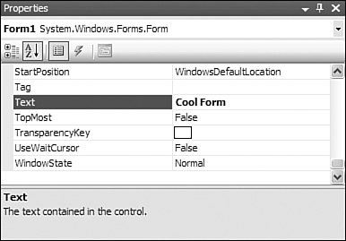
Table 7-1 lists some of the more interesting form properties and their uses. Table 7-1. Form PropertiesProperty | Description |
|---|
(Name) | This is the name of the form, or more correctly, of the class that is the form. By default, it is named "Form x" where x is some number. It needs to be changed to something informative. | AcceptButton | Indicates which Button control already placed on the form should be triggered when the user presses the Enter key. | AutoScroll | If you set this field to True, the form automatically adds scroll bars that move around the contents of the form if the form is sized too small to show everything. | BackColor | The background color. Uses a specific or general system color. | BackgroundImage | Use this property, along with the BackgroundImageLayout property, to place a graphic on the background of the form. | CancelButton | This is just like the AcceptButton property, but the assigned button is triggered by the Escape key, not the Enter key. | ContextMenuStrip | This property lets you create a custom shortcut menu that appears when the user right-clicks on the background of the form. ContextMenuStrip refers to a separate control that you add to the form. | ControlBox | You hide or show the control box in the upper-left corner of the form through this property setting. | Cursor | Indicates the style of mouse cursor that appears when the mouse is over the form. This property demonstrates one of the many editors that appear within the properties window. If you click the "down arrow" at the right of the property setting, it displays a graphic list of all included mouse cursors. Click an image to get the one you want. (Other properties include custom editors designed for their type of content.) This list only includes the built-in cursors. You can also modify this property in the form's source code if you need to set the cursor to a custom graphic. | FormBorderStyle | This property indicates the type of form to display. The default is Sizable, which lets the user resize the form by dragging the bottom-right corner. If you set this property to None, the form's title bar and borders disappear. You would use this setting for an application's "Splash" welcome form, which normally has no form border. | Icon | Sets the graphic displayed in the upper-left corner of the form's border. | IsMdiContainer | Enables "multiple document interface" support on this form. This allows a master form to "contain" multiple child document forms. Visual Studio itself can display forms and source code windows in the MDI style. | KeyPreview | If you set this property to True, the form's KeyDown and KeyPress events will get to process any keys entered by the user, even if those keys were destined for a control contained on the form. This is useful when you need to capture keys that apply to the entire form, such as using the F1 key used to trigger online help. | Location | Sets the top and left position of the form on the screen. The StartPosition property also impacts the location of the form. | MainMenuStrip | Identifies the MenuStrip control to use for the form's main menu. The referenced MenuStrip control is added separately to the form. | MaximizeBox | Indicates whether the "maximum box" appears in the upper-right corner of the form. This button lets the user show a form in "full screen" mode. | MinimizeBox | Indicates whether the "minimize box" appears in the upper-right corner of the form. This button lets the user send the form to the system task bar. | MinimumSize | On forms that can be resized, this property indicates the minimum allowed size of the form. The user will not be able to size the form any smaller than this. This property, like some of the others, is a composite property, built by merging two or more other properties. In this case, it is built from distinct Width and Height sub-properties. | Opacity | Allows you to specify the level of transparency for a distinct color that appears on the form (set via the TransparencyKey field). Setting this field to 100% means that that color is fully displayed with no transparency; setting it to 0% makes that color fully transparent. You can set this property anywhere from 0% to 100%. Anything that appears behind the form will be partially or completely visible through the transparent portions of this form. | ShowInTaskbar | Specifies whether this form should appear as an item in the system task bar. | Size | Indicates the current size of the form through distinct Width and Height sub-properties. | StartPosition | Specifies how the form should be placed on the screen when it first appears. It is set through a list of predefined values, which actually link to an enumeration. | Tag | You can put any type of data you want in this property; it's there for your use. | Text | The form's display caption is set through this field. | TopMost | If set to True, this form will appear on top of all others, even when it is not the active form. | TransparencyKey | Indicates the color to use for transparency when the Opacity field is other than 100%. | Visible | Indicates whether the form is currently visible or not. | WindowState | Identifies the current state of the window: normal, maximized, or minimized. |
I only listed about half of the available properties; clearly you have a lot of control over the form and how it is presented to the user. What's really interesting is that many of these properties are not limited to just forms. Some of these properties come from the shared System.Windows.Forms.Control class, and also appear in all other controls. This includes properties like Visible, Location, BackColor, and Text. Although the text displayed in a form's caption and the text displayed on a command button differ significantly in their presentation, the usage through code is identical. Form1.Text = "This is a form caption." Button1.Text = "This is a button caption."
Although you can set all of the properties in Table 7-1 through the Properties panel, you can also update and view them through code. In fact, if you've modified any of the properties through the Properties panel, then you've already updated them through source code, because Visual Studio is just updating your code for you. Try it out! Set the form's TopMost property to True, and then view the InitializeComponent routine in the Form1.Designer.vb file. You'll find the following new statement near the bottom of the method. Me.TopMost = True
I know what you're thinking: "I'm a programmer, but my text editor is having all of the programming fun. When do I get a chance to modify properties through code?" That's a fair question. Properties are pretty easy to modify. You just name the object to be modified along with the property name and its new value, as Visual Studio did with the TopMost property. Me.Text = "The Library Project"
You can also retrieve the property values by naming them. MsgBox("The form's caption is: " & Me.Text)
You access the form's various methods in much the same way. For instance, the Close method closes the form. Me.Close()
Of course, these statements need to appear within some valid procedure, such as an event handler. Let's add some code to the form's Click event so that when the user clicks on the form, the new code will alter the form's caption, remind us what that caption is, and close the form, causing the program to exit. What a great program! Access the form's source code by selecting Form1.vb in the Solution Explorer, and then clicking on the View Code button at the top of the Solution Explorer. The form's default code block appears. Public Class Form1 End Class
As you remember from earlier in the chapter, this is the tourist portion of the Form1 class, the part that Visual Studio shows to the public (you), and not the more interesting hidden parts (the part in Form1.Designer.vb). But we'll be able to make this section interesting in no time. Add a Click event to the form's surface by selecting "(Form1 Events)" from the Class Name list (above and to the left of the code text editor), and then selecting "Click" from the Method Name drop-down list to its right, as shown in Figure 7-5. Figure 7-5. Adding a Click event to the form 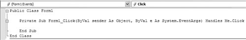
Modify the event handler so that it displays the code listed here. Private Sub Form1_Click(ByVal sender As Object, _ ByVal e As System.EventArgs) Handles Me.Click Me.Text = "The Library Project" MsgBox("The form's caption is: " & Me.Text) Me.Close() End Sub
If you run this code and click on the form's surface, a message box appears with the form's caption just before the application exits (see Figure 7-6). Figure 7-6. A program that communicates when clicked 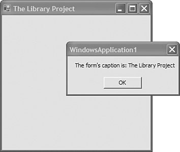
Adding Controls New forms are like blank canvases, and like the great painters before us, we have available a large palate of colorful tools at our disposal. In Visual Studio, these tools are in the form of controls, .NET classes designed specifically for use on form surfaces. Visual Basic and .NET include dozens of Windows Forms controls, and even more are available from third parties. You can even build your own controls, either by deriving them from existing control classes, or by implementing them completely from scratch. Visual Studio's Toolbox includes all of the basic controls you need to build high-quality, or even pathetic low-quality, software applications. Access the Toolbox, part of which appears in Figure 7-7, through the View Toolbox menu command. Figure 7-7. Visual Studio's Toolbox with Windows Forms controls 
There are five ways to add a control to a form. 1. | Double-click on a control in the Toolbox. An instance of the control appears on the form in its default location with all of its default settings.
| 2. | Drag-and-drop a control from the Toolbox to the form.
| 3. | Click on a control in the Toolbox, and then use the mouse to draw the rectangular area on the form where the control will appear. Some controls, like the ComboBox control, have limits on their width or height; they will not necessarily size themselves as you intend.
| 4. | Ask someone else to add the control to the form. This option is for the faint of heart. If you are reading this book, this option is not for you.
| | | 5. | Add the control to the form using Visual Basic source code. As you add controls to the form in Visual Studio, it is writing source code for you on your behalf. There is no reason why you can't add such code yourself. Although there are warnings in the Form1.Designer.vb file telling you not to edit the file, you can hand-modify the InitializeComponents routine if you properly conform to the code style generated by Visual Studio. You can also add controls in other areas of your code, such as in the form's Load event. Adding controls dynamically is beyond the scope of this book, but go ahead, experiment.
|
Some controls have no true user-interface presence in a running application. These controls, when added to your form, appear in a panel just below the form's surface. You can still interact with them just like form-based controls. Once a control appears on the form, use the mouse to move the control, or resize it using the resizing anchors that appear when the control is selected. Some forms also include a small arrow-button, often near the upper-right corner of the control. These are Smart Tags, similar to the Smart Tags feature included in Microsoft Office. Clicking the Smart Tag provides access to useful features associated with the control, as shown in Figure 7-8. Figure 7-8. The Smart Tag for a ComboBox control 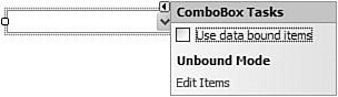
Table 7-2 lists some of the more commonly used controls, all included by default with a new Windows Forms application. If you create a "Web Forms" application in Visual Studioused to design web-based applications with ASP.NETthe available controls will differ from this list. See Chapter 22, "Web Development," for a discussion of ASP.NET applications. Table 7-2. Windows Forms Controls Available in Visual StudioIcon | Control | Description |
|---|
|  | BackgroundWorker | .NET includes support for multi-threaded applications. The BackgroundWorker control lets you initiate a background task right from the comfort of your own form. It's especially useful when you wish to update form-based display elements interactively with the another "worker" thread. You kick off the new work task through this control's RunWorkerAsync method, and perform the actual work in its DoWork event. | |  | Button | A standard push button. A button's Click event is its most common programmatic feature, although you can also use its DialogResult property to trigger a dialog-specific action. | |  | CheckBox | This control implements a two-way (on, off) or three-way (on, off, other) "checked" selection field. The ThreeState property indicates the total number of choices. Use the Checked Boolean property for two-way checkboxes, or the CheckState property for three-way checkboxes. | |  | CheckedListBox | The CheckedListBox control combines the best of the ListBox and CheckBox worlds, giving you a list where each item can be checked in a two-way or three-way manner. The GetItemChecked and GetItemCheckState methods (and their "Set" counterparts) provide one of the many ways to examine the status of items in the list. Be aware of a similar control named CheckBoxList; it is for use in ASP.NET applications only. | |  | ColorDialog | Displays the standard Windows form used for color selection by the user. Display the color dialog using this control's ShowDialog method, getting the result via the Color property. | |  | ComboBox | This control implements the standard Windows drop-down ComboBox control, in all its various styles. The list of items can include any objects you wish; it is not just limited to strings. You can also provide custom "ownerdraw" code that lets you draw each list item yourself. | |  | ContextMenuStrip | This control lets you design a shortcut or "context" menu, to be displayed when the user right-clicks on the form or the control of your choice. It is designed and used in much the same way as the standard MenuStrip control. | |  | DataGridView | The DataGridView control implements a standard table-like grid used to display or edit data in individual cells. It is loaded with more display options than you can shake a stick at. The displayed data can be bound to some external data source, or you can make it up on the fly. A "virtual data" mode also lets you load data only as needed. | |  | DateTimePicker | The DateTimePicker control lets the user enter a date, a time, or both, either through basic text entry or mouse-based controls. Although not as free-form as a simple text field, it does enforce the selection of a date or time. You can set minimum and maximum boundaries on the user's selection. The MonthCalendar control provides an alternative interface for date-specific selection. | |  | DomainUpDown | Through this control, the user selects one from among a list of choices that you define, choices that have a specific inherent order. Use this control as an alternative to a ComboBox or TrackBar control when warranted. | |  | FolderBrowserDialog | Displays the standard Windows form used for directory or folder selection by the user. Display the selection dialog using this control's ShowDialog method, getting the result via the SelectedPath property. | |  | FontDialog | Displays the standard Windows form used for font selection by the user. Displays the selection dialog using this control's ShowDialog method, getting the result via the Font property. Other properties provide access to components of the selected font. | |  | GroupBox | The GroupBox control provides a simple way to visibly group controls on a form. Subordinate controls are drawn or pasted directly onto the GroupBox control. To access similar functionality without the visible border or caption, use the Panel control. | |  | HelpProvider | The HelpProvider control lets you indicate online help details for other controls on the form. When used, it adds several extra "Help" pseudo-properties to each of the other form controls through which you can supply the help context details. When implemented properly, the indicated online help content will display when the user presses the F1 key in the context of the active control. | |  | HScrollBar | This control implements a horizontal scroll bar, allowing the user to scroll among a display region or list of choices. For a vertical implementation of this control, use the VScrollBar control. Several other controls include their own copy of these scroll bars. | |  | ImageList | The ImageList control encapsulates a set of small graphics or icons for use by other controls that support image lists. Image lists are commonly used by ListView, Toolbar, and TreeView controls. | |  | Label | This control displays static text on a form. By using the various border and background properties, you can display simple lines and rectangles on a form. Visual Basic 6.0 included specific line and rectangle drawing controls, but they are not available in .NET. You must either simulate them using a Label control, or draw them yourself using the GDI+ drawing commands (which isn't that difficultsee Chapter 17, "GDI+"). | |  | LinkLabel | The LinkLabel control implements a static label that includes one or more "links" within the text content. These links are similar to the standard text links that appear in web browser content. The control calls its LinkClicked event handler when the user clicks on any of the embedded links. | |  | ListBox | This control implements the standard Windows list box control, displaying a list of items from which the user can select zero or more. The items can include any objects you wish; it is not just limited to strings. You can also provide custom "ownerdraw" code that lets you draw each list item yourself. | |  | ListView | The ListView control presents a set of items with optional display properties. It is quite similar to the (pre-Vista) Windows File Explorer with all of its various display modes. You can add column-specific data for the "details" view. The items in the control appear as a set of ListViewItem class objects. | |  | MaskedTextBox | This variation of the standard text field helps the user enter formatted numeric or text data by displaying an entry template or mask. For instance, you can force the user to enter a telephone number in "xxx-xxx-xxxx" format by using a numeric mask with embedded hyphen characters. | |  | MenuStrip | This control lets you design standard form menus, which are displayed along the top of the user area of the form. Menus within the menu strip are implemented through ToolStripMenuItem class instances. The menu strip is a toolbar-like implementation of a standard Windows menu. (The older MainMenu control is still available if you need it.) You can add other types of controls to the menu, including toolbar-specific ComboBox controls. Context-sensitive menus, displayed when the user right-clicks on the form or a control, are implemented through the ContextMenuStrip control. | |  | MonthCalendar | The MonthCalendar control displays a subset of a calendar, focusing on a month-specific view. More than one month can be displayed at a time, in vertical, horizontal, or grid configurations. The DateTimePicker control provides an alternative interface for date-specific selection. | |  | NotifyIcon | The NotifyIcon control lets you place an icon in the "system tray" area of the Windows task bar, and communicate important messages to the user through this interface. Because this control has no form-specific user interface, it is possible to use it without having a standard form displayed. | |  | NumericUpDown | Allows the user to select a numeric value using a scrollable up/down section method. Use this control as an alternative to HScrollBar, TextBox, TrackBar, or VScrollBar controls when warranted. | |  | OpenFileDialog | Displays the standard Windows form used for "open" file selection by the user. The user can select one or more existing files from local or remote file systems. Display the selection dialog using this control's ShowDialog method, getting the result via the FileName or FileNames property. The OpenFile method provides a quick way to open the selected file. | |  | PageSetupDialog | Displays the standard Windows form used for page setup configuration by the user. Display the selection dialog using this control's ShowDialog method, getting the result via the PageSettings and PrinterSettings property. | |  | Panel | The Panel control logically groups controls on a form. Subordinate controls are drawn or pasted directly onto the Panel control. To access similar functionality with a visible border and user-displayed caption, use the GroupBox control. | |  | PictureBox | This control displays an image in a variety of formats. It should not be confused with the Visual Basic 6.0 PictureBox control, which is more closely related to the Windows Forms Panel control. | |  | PrintDialog | Displays the standard Windows form used for document printing and print properties selection by the user. Display the selection dialog using this control's ShowDialog method. This control is used in conjunction with an instance of the System.Drawing.Printing.PrintDocument class, which is created through code or via the PrintDocument control. | |  | PrintDocument | This control is used as part of the print and print preview process. It adds a wrapper around your custom print implementation, providing a consistent method of selecting and printing document pages. | |  | PrintPreviewDialog | This control provides a standardized interface for print preview, implementing all elements of the entire print preview dialog. When used with a PrintDocument class or control, it displays on-screen precisely what will appear on the final printed page. In fact, your printing code doesn't necessarily know if it is printing to the printer or the print preview display. | |  | ProgressBar | The ProgressBar provides graphical feedback to the user for a task completion range. Normally, the range goes from 0% to 100%, but you can supply a custom range. The Value property indicates the current setting between the Minimum and Maximum range limits. | |  | PropertyGrid | The PropertyGrid control allows the user to graphically edit specific members of an attached class instance. The Properties panel within the Visual Studio environment is an instance of this control. This control makes heavy use of class-based attributes to control the display and edit features of properties. Chapter 17 uses this control to support bar code label management in the Library Project. | |  | RadioButton | This control implements the standard Windows radio selection button. Although the circular "point" display is most common, the control can also appear as a toggle button by setting the Appearance property appropriately. The Checked property indicates the current value of a control. All RadioButton controls that appear within the same "group context" act in a mutually exclusive manner. Use the Panel and GroupBox controls to create specific group contexts. | |  | ReportViewer | The ReportViewer control allows you to design and display custom banded reports tied to collection or ADO.NET data sources. Using this control to design a report will add an ".rdlc" file to your project that contains the actual report design. | |  | SaveFileDialog | Displays the standard Windows form used for "save" file selection by the user. The user can select a new or existing file from local or remote file systems. The control optionally prompts the user to overwrite existing files. Display the selection dialog using this control's ShowDialog method, getting the result via the FileName property. The OpenFile method provides a quick way to open the selected file. | |  | SplitContainer | This control adds a "split bar" by which you can divide your form into multiple sizeable regions, each of which contains a Panel control. Use the Orientation property to alter the direction of the split. The order in which you add SplitContainer controls to a form will impact the usability of the splits; experimentation is recommended. | |  | StatusStrip | This control displays a "status bar," usually along the bottom edge of a form, through which you can display status and other context-sensitive information to the user. The strip can contain multiple ProgressBar, StatusStripPanel, and ToolStripLabel controls. The older StatusBar control is still available if you need it. | |  | TabControl | The TabControl control lets you divide the controls of your form into multiple "tabbed" regions. Each named tab has an associated TabPage control, which works a lot like the Panel control. Add or paste subordinate controls directly to each TabPage control. | |  | TextBox | This control implements the standard Windows text box, both in its single-line and multi-line styles. The main body content is set through the Text property. The PasswordChar and UseSystemPasswordChar properties allow you to mask the input when accepting a user-supplied password. | |  | Timer | This control triggers a timed event at an interval you specify. The size of the interval, in milliseconds, is set through the Interval property. If the Enabled property is set to True, the Tick event handler will be called at each met interval. Although you can set the interval as small as one millisecond, it is unlikely that you will achieve this frequency with today's hardware. | |  | ToolStrip | The ToolStrip control implements a toolbar on which other controls appear. It comes with a set of associated controls and classes that provide advanced rendering and user interaction features. | |  | ToolStripContainer | The ToolStripContainer control provides a convenient way to add MenuStrip, StatusStrip, and ToolStrip controls to the edges of a form. | |  | ToolTip | The ToolTip control lets you indicate a "tool tip" for other controls on the form. When used, it adds a "ToolTip" pseudo-property to each of the other form controls, through which you can supply the associated tool tip text. When the mouse hovers over a control with an assigned tool tip text, a small text window appears temporarily over the control to provide useful information to the user. | |  | TrackBar | The TrackBar control allows the user to make a selection among a small number of related and ordered values. Its real-world counterpart is the volume control on a radio. Use this control as an alternative to an HScrollBar, NumericUpDown, or VScrollBar control when warranted. | |  | TreeView | The TreeView control presents a set of items in a hierarchical arrangement. It is quite similar to the "directory tree" portion of the (pre-Vista) Windows File Explorer. Each item in the tree is a "node" that can have zero or more child nodes. | |  | VScrollBar | This control implements a vertical scroll bar, allowing the user to scroll among a display region or list of choices. For a horizontal implementation of this control, use the HScrollBar control. Several other controls include their own copy of these scroll bars. | |  | WebBrowser | Implements a web browser within your application. You can use the standard web-based navigation features available within Internet Explorer for URL-based access, or provide your own custom HTML content through the DocumentText property or related properties. |
Although there is no reasonable limit on the number of controls you can add to a form, there is a limit on how much information the user can experience on a single form without a direct wired connection to the brain. Don't go too wild. Events and Delegates Each form and control in a .NET application contains its own WndProc window procedure, and as it processes each incoming message from the message pump, it translates those messages into events. Events are the standard .NET technique that controlsand all other classesuse to say, "Hey, something is happening, and you might want to do something about it." When you include a form or control in your application, you can monitor one, some, or all of these events, and write custom code that responds appropriately. All of the custom code you write for each event appears in an event handler. But what actually happens between the finger of the user on the mouse and the logic in your custom event handler? Figure 7-9 shows you graphically what actually happens between action and custom logic. Figure 7-9. What really happens when the user clicks a button 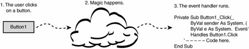
Clearly, there is still some mystery surrounding event processing. Controlsand all classesdetermine which events they will make available. For controls, many of the events parallel user-initiated actions: Click, MouseDown, KeyPress, SizeChanged. But there also many events that could only be triggered by modifications to the control through your source code: TabIndexChanged (when the tab-key order of the controls changes), BackgroundImageChanged, and CursorChanged are just three of the many events that the user cannot affect directly. A few final events tie to system-level changes, such as the SystemColorsChanged event, which fires when the user modifies the system-wide color scheme through the control panel. Each event has not only a name (such as Click), but a set of parameters that the event handler will receive when called. Here's a typical event handler for a Button control. Private Sub Button1_Click(ByVal sender As System.Object, _ ByVal e As System.EventArgs) Handles Button1.Click End Sub
This event handler receives two arguments from the triggering event: a System.Object instance (sender) and a System.EventArgs instance (e). Other event handlers may use a slightly different set of arguments, so how do you know what to use? Any events defined within a control class must also indicate the number and type of arguments it will send to the event handler. Visual Basic includes an Event statement that defines events. Although the Button control was likely written in C#, here is a possible look at what the event definition for the Button's Click event might look like in Visual Basic. Public Event Click(ByVal sender As System.Object, _ ByVal e As System.EventArgs)
This definition sure looks a lot like the event handler, and it should. The Event statement establishes a parameter-passing contract between the control and any code that wants to receive event notifications. In this case, the Click event promises to send two arguments to the event handler. The first, sender, is a reference to the object that the event refers to. For Button controls, this parameter receives a reference to the Button instance itself. The second argument, e, provides a method for passing an entire object of additional information. The System.EventArgs class doesn't have much information, but some events use a variation of the second argument that uses System.EventArgs as its base class. It turns out that the arguments used for the Click event are pretty common among the different controls and events. Instead of retyping the argument list in each Event statement, the designer of a control can define a delegate, a .NET type that defines an argument list and, for functions, a return value. Public Delegate Sub StandardEventDelegate( _ ByVal sender As System.Object, _ ByVal e As System.EventArgs)
Event statements can then use the defined delegate as a shortcut for typing out the entire parameter list. Public Event Click As StandardEventDelegate
Whether the Event statement uses a delegate or a full argument list, it has a firm grasp on what data it needs to send to any listening event handlers. And it sends those arguments using the Visual Basic RaiseEvent statement. Let's trace this process down for the Button control. When the user clicks on the button, the message pump finds a way to get a message to the WndProc procedure for the Button control. That control examines the message, sees it is a mouse click, and decides to tell event handlers about it. Then, from within the WndProc code, it raises the event. RaiseEvent Click(Me, New System.EventArgs)
The Visual Basic Me keyword refers to the Button control instance itself. The e argument for a Button control contains no information beyond the default fields included in a System.EventArgs instance, so WndProc just sends a new empty instance. Controls with other event arguments would have created an instance first, filled it in with the relevant data, and passed that instance to the event handler. If an event fires in an application, and there is no event handler to hear it, does it make a sound? Perhaps not. There is no requirement that an event have any active handlers listening. But when we do want to listen for an event, how do we do it? The standard way to do this in a Windows Forms application is a two-step process. First, the user of the control (your form class) needs to announce to the control, "I want to monitor your events." Then it attaches event handlers to specific events. Earlier in the chapter, we saw that adding a control to the Form1's user interface actually triggers Visual Studio to write source code in the Form1.designer.vb file. Here's the code added for a Button control named Button1 (with line numbers). 01 Partial Class Form1 02 Inherits System.Windows.Forms.Form 03 04 Friend WithEvents Button1 As System.Windows.Forms.Button 05 06 Private Sub InitializeComponent() 07 Me.Button1 = New System.Windows.Forms.Button 08 09 Me.Button1.Location = New System.Drawing.Point(48, 16) 10 Me.Button1.Name = "Button1" 11 Me.Button1.Size = New System.Drawing.Size(75, 23) 12 Me.Button1.TabIndex = 0 13 Me.Button1.Text = "Button1" 14 Me.Button1.UseVisualStyleBackColor = True 15 16 Me.Controls.Add(Me.Button1) 17 End Sub 18 End Class
The code in the InitializeComponent method creates the Button control instance (line 07), modifies its properties to get just the look we want (lines 09 to 14), and attaches it to the form (line 16). But there is one additional line that defines the actual Button1 reference type variable (line 04): Friend WithEvents Button1 As System.Windows.Forms.Button
I talked about class-level fields in Chapter 6, "Data and Data Types," and Button1 is just a typical class-level field. But it's the WithEvents keyword included in the statement that lets the control know that someone wants to monitor event notifications. Now, whenever a Button1 event fires, it knows that Form1 may contain event handlers that are watching and listening. The second of our two-step event-to-handler connection process involves the actual connection of the handler. Let's look at the event handler definition again for the Button1 instance. Private Sub Button1_Click(ByVal sender As System.Object, _ ByVal e As System.EventArgs) Handles Button1.Click End Sub
It's just an ordinary class method, but with a Handles clause hanging off the end of the definition. This clause is what links the event with the Button1.Click event itself. You can follow the Handles keyword with multiple event names. Private Sub ManyButtons_Click(ByVal sender As System.Object, _ ByVal e As System.EventArgs) Handles Button1.Click, _ Button2.Click, Button3.Click End Sub
Now the single ManyButtons_Click event handler will listen for Click events from three different controls. You can even mix up the monitored events; one event handler can listen for different named events. Private Sub ManyEvents(ByVal sender As System.Object, _ ByVal e As System.EventArgs) Handles Button1.MouseDown, _ Button2.MouseUp End Sub
Another variation is to have multiple event handlers monitor a single event. Private Sub FirstHandler(ByVal sender As System.Object, _ ByVal e As System.EventArgs) Handles Button1.Click End Sub Private Sub SecondHandler(ByVal sender As System.Object, _ ByVal e As System.EventArgs) Handles Button1.Click End Sub
There is another way to connect events to event handlers that does not involve either the WithEvents keyword or the Handles keyword. Once you have an instance of an event-exposing class, you attach a handler to one of its events using the AddHandler statement. The following statement links Button1's Click event to an event handler named MyHandler. MyHandler must have the correct argument list for the defined event. AddHandler Button1.Click, AddressOf MyHandler
A related RemoveHandler statement detaches a handler from an event. There are a lot of complicated steps that take you from an initial user or system action to the code in an event handler. I've spent a lot of chapter space discussing exactly how events work, but with good reason. Events and event processing are core features of .NET application development. Eventually, you will spend so much time writing event handlers that it will all become second nature to you. But I also went into all of this detail so that you could take full advantage of this technology. Visual Basic not only lets you monitor controls for events, it lets you design new events into your own classes. You can use the Delegate, Event, RaiseEvent, WithEvents, Handles, AddHandler, and RemoveHandler keywords for your own custom events, triggered by whatever conditions you choose. If you have a class that represents an employee, you can have it trigger a Fired event whenever the employee loses his or her job. By adding custom events, you make it possible for custom code to be attached to your class logic, even if a programmer doesn't have access to your class' source code. |