10.2. Phase 2: Publishing Options Once you've selected an album or a batch of photos, click the Book button below the main picture area (Figure 10-1), or choose File  New Book. New Book. Now you see something like Figure 10-1: a dialog box in which you can specify what you want your book to look like. The dialog box looks pretty simple, but it's crawling with important design options, many of which are offered in iPhoto 5 for the first time. 10.2.1. Book Type This pop-up menu, shown open in Figure 10-1, lets you specify whether you want to publish your book as a hardbound volume (classier and more durable, but more expensive) or as a paperback. If you choose the softcover option, you can also choose one of three book sizes. The options are 11 x 8 ½ inches, which feels the slickest and most formal; 8 x 6, which is more portable; and 3 ½ x 2 5/8 . 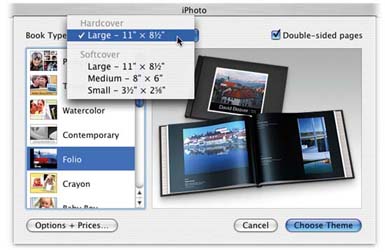 | Figure 10-1. You can change these settings later, even after you've started laying out your book pages. But if you have the confidence to make these decisions now, you'll save time, effort, and (if you want captions for your photos) possibly a lot of typing. | |
This last option gives you a tiny, wallet- size flip book, with one photo filling each page, edge to edge. You must order these in sets of three (for $12), which suggests that Apple imagines them to serve as simultaneous giveaways to relatives, wedding guests, business clients and so on. In any case, they're absolutely adorable (the booklets, not the business clients ). 10.2.2. Double-Sided Pages The pages of all softcover book styles are printed with photos on both sides. If you choose a hardback book, though, you can choose either double-sided printing or single-sided, meaning that each left-hand page is blank. The single-sided printing style tends to give each photo page more weight and drama because it's isolated, but of course your book winds up costing more because it's longer. 10.2.3. Theme Choices And now, the main event: choosing a theme ”a canned design, typography, and color scheme ”for the cover and pages of your book. The scrolling list of named icons at the left side of the dialog box contains 15 professionally designed page templates, each dedicated to presenting your photos in a unique way. As you click each one's name in the list, the right side of the dialog box reveals a photograph of a representative book that's been published in that style. (They're reproduced here for your comparison pleasure .) The first eight of them are new in iPhoto 5. Some are designed to cover even the background of the page with textures, shadows, passport stamps, ripped-out clippings, and other photorealistic simulations. Here's a brief description of each: -
Picture Book. This design's motto could be "maximum photos, minimum margins." There's nowhere for text and captions, and the photos stretch gloriously from one edge of the page to the other ”a full bleed , as publishers say. 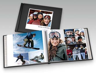 This dramatic design can be emotionally compelling in the extreme. The absence of text and minimization of white space seems to make the photos speak ” if not shout ”for themselves . Now, as you build your first book, you may be tempted to choose a theme that offers space for captions. But if your text is no more illuminating than,"Timmy doing a belly-flop"or"Dad falls asleep at the bar," consider the Picture Book theme instead. This is, after all, a photo album, so it may be worth giving the photos all the space they deserve. You don't need to eat into their space by restating the obvious.
Tip: Keeping in mind that the book is published horizontally, in landscape mode, will help you maximize page coverage. For example, on pages with only one photo, a horizontal shot looks best, since it'll fill the page, edge to edge. On pages with two photos, two side-by-side vertical (portrait-mode) shots look best. They'll appear side by side, filling the page top to bottom.
-
Travel. If you choose this option, iPhoto will publish a book with beige- and gold-colored page backgrounds. The photos are also given a graphic treatment that make them appear to have been taped into a scrapbook, usually at a slight angle to the page. Some of the photos will look like they've actually been folded and then unfolded; others will seem to have been built from 25 smaller ones, all assembled into one larger mosaic image. Adding captions to the pages is optional; if you want them, they'll appear on strips that look like they've been ripped, jagged edge and all, from a piece of stationery. 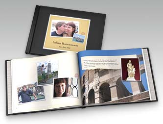 Overall, the effect is casual and friendly ”not what you'd submit to National Geographic as your photographic portfolio, of course, but great as a cheerful memento of some trip or vacation. -
Watercolor. "Watercolor," in this case, refers to the page backgrounds, which appear in gentle, two-toned pastel colors. This time, you can choose to have your photos "mounted" on the pages either slightly askew, for an informal look, or neatly parallel to the page edges. Note, though, that this design doesn't offer an option for photo captions, so you'll have to let the pictures tell the story.  -
Contemporary. The page backgrounds are white, the photos are all clean and square to the page, and captions, if you want them, appear in light gray, modern type. The maximum number of photos on a page is three, ensuring that they remain large enough to make a bold statement. Clearly, though, Apple's hoping that you'll choose only one maximum-impact photo per page; it offers you four different " white-space " treatments for one-photo pages. 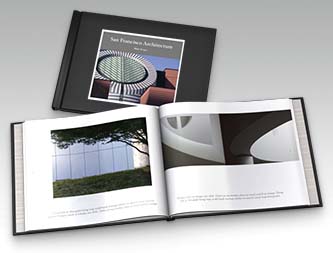 -
Folio. This design is among the most powerful of the bunch, primarily because of the glossy jet-black page backgrounds. (You can also choose plain white.) To use the technical term , it looks "really cool." 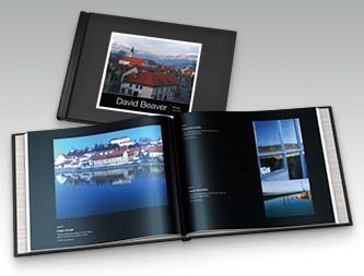 This template must have been some designer's pet project, because it's the only one that offers special layout designs for a title page, About page, and explanatory-text page, all done up in great-looking fonts in white, gray, and black. Caption space is also provided. -
Crayon. Pretty neat: In this design, the pages are photographically printed to look like they're textured paper. For each page, you can choose either a photos-mounted-askew layout or ”get this ”a straight layout in which each photo has a frame "drawn" around it with a crayon. And to keep with that Crayola-ish theme, you can choose from any of 10 background colors for each page. 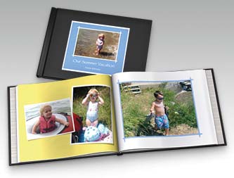 You can place up to six photos on a page. Oddly enough, though, you're offered the opportunity to include captions only on the two-photo page design. -
Baby. You can choose either Boy (light blue accents on the page backgrounds) or Girl (pink). For each page, you can choose a page-background pattern in stripes , calico, gingham, or canvas. You can also opt to have your photos askew or aligned, but you can't include captions. 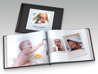 Not that you'd really need them. These book designs are obviously included as baby-announcement books ”there's even an Information page template with blanks to fill in like Gender, Weight, Time, and Place. Really, who'd want a bunch of mundane text detracting from the powerful graphic statement made by your baby pictures? If you scroll down far enough into the list of design templates, you'll find a second set of them called Old Themes. These were the design choices in iPhoto 4. True, they may be old in computer time (2004 ”ooh! Ancient!), but they're still perfectly usable (at least for hardback books; they're not available in softcover). In fact, because iPhoto 5 offers double-sided printing for the first time, these older designs have been given new life. They include: -
Picture Book. This theme is identical to the New, Improved Picture Book theme described above. The only differences are that the new one lets you place up to 16 photos per page (instead of six), has more modern-looking type on the cover and Introduction page, and lets you choose how you want the photos arranged on a six-photo page.  -
Catalog. This design looks exactly like a mail-order catalog: a picture on the left, and a name and description on the right. There are eight pictures per page (or one, or four). It's neatly aligned and somewhat conservative. For example, there's a page design called Introduction, where you can pour a lot of text, such as your shipping policies, a letter from the founder, what this season 's catalog offers, and so on. 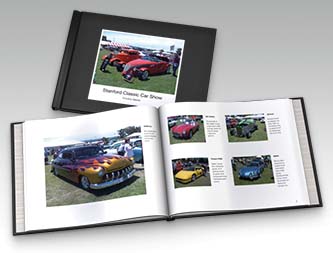 It's good for more than just designing catalogs, however. It would be an ideal "face book" (with mini-biographies) for, say, a dating agency or personnel director. It's also a candidate for a regular photo album, in the event you're the kind of person who wants it to look square and gridlike, like a "real" photo album from Office Max. -
Classic. It's easy to deduce the philosophy behind this conservative, clean design: maximum photos, minimum text. Photos are as large as possible on the page (up to six per page), and each offers only enough room for a title and a very short caption. 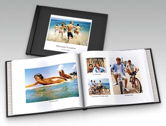 -
Collage. This design is a wacky, energetic layout in which no photos are square with the page. Everything falls at a tilt, as though tossed onto a coffee table helterskelter. If there's more than one photo per page, they may even overlap.  This design is exactly like Story Book, except without captions. (The one exception: A page design called "One with Text" gives you the flexibility to insert an occasional single photo with a tall, skinny text block next to it.) -
Portfolio. Modeled after a photographer's portfolio, this design has elements of both Catalog and Picture Book. Like Catalog, it provides text boxes that accommodate a title and description for each photo. But as with Picture Book, the photos are otherwise displayed at maximum size, with very little white space between them.  The whole effect is a tad industrial-looking, so you probably wouldn't want to use it as a "memory book" for some trip or event. It's useful in situations where Catalog would be right, except that it's more interesting to look at, thanks to the varied photo sizes. -
Story Book. This layout is the big brother to Collage. Once again, you get a zany layout of crooked, overlapping photos. The difference: In this design, text boxes appear on each page for captions, which are always parallel to the page edges and therefore anchor the design. Like Collage, this theme works best when fun, craziness, or lightheartedness is your desired effect.  -
Year Book. This theme lets you fit up to 32 photos on each page ”just as in a high school yearbook. Of course, if you choose greater quantities , the photos themselves get smaller ”but iPhoto always leaves you enough room for a title ("Chris Jones") and a little description ("Swim team '05; voted Most Likely to Enter the Priesthood"). 
Tip: Make an effort to choose a quantity of photos that neatly fills the final page, or at least a row of it. Otherwise, the final page can look a bit half-finished.
As you explore the themes and other book-format options, remember that you can always click the Options+Prices button in the corner of the dialog box. It takes you online to a special Web page that fills you in on the details of the options you've selected, including the maximum number of pages, dimensions, and, oh yeah the price. Once you've settled on a design theme for your book, your initial spate of decision-making is mercifully complete. Click Choose Theme.
Tip: You can always revisit your choice of theme ”or even book type (size, hardcover, and so on) ”by clicking the Themes button at the bottom of the iPhoto window, as shown in Figure 10-3.
|