Chapter 3. Formatting and Aligning Your Text
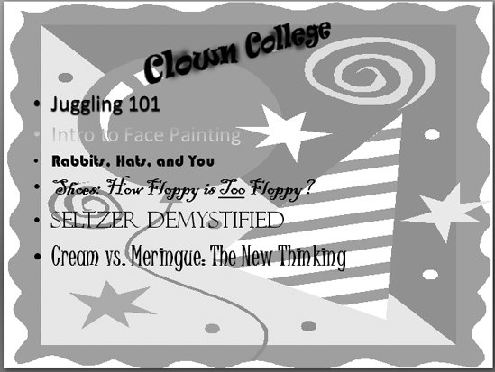
| Content may be king, but presentation is queen . You're going to spend a lot of time choosing just the right text to add to your slides, so don't blow all that hard work by ignoring the way your text looks. If your text is hard to read or conveys a message counter to the point you're trying to makeif you choose whimsical, candy -colored fonts for a presentation introducing your company's expanded line of funeral services, for exampleyou're going to confuse (or even lose) your audience. This chapter shows you how to format your text effectively. You'll find out how to choose fonts, colors, and special effects (such as underlining, shadowing, bordering, and beveling) that support and strengthen your message (Figure 3-1), and how to avoid the effects that detract from it (Figure 3-2).
Note: For tips on formatting non-text presentation elements such as pictures, spreadsheets, and other visuals, check out Chapter 9. If it's editing your overall slideshow you're interested inshuffling slides or adding headers or footers, for examplehead to Chapter 5. |

