8.6 Designer Integration
| Many controls are created with reuse in mind, whether it is across multiple applications within one company or perhaps for sale and distribution. Reusable controls should take advantage of designer integration so that they integrate into the Visual Studio .NET design environment. With designer integration you can control
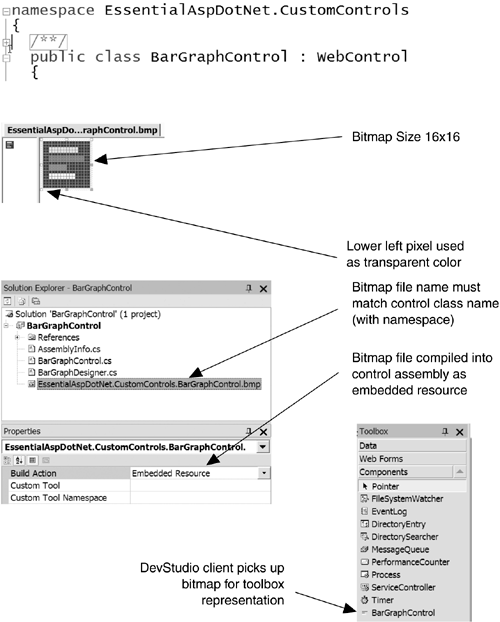
Adding designer integration to your control is the final, critical step in making your control accessible to developers who want to use it. 8.6.1 Properties and AppearanceWhen a control you build is used in Visual Studio .NET, the first thing users of your control will see is the cool 16-by-16 graphic that represents your control in the Toolbox ”or the lack thereof. To associate a Toolbox image with your control, you must create a bitmap that is 16 by 16 pixels. The lower left pixel of the bitmap is used as the transparent color when the control is rendered in the Toolbox. The file name of the bitmap must be the full class name of the control class with which it is associated. For example, if you have defined a control class named Control1 in the MyControls namespace, the bitmap file for that control must be named MyControls.Control1.bmp . Finally, the bitmap needs to be compiled into the control assembly as an embedded resource. You can do this in a Visual Studio .NET project by setting the Build Action of the bitmap file to Embedded Resource . Be aware that Visual Studio .NET prepends the default namespace associated with your project to any embedded resources, so you must either take that into consideration when naming your bitmap file to ensure that it matches the control class name, or remove the default namespace from your project altogether (accessible through the project properties dialog). In a command-line compilation, you can embed a bitmap as a resource by using the /resource switch referencing the bitmap file. The entire process of associating a Toolbox bitmap with your control is shown in Figure 8-6. Figure 8-6. Setting the Toolbox Bitmap for Your Control The second thing users of your control will notice is the tag that is placed into the .aspx page. You can control what this tag looks like through the class-level attribute ToolboxData . This attribute takes a string as a parameter that is the tag you would like rendered for your control, using the placeholder {0} wherever a tag prefix is used (which is also controllable through an assembly-level attribute). Listing 8-39 shows a custom control that specifies the tag that should be used through the TooboxData attribute. Note that you can specify any initial attributes or content you would like the tags for your control to have when they are first placed on a form. Listing 8-39 Specifying a Client Tag for a Custom Control [ToolboxData("<{0}:BarGraphControl runat='server'/>")] public class BarGraphControl : WebControl { /*...*/ } In addition to the tag for your control, you can specify how the @Register directive should appear for your control when users place an instance of your control on their form for the first time. To do this, you specify an assembly-level attribute called TagPrefix , which takes two strings as parameters: the namespace of your control and the tag prefix to use when placing tags for your control on a form. Listing 8-40 shows an example of using the TagPrefix attribute to customize the @Register directive generated by Visual Studio .NET for a custom control. Listing 8-40 Customizing the @Register Directive for a Custom Control [assembly: TagPrefix("EssentialAspDotNet.CustomControls", "eadn")] A number of attributes can be applied to properties of a control to influence their appearance and usage from within a designer. Table 8-5 shows a complete list of the attributes that apply to control properties. The two that should most often be applied are the Category and Browsable attributes, which control under which category a property should appear and whether it should appear at all. Table 8-5. Control Property Attributes
8.6.2 Type ConvertersYou can also define custom type converters if your control has complex properties that may need special UI support in the designer. Because properties for controls can be specified as attributes (by default) within a control tag on a form, all property types need a way to be converted to and from a string representation. For many properties, this happens automatically because there are several built-in converter classes, as shown in Table 8-6. Table 8-6. Built-in Type Converters
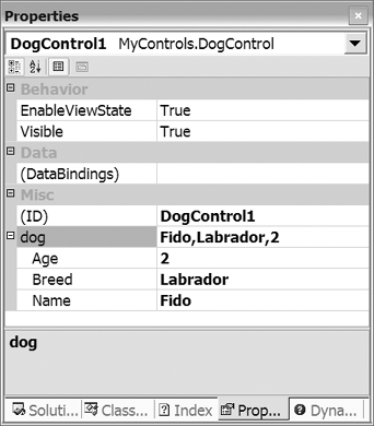
For other property types, however, you need to provide a custom converter to allow clients to specify property values within a control tag. To provide a custom converter for a property in your control, you must create a new class deriving from System.ComponentModel.TypeConverter to perform the conversions, and you must associate that type converter class with your property by using the TypeConverter attribute. For example, suppose we built a control that exposed a composite property to set the attributes of a Dog, including its name, age, and breed. These attributes could be encapsulated into a structure and exposed as subproperties , as shown in Listing 8-41. Listing 8-41 The Dog Structure public enum eBreed { Dalmation, Labrador, GoldenRetriever, Mutt, BlackLabradorRetriever } public struct Dog { private string _name; private eBreed _breed; private int _age; public Dog(string name, eBreed breed, int age) { _name = name; _breed = breed; _age = age; } public string Name { get { return _name; } set { _name = value; } } public eBreed Breed { get { return _breed; } set { _breed = value; } } public int Age { get { return _age; } set { _age = value; } } } If a custom control exposed the Dog structure as a property without adding a TypeConverter , users of this control would only be able to set the value of the dog property programmatically. For users to be able to manipulate the subproperties of the Dog structure through the designer, we must provide a way to convert the structure to and from a string representation. Listing 8-42 shows the implementation of DogConverter , a class that provides conversion between the Dog data type and its equivalent string representation (which, in this case, we have chosen to be "name, breed, age"). Listing 8-42 A Custom Type Converter for Dog public class DogConverter : TypeConverter { public override bool CanConvertFrom( ITypeDescriptorContext context, Type destType) { if (destType == typeof(string)) return true; else return base.CanConvertFrom(context, destType); } public override bool CanConvertTo( ITypeDescriptorContext context, Type destType) { if (destType == typeof(InstanceDescriptor) destType == typeof(string)) return true; else return base.CanConvertTo(context, destType); } public override object ConvertFrom( ITypeDescriptorContext context, CultureInfo culture, object value) { // Parse the string format, which is: name,breed,age string sValue = value as string; if (sValue != null) { string[] v = sValue.Split(new char[] {','}); return new Dog(v[0], (eBreed)Enum.Parse(typeof(eBreed), v[1]), Int32.Parse(v[2])); } else return base.ConvertFrom(context, culture, value); } public override object ConvertTo( ITypeDescriptorContext context, CultureInfo culture, object value, Type destinationType) { Dog dg = (Dog)value; if (destinationType == typeof(InstanceDescriptor)) { Type[] parms = new Type[]{typeof(string), typeof(eBreed), typeof(int)}; object[] vals = new object[] {dg.Name, dg.Breed, dg.Age}; return new InstanceDescriptor( typeof(Dog).GetConstructor(parms), vals); } else if (destinationType == typeof(string)) { return string.Format("{0},{1},{2}", dg.Name, dg.Breed, dg.Age); } return base.ConvertTo(context, culture, value, destinationType); } } Note that four core methods must be overridden in a type converter. First, the CanConvertFrom and CanConvertTo methods indicate what types this class can convert from and to. In our case, the purpose of providing this class is to convert from a Dog to a string and back again. Second, the ConvertFrom method requests that the class perform a conversion from a given type to the real type, which in our case will always be from a string to a Dog . Finally, the ConvertTo method involves taking a reference to the real type and returning a conversion of it into the target type, which in our case will always be a string. The one additional requirement of the designer is that it be able to generate code to create an instance of your type. To provide this information, we must also support conversion to an InstanceDescriptor , which is a class that stores information on how to create an instance of a particular class so that the designer can correctly rehydrate your class from its persistent store. In our case, we need to provide an InstanceDescriptor that describes how to invoke the three-parameter constructor of our Dog structure, shown in our implementation of ConvertTo . The last step is to apply this custom type converter to our Dog structure, which we do by using the TypeConverter attribute, as shown in Listing 8-43. Listing 8-43 Applying a Type Converter to a Type [TypeConverter(typeof(DogConverter))] public struct Dog { //... } Once a property has a valid converter associated with it, the designer lets the user modify the property value through the property window, taking whatever string is passed in, running it through the converter, and assigning it to the control's property. If you would like the user to be able to edit the subproperties of your type individually, you can derive your type converter from a special derivative of TypeConverter called ExpandableObjectTypeConverter . Figure 8-7 shows what the property editor looks like when the DogConverter class is derived from ExpandableObjectTypeConverter . Figure 8-7. Expandable Properties 8.6.3 Property EditorsSome control authors may want to take this one step further and provide their own custom editors for users to edit properties with. Instead of having users type a formatted string in the property editor, they can associate an editor with a property that can launch a form or dialog to edit the property. Several built-in editors are available, as shown in Table 8-7. Table 8-7. Built-in Editors
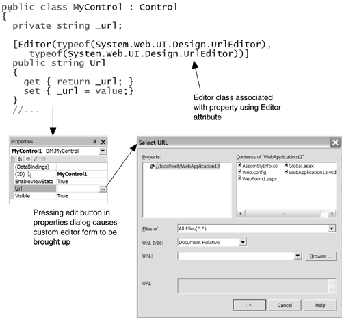
For an example of using a custom editor, consider a class that maintains a URL property. If would be nice if instead of having users type in any random string for this property, there were a selection dialog that helped them construct a proper URL. By using the Editor attribute on the string property used to access and set the URL, the control builder can associate the built-in UrlEditor class to do just this, as shown in Figure 8-8. Note that the Editor takes two parameters, the type of the editor class and the base class from which it inherits, which currently should always be System.Drawing.Design.UITypeEditor . Figure 8-8. Associating a Custom Editor with a Control Property To create your own custom editor for a property, you derive a new class from System.Drawing.Design.UITypeEditor and override the EditValue and GetEditStyle methods. The GetEditStyle returns an enumeration indicating what type of user interface the editor is going to use: modal dialog, drop-down box from within the property list, or none. EditValue takes a reference to the object it is editing and returns a new object with new values. What happens inside EditValue is completely up to you, but most often it invokes a modal dialog box with controls on it to edit the values for the object. Listing 8-44 shows an example of a custom editor for editing the Dog structure shown earlier and how to hook it up to the Dog structure using the Editor attribute. Listing 8-44 A Custom Editor Example public class DogEditor : UITypeEditor { public override object EditValue( ITypeDescriptorContext tdc, IServiceProvider sp, object obj) { Dog dg = (Dog)obj; // DogEditorDlg class now shown... DogEditorDlg dlg = new DogEditorDlg(); dlg.DogName.Text = dg.Name; dlg.DogAge.Text = dg.Age.ToString(); dlg.DogBreed.SelectedIndex = dlg.DogBreed.Items.IndexOf(dg.Breed.ToString()); if (dlg.ShowDialog() == DialogResult.OK) { return new Dog(dlg.DogName.Text, (eBreed)Enum.Parse(typeof(eBreed), dlg.DogBreed.SelectedItem.ToString()), Int32.Parse(dlg.DogAge.Text)); } else return obj; // no change } public override UITypeEditorEditStyle GetEditStyle(ITypeDescriptorContext tdc) { return UITypeEditorEditStyle.Modal; } } // To hook up this editor to the Dog structure: [Editor(typeof(DogEditor), typeof(UITypeEditor))] public struct Dog { /*...*/ } 8.6.4 DesignersFor each control you create, you can create an accompanying designer class that determines how that control appears and behaves within the designer. For many controls, this is unnecessary because the Visual Studio .NET designer creates an instance of your control when it is placed on a form and asks it to render itself. For controls whose rendering depends on runtime data population or that have no visual presence on a form, however, it makes sense to have something show up when such controls are dropped on a form in the designer. Whether this means artificially populating a control with initial data or providing a "stub" rendering indicating that it is a placeholder depends on the type of control. Creating a designer involves creating a new class derived from System.Web.UI.Design.ControlDesigner and overriding its GetDesignTimeHtml method. This method should return the HTML you want to represent your control at design time. The last step is to associate the designer with your control class by using the Designer attribute. Listing 8-45 shows a custom control class with an associated designer. This listing also demonstrates the common practice of placing the designer in a new namespace called Design within the control class's namespace. Listing 8-45 A Custom Control with an Associated Designer Class namespace Design { public class MyControlDesigner : ControlDesigner { public override string GetDesignTimeHtml() { return "<h3>MyControl in design mode!</h3>"; } } } [Designer(typeof(Design.MyControlDesigner))] public class MyControl : Control { /*...*/ } Providing a designer for a control does not change the fact that an instance of your control is created in design mode; it merely changes how that control renders itself in a designer. For controls that want to use the standard control rendering in their designer, it is possible to reference the control instance from within the designer via the Component property of the ControlDesigner class. A good example of when this would be appropriate is in the BarGraph control presented earlier in this chapter. This control renders a bar graph with data populated at runtime, so at design time there is nothing to render. To give it a visual presence in the designer, we can access the allocated instance of the control, populate it with some artificial data, and return the result of invoking the control's render function (by calling the base class implementation of GetDesignTimeHtml ). This technique is shown in Listing 8-46. Listing 8-46 Using a Designer to Artificially Populate the BarGraph Control public class BarGraphDesigner : ControlDesigner { bool bGetDesignTimeHtmlCalled = false; public override string GetDesignTimeHtml() { // populate with data the first time only if (!bGetDesignTimeHtmlCalled) { BarGraphControl ctrl = (BarGraphControl)Component; // add some artifical data ctrl.AddValue("Value 1", 10.0); ctrl.AddValue("Value 2", 20.0); ctrl.AddValue("Value 3", 30.0); ctrl.AddValue("Value 4", 40.0); bGetDesignTimeHtmlCalled = true; } return base.GetDesignTimeHtml(); } } The other type of controls that require designers are those that have no runtime rendering or whose rendering depends on too many runtime elements, making rendering in design mode impossible . For these controls, a helper function called CreatePlaceHolderDesignTimeHtml creates a standard placeholder for a control. This method takes a string and renders a gray box with the string displayed at design time, and is used by controls such as the Xml control and the Repeater control in the base class libraries. Listing 8-47 shows a sample designer that renders a placeholder. Listing 8-47 Rendering a Placeholder with a Designer public class MyControlDesigner : ControlDesigner { public override string GetDesignTimeHtml() { return CreatePlaceHolderDesignTimeHtml("see me later"); } }  |
EAN: 2147483647
Pages: 94