The Many Faces of HTML
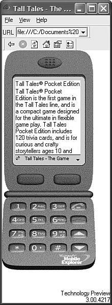
| It's important to understand that a single web page can take on many different appearances, depending on who views it and what they view it with. Figure 1.4 is the same web page pictured earlier in Figure 1.1, as seen in Microsoft's Mobile Explorer emulator, which you can use to test web pages for mobile devices. Most mobile phones have screens less than 200 pixels in width and height, which limits them considerably when it comes to displaying web pages. Figure 1.4. The page from Figure 1.1 looks very different in the Pocket PC version of Internet Explorer.
As you can see, the mobile phone view on the web page is considerably different from its desktop counterpart. In fact, the page is displayed purely as text with no images because there is not enough screen space to accommodate images. This distinction in web page views is important to grasp early in your HTML education because it hammers home the point that you don't have a whole lot of control over how your pages are viewed. Or, more accurately, you don't have much control over the size of the area in which your pages are viewed. Beyond that, browsers are reasonably consistent in rendering the actual content on your pages, as well as deciding what is most important (text) and what can be overlooked (images) if screen space is limited.
What this means is that most web pages will look the same across major desktop web browsers, and they will also look the same on PCs, Macintoshes, and UNIX machines. The page in Figure 1.1, for example, would look the same on any of these machines as long as the size of the viewing window, fonts, and program settings were the same on each machine. Now for the bad news. Even users of the same version of the same web browser can alter how a page appears by choosing different display options and/or changing the size of the viewing window. All the major web browsers allow users to override the background and fonts specified by the web page author with those of their own choosing. Screen resolution, window size, and optional toolbars can also change how much of a page someone sees when it first appears. The mobile phone example in Figure 1.4 illustrates this point quite clearly.
To continue the study of how web pages change with different browsers and display settings, take a look at the page shown in Figure 1.5, which is viewed at 800x600 resolution with a large size font in the Firefox browser. Compare this figure with Figure 1.2, which shows the same page at 800x600 in Internet Explorer with default font settings. Unfortunately, you as a web page author have no direct control over the display settings on a particular computer; each individual who looks at your pages can always choose whatever browser settings he or she prefers. Your job is to design pages so that they look as consistent as possible across major browsers with their default settings. Figure 1.5. The page from Figure 1.2, displayed by Mozilla Firefox with larger fonts.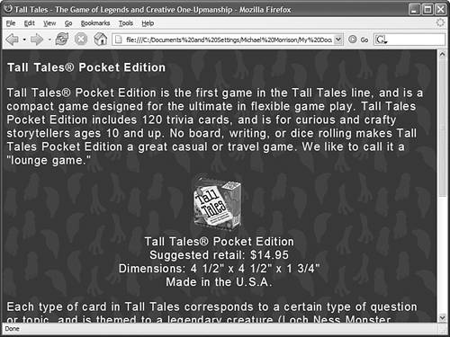 You can't even assume that people will be viewing your web pages on a computer screen. The page in Figures 1.1, 1.2, and 1.5 might also be read on a low-resolution television screen or a high-resolution paper printout (see Figure 1.6). Figure 1.6. Web browsers usually change the background to white when sending pages to a printer.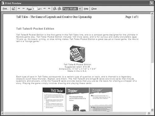 As you learn to make your own web pages, remember how many different forms they can take when people view them. Some web page authors fall into the trap of trying to make pages appear "perfect" on their computer and are sorely disappointed the first time they discover that it looks different on someone else's screen. (Even worse, some authors put silly messages on their pages demanding that everyone change the size of their viewing window and font settings to match the author's computer, or proclaiming, "This page is best viewed by such-and-such." If you've ever encountered such messages, I'm sure you ignored them just like everyone else does.) In Part III, "Creative Web Page Design," you'll find many tips and tricks for ensuring that your pages look great in the widest variety of situations.
|
EAN: 2147483647
Pages: 345