| The StatusBar control can be used to display a status bar on a form. The StatusBar control has a Panels property that can be accessed at runtime. It represents a collection of individual StatusBarPanel objects. The StatusBarPanel class defines several properties that can be used to manipulate the panels, including the following: -
Alignment controls whether text in a panel is left, center, or right aligned. -
Autosize controls whether the panel automatically sizes itself to occupy the remaining area on the status bar. Choices include None and Spring . -
BorderStyle controls the type of border used for the panel. -
Text controls the contents of the panel. -
Width and MinWidth control the width (in pixels) of the panel. Step 1: Adding the StatusBar Control To add a status bar to a program, use the StatusBar control. The StatusBar control is a visible control that positions itself as an empty window aligned with the bottom of the form. To configure the individual panels on the status bar, you must modify the Panels collection. The StatusBarPanel Collection Editor can be launched by selecting the Panels collection using the Properties window (see Figure 8-9.) Figure 8-9. The StatusBarPanel Collections editor. 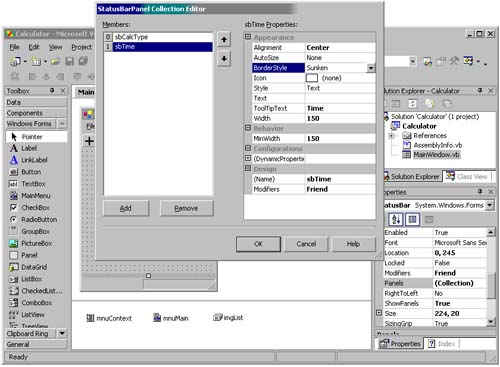 Table 8-3 summarizes the properties we set for our two panels. Table 8-3. Property Values for the Calculator Status Bar Panels | Panel | Name | Other Properties | | | sbCalcType | Autosize: Spring BorderStyle: None Style: Text ToolTipText: Last operation Width: 100 MinWidth: 10 | | 1 | sbTime | Alignment: Center BorderStyle: Sunken Style: Text ToolTipText: Current Time Width: 150 MinWidth: 150 | Step 2: Displaying Information in the Status Bar To display information in a status bar panel that has a Style property of Text , we must modify that panel's Text property. For Calculator , we will modify the SetGUIChecks procedure to write the calculation type to the first panel. Each toolbar button's Tag property contains text that we can use when displaying the operation type to the status bar panel. Private Sub SetGUIChecks(ByVal mnu As MenuItem, _ ByVal btn As ToolBarButton) ' Unselect all buttons Dim i As Integer For i = 0 To 3 toolBar.Buttons(i).Pushed = False Next ' Update toolbar and statusbar btn.Pushed = True statusBar.Panels(0).Text = btn.Tag End Sub Step 3: Using the Timer Control to Display Time The Timer control is an invisible VB.NET control that causes an event to be generated at regular intervals. In our case, we will use it to assist us in keeping the clock on the status bar accurate. The Timer control is fairly simple. It has two properties of interest: Enabled and Interval . When the timer is enabled, it generates a Tick event every n milliseconds , where n is the Interval value. Figure 8-10 shows the Timer control on our MainForm and its associated properties. We selected an interval of 1000 so that the Tick event will happen once every second. Figure 8-10. Using the Timer control. 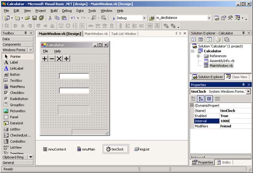 In the Tick event handler, we have placed the following code. It accesses the current date and time via the Now property, and then uses the ToString method to convert it into a string representation of time. Finally, it places the information into the appropriate status bar panel. Private Sub timClock_Tick(ByVal sender As System.Object, _ ByVal e As System.EventArgs) Handles timClock.Tick statusBar.Panels(1).Text = Date.Now.ToString("t") End Sub At this point, the Calculator program is complete. If you execute it, your dialog should resemble that shown earlier in Figure 8-6. | 
