Can I Click on It?
| When people don't know what's clickable on a site, they must work harder and guess. They can easily miss what they are looking for, give up prematurely, or think that they have explored all options when they haven't. The standard paradigm of underlining links and using blue link color provides a strong visual cue to their functions. Don't use blue for nonlink text because blue is still the color most strongly associated with clickability. That said, blue is not always the desired color for links. For reasons such as branding and aesthetics, blue links may be unsuitable. Bolded text also indicates clickability. Highlighting text when the pointer hovers over it to indicate links is also helpful, though it should never be the only indication of clickability because users would then need to minesweep the screen to find the links. Graphical interface elements that appear raised or otherwise stand out also imply clickability. Users usually perceive standard button shapes as clickable, as well as anything else that can be clicked in other popular user interfaces. In sum, make sure that people can easily tell what's clickable and what's not. Don't force them to click everything on the screen to figure out where the links are. Give links visual treatments that are commonly associated with click-ability: mainly colored text and underlining. Don't depend solely on the hand cursor to indicate links. Even experienced users don't always notice when the pointer changes to a hand, and to novice users, the pointer and hand mean the same thing.
Make sure that people can easily tell what is clickable and what is not. Don't force them to click everything on the screen to figure out where the links are.
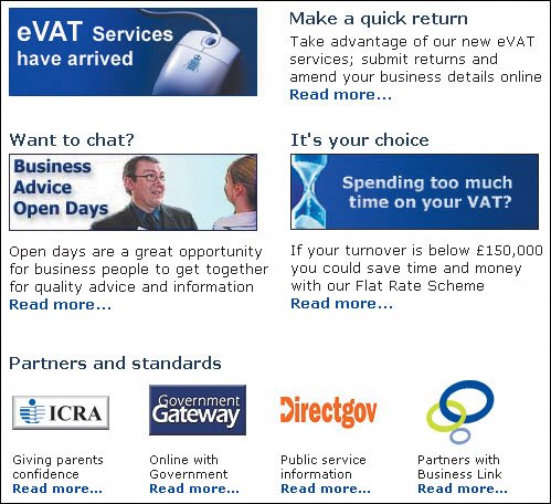
(Facing page, top) In our user testing, people on this site complained that there wasn't a way to apply for an account online and thought that they had to contact a bank representative. They didn't realize that the orange rectangular box was a button. Because of its flat appearance, people thought that it was simply a static graphic used to call attention to the Contact link next to it. When comparing these two links, the underlined colored text has a strong perceived affordance of clickability, while the flat box does notit seems to be purely decorative. Most users would probably ignore the Apply graphic even without the underlined text next to it. But when the box is paired with something with a strong perceived affordance of clickability, their attention will almost always be drawn to the latter. 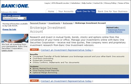 www.bankone.com (Facing page, bottom) The blue bulleted list on this site looks like links and the users we tested were perplexed that clicking on them didn't take them to a new page. When nothing happened, a few people even thought that the site was not functioning. The color blue has a strong perceived affordance of clickability. Don't use it for nonclickable items. 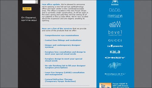 www.san-diego-vision.com The users in our tests didn't know that the headers on this site were active because they lacked the perceived affordance of clickability. They were not underlined, so people simply thought the bolded text was headers. The instructions say to click Search to get job openings, and people were perplexed when they didn't see a button to activate the request. 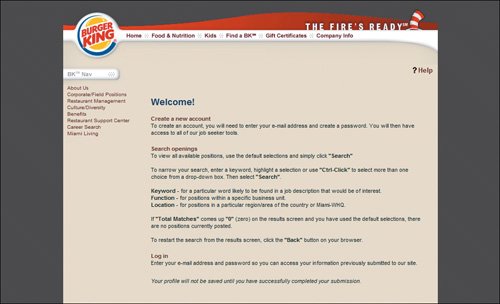 www.bk.com (Facing page, top) This is an example of the misuse of visual metaphors. While the rectangular boxes with beveled edges look like buttons, they are not. The instructions say to click something else. 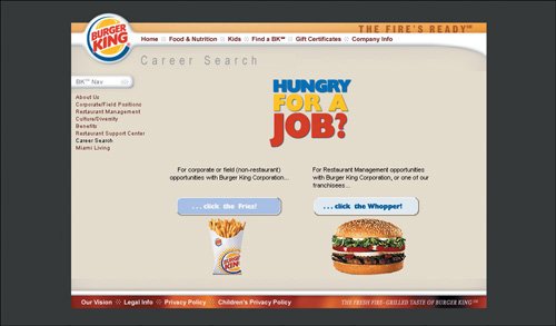 www.bk.com Can you tell which elements here are clickable? If you guessed any of the graphics or bolded headers, you are wrong. The only thing active is the "Read more..." text. It's good that the clickable text is blue, but what about the other blue bolded items? It's important to use color and graphical treatments consistently to denote different things. www.hmce.gov.uk |
EAN: 2147483647
Pages: 107