The Scale of Misery
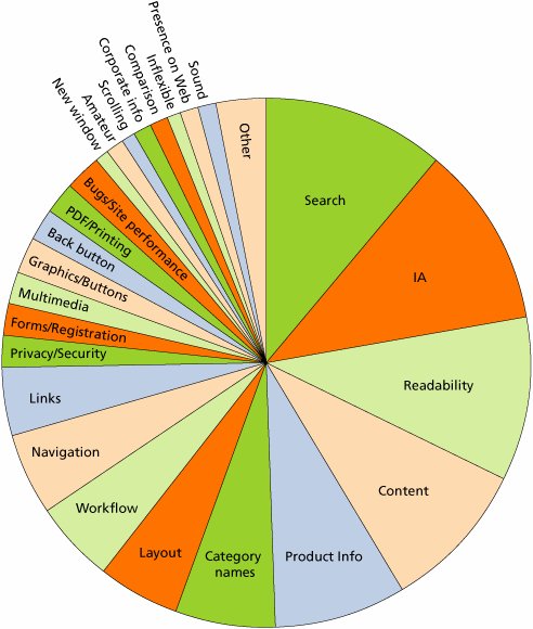
| The combined severity points across all usability problems can be seen as an estimate of the total misery of the Web user experience today. We already know from Chapter 2 that the situation is pretty bad because users repeatedly fail their tasks or give up on sites. This pie chart shows what types of problems cause users the most trouble. Usability problems weighted by their severity score. Each slice indicates the percentage of the total misery imposed on users by each type of design mistake. The last slice represents the 4 percent of the total score that was due to various miscellaneous issues that defy classification. In the severity scale we prepared for this book, Search was the worst offender, sharply followed by confusing information architecture, low readability, and uninformative content. In other words, almost three-quarters of the usability issues that people encounter have to do with basic user goals: finding, reading, and understanding information. Most of these problems delayed or annoyed users, but they eventually overcome them in many cases. For example, users might get lost in a site's information architecture but still find what they want through Search.
You must look beyond Search and findability to determine why your site isn't fulfilling its business potential. Much of your losses are probably caused at the page level. Certainly, some very bad design mistakes are so small or infrequent that they didn't rack up enough points to account for at least one percent of the total. Aggressive, offensive, and intrusive ads, for example, accounted for only four-tenths percent of the severity score and are thus not shown in the pie chart. The low score for bad ads is based on two things. First, we didn't test very many content sites in this study, so most of the sites we used didn't have that many ads. Second, ads must be extremely obnoxious to get users to leave a site. This does not mean that users don't find them irritating. They do. But most have developed a defense strategy of ignoring anything that looks like an ad which is why we have a usability guideline advising that none of your design elements do. To get a better grasp on the big areas of design mistakes in current Web sites, we then grouped the problems into larger categories. As this pie chart shows, Search was still such a big problem, it's literally in a category all by itself. But in this grouping, findability was the biggest issue, accounting for 26 percent of user misery. Findabilitywhich includes design elements such as information architecture, category names, and linksis one of two ways users get to where they want to go on a site. Search, of course, is the other. When we add up the two, we see that 37 percent of people's difficulties on the Web relate to getting to the right page. Usability problems weighted by their severity score and grouped into larger categories of design mistakes. Combining usability issues into broader categories shows the major areas that caused confusion and dissatisfaction among users. 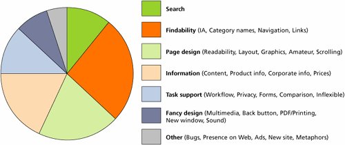 Another 62 percent of user misery is caused by bad design at the page level or bad design of a progression of pages in a workflowcases in which users arrived at the right location but it didn't meet their needs. This means that you must look beyond Search and findability to determine why your site isn't fulfilling its business potential. Much of your losses are probably caused at the page level by information that is incomprehensible, lowers trust, or simply doesn't provide a crucial answer that users want. Conversely, just one percent of users' difficulties related to issues caused by companies having multiple, inconsistent Web sites, so this is a less severe problem.
One piece of good news: Fancy design now causes only eight percent of users' misery, down from its glory days in the dot-com bubble, when it was much more commonly used. We still need to guard against the reemergence of excesses like splash screens and annoying animation, but for the moment they are mainly a thing of the past. |
EAN: 2147483647
Pages: 107
- Integration Strategies and Tactics for Information Technology Governance
- Assessing Business-IT Alignment Maturity
- Linking the IT Balanced Scorecard to the Business Objectives at a Major Canadian Financial Group
- Technical Issues Related to IT Governance Tactics: Product Metrics, Measurements and Process Control
- The Evolution of IT Governance at NB Power