Eight Problems That Haven t Changed
Eight Problems That Haven't ChangedEight of the original usability problems are as important today as they were when we first identified them. Though some of these bad design practices are less common on the Web now, others are actually more of a problem because continued abuse has made users ever more sensitive to them. Areas that still cause major problems include:
Links That Don't Change Color When VisitedThe oldest usability guideline for any type of navigational design is to help users understand where they've been, where they are, and where they can gotheir online past, present, and future. The three are somewhat interrelated: A good grasp of past navigation helps you understand your current location, since it's the culmination of your journey. Knowing your past and present locations in turn makes it easier to decide where to go next. On the Web, links are a key factor in this navigation process. Users can stop using links that proved fruitless in the past. Conversely, they might revisit links they found helpful in the past. Most important, when users know which pages they've already visited, they are less likely to unintentionally revisit them. Generally, Web browsers are severely deficient in supporting user navigation, but they do provide one important navigation feature: They allow designers to change the color of a page link when a user has already visited the page. Changing the color of visited links has been part of Web browsing since Mosaic arrived from National Center for Supercomputing Applications (NCSA) in 1993. Currently 74 percent of Web sites use this design approach, making it a convention that people have come to expect. On sites that violate this convention, however, there can be serious usability problems. Users in our testing unintentionally revisited pages and got lost more easily, misinterpreted or overlooked the difference between similar links if they were unsure which they had already visited, and gave up on the site faster. They felt less mastery over sites that failed to reflect their actions and help them navigate. Such usability problems are aggravated for users with weak short-term memory, who often can't remember what they've clicked without a visual representation. Of course, all humans suffer from weak short-term memory to some degree, which is why all users are better served by changing link colors. Since this definitely impacts some people more than others, it's particularly important to change link colors if your audience includes, for example, many older users, as our research with senior citizens shows. Unchanging link colors create navigational confusion because users don't quite understand their different choices or where they are. This is as serious a usability problem as it has ever been, so it continues to deserve three skulls.
The Exception: Command-Oriented FunctionalityCommand-oriented functionality is the exception to this rule. Showing visited areas is unnecessary for applications in which people might want to repeat actions multiple times. When deciding whether to show visited areas, consider if the action takes people to other screens or merely lets them repeat activities on the same screen. If users are going to other areas, especially to get content, they might only need one visit, so showing a visited link is appropriate. However, if people want to repeat an activity on the same screen, showing visited links is unnecessary. Breaking the Back ButtonSome things in life can't be undone: For example, once you sell stock from your brokerage account, those shares are gone and you can't take them back if the price goes up. On the Web, however, people should be comfortable knowing that they can undo or alter their actions. Encouraging users to explore a site freely, secure in knowing that they can escape any problems they may encounter, is one of the most fundamental principles of human-computer interaction. In traditional software applications, the "undo" command serves this purpose. If you are exploring, say, a graphics program, you can color parts of a picture red and see if you like it. If not, Command-Z to the rescue and the red gets zapped. Since the early 1980s it has been a firm design guideline for all software platforms to support "undo" as much as possible in all applications. Backtracking serves the purpose of "undo" in hypertext navigation. You can move around in the information space as much as you like and never truly get lost because you can retrace your path and revert to safe ground. In Web browsers, backtracking is implemented through the Back button. Users just keep clicking this button until they return to the place they want to be. Expert users can also click the pointer over the Back button to pull down a menu of their full backtrack history and revert directly to a previous location.
Back is the second most used feature of Web browsing. Assuming, of course, that it works as intended. In statistical studies, the Back button is usually the second most-used feature of Web browsing. (The most-frequently used feature is links to new pages.) In user testing, we often see people click Back repeatedly even when there is a direct link to the place where they want to return. At first, this behavior seems paradoxical because users must click more and spend extra time backtracking. But when we factor in the brain time required for people to use direct links on different sites, we understand why they prefer Back even to a faster way. Back provides two huge benefits and one smaller benefit:
Back, then, is the user's lifeline. No matter what happens, Back will save you. Assuming, of course, that it works as intended. Unfortunately, Web sites can employ several coding tricks that disable Back buttons and seriously thwart users' movements.
The most insidious way to disable the Back button is to remove it from the browser window through a JavaScript instruction to hide the chrome. Though it has connotations of frivolous decorations like the tail fins on 1960s Cadillacs, the chrome actually includes several of the most useful features of Web browsing, such as Back, Forward, Print, Refresh, and Change Font Size. A browser window without its chrome cripples users. (The exception is certain types of Internet applications that technically are displayed in browser windows but don't involve hypertext navigation or the viewing of documents. These are sometimes presented better without the chrome because they are not browsing tasks, even if a browser's code is used as a rendering platform.) Clicking a link to open a new browser window also disables the Back button because the new window typically doesn't inherit the history of the original window. Making users open windows that they didn't ask for is a mistake in its own right, as discussed in the following section, so this is just one reason to avoid this design technique. Finally, the Back button can be broken through the use of redirects that are embedded on a Web page instead of being communicated behind the scenes by server redirects. If a Web page has moved, it is certainly a good idea to leave behind a redirect to avoid broken links. But this redirect should be implemented as an HTTP 301 or 302 response from the Web server because these codes instruct the browser to move to the new URL immediately and forget about the old one. (The difference between the two status codes is that 301 indicates a page that has moved permanently, whereas 302 indicates a page that has moved temporarily.) Unfortunately, some Web sites implement the redirect by placing a meta-tag refresh instruction on the old page that causes it to be immediately replaced by the new page. When users try to revert to a previous location, their first click on Back will take them to the old page on which the refresh code was embedded. Of course, loading this page activates the forwarding instructions, and the user is immediately bounced to the new location. But that's the page the user was just trying to leave! Every additional click on Back has the same effect, so the user is trapped on this new page. In user testing, we observe significant confusion whenever the Back button is not available or doesn't work. Expert users may know how to overcome the problems we have just described, but most users simply feel stuck and abandoned. Breaking the Back button continues to cause severe usability problems and still deserves three skulls. Opening New Browser WindowsWhen users click a link or a button, they usually expect a new Web page to appear in place of the last. To undo their action, they click the Back button, as discussed in the previous section. Violating these expectations intrudes on their experience and free navigation through cyberspace.
Designers often tell us that they open new windows so they don't lose visitors to their site. But ultimately that's a lost cause. If people really want to leave, they will. Unfortunately, many Web site designers insist on displaying new information in a new browser window instead of reusing the existing window. Sometimes these are small pop-ups, a phenomenon that's annoying enough to warrant its own separate discussion. (See "Pop-Up Windows" in this chapter.) Other times, the new page is displayed in a new, full-sized browser window. Designers often tell us that they open new windows so they don't lose visitors to their sites. For this reason, new windows are particularly common when linking to material on other Web sites. But ultimately it's a lost cause to trap users on your site. If people really want to leave, they will. And if users follow a link to another site and want to return to your site, they will invariably do so by clicking Back, since that's the most popular way to revisit pages. Proliferating browser windows present a plethora of usability problems. Most fundamentally, they pollute users' workspaces with more windows than they request, sometimes causing crashes or memory errors. Users are left to clean up these surplus windows, assuming that they can even find them in the system taskbar. Web browsers include a perfectly fine feature to open a link in a new window: The user can right-click on the link. Admittedly, this is an expert-user feature, but only experienced users should use multiple windows in any case. In testing, we often see experienced users open additional windows to parallel-browse multiple sites or products, or to preserve the old context while exploring a new direction. Bottom line: If users want extra windows, they can ask for them. Since Back will only take users as far as the first page displayed in a window, expert users may realize that they must close the offending new window in order to get back to the original. But most users don't really understand how to manipulate multiple windows and are focused on working in the front-most window on the screen. If they can't go back, they are trapped. If the new window doesn't take up the entire screen or completely obscure the original window, people sometimes return to it by clicking in the part of the window that is visible (although this is often by mistake when they are trying to use the scrollbar in the front-most window). Clicking in another window pops it to the front and hides the window that was previously on top. This is a very simple way of multiwindowing for experienced users, but even some of them cannot always keep track of all the windows on their screen. Commonly, after a user has opened a separate window, he accidentally or deliberately pops the original window back on top, obscuring the new one. Later he might click a link that causes information to appear in the new window, but because it's now obscured, he never sees it. The designer may have intended to make the information more prominent by displaying it in a new window but in reality the user doesn't even know it's there. The Microsoft Windows operating system lists currently open windows at the bottom of the screen in the taskbar. This bar is small and subtle, however, and placed in an out-of-sight-out-of-mind location. From user testing, we know that people often overlook the taskbar and its reminder that important content is available in an obscured window.
As we have seen, opening new browser windows has the following ill effects:
All these usability problems are as bad as ever, and we see them in test after test. The design mistake of opening new browser windows thus continues to deserve a full compliment of three skulls. The Exception: PDF and Similar DocumentsIn user testing, we often observe that when people are finished using Adobe PDF files, Microsoft Word memos and PowerPoint slides, Excel spreadsheets, and similar documents, they click the window's Close box instead of the Back button. This gets them out of the document, all right, but not back to the Web page where they started. Blowing away browser windows is particularly bad on intranets, where users often have to log in or jump through other hoops to access document repositories. Because people frequently close document windows, the best guidelines for linking to non-Web documents are:
All these guidelines stem from the same underlying phenomenon: Non-Web documents are native PC formats. These formats have their own applications, each of which gives users a set of commands and navigation options that are different from the ones for browsing Web sites.
When users work with, say, a PowerPoint slideshow, their focus is on PowerPoint's slide-manipulation features. Because the experience is so similar to that of working with their own local slides, it's easy to tune out the fact that they downloaded these slides from a Web site. When they're finished with the slides, they do what one always does when finished using PowerPoint: reach for the Close box. When a PC-native application opens inside a browser window, a secondand equally unfortunatephenomenon occurs. If users can still see browser commands and buttons, they'll sometimes assume they can use these features to manipulate the document. Unfortunately, features like "Make Text Bigger," "Print," and "Find in Page" don't work while in a native application document. Given this, it's better not to show users familiar (and nonfunctional) browser buttons while they're working with a non-Web document. Remember that this is an exception, not a guideline. The guideline for Web pages is to keep them within the same window and avoid opening new browser windows. Pop-Up WindowsIf anything, pop-up windows are an even worse offense against usability now than they were in the past. Users have become ever more annoyed with pop-ups, and many have gone so far as to install special pop-up blocking software. Since we know that people hate installing new software, the fact that they are doing so is testimony to how far they'll go to rid themselves of pop-up intrusions. To most users, the popping aspect of pop-ups is reason enough to avoid them. Pop-ups often come as a surprise and deviate from what users expect on the Web, which is to have information rendered in the main browser window. Furthermore, pop-ups have seedy connotations because they most often appear on gambling and porn sites. Citibank warns its customers against pop-ups because they are often used for "phishing"tricking people into providing sensitive information by masquerading as a trustworthy business or person. This is just one more example of why pop-ups have a bad name. Obviously, when big, respected companies warn against pop-ups, users are going to be even more reluctant to interact with them on other sites. A bit of this warning is going to keep nagging them and reduce their trust in any site that throws them a pop-up, even if that site is respectable and doesn't intend any harm. 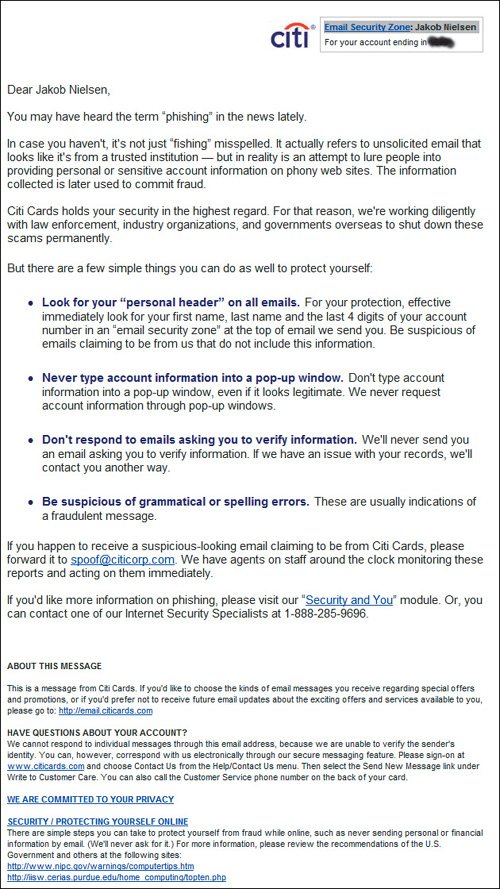 www.citicards.com Users with many different types of disabilities have particular problems managing extra windows. People with motor skills impairments certainly don't relish having to struggle to click unwanted Close boxes. And low-vision users may not even know that a pop-up has appeared if they have zoomed in their screen magnifier to inspect a different part of the screen. Finally, blind users are severely impacted by the additional cognitive load of having to cope with multiple windows and remember what information was read aloud from which pop-up.
Many users close pop-ups as fast as possibleoften even before the content has been rendered. The fact that it is a pop-up is reason enough to want it gone, and fast. Empirically, we see many users close pop-ups as fast as possibleoften even before the content has been rendered. The fact that it is a pop-up is reason enough to want it gone, and fast. Pop-ups actually can be used legitimately in interaction design. In the old days, a pop-up was a good solution to display a small amount of supplementary information while keeping most of the user's primary workspace in view. Two classic examples of legitimate use are for help information and glossary definitions. Users like to read help in a small window, so they can refer back to the problem without losing the context. Sad to say, even good pop-ups are rarely appropriate these days, however, because evil pop-ups have tarnished their reputation. One e-commerce site recently started losing significant sales because it used pop-ups for a critical element of its checkout process. This design had worked reasonably well with customers in the past, but suddenly many users were not seeing the pop-up information, either because they employed pop-up blockers or manually killed them off without reading them. Pop-ups have always been annoying enough to deserve three skulls and they are now working so poorly that we ought to give them four. But since the rating scale doesn't go that low, we'll have to settle for three.
Design Elements That Look Like AdvertisementsWeb users are extremely goal oriented. They look for the information they care about and ignore anything others want to push on them. In fact, users don't just passively ignore unwanted information; they have evolved an active system of self-defense against it. That's because on the Web they are constantly barraged with attempts to capture their attention and divert it from their own goals. Banner Blindness and Other User Ad RadarMost famously, users exhibit incredibly powerful "banner blindness." Eye-tracking studies have recorded microseconds-long fixations inside banners but almost never longer gazes or reading. Users dodge even the most obnoxiously flashing banners by training their eyes to avoid this attack on the senses. "Banner blindness" has expanded beyond the deliberate act of not looking at banners to encompass avoidance of anything that usually signals irrelevant information or advertisements. People also disregard colorful boxes in the margin of the page because they are commonly used in ads. In fact, anything that's overly large or colorful risks being ignored, particularly if it includes animation. We frequently see users try anything except clicking an item that's clearly what they want on a Web page. When questioned after the test, they tell us again and again, "Oh, I saw that, but it looked like an ad, so I ignored it." Users have been conditioned to assume that all useful parts of Web sites appear as plain text, with the exception of fairly small "Add to Cart" buttons next to product photos. We have even observed people not buying products on e-commerce sites because they couldn't find the Buy buttonit was too big and colorful, so they subconsciously filtered it out.
It is irrelevant whether the design element actually is an ad. Since people don't read it, they won't ever know. Ironically, in these situations, it is irrelevant whether the design element actually is an ad. Since people don't read it, they won't ever know. Their reflex reaction to disregard it prevents them from ever considering reading it. The highly graphical rectangular boxes at the top of this page can easily be confused with external advertising because they look like ads. If you want people to notice something on your site, make sure it doesn't look like advertising; people tend to divert their attention from ad-like items. Simple text links on appropriate areas of the page can attract more attention than highly graphical or dynamic elements because they're contextual and appear more credible. In addition, the Search box is not standard and therefore can easily be missed. 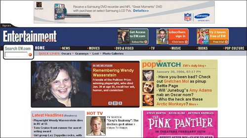 www.ew.com There's also a technical reason to avoid elements that look like ad banners: Some users have advertising-blockers installed to prevent ads from ever appearing on their screens. This software can't read the contentall it knows is to discard any graphic that has the dimensions of an approved advertising banner (say, 728-by-90 pixels). If anything, users have become more adept at banner blindness and other ad avoidance techniques over time. Including elements that resemble ads is a sure way to inflict usability damages on a Web site, so it still merits all three skulls. Violating Web-Wide ConventionsLet us remind you of Jakob's Law of the Internet User Experience: Users spend most of their time on other Web sites. (The law is discussed in more detail in Nielsen and Marie Tahir's Homepage Usability: 50 Websites Deconstructed.) Even if users come to your site in droves because it's the biggest and most prominent on the Web, their accumulated visits to other sites will still vastly outnumber their visits to yours. This means that users gear their expectations for your site by what they have learned to expect elsewhere. If they are accustomed to prevailing design standards and conventions, they'll expect to encounter those on your site as well. With 1 minute and 49 seconds on average to convince potential customers that you are worth doing business with, don't waste it on making them struggle with a deviant user interface.
We continue to see users get confused when sites do things in unexpected ways and to see them pleased when they immediately understand a site because it does things they expect. Therefore, we continue to give three skulls to the problem of violating Web-wide conventions. This design neglects interaction conventions, making it unnecessarily difficult for people to find what they need. The words Lunch, Dinner, and Navigate provide strong cues for clickablity when they're not selectable. The only selectable items on this homepage are five of the eggs. If you happen to click on the egg holder at the wrong place, you might think that there is no more information than what's shown here. Obscure interface elements degrade the user experience and discourage people from using the site. When information is hidden, people assume it's not there. Interactions that are predictable empower people to navigate without fear of encountering obstacles. 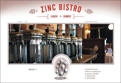 www.zincbistroaz.com Vaporous Content and Empty HypeOne of the biggest problems on the Web is that companies don't want to come clean and say what they are doing in plainspoken language on their sites. This continues to be critical because Web users are extremely impatient and allocate so little time to each page. The more florid the descriptions, the more users tune them out and go elsewhere. It's essential to quickly state what you are offering users and what's in it for them. Interestingly, one of the oldest guidelines for sales and marketing in any medium is to sell the benefits, not the features, so we shouldn't really have to harp on this here. Sadly, the Web is so smothered in vaporous content and intangible verbiage that users simply skip over it. Of course, the more bad writing you push on your users, the more you train them to disregard your message in general. Useless content doesn't just annoy people; it's a leading cause of lost sales.
The more bad writing you push on your users, the more you train them to disregard your message. Useless content doesn't just annoy people; it's one of the leading causes of lost sales. (Facing page) Montblanc makes nice pens, but it's impossible to find out anything about them on the company's Web site. This screen is the category page for their collection of classic designs, but users can get an overview of the types of pens that are available (fountain pen, ballpoint, pencil, highlighter) only by clicking through the tiny triangular arrows next to the photos. Also, the site does not provide the type of information users are looking for, such as size, color, or price. 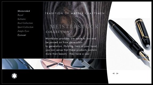 www.montblanc.com The practice of making Web sites more visible by search engines is called Search Engine Optimization (SEO). The more concrete your text, the better your site will rank in search engines. As we saw in Chapter 2, users researching a potential purchase almost always start with a search. This makes SEO the No. 1 marketing technique for Web sites, and using clear, basic words is the No. 1 SEO technique because these are the words that people enter into search engines. Using fluffy language doesn't just hurt you while users are on your site. It can prevent users from finding your site in the first place because sites that use plain language will outrank you in the search engine results page listings. Dense Content and Unscannable TextDense blocks of text are a major turn-off for Web users. The plain look of a page packed with type immediately suggests to users that they will have to work hard to extract the information they want. In information-foraging terms, blocks of text are analogous to the hard shell of a tortoise. Many predators will let the sluggish critter go because it's simply not worth their time and effort to break open the shell to get at the meat. Similarly, Web users often think that digging through dense type takes more time than it's worth. Government agencies are often the worst offenders in this category. This is probably because civil servants are used to working with long, dense documents that are written for internal audiences and richly salted with specialized bureaucratic terminology. When government agencies tone this down a little, they think they have made the content more accessible to the average Web reader. And they have, but not enough. Bureaucratese must be toned down a lot. This is a classic example of a usability problem caused by designers and authors being too steeped in their internal culture to recognize the huge gap between it and the larger world. Web text should be short, scannable, and approachable. Typically, you should write half as many words for the Web as you would for print. If targeting a broad consumer audience that includes people with no or little education, it's better to aim at 25 percent of the print word count. And in Web writing, it's always best to start with the conclusion, so that people who read only the first line or two on a page still get the main point. Until Web content is written clearly and concisely, this remains a three-skull problem. The U.S. Social Security Administration's information about receiving benefits abroad is written at the reading level of a college senior. Basically, it requires a college degree to easily understand this Web page. The text here is not horrible compared to that on some federal government sites. For example, this page does start with the conclusion. Still, many sentences cry out for a rewrite. At 61 words, this is the worst offender: "For example, if you are entitled to worker's benefits and are a citizen of one of the many countries with which the United States has a reciprocal arrangement to pay each other's citizens in another country, your Social Security benefits may continue after you leave the United States (see a list at Your Payments While You Are Outside The United States)." 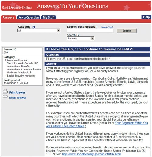 ssa-custhelp.ssa.gov The British government provides information about pensions abroad at an 11th grade reading level. This is still too complicated for information targeted at a broad audience of senior citizens, who are less likely than younger people to have completed high school. Aging can also diminish any elderly person's ability to read complicated text. Our research on low-literacy users indicates that it's best to write for an eighth-grade reading level when targeting a broad consumer audience (and taxpayers are the broadest audience of them all). Still, the British government's site outdid that of the American Social Security Administration. For example, the conclusion it begins with"If you are retiring abroad, you can continue to receive your UK state pension"is stated clearly and in larger font than the text that contains the various exceptions to this rule. 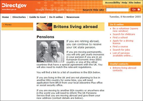 direct.gov.uk |
EAN: 2147483647
Pages: 107