What is a Gantt chart?
|
A Gantt chart, as seen in Figure 5-5, is used to show the project schedule in a graphic form.
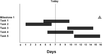
Figure 5-5: GANTT CHART
It is probably the most used graphic report in project management and may be the most used of any of the reports used in project management. The Gantt chart is about 100 years old and was invented by Henry L. Gantt in 1917. Back then the charts were, of course, drawn by hand instead of computer. Today every project management software package produces the Gantt chart. It is clearly the favorite graphic for displaying the project schedule.
In its simplest form the Gantt chart consists of a calendar as the horizontal axis and a list of tasks along the vertical axis. There are one or more lines allowed for each task. In the main part of the Gantt chart, each task is represented by a bar or rectangle. The bar or the activity bar is positioned with the left end over the date on the calendar axis when the activity starts. The right end of the activity bar is positioned over the date that the activity ends. Thus the length of the bar represents the elapsed time of the activity and also shows the approximate duration of the activity. Most representations of the Gantt chart show the activity bar through the nonworking days. This means that the length of the Gantt bar for an activity will be equal to the duration plus the nonworking days plus any scheduled interruptions of the activity.
Tell me more …
The Gantt chart is very helpful for representing the schedule. It makes it easy to see when an activity is scheduled to start and when it is scheduled to end, and it also shows which activities should be in progress on a given day. If a vertical line is drawn over the calendar date for today, it can be easily seen which activities are complete, which are ahead of schedule or behind schedule, or how soon activities are scheduled to begin or finish.
If a vertical line is drawn through a given day, the activities that are scheduled to be taking place simultaneously will have the line pass through them. In this way the need for simultaneous resources can clearly be seen. The Gantt chart can be used in conjunction with a resource histogram, which is discussed later in this chapter, to show the utilization of resources and the schedule simultaneously.
The Gantt chart does not normally show the logical interdependencies between the predecessor and successor activities very well. If that is our interest, it is better served by the network diagram, which shows logic nicely but does not have a time scale axis like the Gantt chart. In the later versions of Microsoft Project, logical arrows have been added to the Gantt chart. This will undoubtedly and perhaps unfortunately force all other producers of software for project management to do the same. These logical connections are useful only for seeing the relationships among a very few activities. When the schedule becomes typical and has several hundred activities, the arrows connecting the activities will be going from page to page and become difficult or impossible to follow. The Gantt chart can be annotated with hundreds of pieces of information about each activity. In Microsoft Project there are over 200 pieces of information that can be attached to any of the activity bars, and the data can be placed in the four positions around the bar as well as inside the bar itself. The bars can also be shown in many colors to indicate various conditions and data. The ends of the bars can be given distinctive shapes to indicate other conditions as well.
Milestones can also be shown on the Gantt chart. A milestone is an activity in the schedule that has a duration of zero. Naturally this would be difficult to show since an activity with a duration of zero has a length of zero and is therefore invisible. Milestones are automatically plotted by a special symbol, usually a diamond shape or a triangle. Milestone charts are discussed later in this chapter.
The Gantt chart (see Figure 5-6) can also show summary activities. These can be represented in a distinctive way so that they are not confused with the scheduled activities. Summary activities are discussed later in this chapter.
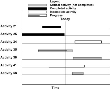
Figure 5-6: GANTT CHART
In addition to printing the textual information about actual start dates, actual finish dates, remaining duration, or percent complete, progress on an activity can be shown by placing a small bar inside the activity bar with the length of the bar proportional to the percent complete of the activity.
If we want to see the differences between various baseline schedules and the current schedule, they can be plotted according to the same calendar scale, and the various schedule bars for each activity can be shown on the chart. In Microsoft Project as many as four simultaneous schedules can be displayed. Of course the advantages of showing four different schedules might not be worth the difficulty of trying to read the information from them.
|
EAN: 2147483647
Pages: 126