Open Window: One design, three layouts
|
| Ray Henry, Designer www.csszengarden.com/090  OPEN WINDOW was originally inspired by a photograph that Ray Henry planned to use as a focal point, but fear of creating a predictable result kept him seeking new approaches. He had seen other layouts with fixed elements for navigation and banners, but he had not run across a design that placed critical elements in the bottom of the browser rather than at the top. Because fixed positioning isn't supported in Internet Explorer for Windows, Henry knew he'd have to invest extra effort to make the design work in a cross-browser compatible way. Therefore, he tapped into CSS hacking techniques so that all contemporary browsers could support some aspect of Open Window (FIGURE 1). Figure 1. The imagery used in Open Window, including the photo that inspired the design. The BasicsBeginning with the body and container elements, Henry turned off default body margins and padding, and set font defaults. body#css-zen-garden { background:#A1B4CD; margin:0; padding:0; font-family:verdana, arial, sans-serif; font-size:11px; } Next, he set the #container block to a width of 100 percent, which created the liquid effect that allows the design to fill the window: #container { width:100%; text-align:left; } At this point, the layout looks the same no matter which browser is interpreting the CSS (FIGURE 2). Figure 2. The basics: Everything looks the same, no matter the browser. Fixing the IntroThe design is about to get far more interesting once the #intro is positioned: #intro { width:100%; height:276px; } html>body div#intro { position:fixed; bottom:0px; right:0; } html*#intro { border-bottom:3px solid #fff; position:fixed; bottom:-10px; } #intro { height:286px; voice-family: "\"}\""; voice-family: inherit; height:auto; } Examining this CSS, you'll find a number of techniques in use to send specific styles to specific browsers. The first #intro selector applies to all browsers. The next two style rules are for enhanced browsers that support fixed positioning, with the third containing a border that Internet Explorer 6 for Windows does interpret. Finally, you'll see the Box Model Hack that Henry employed to correct the height interpretation of the #intro section in Internet Explorer 5. In Internet Explorer, the #intro is now at the top of the page (FIGURE 3) with a white border; but in Mozilla and Safari, note that the #intro is fixed to the bottom (FIGURE 4). Figure 3. Internet Explorer: The #intro is at the top, with a bottom white border. Figure 4. Mozilla (and Safari): The #intro is fixed to the bottom of the page, and you can see how it overlaps the text behind it. Up, Down, Left, RightAt this point, the top and bottom sections are defined. Of course, they're really the same sections, but continuing with his use of filtering techniques, Henry added the CSS to create the portions of the layout that will appear either at the top of the design or at the bottomdepending upon the browser in use. A Step to the Right...First, a photograph is added, which sets the color scheme and anchors the design with its engaging imagery: #pageHeader { background:url(pageHead_bg.jpg) no-repeat top left; width:332px; height:283px; position:absolute; right:0; top:0; } This positions the #pageHeader for Internet Explorer (FIGURE 5) and Mozilla, although you'll see that the box is relative to where the browser is placing the fixed section (FIGURE 6). Interestingly, Opera doesn't display the image just yet, either. A little tweaking will be required later to make that happen. Figure 5. The image is now at the top right of the design in Internet Explorer. Figure 6. The image is at the bottom right of the design in Mozilla, and we can't see it completely just yet. A Jump to the Left...The next section of CSS adds the #preamble styles, though we've trimmed some of the inner styling for content length concerns: #preamble { background:#A1B4CD url(preamble_bg.gif) repeat-y top right; height:283px; width:312px; margin:0; padding:0; position:absolute; left:0; top:0; } html>body #preamble { position:absolute; left:0; } Again, you can see how the first #preamble selector sets the positioning for the block (FIGURE 7), which is then positioned for other browsers using a child selector and absolutely positioning the block at the left edge (FIGURE 8). Figure 7. The #preamble section is now positioned at the top left in Internet Explorer. Figure 8. The image is at the bottom left of the design in Mozilla (and Safari), and, as with the #pageHeader block, we can't see it completely just yet. And Now for the MiddleHenry now places the #quickSummary section smack between the #pageHeader and #preamble sections: #quickSummary { background:url(quickSum_bg.gif) repeat-x top right; border-right:3px solid #fff; margin:0 332px 0 312px; padding:52px 0 0 0; height:283px; voice-family: "\"}\""; voice-family: inherit; height:231px; } The only hack in place here is the Box Model Hack in the #quickSummary declaration. This is being used to correct width interpretations in browsers that don't have proper support for the box model. Note Read more about the Box Model Hack at http://tantek.com/CSS/Examples/boxmodelhack.html. At this point, the three layouts are becoming more visible. Internet Explorer is displaying the full section along the top (FIGURE 9), whereas Mozilla is showing it along the bottom (FIGURE 10). You can also see the beginnings of the Opera version emerging (FIGURE 11). Figure 9. The design in Internet Explorer, with a top masthead look. Figure 10. In Mozilla, the section is fixed to the bottom. Figure 11. Opera is only displaying the center portion at this point. Styling the Content and LinksThe next step is to get the content and links styled. You can see all of the CSS rules used to accomplish this on the actual Zen Garden site, but a few interesting points along the way are worthy of study. First, note the float used to place the content to the left of the design: #supportingText { width:100%; float:left; margin-right:-332px; margin-top:-3px; } It's interesting to point out that even with a width of 100%, there are negative margins set to more effectively manage the appearance of the text content. The negative margin-right acts like setting a positive padding-right ensuring that the text doesn't extend pass the boundary set by the left side of the photo. padding-right could not be used with the width defined as 100% because it would set #supportingText to 100% + 332px. The #footer is styled to address cross-browser concerns: #footer { background:#d6e0ee; margin:0 332px 0 0; border-right:3px solid #fff; border-top:3px solid #fff; border-bottom:3px solid #fff; padding:15px 0; text-align:center; } html>body #footer { background:transparent; position:fixed; right:0; bottom:261px; padding:0; margin:0 160px 0 0; border-right:0; border-top:0; border-bottom:0; text-align:left; } In this case, the footer is being placed within the top visual portion for Internet Explorer (FIGURE 12) and within the bottom portion in Mozilla (FIGURE 13). Figure 12. In Internet Explorer, the #footer is displayed in the bottom content section.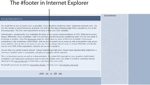 Figure 13. Mozilla displays the #footer within the fixed bottom portion.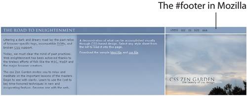 Now for OperaAt this point, the design is complete for Internet Explorer, Mozilla, and Safari, but the layout in Opera still needs tweaking to make the top sections appear and function properly. Here's a snippet of the Opera section of the CSS: @media all and (min-width: 0px){ div#intro { position: absolute; right:0; width:100%; height:283px; top:0; z-index: 0; border-bottom:3px solid #fff; } This technique taps in to CSS3 Media Queries, which allows the designer to send styles directly to Opera 7 only. Now the layout looks great in Opera, too. Note Read more about the Opera 7 CSS3 @media technique at www.virtuelvis.com/archives/145.html. Three in OneHenry's original idea renders properly in Mozilla and Safari; the work-around for Internet Explorer displays nicely in that browser, and in Opera we find a compromisethe imagery is at the top, but unlike the way it appears in Internet Explorer, it's fixed in Opera, so the page body scrolls underneath the top fixed portion. Open Window takes its name from the bottom and top relationship created as a result of Henry's experimentation. |
|
 Visual Enlightenment for the Web")
EAN: N/A
Pages: 117