Using Proportion
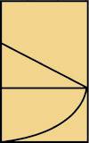
| Most designers rely on their intuitive sense of proportion in approaching a poster. When our intuition hits a roadblock, however, the principles of proportion can be very helpful in determining the correct division of space within a layout. Let's look at some basic ones now. The Golden SectionThe golden section, discovered by the Greeks in the fifth century B.C., was once referred to as a "key" to proportion. The golden section is a ratio that divides a whole into two segments so that the smaller segment has the same proportion to the larger that the larger has to the whole. This can be expressed algebraically as a:b = b:(a+b). The sides of a golden rectangle have a proportion of 1:1.618. Figure 6.20. To construct a golden rectangle, begin with a square. Draw a diagonal from a midpoint of one side to an opposite corner, and then draw an arc from that diagonal.
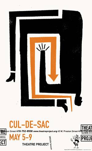
Whether they realize it or not, most people prefer a rectangle with proportions close to the golden section. A composition using a golden rectangle feels more balanced, comfortable, and natural to the viewer. note Like vertical symmetry, the golden section is found in nature, which is why it feels familiar and comfortable in a design. Nautilus shells, sunflowers, and pinecones all have features that are closely tied to the golden section ratio. Golden section proportions are used in works of sculpture, painting, and architecture. In addition to man-made works, golden section proportions can even be found in humans, plants, and animals. If you look at a variety of posters, magazine ads, and other rectangular compositions carefully, you'll find that they are often divided into two parts using the golden section, or that the point of interest tends to lie along the line that forms the golden section. Figure 6.21. Loosely based on the golden rectangle, like many posters are, the action in this Theatre Project poster by Spur Design is broken up into a square section (containing the illustration) and a smaller section (containing the type and branding).
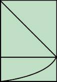
The Root 2 RectangleRoot 2 rectangles are also used in poster layouts, though their proportion is approximately 1:1.414, slightly different from that of the golden rectangle. (If you're wondering how this rectangle got its name, 1.414 is the approximate square root of 2.) The root 2 rectangle is said to be sacred or a symbol of birth, and can be found in some ancient artworks. Figure 6.22. To construct a root 2 rectangle, draw a diagonal across a square, and then draw an arc from that diagonal.
In poster design, root 2 rectangles are used in the same way that golden rectangles are, forming two balanced sections or providing compelling placement for a point of interest. Figure 6.23. Like posters based on golden rectangles, root 2 posters have a square area as the focal point, as with the bull image in this Professional Bull Riders design. The other section, in this case containing the type, is slightly smaller than that of a golden rectangle design.
|

EAN: 2147483647
Pages: 103