Owner-Drawn Controls
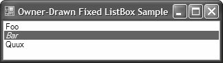
| The appearance of most of the standard controls is consistent with those exposed by the underlying operating system. Where possible, you should use these controls to ensure that your applications are equally consistent, although some styles of applications, such as Windows Media Player, demand UIs that differ from the norm. When an existing control provides all the functionality you need but not the desired UI, you can take over the drawing by using a control feature known as owner-draw. An owner-drawn control provides events that allow a control's owner (or the control itself) to take over the drawing chores from the control in the underlying operating system. Controls that allow owner-drawsuch as some of the list controls, TabControl, and Tool tipexpose a property that turns owner-draw on and then fires events to let the container know that it should do the drawing. For example, the ListBox control exposes the DrawMode property, which can be one of the following values from the DrawMode enumeration: namespace System.Windows.Forms { enum DrawMode { Normal = 0, // Control draws its own items (default) OwnerDrawFixed = 1, // Fixed-size custom drawing of each item OwnerDrawVariable = 2, // Variable-size custom drawing of each item } }Figure 10.8 shows an owner-drawn ListBox control that changes the style to Italics when it's drawing the selected item.[6]
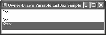
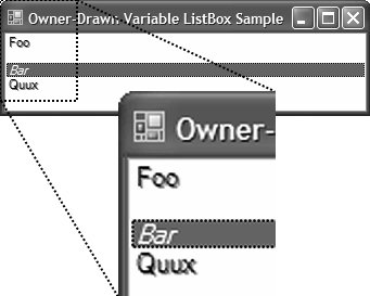
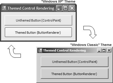
Figure 10.8. Owner-Drawn ListBox To handle the drawing of a ListBox, you first set the DrawMode property to something other than Normal (the default), and then you handle the ListBox control's DrawItem event: // OwnerDrawFixedSampleForm.Designer.cs partial class OwnerDrawFixedSampleForm { ... void InitializeComponent() { ... // listBox this.listBox.DrawMode = DrawMode.OwnerDrawFixed; ... } } // OwnerDrawFixedSampleForm.cs partial class OwnerDrawFixedSampleForm : Form { public OwnerDrawnFixedSampleForm() { InitializeComponent(); } void listBox_DrawItem(object sender, DrawItemEventArgs e) { // Draw the background e.DrawBackground(); // Get the default font Font drawFont = e.Font; bool ourFont = false; // Draw in italics if selected if( (e.State & DrawItemState.Selected) == DrawItemState.Selected ) { ourFont = true; drawFont = new Font(drawFont, FontStyle.Italic); } using( Brush brush = new SolidBrush(e.ForeColor) ) { // Draw the list box item e.Graphics.DrawString( listBox.Items[e.Index].ToString(), drawFont, brush, e.Bounds); if( ourFont ) drawFont.Dispose(); } // Draw the focus rectangle e.DrawFocusRectangle(); } } }This code uses several members of the DrawItemEventArgs object that's passed to the DrawItem event handler: namespace System.Windows.Forms { class DrawItemEventArgs : EventArgs { // Properties public Color BackColor { get; } public Rectangle Bounds { get; } public Font Font { get; } public Color ForeColor { get; } public Graphics Graphics { get; } public int Index { get; } public DrawItemState State { get; } // Methods public virtual void DrawBackground(); public virtual void DrawFocusRectangle(); } }The DrawItem event is called whenever the item is drawn or when the item's state changes. The DrawItemEventArgs object provides all the information you need to draw the item in question, including the index of the item, the bounds of the rectangle to draw in, the preferred font, the preferred color of the foreground and background, and the Graphics object to do the drawing on. DrawItemEventArgs also supplies the selection state so that you can draw selected items differently (as our example does). DrawItemEventArgs also gives you a couple of helper methods for drawing the background and the focus rectangle if necessary. You usually use the latter to bracket your own custom drawing. When you set DrawMode to OwnerDrawFixed, each item's size is set for you. If you'd like to influence the size, too, you set DrawMode to OwnerDrawVariable, and, in addition to doing the drawing in the DrawItem handler, you specify the height in the MeasureItem handler: // OwnerDrawVariableSampleForm.Designer.cs partial class OwnerDrawVariableSampleForm { ... void InitializeComponent() { ... // listBox this.listBox.DrawMode = DrawMode.OwnerDrawVariable; ... } } // OwnerDrawVariableSampleForm.cs partial class OwnerDrawVariableSampleForm : Form { public OwnerDrawnVariableSampleForm() { InitializeComponent(); } void listBox_MeasureItem(object sender, MeasureItemEventArgs e) { // Make every even item twice as high if( e.Index % 2 == 0 ) e.ItemHeight *= 2; } }The MeasureItem event provides an instance of the MeasureItemEventArgs class, which gives you useful properties for getting and setting each item's height: namespace System.Windows.Forms { class MeasureItemEventArgs : EventArgs { // Properties public Graphics Graphics { get; } public int Index { get; } public int ItemHeight { get; set; } public int ItemWidth { get; set; } } }Figure 10.9 shows the effects of doubling the heights of the event items (as well as continuing to show the selection in italics). Figure 10.9. An Owner-Drawn List Box Using Variable Height Unlike the DrawItem event, the MeasureItem event is called only once for every item in the control, so things such as selection state can't be a factor when you decide how big to make the space for the item. ControlPaintOften, owner-draw is used to draw a control that looks just like an existing Windows control but has one minor addition, such as drawing disabled text in a list box. In those cases, you'd like to avoid spending any time duplicating the way every version of Windows draws its controls. For that purpose, you can use the ControlPaint helper class. ControlPaint, has static members for drawing common controls, lines, grids, and types of text: namespace System.Windows.Forms { sealed class ControlPaint { // Properties public static Color ContrastControlDark { get; } // Methods public static IntPtr CreateHBitmap16Bit(...); public static IntPtr CreateHBitmapColorMask(...); public static IntPtr CreateHBitmapTransparencyMask(...); public static Color Dark(...); public static Color DarkDark(...); public static void DrawBorder(...); public static void DrawBorder3D(...); public static void DrawButton(...); public static void DrawCaptionButton(...); public static void DrawCheckBox(...); public static void DrawComboButton(...); public static void DrawContainerGrabHandle(...); public static void DrawFocusRectangle(...); public static void DrawGrabHandle(...); public static void DrawGrid(...); public static void DrawImageDisabled(...); public static void DrawLockedFrame(...); public static void DrawMenuGlyph(...); // New public static void DrawMixedCheckBox(...); public static void DrawRadioButton(...); public static void DrawReversibleFrame(...); public static void DrawReversibleLine(...); public static void DrawScrollButton(...); public static void DrawSelectionFrame(...); public static void DrawSizeGrip(...); public static void DrawStringDisabled(...); // New public static void DrawVisualStyleBorder(...); // New public static void FillReversibleRectangle(...); public static Color Light(...); public static Color LightLight(...); } }To use ControlPaint to draw disabled text in an owner-drawn ListBox, you need only invoke ControlPaint.DrawStringDisabled from the DrawItem event handler for each disabled item: // OwnerDrawVariableSampleForm.cs partial class OwnerDrawnVariableSampleForm: Form { ... void listBox_DrawItem(object sender, DrawItemEventArgs e) { ... using( Brush brush = new SolidBrush(e.ForeColor) ) { // Draw every even item as disabled if( e.Index % 2 == 0 ) { ControlPaint.DrawStringDisabled( e.Graphics, listBox.Items[e.Index].ToString(), drawFont, this.ForeColor, e.Bounds, null); } else { e.Graphics.DrawString( listBox.Items[e.Index].ToString(), drawFont, brush, e.Bounds); } if( ourFont ) drawFont.Dispose(); } ... } }The effect of using ControlPaint is shown in Figure 10.10. Figure 10.10. An Owner-Drawn Variable ListBox Using ControlPaint Owner-draw is great for scenarios when an existing control's functionality is exactly what you need but you need to alter the UI it generates. However, you do need to be careful when using ControlPaint as part of your owner-draw regime; ControlPaint does not paint theme-sensitive UI elements. If you need to support theme sensitivity, you use themed control rendering. Themed Control RenderingAll the Windows Forms common controls are rendered theme-sensitive using a slew of custom renderer classes located in System.Windows.Forms. You get one renderer for each common control, including ButtonRenderer, CheckBoxRenderer, TextBoxRender, and so on. The nice thing about the XxxRenderer classes is that they are publicly available for you to exploit. This allows you to ensure that any control-style rendering you do is consistent not only with Windows Forms but also with the current theme. The following is a sample use of ButtonRenderer: // ThemedControlRenderingSampleForm.cs public partial class ThemedControlRenderingSampleForm : Form { ... void themedPanel_Paint(object sender, PaintEventArgs e) { // Render themed button with the ButtonRenderer ButtonRenderer.DrawButton( e.Graphics, this.themedPanel.ClientRectangle, VisualStyles.PushButtonState.Normal); } }Figure 10.11 illustrates the difference between ControlPaintrendering an unthemed buttonand ButtonRendererrendering a themed buttonand shows how both react to theme change. Figure 10.11. Theme-Sensitive Rendering Using the ButtonRenderer As you can see, ButtonRenderer automatically adapts to the new theme, without any additional code from you.[7]
Where possible, it's best to lean on the renderers for your custom control rendering to ensure that you maintain theme consistency. For raw themed rendering support, however, you'll want to use the same API used by the XxxRenderers: System.Windows. Forms.VisualStyles. This API wraps the shell's UxTheme API and exposes the common controls and accoutrements via static types nested within the VisualStyleElement class. You render these in conjunction with VisualStyleRenderer: // ThemedControlRenderingSampleForm.cs public partial class ThemedControlRenderingSampleForm : Form { ... void themedPanel_Paint(object sender, PaintEventArgs e) { // Render themed button with the VisualStyleRenderer VisualStyleRenderer renderer = new VisualStyleRenderer( VisualStyleElement.Button.PushButton.Normal); renderer.DrawBackground( e.Graphics, this.themedPanel.ClientRectangle); } }Although a thorough exploration of the expansive VisualStyles namespace is beyond the scope of this book, you should familiarize yourself with it if you are rendering custom controls. A good place to start is the MSDN Library.[8]
|
EAN: 2147483647
Pages: 216