Layout Controls
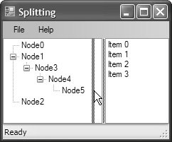
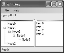
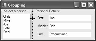
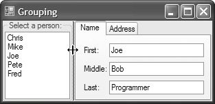
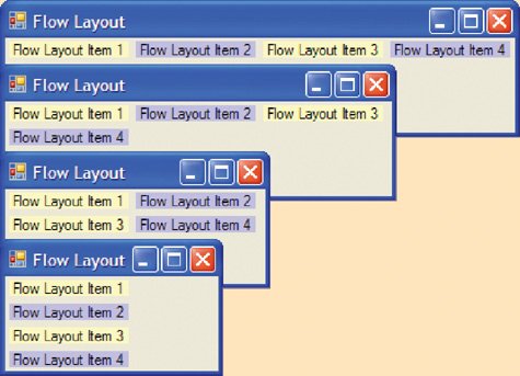
| So far, we've covered the basic building blocks of the Windows Forms layout system. In general, you can bring them together in any number of ways to simplify your layout experience. As powerful as they are, though, they don't cater to all layout scenarios, particularly those that require complex arrangements of controls, which may prove difficult to configure adequately using the features you've seen so far. In these situations, it can be helpful to break a layout problem into smaller, more manageable pieces. For this purpose, you can use a special subset of controls known as container controls. Just like forms, container controls can act as parents for child controls, including other container controls. Container controls share the same layout characteristics of forms in that child controls can be anchored or docked. Because of this, the anchoring and docking settings of a container control aren't relative to the edges of the form, but rather to the edges of the container. Additionally, each of the container controls comes with its own special layout characteristics. You've seen one container control, the Panel, that you use to add automatic scrolling support to a tool strip content panel. Now, we cover several other container controls that let you incorporate splitting, grouping, flow layout, and tabular layout. Splitting Often, you'd like to let users resize some controls independently of the size of the form. For example, Windows Explorer splits the space between the toolstrip and the status strip, with a tree view on the left and a list view on the right. To resize these controls, Explorer provides a splitter, which is a bar that separates two controls. Users can drag the bar to change the proportion of the space shared between the controls. Figure 4.36 shows a simple example of how this can be achieved in Windows Forms, using a SplitContainer control; a TreeView control is docked to fill the SplitContainer's left panel, and a ListView control is docked to fill the SplitContainer's right panel. Figure 4.36. An Example of Splitting (with Cursor Indicating a Potential Drag) By default, SplitContainer is configured to vertical splitting, as specified by its Orientation property. Thus, you can implement horizontal splitting by simply changing the value of the Orientation property from Vertical to Horizontal. Horizontal splitting is illustrated in Figure 4.37. We've added another SplitContainer to the form from Figure 4.36, added a GroupBox control docked to fill the new SplitContainer's top panel, and moved the existing SplitContainer into the new SplitContainer's bottom panel, setting it to dock-fill. Figure 4.37. Horizontal Splitting By default, if the container or form that hosts a split container resizes, the sizes of both SplitContainer panels remain in proportion, as illustrated in Figure 4.38. Figure 4.38. Proportional Resizing of SplitContainer However, you can specify that one of the panels remain a fixed size by setting the FixedPanel property to either of the two panels. If you specify the right panel, the splitter moves with it, leaving the left panel to resize in its wake, and vice versa for the left panel. Either way, the user can still drag the splitter as appropriate. If you want to prevent splitter bar dragging altogether, set SplitContainer.IsSplitterFixed to true. Note that even though SplitContainer is highly useful and saves a lot of design-time effort, you may need to use the pre-Windows Forms 2.0 Splitter control for MDI applications, as discussed in Chapter 14: Applications. GroupingAnother way to divide UI real estate is to group controls. For example, imagine a form showing a list of people on the left and a list of details about the current selection on the right, as shown in Figure 4.39. Figure 4.39. Grouping, Docking, Anchoring, and Splitting You can't tell by looking at this single picture, but as the group boxes in Figure 4.39 change size, the controls inside the group boxes also change size; both group boxes are set to dock-fill their respective SplitContainer panels, and, because they are container controls, their contained controls can use anchoring to ensure nice resizing. And because the group box is a container control, it essentially encapsulates a portion of the UI that you can drag around a form, rather than piece by piece. To do this and to acquire a reusable portion of the UI that you can add to any form, you can create a user control, as discussed in Chapter 10. The GroupBox control is one of several container controls that Windows Forms provides specifically for grouping other controls, including Panels and TabPages. The Panel control is just like a group box except that it has no label and no frame. A panel is handy if you want something that looks and acts like a subform, or a form within a form. TabControl hosts one or more TabPage controls, each of which is a container control with a tab at the top, as shown in Figure 4.40. Figure 4.40. A TabControl with Two TabPage Controls Container controls such as group boxes and tab pages provide a basic level of layout support that allows you to neatly decompose a complex layout problem into smaller, more manageable pieces. In general, though, they are blank canvases from a layout point of view, in that you must still provide the layout of their contained controls by using techniques like docking, anchoring, and automatic resizing. Two controlsFlowLayoutPanel and TableLayoutPanelgo one step further by overlaying the Panel control with additional support for highly customized layout scenarios. Flow Layout If your form is comprised of controls that you want to participate in consistently ordered collapsing and expanding as their container resizes, then you need to use FlowLayoutPanel, which provides flow-style resizing in much the same way as web pages do. Figure 4.41 shows FlowLayoutPanel used to lay out four labels in left-to-right order and to retain that order as best it can during a resize. Figure 4.41. A FlowLayoutPanel Laying Out Controls in Left-to-Right Order (See Plate 7) Although this example uses labels, any control can be placed within a FlowLayoutPanel, including other FlowLayoutPanels for more granular flow control. The key property of FlowLayoutPanel is FlowDirection, which specifies the order in which the contained controls are arranged. FlowDirection can be one of four FlowDirection enumeration values: namespace System.Windows.Forms { enum FlowDirection { LeftToRight = 0, // default TopDown = 1 RightToLeft = 2, BottomUp = 3, } }Figure 4.42 illustrates each of these values being applied. Figure 4.42. All Four FlowDirection Enumeration Values in Action For each FlowDirection, the first element in the flow is rendered in the position closest to the logical corner of the FlowLayoutPanel implied by FlowDirection, in conjunction with the current locale's reading order (right-to-left or left-to-right). Table 4.1 shows the starting corners for each of the possible combinations.
The way in which controls are rendered to the FlowLayoutPanel away from the starting corner is determined by the order in which they were added to the FlowLayoutPanel's Controls collectionnamely, first-to-last: void InitializeComponent() { ... // Rendered first this.flowLayoutPanel.Controls.Add(this.label1); // Rendered second this.flowLayoutPanel.Controls.Add(this.label2); // Rendered third this.flowLayoutPanel.Controls.Add(this.label3); // Rendered fourth this.flowLayoutPanel.Controls.Add(this.label4); this.flowLayoutPanel.FlowDirection = FlowDirection.LeftRight; ... }Each subsequent control is then rendered away from the first control in the direction also dictated by FlowDirection and reading order; the horizontal flow directionsleft-right and right-leftrender in rows, and the vertical flow directionstop-down and bottom-uprender in columns. If there are more controls than can fit into the remaining column or rowas dictated by FlowLayoutPanel's width or height, respectivelythen subsequent controls are rendered in a new row or column, in the same order as the first, as you saw in Figure 4.42. The proximity of one control to another control or to the edge of FlowLayoutPanel is determined by a combination of FlowLayoutPanel's padding settings and the margin settings of all contained controls. You would expect this, because FlowLayoutPanel is a container control. Figure 4.43 illustrates FlowLayoutPanel with top, right, bottom, and left padding of 10, each contained control with a top, right, bottom, and left margin of 20, and one control set as a flow break. Figure 4.43. FlowLayoutPanel with Margins, Padding, and Flow Breaking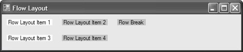 To extend any control placed in a FlowLayoutPanel, you use the FlowBreak property, which, when true, instructs FlowLayoutPanel to treat the control as a break between controls in the current flow. In Figure 4.43, you can see that the third and fourth items do not continue flowing from the flow break; instead, the flow begins anew in a location dictated by FlowDirection. You can also use docking and anchoring to lay out flowing controls. Although it sounds a bit weird, essentially you dock and anchor flowing controls relative to the largest control in the same line of flow whose direction is determined by FlowDirection, as Figure 4.44 illustrates. Figure 4.44. Anchoring and Docking in a FlowLayoutPanel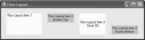 Although FlowLayoutPanel solves an interesting type of layout problem, its layout heuristics are somewhat akin to ordered chaos. If you're a control freak, you may need more order than chaos; if so, you need TableLayoutPanel.6[6]
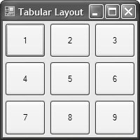
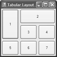
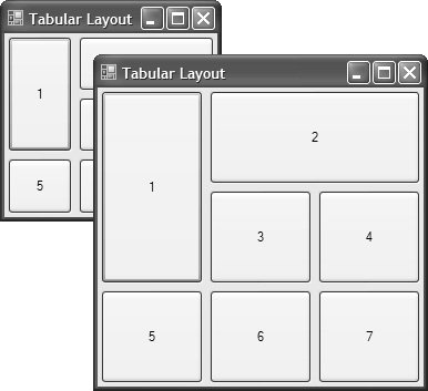
TableLayoutPanel As you would expect, TableLayoutPanel provides a tabular layout experience built on columns, rows, and cells. Figure 4.45 shows a form with a single dock-filled TableLayoutPanel, with three columns, three rows, and, implicitly, nine cells. Figure 4.45. TableLayoutControl with Three Columns, Three Rows, and Nine Cells Because the primary layout units in a table are the rows and columns, TableLayoutPanel goes out of its way to make it as easy as possible to configure these. Smart tag tasks allow you to add and remove columns one at a time, or you can open the Column and Row Styles dialog to do them at once, as shown in Figure 4.46. Figure 4.46. The Column and Row Styles Dialog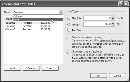 As you can see, the Column and Row Styles dialog allows you to add and remove columns to and from the end of the table or insert them between existing columns, a feature that's not available directly from the smart tag panel. Each column and row has a size type, which allows you to specify size in terms of an absolute pixel value, a percentage, or a size that's relative to the spacing of other columns or rows. For columns, the size applies to width, whereas it applies to height for rows. TableLayoutPanel allocates space based on these settings in the following order: absolute (fixed size), AutoSize, and remaining space by percent; if any space is left over, it expands the last row or column to fill it. In the example in Figure 4.45, all columns and all rows are set to 33%, the overall width and height, respectively, of the TableLayoutPanel. This setting ensures that the columns and rows resize to match as TableLayoutPanel resizes. If you need columns and rows to remain fixed in size, you specify their sizes with an absolute value. TableLayoutPanel also allows you to span multiple rows and columns, a common requirement of table layouts. You can't set this using the Column and Row Styles dialog, but you can set the ColumnSpan and RowSpan properties, which are added to each control that resides in a cell. To span two columns, for example, you would select the control in the cell where you wanted to start the span and then set the ColumnSpan property to 2, the number of columns you want spanned. The same goes for the RowSpan property. Both are illustrated in Figure 4.47. Figure 4.47. TableLayoutControl Column and Row Spanning When you've created your tabular structure, you fill its cells with the desired controls; as with the other panels, you can use any type of control. The key limitation is that each cell can contain, at most, one control; although, you can host multiple controls in a single cell by adding them to a container control that you then place into the cell. If you need to, you can use anchoring and docking to manage the way your controls are resized in conjunction with TableLayoutPanel's resizing configuration. Figure 4.48 shows the table from Figure 4.47 with each of the contained controls dock-filling its cell, allowing them to resize proportionally just as the table's cells do. Figure 4.48. Resizing Dock-Filled Controls Within a TableLayoutPanel Note that each cell contains some padding; the amount of padding is determined by each control's Margin property, which you can use to fine-tune your overall layout. | ||||||||||||||||||


EAN: 2147483647
Pages: 216