Controls
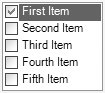
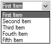
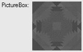
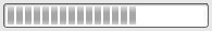
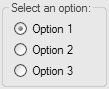
| What follows is a brief survey of the standard Windows Forms 2.0 controls, listed in alphabetical order. ButtonButtons, such as the one in Figure D.2, are used to trigger actions on forms. Figure D.2. A Button Control in Action When a button is pressed, the Click event is triggered: void button1_Click(object sender, System.EventArgs e) { MessageBox.Show("Ouch!"); }In addition, buttons can be designated as a form's AcceptButton or CancelButton. These designations specify that the button is automatically clicked when the user presses the Enter key (AcceptButton) or the Esc key (CancelButton). CheckBoxCheckBox objects, shown in Figure D.3, are most often used to indicate the answer to a yes/no question. Figure D.3. A CheckBox Control in Action Check boxes normally have two states: checked or unchecked. Testing the state of the check box is as simple as retrieving the value of the Checked property: if( this.checkBox.Checked ) MessageBox.Show("Check box checked!");Check boxes also support a mode in which they have three states: checked, unchecked, and indeterminate. You enable this mode by setting the ThreeState Boolean property to true, which causes CheckBox to start in an indeterminate state and, as a user clicks it, toggle between the checked, unchecked, and indeterminate states. CheckedListBoxA CheckedListBox, shown in Figure D.4, is an extension of the ListBox that allows users to choose multiple items in the list by checking boxes. Figure D.4. A CheckedListBox Control in Action You can detect when an item is either checked or unchecked by handling the ItemCheck event: void checkedListBox_ItemCheck(object sender, ItemCheckEventArgs e) { MessageBox.Show("Item checked: " + e.CurrentValue.ToString()); }When multiple list item selection is common, checking one or more check boxes is easier, and more intuitive, to the user than Ctrl+Shift+left-clicking. In all other ways, the checked list box is identical to the standard list box. ComboBoxThe ComboBox control, shown in Figure D.5, is a hybrid of a list box and a text box. Figure D.5. A ComboBox Control in Action The text box part of the control allows users to enter data directly into the control. When the user clicks on the down button, a list of items is shown that users can pick from. Like a TextBox, a ComboBox can be configured to allow free-form entry of information or to allow users to select only items that are in the list of items within the control. Because the control is part TextBox and part ListBox, it's not surprising that it can do a little of both. As with text-oriented controls, the most common task is usually retrieving the text: MessageBox.Show(this.comboBox.Text); As with the list box, you can handle the event when the selected index changes: void comboBox_SelectedIndexChanged(object sender, EventArgs e) { MessageBox.Show( "Selected Item: " + this.comboBox.SelectedItem.ToString()); }ContextMenuStrip
See Chapter 2 and Chapter 4: Layout. DataGridView
See Chapter 16 and Chapter 17. DateTimePickerThe purpose of the DateTimePicker control, shown in Figure D.6, is to display a usereditable date or time or both. Figure D.6. A DateTimePicker Control in Action To help control the dates and times that are displayed, the control allows users to specify a minimum and maximum date and time. To specify whether to show either the date or the time portion of the current date/time, you can choose a format for the text in the control: this.dateTimePicker.Format = DateTimePickerFormat.Short; Short and Long specify different date formats, and Time specifies a time format. Usually, if you are using the control for times, you will want to enable the up and down buttons by specifying true for ShowUpDown, as shown in Figure D.7. Figure D.7. A DateTimePicker with ShowUpDown Enabled To retrieve the date or time from the control, you get the Value of the control: MessageBox.Show(this.dateTimePicker.Value.ToShortDateString()); DomainUpDownThe DomainUpDown control, shown in Figure D.8, allows users to select from an item in a list and use arrow buttons to navigate between the items. Figure D.8. A DomainUpDown Control in Action Retrieving data from the control is identical to retrieving data from a TextBox: MessageBox.Show(this.domainUpDown.Text); FlowLayoutPanel
See Chapter 4. GroupBoxChapter 4. HScrollBarThe HScrollBar control, shown in Figure D.9, is a horizontal scroll bar. Figure D.9. An HScrollBar Control in Action Most controls that use a scroll bar do so automatically, but you can use this control manually to specify a scroll bar for subtle uses such as specifying a range of large values. You can specify the minimum and maximum range using the Minimum and Maximum properties: this.hScrollBar.Minimum = 0; this.hScrollBar.Maximum = 10; The ValueChanged event communicates when the value has changed, and the Value property exposes the current scroll value: void hScrollBar_ValueChanged(object sender, EventArgs e) { MessageBox.Show("HScroll value: " + this.hScrollBar.Value.ToString()); }LabelThe Label control holds literal text that is meant to be informative to the user. For example, in a typical application, labels are displayed near other controls to guide users in their use, as shown in Figure D.10. Figure D.10. A Label Control in Action Although Labels can display images, they always display whatever string value is stored in their Text property. Labels automatically size to fit their contents by default, but you can prevent this by setting the AutoSize property to false. When you do, text inside a label wraps to the width of the label. You can align the text to any side or corner of the Label control, or its center, by using the TextAlign property: this.label.AutoSize = false; this.label.Text = "This is information for the user..."; this.label.TextAlign = ContentAlignment.TopCenter; LinkLabelLinkLabel objects, shown in Figure D.11, are just like labels but allow for one or more hyperlinks to be embedded in the displayed text. Figure D.11. A LinkLabel Control in Action These links are clickable elements that trigger events, typically to allow users to navigate to help and support web sites from Windows Forms applications. You can add text to the link label in the same way as any other label. To specify a portion of the text value to be a link, you use the LinkArea property: // Will automatically parse common URLs this.linkLabel.Text = "Take me to Microsoft."; this.linkLabel.LinkArea = new LinkArea(11, 9); The link area is displayed as a hyperlink that, when clicked, fires the LinkLabel's Clicked event: void linkLabel_Click(object sender, EventArgs e) { System.Diagnostics.Process.Start("http://www.microsoft.com"); }You can add two or more links to the LinkLabel, where each link is a portion of the text in the Text property. To do so, you add Link items to the LinkLabel's Links collection: // Will automatically parse common URLs this.linkLabel.Text = "Take me to Microsoft or MSDN Online."; this.linkLabel.Links.Add( new LinkLabel.Link(11, 9, "http://www.microsoft.com")); this.linkLabel.Links.Add( new LinkLabel.Link(24, 11, "http://msdn.microsoft.com")); To work out which link was clicked, you handle LinkClicked, which passes a LinkLabelLinkClickedEventArgs that contains the text value stored in the Link object: void linkLabel_LinkClicked( object sender, LinkLabelLinkClickedEventArgs e) { // Start IE with the URL System.Diagnostics.Process.Start((string)e.Link.LinkData); }ListBoxListBox, shown in Figure D.12, holds multiple text items that can be selected by a user. Figure D.12. A ListBox Control in Action The items in a ListBox are contained within a collection exposed by the Items property. A ListBox supports selection of one or more items in the list by the traditional Ctrl+clicking of items. You can find out the selected item by using the SelectedItem property: MessageBox.Show( "Selected Item: " + this.listBox.SelectedItem.ToString()); In addition, you can handle the SelectedIndexChanged event whenever the selection changes: void listBox_SelectedIndexChanged(object sender, EventArgs e) { MessageBox.Show( "Selected Item: " + this.listBox.SelectedItem.ToString()); }To specify how many list items can be selected, you use the SelectionMode property, which can be any of the SelectionMode enumeration values: namespace System.Windows.Forms { enum SelectionMode { None = 0, // No items can be selected One = 1, // One item can be selected at a time (default) MultiSimple = 2, // One or more items can be selected at a time MultiExtended = 3, // One or more items can be selected at a time, // with the additional use of the Shift, Ctrl, // and arrow keys } }ListViewThe ListView control, shown in Figure D.13, is similar to the list box in that it shows multiple items that can be selected either individually or as multiple selections. Figure D.13. A ListView Control in Action The chief difference is that the ListView supports views much like Windows Explorer's view of files, including a large icon view, a small icon view, a list view, a details view, or a tiled view. The following code shows how to re-create Figure D.13. // Show ListView in Large Icons mode this.listView.View = View.LargeIcon; // Associate with ImageList this.listView.LargeImageList = this.listViewImageList; // Add new list-view items to ListView this.listView.Items.AddRange( new System.Windows.Forms.ListViewItem[] { new ListViewItem("First Item", 0), new ListViewItem("Second Item", 1), new ListViewItem("Third Item", 2), new ListViewItem("Fourth Item", 3), new ListViewItem("Fifth Item", 4) } );In this code, you can see that you associate images to list-view items using an ImageList, just as the TreeView does. You do this by setting either the LargeImageList or the SmallImageList property, the former being used for large icon and tiled views, and the latter being used for small icon view. If you choose details view, you need to create at least one column, using code like the following: // Show ListView in Details mode this.listView.View = View.Details; // Create column this.listView.Columns.Add("First Column"); ...This code yields Figure D.14. Figure D.14. A ListView Control in Details View As with the ListBox, you can trap the change in the selected index: void listView_SelectedIndexChanged(object sender, EventArgs e) { // Show the first of the selected items MessageBox.Show( "Selected Item: " + this.listView.SelectedItems[0].ToString()); }MaskedTextBox
See Chapter 3. MenuStrip
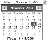
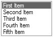
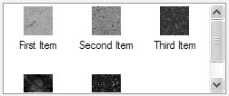
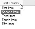
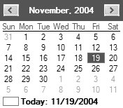
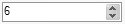
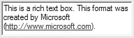
See Chapter 2 and Chapter 4. MonthCalendarThe MonthCalendar control, shown in Figure D.15, is used to show or select specific dates. Figure D.15. A MonthCalendar Control in Action You can retrieve the selected date this way: // Get all the Dates chosen // SelectionStart is beginning Date // SelectionEnd is last date // SelectionRange will return all the dates MessageBox.Show( string.Format("Date(s): {0} - {1}", this.monthCalendar.SelectionStart.ToShortDateString(), this.monthCalendar.SelectionEnd.ToShortDateString()));You can change the look and feel of the calendar to blend in with your application's UI. In addition, you can show multiple months simultaneously by specifying the CalendarDimensions of the control. You can also add boldface to an array of specific dates or yearly dates on the calendar. The user can select multiple dates or a range of dates, although the maximum number of days selected is limited by the MaxSelectionCount property. NumericUpDownFunctionally, the NumericUpDown control is much like the DomainUpDown control, but the intention of this control is to allow the user to specify a numeric value, as shown in Figure D.16. Figure D.16. A NumericUpDown Control in Action The control shown in Figure D.16 supports a minimum value, a maximum value, and the unit by which a clicked up or down button will increment or decrement the value. Unlike the other controls we've discussed that expose Minimum, Maximum, and Value properties as integers, NumericUpDown exposes them as decimals for fine-grained numeric incrementing: this.numericUpDown.Maximum = 1.00; this.numericUpDown.Minimum = 2.00; this.numericUpDown.Increment = 0.5; You can select the numeric value of the control using the Value property: MessageBox.Show(this.numericUpDown.Value.ToString()); PanelSee Chapter 4. PictureBoxThe PictureBox control's only function is to display images to the user, as shown in Figure D.17. Figure D.17. A PictureBox Control in Action PictureBox supports most bitmap formats (.bmp, .jpg, .gif, and so on) and some vector formats (.emf and .wmf). You can set PictureBox's image via the Image property: this.pictureBox.Image = new Bitmap(@"c:\windows\zapotec.bmp"); PrintPreviewControlSee Chapter 8. ProgressBarThe ProgressBar control, shown in Figure D.18, is often used to provide visual feedback on the progress of a long-running operation. Figure D.18. A ProgressBar Control in Action A ProgressBar's progress is measured by its current value, as specified by the Value property. Value ranges between the Minimum and Maximum property valuesusually 1 and 100, respectivelyto display progress as a percentage of completion: // Set the progress bar minimum, maximum, and current values this.progressBar.Minimum = 1; this.progressBar.Maximum = 100; this.progressBar.Value = 60; You create the appearance of progress by incrementing the Value property, starting at Minimum and finishing when Maximum is reached. To do this, you increment the Value property directly or call the Increment method: // Increment progress bar this.progressBar.Value += 1000000; // No range protection this.progressBar.Increment(1000000); // Range protection If you increment Value directly, you need to write additional code to make sure that Value does not extend beyond the range specified by the Minimum and Maximum properties; otherwise, an exception is generated. Alternatively, you can call Increment and feel secure in the knowledge that Value will be capped to the Maximum or Minimum property values if the increment value takes it beyond the range of either. RadioButtonRadioButton controls, shown in Figure D.19, are similar to CheckBoxes in that they have checked and unchecked states, but RadioButton controls are typically used in a series to indicate a choice of one of a range of mutually exclusive values. Figure D.19. RadioButton Controls in Action When more than one radio button is placed in a container (a form or one of the container controls listed later), the radio buttons allow only one button at a time to be selected. You can test radio buttons in the same way you check CheckBoxes: if( this.option1RadioButton.Checked ) MessageBox.Show("Option 1");RichTextBoxExtending on the TextBox control, RichTextBox, shown in Figure D.20, is used for both editing and formatting text. Figure D.20. A RichTextBox Control in Action Specifically, the control lets you set ranges of text with various fonts, colors, and sizes. You can save the document in the rich text edit control using the SaveFile method: // Save the file richTextBox.SaveFile("myRTFFile.rtf", RichTextBoxStreamType.RichText);SplitContainer
See Chapter 4. StatusStrip
See Chapter 2 and Chapter 4. TabControlSee Chapter 4. TableLayoutPanel
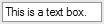
See Chapter 4. TextBoxTextBox controls, shown in Figure D.21, are used to display user-editable text. Figure D.21. A TextBox Control in Action The text box allows for both single- and multiple-line text editing and display. The most common thing you'll do with a text box is retrieve the text within it: MessageBox.Show(this.textBox.Text); ToolStrip
See Chapter 2 and Chapter 4. ToolStripContainer
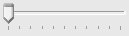
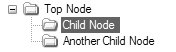
See Chapter 4. TrackBarThe TrackBar, shown in Figure D.22, allows the user to specify a numeric value with a maximum and a minimum value. Figure D.22. A TrackBar Control in Action You specify the range using the Minimum and Maximum properties: this.trackBar.Maximum = 90; this.trackBar.Minimum = 10; The control captures the arrow, Page Up, and Page Down keys to control how the values are moved on the track bar. You can specify the number of positions in the bar, the number of values between each visible tick, and the number of ticks to move on an arrow key move or on the Page Up and Page Down key moves. When the TrackBar value changes, you catch the ValueChanged event to handle it: void trackBar_ValueChanged(object sender, EventArgs e) { MessageBox.Show(this.trackBar.Value.ToString()); }TreeViewThe TreeView control, shown in Figure D.23, is used to show hierarchies. Figure D.23. A TreeView Control in Action The tree is made up of nodes. Each node can contain a nested list as exposed via the Nodes property collection, which is what provides the hierarchy. To create nodes in the tree view, you use code such as this: // Create top tree node TreeNode topNode = this.treeView.Nodes.Add("Top Node"); // Add child nodes in the top node topNode.Nodes.Add("Child Node"); topNode.Nodes.Add("Another Child Node");If you want to specify images for each of the nodes, you need to associate an ImageList with your TreeView via the latter's ImageList property. Then, you set the TreeView's ImageIndex and SelectedImageIndex properties to specify the default icon for each node when unselected and selected, respectively: // Associate with ImageList this.treeView.ImageList = this.treeViewImageList; this.treeView.ImageIndex = 0; this.treeView.SelectedImageIndex = 1; // Create top tree node TreeNode topNode = this.treeView.Nodes.Add("Top Node"); // Add child nodes in the top node topNode.Nodes.Add("Child Node"); topNode.Nodes.Add("Another Child Node");TreeNode also has both an ImageIndex and a SelectedImageIndex property, which you use to specify images on a node-by-node basis. You can configure all this from the Properties window, too. Finally, the TreeView control supports additional events for expanding and collapsing nodes, something that allows you to lazily load it as the user looks down the hierarchy. VScrollBarThe VScrollBar control, shown in Figure D.24, is a vertical scroll bar. It is just like the HScrollBar but is drawn vertically instead of horizontally. Figure D.24. A VScrollBar Control in Action In general, you'll find that ScrollableControl is robust and will save you from most situations when you otherwise might have needed to implement scrolling support using the HScrollBar and VScrollBar building blocks. WebBrowser
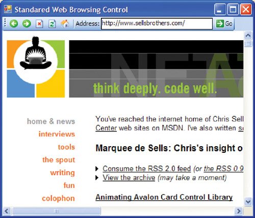
The WebBrowser control lets you display web page content, as shown in Figure D.25. Figure D.25. The WebBrowser Control in Action (See Plate 21) WebBrowser navigates to a web page when its Navigate method is invoked and passed the URL to navigate to: // MainForm.cs partial class MainForm : Form { ... void goToolStripButton_Click(object sender, EventArgs e) { // Navigate to url this.webBrowser.Navigate(this.addressToolStripTextBox.Text); } ... }Additionally, WebBrowser provides methods to handle the other navigation options you would expect to find in any browser, including back, forward, stop, refresh, and home: // MainForm.cs partial class MainForm : Form { ... void backToolStripButton_Click(object sender, EventArgs e) { this.webBrowser.GoBack(); } void forwardToolStripButton_Click(object sender, EventArgs e) { this.webBrowser.GoForward(); } void stopToolStripButton_Click(object sender, EventArgs e) { this.webBrowser.Stop(); } void refreshToolStripButton_Click(object sender, EventArgs e) { this.webBrowser.Refresh(); } void homeToolStripButton_Click(object sender, EventArgs e) { this.webBrowser.GoHome(); } ... }WebBrowser.GoHome navigates to the home page you've specified in Internet Explorer. When a document is fully downloaded, you may need to perform a post-navigation operation, such as ensuring that the address text is updated to reflect the URL resulting from navigating forward, backward, or home. WebBrowser fires the DocumentCompleted event for this purpose: // MainForm.cs partial class MainForm : Form { ... void webBrowser_DocumentCompleted( object sender, WebBrowserDocumentCompletedEventArgs e) { // When finished navigating, make sure Address text matches // the URL that we navigated to this.urlToolStripTextBox.Text = this.webBrowser.Url.ToString(); } } |

EAN: 2147483647
Pages: 216
- Structures, Processes and Relational Mechanisms for IT Governance
- Linking the IT Balanced Scorecard to the Business Objectives at a Major Canadian Financial Group
- Measuring ROI in E-Commerce Applications: Analysis to Action
- Governance in IT Outsourcing Partnerships
- The Evolution of IT Governance at NB Power
- Chapter III Two Models of Online Patronage: Why Do Consumers Shop on the Internet?
- Chapter IV How Consumers Think About Interactive Aspects of Web Advertising
- Chapter XI User Satisfaction with Web Portals: An Empirical Study
- Chapter XVII Internet Markets and E-Loyalty
- Chapter XVIII Web Systems Design, Litigation, and Online Consumer Behavior