Section 6.2. Using Components


6.2. Using Components

An Atlas component is encapsulated JavaScript that is not bound to HTML elements on a page, but stands alone. An Atlas component aggregates a set of JavaScript functionality to provide a single interface for use in code. A behavior is a bit limited in use, so a component can offer more functionality. Atlas comes with several components, most of them in the area of data controls (as you will see in Chapter 9), but here we will cover one component that is very usable in the real world and actually quite common on web pages: a pop-up component.

6.2.1. Using the Pop-Up Component

In this section we implement some pop-up functionality for our tabbed page. First of all, you need to create a component. The underlying mechanismSys.UI.PopupBehavioris a behavior, but one without a visual representation. That's why pop-up functionality is regarded as a component in Atlas, despite the fact that there is also a behavior of that name. (The Atlas documentation uses both the terms behavior and component for pop-up.) You can think of pop-up as a behavior that is triggered by the user or by JavaScript, but then uses a component to create a new visual representation. The pop-up component just allows you to show and hide a pop-up, but you must define the pop-up yourself; it is not built in as part of the behavior or component (that's why it fits in both categories).

Implementing the pop-up requires you to complete the following steps:

  1. Define the pop-up in HTML as an element to display.

  2. Create the pop-up component in xml-script.

  3. Using xml-script, link the pop-up to an event so that it will be displayed under the appropriate circumstances (in this case, when the user hovers over a tab).

Let's start with the first step. Here's the pop-up as defined in as a <div> element in HTML, hidden by default:

 <div  style="display: none;width: 250px; border-style: solid 1px black; background-color: White;">   Atlas is an Ajax framework for ASP.NET 2.0 and   available at <a href="http://atlas.asp.net/">atlas.asp.net</a>. </div> 

You want the pop-up to appear when the user hovers over a specific section of text. We'll denote this section with a <span> element, as shown in the following snippet:

 <div >   This is the first tab.<br />   It is full of <span  style="text-decoration: underline; color: Blue;">Atlas</span> information.<br />   Although it seems to be full of dummy text. </div> 

Although the underlining style gives the impression that the text portion is a link, it isn't, since no HTML link is needed for the desired effect. However, the underlining itself is important; otherwise, users would have to guess that they have to hover over the text with the mouse pointer. Some other sites use bold or color to denote the presence of a special behavior such as a pop-up, but this is debatable from a usability point of view.


Finally, you need to set up the xml-script portion of the page. The pop-up behavior must be attached to the second <div> element (the part that actually pops up). The parentElement attribute specifies the name of the element to which that pop-up is attached. Another important attribute is positioningMode, which describes where the pop-up will appear.

The following values are supported (except for Absolute, all positions are relative to the parent element):

  • Absolute (default)

  • Center

  • BottomLeft

  • BottomRight

  • TopLeft

  • TopRight

Here is some xml-script markup you might use for the pop-up:

 <control >   <behaviors>     <popupBehavior  parentElement="PanelText" positioningMode="Center" />   </behaviors> </control> 

Note that the <popupBehavior> element takes an ID; this ID is used to establish a connection between the pop-up component and the element from which the pop-up is triggered.

The pop-up behavior has two main methods: show() and hide(). These methods must be executed using <invokeMethod> to show the pop-up when the mouse hovers over the label and to hide it again when the mouse leaves the label. There is nothing new here, as the xml-script markup shows:

 <label >   <behaviors>     <hoverBehavior unhoverDelay="2000">       <hover>         <invokeMethod target="AtlasPopup" method="show" />       </hover>       <unhover>         <invokeMethod target="AtlasPopup" method="hide" />       </unhover>     </hoverBehavior>   </behaviors> </label> 

The attribute unhoverDelay="2000" makes sure that the information text is displayed for a reasonable amount of time (two seconds), even when the user moves the mouse pointer away immediately.


Example 6-3 shows the complete markup needed to implement the ASP.NET page shown in Figure 6-2.

Figure 6-2. The pop-up appears when the mouse hovers over the text


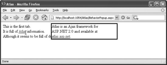
Example 6-3. Implementing pop-up functionality with a component

 BehaviorPopup.aspx <%@ Page Language="C#" %> <!DOCTYPE html PUBLIC "-//W3C//DTD XHTML 1.0 Transitional//EN" "http://www.w3.org/TR/xhtml1/DTD/xhtml1-transitional.dtd"> <html xmlns="http://www.w3.org/1999/xhtml"> <head runat="server">   <title>Atlas</title> </head> <body>   <form  runat="server">     <atlas:ScriptManager runat="server"  />     <div >       This is the first tab.<br />       It is full of <span          style="text-decoration: underline; color: Blue;">Atlas</span>         information.<br />       Although it seems to be full of dummy text.     </div>     <div  style="display: none; width: 250px; border: solid 1px black; background-color: White;">       Atlas is an Ajax framework for ASP.NET 2.0 and       available at <a href="http://atlas.asp.net/">atlas.asp.net</a>.     </div>   </form>   <script type="text/xml-script">     <page xmlns:script="http://schemas.microsoft.com/xml-script/2005">       <components>         <control >           <behaviors>             <popupBehavior                parentElement="PanelText" positioningMode="Center" />           </behaviors>         </control>         <label >           <behaviors>             <hoverBehavior unhoverDelay="2000">               <hover>                 <invokeMethod target="AtlasPopup" method="show" />               </hover>               <unhover>                 <invokeMethod target="AtlasPopup" method="hide" />               </unhover>             </hoverBehavior>           </behaviors>         </label>       </components>     </page>   </script> </body> </html> 

Figure 6-2 shows the page generated by the markup in Example 6-3.

Custom Behaviors and Components

To create a custom component, start with an existing component and adapt it to your needs. An excellent example of how to build a custom behavior can be found at http://aspadvice.com/blogs/garbin/archive/2006/01/23/14786.aspx. Chapter 4 shows a custom behavior in action. However, the basic steps are the following:

  1. Implement the required methods geTDescriptor() (which exposes all properties) and dispose() (to clean up).

  2. Register the class you implemented using Type.registerSealedClass() and derive it from Sys.Component.

  3. Add your component type using Sys.TypeDescriptor.addType() so that you can use it from within xml-script.

Custom behaviors work quite similarly. You have to implement geTDescriptor() and dispose(), and have to register both using registerBaseMethod(). Finally, you have to register the class (type Sys.UI.Behavior) and add the type. Examining Atlas.js provides a good insight into how to implement a custom behavior. Tip: use the debug version of Atlas, where the code is nicely indented and easy to read.


Programming Atlas
Programming Atlas
ISBN: 0596526725
EAN: 2147483647
Year: 2006
Pages: 146

flylib.com © 2008-2017.
If you may any questions please contact us: flylib@qtcs.net