Implementation

function OpenWin(url, w, h) { if(!w) w = 400; if(!h) h = 300; window.open(url, "_new", "width=" + w + ",height=" + h + ",menubar=no,toobar=no,scrollbars=yes", true); }

Implementation of the ImageListView control requires constructing the following components:

  • ScrollButton component

  • ImageListViewItem component

  • ImageListView control

  • ImageListViewDesigner

Of these four components, only three are tightly coupled: ImageListViewItem, ImageListView, and ImageListViewDesigner. The ScrollButton class is designed to be independent so that it can be reused in other projects. This of course raises another key design ideal: reusable components. During the course of developing controls, or any software, there exists a set of shared/common functionality that can be reused. All endeavors in development should look for such reusable components.

Each of the following sections describes the design and implementation of the components required to build the ImageListView control.

ScrollButton

Like other soft-controls developed thus far, the ScrollButton has two jobs: painting and hit-testing. The first job, painting, involves determining the orientation of the button. The ScrollButton can be used to represent either an Up or a Down orientation. The orientation of the button is used to determine the style of arrow to render on the button. Rather than using two bitmaps, or using one bitmap and rotating it, to represent the arrow, the ScrollButton uses a GraphicsPath primitive to create the polygon for the arrow.

Note

The GraphicsPath object allows for a polygon, or path, to be constructed from a set of points or lines. This path can then be filled in the same manner as a rectangle or an arc using standard graphics calls. Developers of custom controls would do well to learn the ins and outs of GDI+.


The decision to create a soft-control rather than a full-blown Control-derived component is based on one simple fact: a full control is not needed. For the ScrollButton to serve its intended purpose, it does not need any of the services or implementation afforded by the Control base class. Sometimes figuring out what's not needed can help to determine the proper starting point for a new component or control.

Note, however, that the ScrollButton could just as easily be developed as a Control-derived or event Button-derived control. The only drawback to this approach is the extra resources consumed by creating an additional window handle and any unseen overhead within the base class implementations. For die-hard ATL/C++ developers, the idea of "don't pay for what you don't use" carries over into C# and .NET. Because the ScrollButton does not use or need any features from the Control base class, why pay the price of using it? Implementation inheritance is like consuming alcoholic beverages. Do it responsibly.

Because the ScrollButton class represents the smallest component, its implementation is shown here first. Listing 9.1 contains the implementation for ScrollButton.

Listing 9.1 ScrollButton Implementation
  1: using System;  2: using System.Drawing;  3: using System.Windows.Forms;  4:  5: namespace SAMS.ToolKit.Controls  6: {  7:     public enum ScrollButtonOrientation {  8:         Up,  9:         Down 10:     } 11: 12:     public class ScrollButton { 13: 14:         private static int    SIZE            = 16; 15:         private static int  PADDING           = 5; 16:         private    Rectangle                  btnRect; 17:         private ScrollButtonOrientation       orientation; 18: 19:         public Point Location { 20:             get {  return new Point( btnRect.X, btnRect.Y ); } 21:             set { 22:                 btnRect = new Rectangle( ((Point)value).X, ((Point)value).Y, SIZE,  graphics/ccc.gifSIZE ); 23:             } 24:         } 25: 26:  public ScrollButton( ScrollButtonOrientation sbo ) { 27:             orientation = sbo; 28: 29:         } 30: 31:         public bool HitTest( Point pt ) { 32:             return btnRect.Contains( pt ); 33:         } 34: 35:         public void Draw( Graphics g, ButtonState state ) { 36:             DrawButton( g, state ); 37:             DrawArrow( g, state ); 38:         } 39: 40:         private void DrawButton( Graphics g, ButtonState state ) { 41:             if( btnRect.IsEmpty ) return; 42:             ControlPaint.DrawButton( g, btnRect, state ); 43:         } 44: 45:         private void DrawArrow( Graphics g, ButtonState state ) { 46:             if( orientation == ScrollButtonOrientation.Up ) 47:                 DrawUpArrow( g, state ); 48:             else 49:                 DrawDownArrow( g, state ); 50:         } 51: 52: 53:         private void DrawUpArrow( Graphics g, ButtonState state ) { 54:             Point[] pts = new Point[3]; 55:  pts[0].X = btnRect.Left + (btnRect.Width / 2) + (state == ButtonState.Pushed ? 1 :
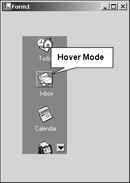
  graphics/ccc.gif0); 56:             pts[0].Y = btnRect.Top + PADDING + (state == ButtonState.Pushed ? 1 : 0); 57: 58:             pts[1].X = btnRect.Left + 2 + (state == ButtonState.Pushed ? 1 : 0); 59:             pts[1].Y = btnRect.Bottom - PADDING + (state == ButtonState.Pushed ? 1 :  graphics/ccc.gif0); 60: 61:             pts[2].X = btnRect.Right - 2 + (state == ButtonState.Pushed ? 1 : 0); 62:             pts[2].Y = btnRect.Bottom - PADDING + (state == ButtonState.Pushed ? 1 :  graphics/ccc.gif0); 63:             RenderArrow( g, pts ); 64:         } 65: 66:         private void DrawDownArrow( Graphics g, ButtonState state ) { 67:             Point[] pts = new Point[3]; 68:             pts[0].X = btnRect.Left + (btnRect.Width / 2) + (state ==  graphics/ccc.gifButtonState.Pushed ? 1 : 0); 69:             pts[0].Y = btnRect.Bottom - PADDING + (state == ButtonState.Pushed ? 1 :  graphics/ccc.gif0); 70: 71:             pts[1].X = btnRect.Left + 2 + (state == ButtonState.Pushed ? 1 : 0); 72:             pts[1].Y = btnRect.Top + PADDING + (state == ButtonState.Pushed ? 1 : 0); 73: 74:  pts[2].X = btnRect.Right - 2 + (state == ButtonState.Pushed ? 1 : 0); 75:             pts[2].Y = btnRect.Top + PADDING + (state == ButtonState.Pushed ? 1 : 0); 76: 77:             RenderArrow( g, pts ); 78:         } 79: 80:         private void RenderArrow( Graphics g, Point[] pts ) { 81:             System.Drawing.Drawing2D.GraphicsPath path = new  graphics/ccc.gifSystem.Drawing.Drawing2D.GraphicsPath( ); 82:             path.AddLines( pts ); 83:             path.CloseFigure( ); 84:             Brush blackBrush = new SolidBrush(System.Drawing.Color.Black); 85:             g.FillPath( blackBrush, path ); 86:             blackBrush.Dispose( ); 87:         } 88: } 89: } 

By now the basic structure of soft-controls should be ingrained in your mind. The ScrollButton introduces a new Graphics primitive: the GraphicsPath. To draw the arrow or triangle that represents the arrow, a GraphicsPath object is constructed based on three points. These three points represent the path of the polygon to be later filled.

The orientation of the arrow is determined by the enum ScrollButtonOrientation specified during the construction of the ScrollButton. The methods DrawUpArrow and DrawDownArrow, found in Listing 9.1 on lines 53 and 66, respectively, handle the process of creating the points used to represent the arrow to be drawn. In addition, the arrow is offset when the ScrollButton is in a pushed state. This offsetting gives the appearance of the button control being pushed into the screen.

After the points for the arrow have been calculated, the RenderArrow method uses these points to construct the GraphicsPath object. Notice on line 83 the path.CloseFigure method invocation. The CloseFigure method call completes the polygon so that when the GraphicsPath is filled, a solid triangle will be the output.

Now that the ScrollButton is in place, the next step in building the ImageListView control is the construction of the ImageListViewItem component. The ImageListViewItem component is used to manage information reguarding an item within the ImageListView control.

ImageListViewItem

Similar to the OutlookBarTab component, an ImageListViewItem is a component that tracks various information about the item it represents within the ImageListView control. This approach is a common theme when building composite controls that contain items such as the Tab control, Menu control, or ToolBar control. Each ImageListViewItem is capable of rendering itself in either large or small image mode and provides hit testing and hover state feedback. When the mouse pointer is held over an image, the image is drawn in a popped-up style state to indicate the hover state mode, as shown in Figure 9.2.

Figure 9.2. Hover state feedback.

figure 9.2. hover state feedback.

As with other controls and components developed so far, a determination of the base class from which to begin needs to be addressed. First, the ImageListViewItem needs to be defined. Is it a control? No. What is the ImageListViewItem? An ImageListViewItem is an object that is to be used to manage the display of text and an associated icon or image. The ImageListViewItem depends on its parent, the ImageListView control, for location and mouse event processing. In addition, the ImageListViewItem needs its parent in order to access the proper ImageList, large or small, to obtain the associated image to draw.

The ImageListViewItem represents a subcomponent of the ImageListView control. This basic definition and the requirements of the ImageListViewItem help to establish the base class for it. Listing 9.2 contains the implementation of the ImageListViewItem component. A vast majority of the code deals with drawing both the text and the associated image.

Listing 9.2 ImageListViewItem Component
   1: using System;   2: using System.ComponentModel;   3: using System.Drawing;   4: using System.Windows.Forms;   5:   6: namespace SAMS.ToolKit.Controls   7: {   8:   9:  10:     public enum ListViewItemState {  11:         Normal,  12:         Hover,  13:         Pushed  14:     }  15:  16:  17:  18:  19:     [ToolboxItem( false )]  20:     public class ImageListViewItem : System.ComponentModel.Component {  21:  22:         private static int EDGE_PADDING = 4;  23:         private static int TEXT_PADDING = 12;  24:         private static int LARGE        = 32;  25:         private static int SMALL        = 16;  26:  27:         private string        text;  28:         private int           imageIndex;  29:         private Rectangle     imageRect;  30:         private Rectangle     textRect;  31:         private bool          drawLarge;  32:         private float         fontHeight;  33:         private Image         image;  34:         private int           fontLines;  35:         private int           height;  36:         private Point         location;  37:  38:         internal ImageListView    parent;  39:  40:         [  41:         Description( "Text displayed for the current item" ),  42:         Category( "Appearance" )  43:         ]  44:         public string Text {  45:             get {  return text; }  46:             set {  47:                 text = value;  48:             }  49:         }  50:  51:         [  52:         Description( "Image Index used to display associated image" ),  53:         Category( "Appearance" )  54:         ]  55:         public int ImageIndex {  56:             get {  return imageIndex; }  57:             set {  58:                 imageIndex = value;  59:             }  60:         }  61:  62:         [ Browsable( false )]  63:         public ImageListView Parent {  64:             get {  return parent; }  65:         }  66:  67:         [Browsable( false )]  68:         public int Height {  69:             get {  return height; }  70:         }  71:  72:         [Browsable( false )]  73:         public Point Location {  74:             get {  return location; }  75:         }  76:  77:         public ImageListViewItem( ) {  78:             parent        = null;  79:             drawLarge    = true;  80:             imageIndex    = -1;  81:             imageRect    = new Rectangle(0,0,0,0);  82:             textRect    = new Rectangle(0,0,0,0);  83:             image        = null;  84:             height        = 0;  85:         }  86:  87:         public bool HitTest( Point pt ) {  88:             return (imageRect.Contains( pt ) || textRect.Contains( pt ));  89:         }  90:  91:  92:         public int CalcHeight( Graphics g, Font font, int width, bool LargeImage ) {  93:  94:             drawLarge = LargeImage;  95:  96: height = ( LargeImage ? LARGE : SMALL );  97:  98:             //calc the height of the Text  99:             SizeF fontSize = g.MeasureString( text, font ); 100:             fontHeight = fontSize.Height; 101:             fontLines = 1; 102:             if( LargeImage ) { 103:                 height += TEXT_PADDING; 104:                 if( fontSize.Width > width ) { 105:                     //Need to wrap the text 106:                     height += (int)((float)2*fontSize.Height); 107:                     fontLines = 2; 108:                 }  else 109:                     height += (int)fontSize.Height; 110:             } 111:             return height; 112:         } 113: 114: 115:         public void Draw( Graphics g, Font font, Brush foreBrush, Point location,  graphics/ccc.gifint maxWidth, ListViewItemState state ) { 116: 117:             if( height == 0 || imageIndex == -1) return; 118:             this.location = location; 119:             image = ( drawLarge ? parent.LargeImageList.Images[imageIndex ] :  graphics/ccc.gifparent.SmallImageList.Images[ imageIndex ] ); 120:             if( drawLarge ) 121:                 DrawLarge( g,font,foreBrush,location,maxWidth,state ); 122:             else 123: DrawSmall( g,font,foreBrush,location,maxWidth,state ); 124:         } 125: 126:         public void DrawSmall( Graphics g, Font font, Brush foreBrush, Point  graphics/ccc.giflocation, int maxWidth, ListViewItemState state  ) { 127: 128:             imageRect = new Rectangle( location.X + EDGE_PADDING, location.Y, SMALL,  graphics/ccc.gifSMALL ); 129:             textRect = new Rectangle( location.X + (2*EDGE_PADDING) +  graphics/ccc.gifimageRect.Width, location.Y, maxWidth, (int)fontHeight ); 130: 131:             StringFormat fmt    = new StringFormat( ); 132:             fmt.Alignment       = StringAlignment.Near; 133:             fmt.LineAlignment   = StringAlignment.Center; 134:             fmt.Trimming        = StringTrimming.EllipsisCharacter; 135:             fmt.FormatFlags     = StringFormatFlags.NoWrap; 136: 137:             g.DrawString( text, font, foreBrush, textRect, fmt ); 138: 139:             DrawImage( g, imageRect, state ); 140:         } 141: 142:         public void DrawLarge( Graphics g, Font font, Brush foreBrush, Point  graphics/ccc.giflocation, int maxWidth, ListViewItemState state  ) { 143: 144:             imageRect = new Rectangle( (location.X + (maxWidth/2)   (LARGE/2)),  graphics/ccc.giflocation.Y, LARGE, LARGE ); 145:             textRect = new Rectangle( location.X + EDGE_PADDING, imageRect.Bottom +  graphics/ccc.gifTEXT_PADDING, maxWidth, fontLines*(int)fontHeight ); 146: 147:             StringFormat fmt    = new StringFormat( ); 148:             fmt.Alignment        = StringAlignment.Center; 149:             fmt.LineAlignment    = StringAlignment.Center; 150:  fmt.Trimming        = StringTrimming.EllipsisCharacter; 151: 152:             g.DrawString( text, font, foreBrush, textRect, fmt ); 153: 154:             DrawImage( g, imageRect, state ); 155: 156:         } 157: 158:         private void DrawImage( Graphics g, Rectangle destRect, ListViewItemState  graphics/ccc.gifstate ) { 159:             Rectangle drawRect = destRect; 160:             switch( state ) { 161:                 case ListViewItemState.Normal: 162:                     g.DrawImage( image, drawRect ); 163:                     break; 164: 165:                 case ListViewItemState.Pushed: 166:                     drawRect.Inflate(-2,-2); 167:                     ControlPaint.DrawBorder3D( g, drawRect, Border3DStyle.Adjust |  graphics/ccc.gifBorder3DStyle.SunkenInner, Border3DSide.All ); 168: 169:                     drawRect.Inflate(2,2); 170:                     drawRect.X +=1;drawRect.Width-=2; 171:                     drawRect.Y +=1;drawRect.Height-=2; 172:                     g.DrawImage( image, drawRect ); 173: 174:                     break; 175: 176:                 case ListViewItemState.Hover: 177:                     drawRect.Inflate(-2,-2); 178:                     ControlPaint.DrawBorder3D( g, drawRect, Border3DStyle.Adjust |  graphics/ccc.gifBorder3DStyle.RaisedOuter, Border3DSide.All ); 179: 180:                     drawRect.X -=1;drawRect.Width+=2; 181:                     drawRect.Y -=1;drawRect.Height+=2; 182:                     g.DrawImage( image, drawRect ); 183:                     break; 184:             } 185:     } 186:     } 187: } 

As noted previously, most of the code from Listing 9.2 deals with drawing both the text and the image for the item. All drawing boils down to determining the size, position, and color of what is going to be drawn. Determining the size of the image, whether large or small, and the size of the text serve to then derive the calculations for size and placement of the text and image.

Implementing various effects, such as a hovering effect when the mouse is over an item or a pushed effect when a mouse click occurs, requires subtle drawing hints. In the case of hovering, a border is added to the image, and the image itself is offset to give the appearance of movement.

Stepping through the drawing code, beginning on line 115 of Listing 9.2, the basic logic is as follows:

  1. Is height > 0 ? Yes, go to 2. No, return.

  2. Do we have a valid image index ? Yes, go to 3. No, return.

  3. Get image. Draw Large? Yes, go to 4. No, go to 5.

  4. Calculate image rectangle. Calculate text rectangle to sit below image rectangle. Draw text. Go to 6.

  5. Calculate image rectangle. Calculate text rectangle to sit adjacent to image. Draw text. Go to 6.

  6. Draw image based on state Hover, Pushed, Normal. See DrawImage on line 158.

These six steps outline the drawing logic for the ImageListViewItem component. There is no hard-and-fast rule for drawing other than that it should "look right." Defining that look, of course, is left to the developer of the control.

With the ImageListViewItem component complete, the next step is to create the ImageListView control itself.

ImageListView Control

The next piece of the puzzle for the ImageListView control is implementing the container for all the components listed so far. As with the OutlookBar control, the ImageListView has one primary function: managing the subcomponents it contains. And also like the OutlookBar control, the ImageListView control contains a custom collection in order to maintain and manage the set of ImageListViewItems associated with the control.

The ImageListView control manages one or more ImageListViewItems. Although the ImageListViewItems are capable of drawing themselves, the ImageListView control is responsible for managing their position, scrolling, and handling events such as mouse events.

A custom event is provided to notify any observers, such as the parent form, when a particular ImageListViewItem has been clicked. This custom event provides the index for the item that has been clicked on.

Again, rather than providing extraneous features, the ImageListView control features are kept to a minimum to demonstrate the processing of building a custom control. Table 9.1 lists the properties exposed by the ImageListView control.

Table 9.1. ImageListView Control Properties and Description
Property Description
SmallImageList ImageList component containing a set of 16x16 images.
LargeImageList ImageList component containing a set of 32x32 images.
Items Custom collection of ImageListViewItems.
LargeIcons Boolean value used to determine whether to show the large or small images.

Before the source listing for the ImageListView control is shown, it should be noted that the listing contains the code for a custom collection. Providing custom collections is a common theme and a task you should become comfortable with. The relevant sections of the custom collection will be discussed following the source listing.

Without further ado, Listing 9.3 contains the source code for the ImageListView control. Following the listing is a discussion of its implementation.

Listing 9.3 ImageListView Control
   1: using System;   2: using System.ComponentModel;   3: using System.Collections;   4: using System.Drawing;   5: using System.Windows.Forms;   6:   7:   8: namespace SAMS.ToolKit.Controls {   9:  10:     public class ImageListViewEventArgs : EventArgs {  11:         private int    itemIndex;  12:  13:         public int ItemIndex {  get {  return itemIndex; }  }  14:  15:         public ImageListViewEventArgs( int index ) {  16:             itemIndex = index;  17:         }  18:     }  19:  20:     public delegate void ItemClickedEventHandler( object sender,  graphics/ccc.gifImageListViewEventArgs e );  21:  22:     [  23:     Description( "ImageListView Control" ),  24:     DefaultEvent("ItemClicked" ),  25:     DefaultProperty( "Items" ),  26:     Designer( typeof( SAMS.ToolKit.Design.ItemListViewDesigner ) )  27:     ]  28:     public class ImageListView : Control {  29:  30:         private int             topIndex            = 0;  31:         private int             lastIndex           = 0;  32:         private Point           firstItemLocation   = new Point(0,0);  33:         private Point           lastItemLocation    = new Point(0,0);  34:         private bool            bScrollUp           = false;  35:         private bool            bScrollDown         = false;  36:         private bool            bLargeIcons         = true;  37:         private int             hitIndex            = 0;  38:         private int             hoverIndex          = -1;  39:         private ImageList       largeImageList      = null;  40:         private ImageList       smallImageList      = null;  41:         private ScrollButton    downScroll;  42:         private ScrollButton    upScroll;  43:         private ListViewItemCollection    items;  44:  45:  46:  47:         [  48:         Description( "Event raised when an ImageItem is clicked" ),  49:         Category( "Behavior" )  50:         ]  51:         public event ItemClickedEventHandler ItemClicked;  52:  53:         [  54: Description( "Large Image List" ),  55:         Category( "Appearance" )  56:         ]  57:         public ImageList LargeImageList {  58:             get {  return largeImageList; }  59:             set {  largeImageList = value; Invalidate( );}  60:         }  61:  62:         [  63:         Description( "Small Image List" ),  64:         Category( "Appearance" )  65:         ]  66:         public ImageList SmallImageList {  67:             get {  return smallImageList; }  68:             set {  smallImageList = value; Invalidate( ); }  69:         }  70:  71:  72:         [  73:         Description( "Image Items Collection" ),  74:         Category( "Appearance" ),  75:         DesignerSerializationVisibility( DesignerSerializationVisibility.Content )  76:         ]  77:         public ListViewItemCollection Items {  78:             get {  return items; }  79:             set {  items = value; }  80:         }  81:  82:         [  83:    Description( "use large images" ),  84:         Category( "Appearance" )  85:         ]  86:         public bool LargeIcons {  87:             get {  88:                 return bLargeIcons;  89:             }  90:             set {  91:                 bLargeIcons = value;  92:                 Recalc( );  93:                 Invalidate();  94:             }  95:         }  96:  97:  98:  99:         public ImageListView( ) { 100:             items = new ListViewItemCollection( this ); 101:             downScroll = new ScrollButton(ScrollButtonOrientation.Down); 102:             upScroll = new ScrollButton(ScrollButtonOrientation.Up); 103:         } 104: 105: 106: 107:         protected override void OnPaint( PaintEventArgs e ) { 108:             base.OnPaint( e ); 109: 110:             if( items.Count == 0 ) return; 111:             if( this.bLargeIcons ) { 112:                 if( this.largeImageList == null ) return; 113:             }  else { 114:                 if( this.smallImageList == null ) return; 115:             } 116: 117:             int ClientHeight = this.ClientRectangle.Height; 118:   lastIndex = topIndex; 119:             int heightAdjust; 120:             Point pt = new Point(0,0); 121:             Brush brush = new SolidBrush( this.ForeColor ); 122: 123:             do { 124:                 ImageListViewItem Item = items[ lastIndex++ ]; 125:                 heightAdjust = Item.Height; 126: 127:                 DrawItem( e.Graphics, brush, Item, pt,  graphics/ccc.gifSAMS.ToolKit.Controls.ListViewItemState.Normal ); 128: 129:                 pt.Y += heightAdjust + 25; 130: 131:             }  while( pt.Y < ClientHeight && (lastIndex < items.Count)); 132: 133:             lastIndex--; 134:             //Scrolling? 135: 136:             this.bScrollUp = topIndex> 0 ? true : false; 137:             this.bScrollDown = ((lastIndex+1 < items.Count) || (ClientHeight <  graphics/ccc.gifpt.Y)) ? true : false; 138: 139:             DrawScrollButtons( e.Graphics ); 140: 141:         } 142: 143:         protected override void OnSizeChanged( EventArgs e ) { 144:             base.OnSizeChanged( e ); 145:             Graphics g = CreateGraphics( ); 146: 147:             foreach( ImageListViewItem T in items ) { 148:                 T.CalcHeight( g, Font, this.ClientRectangle.Width, bLargeIcons ); 149:             } 150:             this.Invalidate( ); 151:         } 152: 153:         protected override void OnMouseMove( MouseEventArgs e ) { 154: 155:             base.OnMouseMove( e ); 156: 157:  Point pt = new Point( e.X, e.Y ); 158:             Graphics g = CreateGraphics( ); 159:             Brush brush = new SolidBrush( this.ForeColor ); 160:             bool bHaveHover = false; 161: 162:             if( hoverIndex != -1 ) { 163:                 ImageListViewItem Item = items[ hoverIndex ]; 164:                 if( !Item.HitTest( pt ) ) 165:                     Item.Draw( g, Font, brush, Item.Location,  graphics/ccc.gifthis.ClientRectangle.Width, ListViewItemState.Normal ); 166:                 else { 167:                     g.Dispose( ); 168:                     brush.Dispose( ); 169:                     return; 170:                 } 171:             } 172: 173:             for( int index = this.topIndex; index <= this.lastIndex; index++ ) { 174:                 ImageListViewItem Item = items[ index ]; 175:                 if( Item.HitTest( pt ) ) { 176:                     Item.Draw( g, Font, brush, Item.Location,  graphics/ccc.gifthis.ClientRectangle.Width, ListViewItemState.Hover ); 177:                     hoverIndex = index; 178:                     bHaveHover = true; 179:                     break; 180:                 } 181:             } 182: 183:             if( !bHaveHover ) 184:                 hoverIndex = -1; 185: 186:             g.Dispose( ); 187:             brush.Dispose( ); 188:         } 189: 190:         protected override void OnMouseDown( MouseEventArgs e ) { 191: 192:             if( e.Button == MouseButtons.Left ) { 193:                 Point pt = new Point( e.X, e.Y ); 194:     Graphics g = CreateGraphics( ); 195: 196:                 //Hit test for scrolling 197:                 if( this.bScrollUp ) 198:                     if( this.upScroll.HitTest( pt ) ) { 199:                         upScroll.Draw( g, ButtonState.Pushed ); 200:                         g.Dispose( ); 201:                         return; 202:                     } 203: 204:                 if( this.bScrollDown ) 205:                     if( this.downScroll.HitTest( pt ) ) { 206:                         downScroll.Draw( g, ButtonState.Pushed ); 207:                         g.Dispose( ); 208:                         return; 209:                     } 210: 211:                 //Hit Test items 212:                 for( hitIndex = topIndex; hitIndex <= lastIndex; hitIndex++ ) { 213:                     ImageListViewItem Item = items[ hitIndex ]; 214:                     if( Item.HitTest( pt ) ) { 215:                         Brush brush = new SolidBrush( this.ForeColor ); 216:                         Item.Draw( g, Font, brush, Item.Location,  graphics/ccc.gifthis.ClientRectangle.Width, ListViewItemState.Pushed ); 217:                         brush.Dispose( ); 218:                         g.Dispose( ); 219:                         return; 220:                     } 221:                 } 222:             } 223:             hitIndex = -1; 224:             base.OnMouseDown( e ); 225:         } 226: 227:         protected override void OnMouseUp( MouseEventArgs e ) { 228: 229:             if( e.Button == MouseButtons.Left ) { 230:                 Point pt = new Point( e.X, e.Y ); 231:                 Graphics g = CreateGraphics( ); 232: 233:  //Hit test for scrolling 234:                 if( this.bScrollUp ) { 235:                     upScroll.Draw( g, ButtonState.Normal ); 236:                     if( this.upScroll.HitTest( pt ) ) { 237:                         g.Dispose( ); 238:                         this.topIndex--; 239:                         this.Invalidate( ); 240:                         return; 241:                     } 242:                 } 243: 244:                 if( this.bScrollDown ) { 245:                     downScroll.Draw( g, ButtonState.Normal ); 246:                     if( this.downScroll.HitTest( pt ) ) { 247:                         g.Dispose( ); 248:                         this.topIndex++; 249:                         this.Invalidate( ); 250:                         return; 251:                     } 252:                 } 253: 254:                 //Test Image Items 255:                 if( hitIndex != -1 ) { 256:                     ImageListViewItem Item = items[ hitIndex ]; 257:                     Brush brush = new SolidBrush( this.ForeColor ); 258:                     Item.Draw( g, Font, brush, Item.Location,  graphics/ccc.gifthis.ClientRectangle.Width, ListViewItemState.Normal ); 259:                     brush.Dispose( ); 260:                     g.Dispose( ); 261:                     if( Item.HitTest( pt ) ) 262:                         this.OnItemClicked( new ImageListViewEventArgs( hitIndex ) ); 263:                     hitIndex = -1; 264:                 } 265:   } 266:             base.OnMouseUp( e ); 267:         } 268: 269: 270:         protected void DrawScrollButtons( Graphics g ) { 271:             if( bScrollUp ) { 272:                 upScroll.Location = new Point( this.ClientRectangle.Width - 20, 20 ); 273:                 upScroll.Draw( g, ButtonState.Normal ); 274:             } 275: 276:             if( bScrollDown ) { 277:                 downScroll.Location = new Point( this.ClientRectangle.Width - 20,  graphics/ccc.gifthis.ClientRectangle.Bottom - 20 ); 278:                 downScroll.Draw( g, ButtonState.Normal ); 279:             } 280:         } 281: 282:         protected void DrawItem( Graphics g, Brush brush, ImageListViewItem Item,  graphics/ccc.gifPoint pt, ListViewItemState state ) { 283:             Item.Draw( g, Font, brush, pt, this.ClientRectangle.Width, state ); 284:         } 285: 286:         protected void Recalc( ) { 287:             Graphics g = CreateGraphics( ); 288:             foreach( ImageListViewItem T in items ) 289:                 T.CalcHeight( g, Font, this.ClientRectangle.Width, bLargeIcons ); 290: 291:             g.Dispose( ); 292:         } 293: 294: 295:         protected virtual void OnItemClicked(ImageListViewEventArgs e) { 296:             if( ItemClicked != null ) 297:  ItemClicked( this, e ); 298:         } 299: 300:         public class ListViewItemCollection : ICollection, IEnumerable, IList { 301: 302:             private System.Collections.ArrayList    internalArrayList; 303:             private ImageListView                    owner; 304: 305: 306:             public ListViewItemCollection( ImageListView parent ) { 307:                 owner = parent; 308:                 internalArrayList = new ArrayList( ); 309:             } 310: 311: 312:             //ICollection Interface Implementation 313:             public int Count { 314:                 get {  return internalArrayList.Count; } 315:             } 316: 317:             public bool IsSynchronized { 318:                 get {  return internalArrayList.IsSynchronized; } 319:             } 320: 321:             public object SyncRoot { 322:                 get {  return internalArrayList.SyncRoot; } 323:             } 324: 325:             public void CopyTo( Array array, int arrayIndex ) { 326:                 internalArrayList.CopyTo( array, arrayIndex ); 327:             } 328: 329: 330:             //IEnumerable Interface Implementation 331:             public IEnumerator GetEnumerator( ) { 332:                 return internalArrayList.GetEnumerator( ); 333:             } 334: 335:             //IList Interface Implementation 336:             public bool IsFixedSize { 337:   get {  return internalArrayList.IsFixedSize; } 338:             } 339:             public bool IsReadOnly { 340:                 get {  return internalArrayList.IsReadOnly; } 341:             } 342: 343:             object IList.this[ int index ] { 344:                 get {  return this[ index ]; } 345:                 set {  this[ index ] = (ImageListViewItem)value; } 346:             } 347: 348:             int IList.Add( object o ) { 349:                 return this.Add( (ImageListViewItem)o ); 350:             } 351: 352:             void IList.Clear( ) { 353:                 this.Clear( ); 354:             } 355: 356:             public bool Contains( object o ) { 357:                 return internalArrayList.Contains( o ); 358:             } 359: 360:             public int IndexOf( object o ) { 361:                 return internalArrayList.IndexOf( o ); 362:             } 363: 364: 365:             void IList.Insert( int index, object o ) { 366:       this.Insert( index, (ImageListViewItem)o ); 367:             } 368: 369:             void IList.Remove( object o ) { 370:                 this.Remove( (ImageListViewItem)o ); 371:             } 372: 373:             void IList.RemoveAt( int index ) { 374:                 this.RemoveAt( index ); 375:             } 376: 377:             //ListViewItemCollection Implementation 378:             public int Add( ImageListViewItem ilvi ) { 379:                 int index = internalArrayList.Count; 380:                 Insert( internalArrayList.Count, ilvi ); 381:                 return index; 382:             } 383: 384:             public void AddRange( ImageListViewItem[] ilvi ) { 385:                 foreach( ImageListViewItem T in ilvi ) 386:                     Add( T ); 387:             } 388: 389:             public void Remove( ImageListViewItem ilvi  ) { 390:                 RemoveAt( IndexOf( ilvi ) ); 391:             } 392: 393:             public void RemoveAt( int index ) { 394:                 internalArrayList.RemoveAt( index ); 395:                 owner.Invalidate( ); 396:             } 397: 398:             public void Insert( int index, ImageListViewItem ilvi ) { 399:                 internalArrayList.Insert( index, ilvi ); 400:                 ilvi.parent = owner; 401:                 ilvi.CalcHeight( owner.CreateGraphics( ), owner.Font,  graphics/ccc.gifowner.ClientRectangle.Width, owner.bLargeIcons ); 402:                 owner.Invalidate( ); 403:    owner.Update( ); 404:             } 405: 406:             public void Clear( ) { 407:                 internalArrayList.Clear( ); 408:                 owner.Invalidate( ); 409:             } 410: 411:             public ImageListViewItem this[ int index ] { 412:                 get { 413:                     try { 414:                         return (ImageListViewItem)internalArrayList[ index ]; 415:                     }  catch( Exception ) { 416:                         return null; 417:                     } 418:                 } 419:                 set { 420:                     try { 421:                         internalArrayList[ index ] = value; 422:                         owner.Invalidate( ); 423:                     }  catch( Exception ) {  } 424:                 } 425:             } 426:         } 427:     } 428: } 

Understanding the code in Listing 9.3 requires breaking it down into the various responsibilities: managing ImageListViewItems, handling mouse events, and providing scrolling.

Managing ImageListViewItems

The management of items within the control is twofold. First is the custom collection that interacts with the ImageListView control whenever an item is added or removed. Second is managing the location of the items within the drawing area of the control itself.

The custom collection is fairly similar to the custom collection created from the OutlookBar control. The differences pertain to the interaction with its parent. In the case of the ImageListView control, when an item is added to the collection, the new item must calculate its size and the parent needs to be invalidated so that the new item will appear. The Insert method, on line 398 of Listing 9.3, contains this insertion logic.

The next major task of managing ImageListViewItems is to determine their position within the client area of the ImageListView control. During the drawing of each item, its calculated height is used to determine the location of the next ImageListViewItem. In the event that there are more items to be drawn than space is available, scrolling buttons need to be displayed. Scrolling support is discussed later.

Drawing logic is contained within the OnPaint method, on line 107 of Listing 9.3. The drawing logic is as follows:

  1. Get index for top item to draw.

  2. Draw item.

  3. Use height of item to determine location of next item to draw.

  4. Will next item be visible based on its location? If yes, go to step 2.

  5. If more than two items, need scrolling support.

This set of steps is repeated until there are no more items to draw or step 5 is reached.

Handling Mouse Events

Mouse events are the main means of interaction with the ImageListView control. In fact, the handling of mouse events represents a significant portion of the code for the ImageListView control. The mouse events used are OnMouseMove, OnMouseDown, and OnMouseUp.

Starting with the OnMouseMove event, on line 153 of Listing 9.3, the logic is as follows:

  1. Is there an item currently being drawn in hover mode? If no, go to step 3.

  2. Is the mouse over the item in hover mode? If yes, nothing to do and return from OnMouseMove; otherwise, draw the item in normal mode.

  3. Loop through visible items and hit-test. If the mouse is over an item, draw the item in hover mode, save the item's index, and exit OnMouseMove.

The MouseMove event is used to provide visual feedback to the user. This visual feedback is accomplished by drawing the item under the mouse in hover mode. That is, the item appears to be raised up from the control.

The next mouse event, OnMouseDown, on line 190, is used to determine whether an item or ScrollButton has been hit. The MouseDown method logic is as follows:

  1. Is there a scroll-up button? If no, go to step 3 else step 2.

  2. Has the scroll-up button been hit? If yes, draw the ScrollButton in a pressed state and exit OnMouseDown, else step 3.

  3. Is there a scroll-down button? If no, go to step 5 else step 4.

  4. Has the scroll-down button been hit? If yes, draw the ScrollButton in a pressed state and exit OnMouseDown, else step 5.

  5. For each visible item, hit-test the item. If an item has been hit, draw the item in a pressed state and exit OnMouseDown.

The final mouse event, OnMouseUp, on line 227 of Listing 9.3, is used to determine whether an item or ScrollButton has been clicked. If an item has been clicked, the OnItemClicked method is invoked for the current item. The OnItemClicked method in turn raises the ItemClicked event. If a ScrollButton has been hit, the topIndex member is adjusted up or down depending on the ScrollButton that was clicked.

Scrolling

The scrolling functionality for the control is provided through the adjustment of the member topIndex. The topIndex member determines which ImageListViewItem will be drawn at the top of the control. Adjusting which item is drawn at the top enables the illusion of scrolling to be obtained. As seen by the implementation, there is no scrolling of the actual window contents. Rather, the item to be drawn first is adjusted.

At this point, the control is functional but not well behaved within the designer, because it will not clean up any items it contains when the control itself is deleted. To realize all the work done so far, there is only one final step: creating a simple designer. This final step is discussed in the following section.

ImageListViewDesigner

For the ImageListView control to be considered a well-behaved control, it must clean up after itself during design-time. Without a designer, the ImageListView control will orphan ImageListViewItems when deleted from a form. Orphaning of the ImageListViewItems happens when the ImageListView control is deleted and there is no designer logic to destroy subcomponents associated with the ImageListView control.

The ImageListViewDesigner will take on the responsibility of destroying all ImageListViewItems when the ImageListView control is deleted. Subscribing to the OnComponentRemoving event of the IComponentChangeService allows for this cleanup to take place. When the component being removed is the ImageListView control, all the ImageListViewItems are destroyed. Listing 9.4 provides the implementation of the designer.

Listing 9.4 ImageListViewDesigner
  1: using System;  2: using System.Collections;  3: using System.ComponentModel;  4: using System.ComponentModel.Design;  5: using System.Drawing;  6: using System.Drawing.Design;  7: using System.Windows.Forms;  8: using System.Windows.Forms.Design;  9: using SAMS.ToolKit.Controls; 10: 11: 12: namespace SAMS.ToolKit.Design 13: { 14: 15:     public class ItemListViewDesigner : ControlDesigner { 16: 17: 18:         private void OnComponentRemoving( object sender, ComponentEventArgs e ) { 19:             IDesignerHost designerHost = (IDesignerHost)GetService(  graphics/ccc.giftypeof(IDesignerHost) ); 20:             //What is being removed? 21:             if( e.Component is ImageListView ) { 22:                 //Destory all Items 23:                 ImageListView ilv = (ImageListView)e.Component; 24: 25:                 while( ((ImageListView)e.Component).Items.Count > 0 ) { 26:                     designerHost.DestroyComponent(  graphics/ccc.gif((ImageListView)e.Component).Items[0] ); 27:   ((ImageListView)e.Component).Items.RemoveAt( 0 ); 28:                 } 29:             } 30:         } 31: 32:         public override void Initialize( IComponent component ) { 33:             base.Initialize( component ); 34: 35:             IComponentChangeService changeService =  graphics/ccc.gif(IComponentChangeService)GetService(typeof(IComponentChangeService)); 36:             changeService.ComponentRemoving += new ComponentEventHandler(  graphics/ccc.gifOnComponentRemoving ); 37:         } 38: 39:         public override void Dispose( ) { 40: 41:             IComponentChangeService changeService =  graphics/ccc.gif(IComponentChangeService)GetService(typeof(IComponentChangeService)); 42:             changeService.ComponentRemoving -= new ComponentEventHandler(  graphics/ccc.gifOnComponentRemoving ); 43: 44:             base.Dispose( ); 45:         } 46: 47:         public ItemListViewDesigner() { 48:         } 49:   } 50: } 

Again, the only function of the designer is to remove orphaned ImageListViewItems during the removal of the ImageListView control. The OnComponentRemoving event handler, located on line 18 of Listing 9.4, accomplishes this task. To properly clean up during the removal of the ImageListView control, the designer iterates through the Items collection of the ImageListView control and has the IDesignerHost service destroy each component. It is necessary to use the IDesignerHost service to destroy these components in order for the components to be removed from the Icon Tray area as well as remove all generated code from the InitializeComponent method that relates to the now deleted components.

With the completion of the designer, the process of building a basic OutlookBar control is finally finished.


    .NET Windows Forms Custom Controls
    User Interfaces in VB .NET: Windows Forms and Custom Controls
    ISBN: 1590590449
    EAN: 2147483647
    Year: 2002
    Pages: 74

    flylib.com © 2008-2017.
    If you may any questions please contact us: flylib@qtcs.net