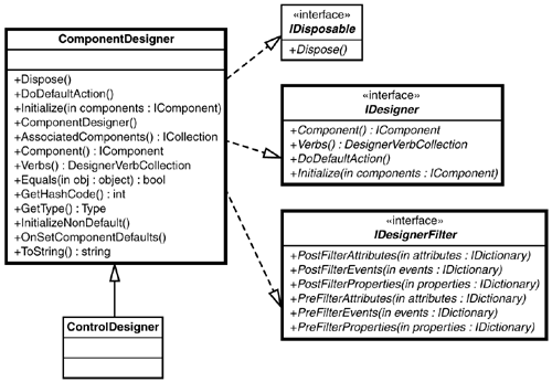
The ControlDesigner Base ClassJust as .NET provides base classes for developing controls, there also exists a set of base classes for implementing designers. In Chapter 5, "Advanced Control Development," the designer base classes are covered in more detail; for now, the ControlDesigner base class is the focus.
The
ControlDesigner
base class provides the bare-bones functionality for designing a control. Figure 3.1 shows a UML diagram of the
ControlDesigner
inheritance chain and supported interfaces. UML, or Unified Modeling Language, diagrams are helpful tools for visualizing the various
Figure 3.1. The ControlDesigner hierarchy.
The base class for ControlDesigner is ComponentDesigner . The ComponentDesigner base class provides support for general component design and is not intended to be used directly for providing design-time support for controls. Its purpose is to provide common functionality for component design-time support. The ControlDesigner base class serves as a starting point for creating control designers and implements the necessary interfaces for VS .NET. The ControlDesigner base class will serve as the base class for the IconButtonDesigner developed in this chapter. Remember that each control has an associated designer class. This association between the control and its designer class is created by specifying the designer class of a control through the use of an attribute. The DesignerAttribute is used for this purpose. |
DesignerAttributeTo specify the designer for a control, the System.ComponentMode.Design.DesignerAttribute is used to decorate the control class. The word decorate is used to denote the fact that the DesignerAttribute provides extra information about the control class. The control class itself does not use the specified designer class; however, VS .NET uses this information to locate and create the specified designer. In the case of the IconButton , the DesignerAttribute would be declared as shown here:
1: [
2: System.ComponentModel.Design.Designer (
3: typeof( SAMS.ToolKit.Design.IconButtonDesigner )
4: )
5: ]
6: public class IconButton : ... { //rest of class }
The declaration for the designer assumes that the
IconButtonDesigner
resides in the namespace
SAMS.ToolKit.Design
and uses the fully qualified
|
The IconButton Designer
It's time to create a simple designer for the
IconButton
control. The designer will be built in two stages. The first stage of the designer will filter properties of the control to remove the
BackColor
and
BackgroundImage
properties. The
As with any project, the first step involves setting up the development environment. After the VS .NET Solution is created, the process of creating and testing the IconButtonDesigner can begin. Setting Up the SAMS.ToolKit Solution
Before we venture into designer development, now would be a good time to set up a VS .NET Solution that will be used throughout the remainder of the book. In VS .NET a Solution is used to contain one or more
Start by creating a new C# class library with the
With the Solution in place, create two folders:
The new Solution should look similar to what's shown in Figure 3.2. Figure 3.2. The SAMS.ToolKit Solution.
As with any .NET project, the familiar
References
folder and the
AssemblyInfo.cs
source file are automatically created. The folders within the Solution allow for a
The
Controls
folder will need to contain the
IconButton.cs
file that was created in the
Filtering PropertiesDuring development of a new custom control, it is sometimes necessary to remove any unwanted or unneeded properties inherited from the base class from which the new custom control derives. The process of adding or removing properties and events is known as filtering. The reason behind filtering, in this case filtering properties, is to alter the available options during the design of the control rather than to provide unnecessary or unused properties/events.
The first designer will be used to remove or filter out two properties from the
IconButton
:
BackColor
and
BackgroundImage
. These properties are inherited from the
Control
base class and serve no purpose for the
IconButton
control because
The capability to filter properties, events, and attributes comes from implementing the
IDesignerFilter
interface. Table 3.1 lists the
IDesignerFilter
interface
Table 3.1. The IDesignerFilter Interface Methods
Advanced uses of the IDesignerFilter interface are covered in Chapter 5, "Advanced Control Development." As the first venture into developing a designer, the first pass of the IconButton designer will remove the unused properties BackColor and BackgroundImage . Currently, the IconButton provides both of these properties as they are implemented by the Control base class. The default properties are supplied when the control is created and can be seen in the property grid when the control is selected on the form (see Figure 3.3). Figure 3.3. The IconButton default properties.
Note The BackgroundImage property has the value of (none) . This means that currently there is no image associated with this property. One of the responsibilities of a Designer class is to provide such feedback to the developer and to the property grid. Notice the BackColor and BackgroundImage properties displayed in Figure 3.3. To remove these properties, the IconButtonDesigner class will implement the method PostFilterProperties and remove the unwanted properties from the properties collection. Because the ControlDesigner base class implements the IDesignerFilter interface, the IconButtonDesigner class needs to override the implementation of the PostFilterProperties method. Listing 3.1 contains the C# source for the IconButtonDesigner . Listing 3.1 Designer Stage One
1: ////////////////////////////////////////////////////////////////////////
2: ///File :IconButton.cs
3: ///Author :Richard L. Weeks
4: ///
5: /// Copyright (c) 2001 by Richard L. Weeks
6: /// This file is provided for instructional purposes only.
7: /// No warranties.
8: ////////////////////////////////////////////////////////////////////////
9:
10: using System;
11: using System.ComponentModel;
12: using System.ComponentModel.Design;
13: using System.Collections;
14: using System.Drawing;
15:
16:
17: namespace SAMS.ToolKit.Design
18: {
19: /// <summary>
20: /// Simple Designer for IconButton
21: /// </summary>
22: public class IconButtonDesigner : System.Windows.Forms.Design.ControlDesigner {
23:
24:
25:
26: public IconButtonDesigner() {
27: }
28:
29:
30: //Overrides
31:
32: /// <summary>
33: /// Remove some basic properties that are not supported by the IconButton
34: /// </summary>
35: /// <param name="Properties"></param>
36: protected override void PostFilterProperties( IDictionary Properties ) {
37: Properties.Remove( "BackgroundImage" );
38: Properties.Remove( "BackColor" );
39: }
40:
41:
42:
43: }
44: }
The PostFilterProperties method receives an IDictionary interface to a collection of properties associated with the control being designed. As with any collection, the Remove method is used to remove the specified item from the collection. In the case of the IconButtonDesigner , the code on lines 37 and 38 of Listing 3.1 remove or filter out the unwated properties: BackgroundImage and BackColor . With the unwanted properties filtered out, they will no longer be displayed within the property grid during the design-time of the IconButton control. However, pragmatic access to the properties is still available to the developer. To enable the designer for the IconButton control, add the following attribute to the IconButton class: System.ComponentModel.Designer(typeof(SAMS.ToolKit.Design.IconButtonDesigner)) The IconButton class should now look similar to what's shown in Listing 3.2. Listing 3.2 Updated Attributes for the IconButton
1:[
2:System.ComponentModel.Description( "SAMS IconButton Control" ),
3:System.ComponentModel.Designer( typeof( SAMS.ToolKit.Design.IconButtonDesigner ) )
4:]
5:public class IconButton : System.Windows.Forms.Control {
6: //IconButton implementation
7: }
Rebuild the SAMS.ToolKit Solution to produce the new control library. To test the results of the designer, start a new Windows Forms Solution and add the IconButton to the form. Notice that the BackColor and BackgroundImage properties are no longer displayed in the property grid, as shown in Figure 3.4. Figure 3.4. The first phase of the IconButtonDesigner .
Designer VerbsVerbs are best described as actions that can be applied to the control being designed. Verbs for a control are linked to an event handler and are added to the context menu for the control, as well as the property window. The best way to understand the role of verbs is to implement them, and that's exactly what the second phase of the IconButtonDesigner is about. To support adding verbs for a control, the designer needs to implement the Verbs property. The Verbs property returns a DesignerVerbsCollection of DesignerVerbs that the control designer supports. The IconButtonDesigner will be extended to provide verbs for changing the ForeColor property of the control to Red , Green , or Blue . The event handler for custom verbs uses the following EventHandler signature: void EventHandler( object sender, EventArgs e ) Listing 3.3 shows the updated IconButtonDesigner with the Verbs property implemented. Listing 3.3 Designer Stage Two
1: ////////////////////////////////////////////////////////////////////////
2: ///File :IconButton.cs
3: ///Author :Richard L. Weeks
4: ///
5: /// Copyright (c) 2001 by Richard L. Weeks
6: /// This file is provided for instructional purposes only.
7: /// No warranties.
8: ////////////////////////////////////////////////////////////////////////
9:
10: using System;
11: using System.ComponentModel;
12: using System.ComponentModel.Design;
13: using System.Collections;
14: using System.Drawing;
15:
16:
17: namespace SAMS.ToolKit.Design
18: {
19: /// <summary>
20: /// Simple Designer for IconButton
21: /// </summary>
22: public class IconButtonDesigner : System.Windows.Forms.Design.ControlDesigner {
23:
24:
25:
26: public IconButtonDesigner() {
27: }
28:
29: public override DesignerVerbCollection Verbs {
30: get {
31: DesignerVerb[] verbs = new DesignerVerb[3];
32: verbs[0] = new DesignerVerb( "Red", new EventHandler( this.OnRedVerb
Line 29 of Listing 3.3 implements the Verbs property. Each verb defines a text string for the menu and an EventHandler to be invoked when the menu handler is selected. Figure 3.5 shows the context menu and property grid of the IconButton using the revised IconButtonDesigner class. Figure 3.5. Verbs support.
VS .NET handles the context menu and property grid support for displaying the supported verbs or commands that the current control designer supports. When one of the supported verbs is selected, the designated
EventHandler
is invoked so that the verb can be executed. In the case of the
IconButtonDesigner
, the
ForeColor
property of the
IconButton
being designed is updated
Designer verbs also allow for
Listing 3.4 The Updated IconButtonDesigner Class
1: ////////////////////////////////////////////////////////////////////////
2: ///File :IconButton.cs
3: ///Author :Richard L. Weeks
4: ///
5: /// Copyright (c) 2001 by Richard L. Weeks
6: /// This file is provided for instructional purposes only.
7: /// No warranties.
8: ////////////////////////////////////////////////////////////////////////
9:
10: using System;
11: using System.ComponentModel;
12: using System.ComponentModel.Design;
13: using System.Collections;
14: using System.Drawing;
15:
16:
17: namespace SAMS.ToolKit.Design
18: {
19: /// <summary>
20: /// Simple Designer for IconButton
21: /// </summary>
22: public class IconButtonDesigner : System.Windows.Forms.Design.ControlDesigner {
23:
24: private enum VERBS {
25: Red,
26: Green,
27: Blue
28: }
29:
30: private DesignerVerb[] designerVerbs;
31:
32: public IconButtonDesigner() {
33: designerVerbs = new DesignerVerb[3];
34: DesignerVerb[] verbs = new DesignerVerb[3];
35: designerVerbs[(int)VERBS.Red] = new DesignerVerb( "Red", new
As a result of the updated IconButtonDesigner , the custom verbs on the context menu will show a check mark next to the currently selected foreground color corresponding to the selected verb (see Figure 3.6). Figure 3.6. Using the designer verb Checked property.
With the addition of verbs, the IconButtonDesigner class is beginning to take shape. In Chapter 5, "Advanced Control Development," the designer will be extended to provide even more features. By now you should have the basic idea of what is involved in developing a designer. |