Section 40. Regression
40. RegressionOverview Regression is one of the statistical tools used in the Multi-Vari approach and is probably the most powerful. A Regression analysis determines
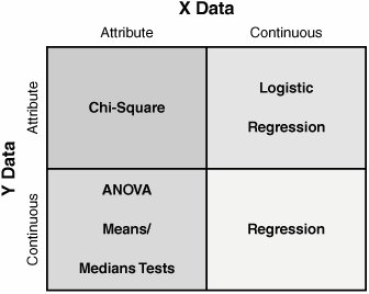
There are two basic forms of Regression:
Regression analysis is the statistical analysis technique used to investigate and model the relationship between the variables. For both the Simple and Multiple techniques, the model parameters are linear in nature, not quadratic or any other power. Given the sheer size of the subject and the application of the tool in Lean Sigma, here the focus is primarily on Simple Linear Regression. Multiple Linear Regression is covered briefly in "Other Options" in this section.[70]
As with all statistical tests, a sample of reality is required. Generally 30 or more data points are required for the X and the corresponding value of Y at that point. Regression is a passive analysis tool and so the process is not actively manipulated during the data capture. After the requisite number of data points have been collected, they are entered as two columns into a statistical software package and analyzed. Analyzing the data graphically using a Fitted Line Plot shows a result similar to the example shown in Figure 7.40.1. Here the X is "Age Of Propellant" in a rocket motor and the Y is "Shear Strength" of the propellant at that age. The data points are plotted on a Scatter Plot and then a straight line is fitted through them to give the best statistical fit. This is the Regression Line. There are many ways of doing this mathematically; in Regression the approach is to use Least Squares, which minimizes the total squares of all the distances from the line. Figure 7.40.1. Example Fitted Line Plot[71] (output from Minitab v14).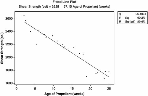
The equation of the straight line (the Regression model) is given above the graph in Figure 7.40.1 and is
Thus, in the future, for any Age of Propellant from 0 to 25 weeks,[72] it is possible to predict the physical property Shear Strength for that propellant. Also, if the Shear Strength had to be maintained above a certain level to perform correctly, then it is also possible to calculate a would-be shelf life for the propellant based on the model.
In the top right of Figure 7.40.1 are three statistics. These are in fact only three of many which are available from the full analysis results, which are shown in Figure 7.40.2. The analysis shows the same equation (model) representing the relationship between Y and X.
For the constant term and for each X in the model there is a p-value indicating whether that term is significantly non-zero. Both have a p-value of zero, which indicates that there would be a small (almost zero) chance of getting coefficients this large (far from zero) purely by random chance. Specifically
The bottom table is an ANOVA (Analysis Of Variance) table. For more details see "ANOVA" in this chapter. The ANOVA table breaks the variation into two main pieces:
The calculation of these is shown graphically in Figure 7.40.3:
Figure 7.40.3. Graphical representation of ANOVA calculation.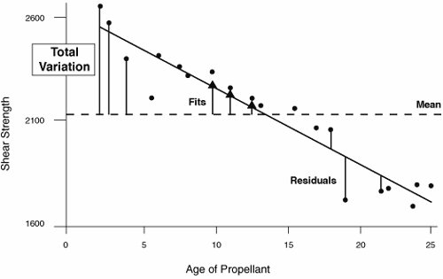 From the preceding calculations it is possible to calculate a signal-to-noise ratio based on the size of the Regression (the signal) versus the background noise (Residual Error). This is the F-test in the table. Here the value of F is 165.38, which means the size of the signal due to the X is 165.38 times greater than the background noise. The software then looks up the F value in a statistical table to discover the likelihood of seeing a difference of this magnitude.[75] The likelihood is the p-value, in this case 0.000.
The p-value indicates the likelihood of seeing a relationship this strong in the data sample purely by random chance; this means that there is no relationship at the population level, it happened by coincidence in selecting the sample from the population. As in most statistical tests, if the p-value is associated with a pair of hypotheses, for Regression:
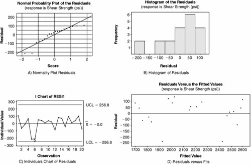
If the p-value is less than 0.05 (as in this example) then the null hypothesis Ho should be rejected and the conclusion is that the Y is dependent on the X. Belts sometimes are misled at this point into assuming that there is a direct causal relationship between the X and the Y. There might be, but a change in X does not necessarily directly cause Y to move. The statistically correct explanation here is that when X moves 1 unit, Y moves by some consistent associated amount. The analysis is not complete until the model adequacy is validated, which is done by reviewing the quality of the fit and an investigation into the variation that has not been explained, the Residuals (the bit left over). Residual evaluation gives a warning sign that the generated model might not be adequate or appropriate. Looking at Figure 7.40.3, you know the residual is the actual value minus the fitted value, and it can be negative or positive depending on whether the data point is above or below the line. There are several measures of model adequacy with respect to the Residuals:
To validate model adequacy it is useful to examine the residuals graphically. To determine if the Residuals are Normal a few options are available:
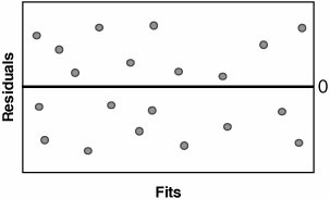
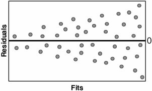
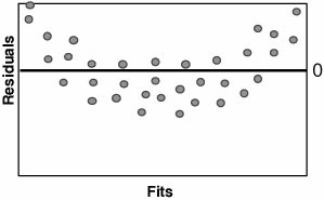
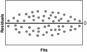
To determine if the Residuals are in Control, an Individuals Chart can be applied to the Residuals as shown in Graph C. Residuals that appear out of control should be studied further. Possible out-of-control issues might include Measurement Systems error, incorrect data entry, or an unusual process event. In the case of the latter, the Team should consult any notes taken during the data collection to evaluate the impact of the process event. To determine if the Residuals have constant variance and to show that they are random (just background noise), a Residuals versus Fits Plot can be applied, as shown in Graph D. The Residuals should be distributed randomly across the Plot; any obvious patterns could indicate model inadequacy as described in Table 7.40.1.
If there are patterns in the Residuals and the R2 value is very high, it probably presents no problem; however, if, for example, R2 is less than 80% then there might be opportunity to create a better model based on the paths recommended in the table. After the model is deemed to be adequate, the Team should collectively draw practical conclusions from it and present them back to the Process Owner and the Champion. RoadmapThe roadmap to conducting a Regression analysis is as follows:
Interpreting the OutputRegression in its Simple Linear form is quite straightforward to apply. There are, however, as with all tools, several pitfalls that can cause Belts problems:
Figure 7.40.6. Incorrect causal relationships.[79]
Other Options"Overview" and "Roadmap" in this section describe Simple Linear Regression, the investigation of the relationship between one Continuous X and one Continuous Y. Multiple Linear Regression, on the other hand, investigates the relationship between multiple Continuous Xs and one Continuous Y. The principles used are similar; however, the Fitted Line Plot no longer helps in this case. The multiple Xs are added into the Regression analysis and the same pointers are used, namely the R-Sq and p-values. The R-Sq(adj) becomes even more important in Multiple Linear Regression because there are more terms (more Xs) added into the model and certainly not all of them give any contribution.[78]
Linear Regression is just that, linear. Sometimes the behavior of the relationship between the X and the Y is non-linear. Most software packages allow the user to select higher order models, specifically quadratic (including X2 terms) and cubic (including X3 terms). Belts tend to get carried away adding in higher-order terms when really the key tenet here is "the simpler the model, the better." Unless there is compelling reason to add a higher-order term, the linear model is usually preferable. Look to the R-Sq(adj) value as the model advances up an order. If R-Sq(adj) decreases for a higher-order model then the higher-order terms do not bring any additional value. | |||||||||||||||||||||||||||||||||||||||||||||||||||||||||||||||||||||||||||||||||||||||||||


EAN: 2147483647
Pages: 138
- Key #3: Work Together for Maximum Gain
- When Companies Start Using Lean Six Sigma
- Making Improvements That Last: An Illustrated Guide to DMAIC and the Lean Six Sigma Toolkit
- The Experience of Making Improvements: What Its Like to Work on Lean Six Sigma Projects
- Six Things Managers Must Do: How to Support Lean Six Sigma