Flylib.com

Books Software


Creating a Liquid-Layout Grid


Creating a Liquid-Layout Grid

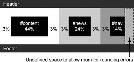
When creating a liquid layout, it is important to include vertical gutters so that the content columns do not butt up against each other. All widths should be set in percentages so that the entire page can be resized as a single unit, depending on the size of the browser window.

Percentage widths are calculated by the browser, so there will be some degree of rounding up or down of the measurements. For this reason, you should leave some undefined space so that there is room for possible rounding errors.

For this layout, the total width of the containers and their padding adds up to 100% . However, the padding on the right side of the #nav has not been included, so there is 3% of undefined space within the overall layout. The measurements are shown in Figure 21.1.

Figure 21.1. Diagram of liquid-layout grid.


Creating the Background Images

This layout uses two background images to give the illusion of column colors. The images must be wide enough to ensure they fill the largest screen. Here, they are 2000px wide.

The first image will be used to create the #content and #news column background colors.

The second image will be used to create the #nav column background color . Because this image sits over the top of the first image, it must have a transparent background as shown in Figure 21.2.

Figure 21.2. Diagram showing the background images.


Styling the <body> Element

Now that the layout grid and images are finished, you can begin coding the page.

The first step is to force the contents of the page up against the edges of the browser window. To do this, you must set both margin and padding to .

You can set both font- size and font-family for all elements on the page by applying these properties to the <body> element using font: 90% arial, helvetica, sans-serif; .

Setting margin and padding on the <body> Element

Browsers use different methods to set their default indentation on the <body> element.


If padding: 0 is used, Opera will set the content against the edges of the browser window.

If margin: 0 is used, all other standards-compliant browsers will set the content against the edges of the browser window.

The only way to force all browsers to work the same way is to set both margin and padding to .


The background- color and color properties also must be set on the <body> element. You can use a background color of #387A9B and a color of #333 as shown in Listing 21.3. The results can be seen in Figure 21.3.

Listing 21.3. CSS Code for Styling the <body> Element
body
{

margin: 0;


padding: 0;


font: 90% arial, helvetica, sans-serif;


background: #387A9B;


color: #333;

}

Figure 21.3. Screenshot of the styled <body> element.


Styling the <h1> Element

The <h1> element will be used to create the top banner.

First, the background- color and color properties must be set. In this example, you will use a background color of #D36832 and a color of #fff .

Standard <h1> elements have predefined top and bottom margins. To force the <h1> element into the top corner of the browser window, these margins must be set to .

To create space around the <h1> content, padding: .5em 3%; is used. This will put .5em of padding on the top and bottom of the content, and 3% on the left and right edges.

Finally, a border is applied to the bottom of the element using border-bottom: 5px solid #387A9B; as shown in Listing 21.4 and Figure 21.4.

Listing 21.4. CSS Code for Styling the <h1> Element
body
{
    margin: 0;
    padding: 0;
    font: 90% arial, helvetica, sans-serif;
    background: #387A9B;
    color: #333;
}

h1
{

background: #D36832;


color: #FFF;


margin: 0;


padding: .5em 3%;


border-bottom: 5px solid #387A9B;

}

Figure 21.4. Screenshot of the styled <h1> element.