Chapter 6. Creating SVG Gradients
 | CONTENTS |  |
In this chapter:
- What Are Gradients?
- The <linearGradient> Element
- The <radialGradient> Element
- SVG Gradients
- Multiple <stop> Elements
- SVG Gradients at Work
- SVG Patterns
What Are Gradients?
One of the visually attractive features of many bitmap graphics on the Web is the use of gradients to add a subtle or sophisticated appearance to an image. Similar effects are available in proprietary vector formats. SVG too provides gradients that can be used to good effect throughout SVG images.
A gradient is a smooth transition from one color to another along a vector. Several color transitions can be applied along the same vector and can be combined to provide complex, subtle, and sometimes very attractive color transitions. In addition to allowing color transitions, SVG provides for transitions in opacity.
In SVG jargon, gradients are simply a special type of "paint server." To apply the paint from a paint server, you simply reference the paint server using a URL and specify whether the paint server should be applied to the stroke or the fill of an element.
The types of gradient available in SVG version 1.0 are a linear gradient and a radial gradient, respectively controlled by the <linearGradient> and <radialGradient> elements. Aspects of the SVG linear and radial gradients can be animated. This chapter looks at only the construction of non-animated gradients. I introduce you to animated gradients in Chapter 8, "Animation: SVG and SMIL Animation."
Both linear and radial gradients are created and used in a similar way. The gradient is best defined using either a <linearGradient> or <radialGradient> element, as appropriate, nested within the <defs> element of an SVG document.
The definition of the gradient is then accessed by another SVG element using a URL within the style attribute of the referencing graphics element. The following simple example shows a linear gradient being referenced by the fill property of a <rect> element.
Listing 6.1 (BasicLinGradient.svg)
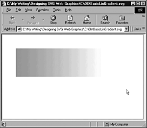
<?xml version="1.0" standalone="no"?> <!DOCTYPE svg PUBLIC "-//W3C//DTD SVG 1.0//EN" "http://www.w3.org/TR/2001/PR-SVG-20010719/ DTD/svg10.dtd"> <svg width="500" height="300"> <defs> <linearGradient id="MyFirstGradient"> <stop offset="5%" style="stop-color:#FF6600"/> <stop offset="95%" style="stop-color:#FFFFCC"/> </linearGradient> </defs> <rect style="fill:none; stroke:red" x="1" y="1" width="498" height="298"/> <rect x="50" y="50" width="300" height="100" style="fill:url(#MyFirstGradient); stroke:none"/> </svg>
The definition of the gradient takes place here:
<defs> <linearGradient id="MyFirstGradient"> <stop offset="5%" style="stop-color:#FF6600"/> <stop offset="95%" style="stop-color:#FFFFCC"/> </linearGradient> </defs>
and that definition is accessed by the following code within the second <rect> element:
style="fill:url(#MyFirstGradient); stroke:none"
The fill property is defined to refer to a URL, #MyFirstGradient. The syntax #MyFirstGradient is a "bare name" XPointer that behaves similarly to the similar syntax in HTML you may be familiar with.
The output of Listing 6.1 is shown in Figure 06.01.
Figure 06.01. A basic linear gradient with the color transition taking place along a horizontal vector.
Take a closer look at creating linear gradients.
The <linearGradient> Element
Linear gradients in SVG can be defined as horizontal gradients, vertical gradients, or diagonally at any angle between the horizontal and vertical. A horizontal gradient is created when the values of the y1 and y2 attributes of the <linearGradient> element are the same and the x1 and x2 attributes differ. A vertical gradient results when the x1 and x2 attributes or the <linearGradient> element are the same and the y1 and y2 attributes differ. A diagonal gradient results when both pairs of attributes differ.
A linear gradient can have two colors or many colors. Each color used in a gradient is specified using a <stop> element, which has stop-color and stop-opacity attributes. SVG also allows you to vary individually the opacity of the "stop colors" that are present within a linear gradient, allowing a large range of subtle visual effects to be achieved.
Creating a banner using a linear gradient
Use what you have learned about linear gradients to create a banner that uses a linear gradient and could be a banner on an HTML or XHTML Web page or even on an SVG Web page.
You want to produce a gradient that starts at deep blue at the top and shades down to pale blue in its lower part. To produce such a vertical linear gradient, the x1 and x2 attributes of the <linearGradient> element need to be same. Your code looks like this:
Listing 6.2 (RectGradient0.svg)
<?xml version='1.0'?> <!DOCTYPE svg PUBLIC "-//W3C//DTD SVG 1.0//EN" "http://www.w3.org/TR/2001/PR-SVG-20010719/ DTD/svg10.dtd"> <svg width="800" height="600"> <defs> <linearGradient id="MyBlueGradient" gradientUnits="userSpaceOnUse" x1="0" y1="0" x2="0" y2="120" > <stop offset="10%" style="stop-color:#000066"/> <stop offset="75%" style="stop-color:#EEEEFF"/> </linearGradient> </defs> <rect x="0" y="0" width="800" height="100" style="fill:url(#MyBlueGradient);"/> </svg>
Note the use of the <defs> element to contain the definition of the <linearGradient> element. The linear gradient is used as the fill of the <rect> element and is accessed by this syntax:
style="fill:url(#MyBlueGradient);"
The url() function makes use of a bare-names XPointer, which is similar to the fragment identifier in HTML and XHTML. The syntax
#MyBlueGradient
refers to the element in the current document that has an id attribute with a value of MyBlueGradient, which in this case is present on the <linearGradient> element nested within the <defs> element.
The linear gradient has two colors a deep blue with a 10 percent offset and a pale blue with a 75 percent offset. The appearance that is produced is shown in Figure 06.02.
Figure 06.02. A vertical linear gradient that could be used as the basis for a banner in a Web page.
Using linear gradients within text
So far, you have seen linear gradients used within graphic shapes, but SVG also allows you to use linear gradients within text. Both vertical and horizontal gradients are possible within text.
In practice, to achieve useful vertical gradients within a glyph or block of text, you need to choose a fairly large font size. To use a vertical linear gradient, you define it as before within the <defs> element using a <linearGradient> element (see Figure 06.03).
Figure 06.03. Two strings of text containing vertical linear gradients.
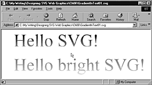
Listing 6.3 (GradientInText01.svg)
<?xml version='1.0'?> <!DOCTYPE svg PUBLIC "-//W3C//DTD SVG 1.0//EN" "http://www.w3.org/TR/2001/PR-SVG-20010719/ DTD/svg10.dtd"> <svg width="800" height="600"> <defs> <linearGradient id="MyBlueGradient" gradientUnits="userSpaceOnUse" x1="0" y1="0" x2="0" y2="100" > <stop offset="10%" style="stop-color:#000066"/> <stop offset="75%" style="stop-color:#AAAADD"/> </linearGradient> <linearGradient id="MyBrightGradient" gradientUnits="userSpaceOnUse" x1="0" y1="100" x2="0" y2="200"> <stop offset="10%" style="stop-color:#FF0000"/> <stop offset="90%" style="stop-color:#FFFF00"/> </linearGradient> </defs> <text x="50" y="70" style="font-family:Times, serif; font-size:72; fill:url(#MyBlueGradient);"> Hello SVG! </text> <text x="50" y="170" style="font-family:Times, serif; font-size:72; fill:url(#MyBrightGradient);"> Hello bright SVG! </text> </svg>
The visual appearance of gradients in text can change markedly, depending on the color of the background against which they are set. Listing 6.4 and Figure 06.04 show the difference in appearance by changing the background from white to black.
Figure 06.04. Vertical gradient in text against a black background.
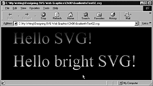
Listing 6.4 (GradientInText02.svg)
<?xml version='1.0'?> <!DOCTYPE svg PUBLIC "-//W3C//DTD SVG 1.0//EN" "http://www.w3.org/TR/2001/PR-SVG-20010719/ DTD/svg10.dtd"> <svg width="800" height="600"> <defs> <linearGradient id="MyBlueGradient" gradientUnits="userSpaceOnUse" x1="0" y1="0" x2="0" y2="100" > <stop offset="10%" style="stop-color:#000066"/> <stop offset="75%" style="stop-color:#AAAADD"/> </linearGradient> <linearGradient id="MyBrightGradient" gradientUnits="userSpaceOnUse" x1="0" y1="100" x2="0" y2="200"> <stop offset="10%" style="stop-color:#FF0000"/> <stop offset="90%" style="stop-color:#FFFF00"/> </linearGradient> </defs> <rect x="0" y="0" width="800" height="600" /> <text x="50" y="70" style="font-family:Times, serif; font-size:72; fill:url(#MyBlueGradient);"> Hello SVG! </text> <text x="50" y="170" style="font-family:Times, serif; font-size:72; fill:url(#MyBrightGradient);"> Hello bright SVG! </text> </svg>
If you want to create a horizontal gradient, you do not have to use large-size fonts, although you can do it as shown in Listing 6.5, as you can see in Figure 06.05. In this further example, I have used a vertical gradient on the first <text> element and a horizontal gradient, with three stops, on the second.
Figure 06.05. A horizontal linear gradient within the lower text.
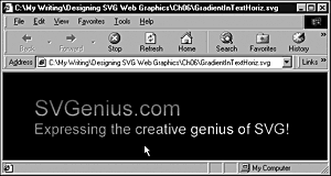
Listing 6.5 (GradientInTextHoriz.svg)
<?xml version='1.0'?> <!DOCTYPE svg PUBLIC "-//W3C//DTD SVG 1.0//EN" "http://www.w3.org/TR/2001/PR-SVG-20010719/ DTD/svg10.dtd"> <svg width="800" height="600"> <defs> <linearGradient id="MyBlueGradient" gradientUnits="userSpaceOnUse" x1="0" y1="0" x2="0" y2="100" > <stop offset="10%" style="stop-color:#000066"/> <stop offset="75%" style="stop-color:#AAAADD"/> </linearGradient> <linearGradient id="MyBrightGradient" gradientUnits="userSpaceOnUse" x1="0" y1="100" x2="600" y2="100"> <stop offset="10%" style="stop-color:#FF0000"/> <stop offset="60%" style="stop-color:#FFFF00"/> <stop offset="90%" style="stop-color:#00FF00"/> </linearGradient> </defs> <rect x="0" y="0" width="800" height="600" /> <text x="50" y="70" style="font-family:Arial, sans-serif; font-size:36; fill:url(#MyBlueGradient);"> SVGenius.com </text> <text x="50" y="100" style="font-family:Arial, sans-serif; font-size:24; fill:url(#MyBrightGradient);"> Expressing the creative genius of SVG! </text> </svg>
Creating a vertical gradient
In the introduction to this chapter, I defined a gradient as a color transition along a vector. Most of the examples I have shown you are graduated along a horizontal vector. To create a vertical gradient, you simply alter the direction of the vector. Instead of the value of x1 and x2 being different, you keep x1 and x2 the same and make y1 and y2 different.
Rotating a gradient
You have seen in this chapter how SVG provides two basic vectors horizontal and vertical along which a gradient is painted. If you want a gradient that is implemented on a diagonal, you have more than one option.
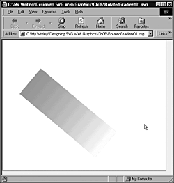
One option is simply to rotate the object containing the gradient, using a transform attribute on a containing grouping <g> element, like this:
Listing 6.6 (RotatedGradient01.svg)
<?xml version="1.0" standalone="no"?> <!DOCTYPE svg PUBLIC "-//W3C//DTD SVG 1.0//EN" "http://www.w3.org/TR/2001/PR-SVG-20010719/ DTD/svg10.dtd"> <svg width="500" height="400"> <defs> <linearGradient id="MyRotatedGradient"> <stop offset="5%" style="stop-color:#FF6600"/> <stop offset="95%" style="stop-color:#FFFFCC"/> </linearGradient> </defs> <rect x="1" y="1" width="498" height="398" style="fill:none; stroke:red;"/> <g transform="rotate(40 150 50)translate(100,50)"> <rect x="50" y="50" width="300" height="100" style="fill:url(#MyRotatedGradient); stroke:none"/> </g> </svg>
I have used a rectangle to show that both the <rect> element and the contained gradient rotate, as you can see in Figure 06.06.
Figure 06.06. A rotated gradient produced by using a rotate transformation on a <g> element.
A more general solution is to rotate the gradient itself or, more precisely, to create a diagonal gradient. To create a diagonal vector, you simply have to make sure that the x1 and x2 attributes differ and that the y1 and y2 attributes also differ. If you use only undefined user units for the dimensions in your SVG image, you also need to set the gradientUnits attribute to a value of userSpaceOnUse:
<linearGradient id="MyDiagonalGradient" x1="50" y1="50" x2="400" y2="200" gradientUnits="userSpaceOnUse">
as shown in this example:
Listing 6.7 (DiagonalLinGradient.svg)
<?xml version="1.0" standalone="no"?> <!DOCTYPE svg PUBLIC "-//W3C//DTD SVG 1.0//EN" "http://www.w3.org/TR/2001/PR-SVG-20010719/ DTD/svg10.dtd"> <svg width="500" height="300"> <defs> <linearGradient id="MyDiagonalGradient" x1="50" y1="50" x2="400" y2="200" gradientUnits="userSpaceOnUse"> <stop offset="20%" style="stop-color:#FF6600"/> <stop offset="80%" style="stop-color:#FFFFCC"/> </linearGradient> </defs> <!-- Outline the drawing area in red. --> <rect style="fill:none; stroke:red" x="1" y="1" width="498" height="298"/> <rect x="50" y="50" width="300" height="100" style="fill:url(#MyDiagonalGradient); stroke:none"/> </svg>
In Figure 06.07, you can see the visual appearance produced by Listing 6.7. You may notice that the red color tends to dominate the gradient and that the diagonal part of the color transition is not striking.
Figure 06.07. In this diagonal gradient, notice that the lower-right corner is paler than the upper-right corner.
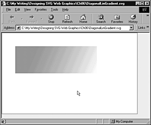
As you can see if you display this graphic onscreen, it graduates from a reddish hue in the upper-left corner of the rectangle to a pale, creamy yellow in the lower right.
Applying a gradient to an outline
An SVG gradient can be applied to an outline in much the same way as it is applied to a fill. Here is a simple example:
Listing 6.8 (LinGradientStroke.svg)
<?xml version="1.0" standalone="no"?> <!DOCTYPE svg PUBLIC "-//W3C//DTD SVG 1.0//EN" "http://www.w3.org/TR/2001/PR-SVG-20010719/ DTD/svg10.dtd"> <svg width="400" height="200"> <defs> <linearGradient id="MyFirstGradient"> <stop offset="5%" style="stop-color:#990066"/> <stop offset="95%" style="stop-color:#FFFF00"/> </linearGradient> </defs> <rect style="fill:none; stroke:#990066" x="1" y="1" width="398" height="198"/> <rect x="50" y="50" width="300" height="100" style="stroke:url(#MyFirstGradient); stroke-width:3; fill:none"/> </svg>
The visual appearance is shown in Figure 06.08.
Figure 06.08. A horizontal linear gradient applied to the outline of a rectangle.
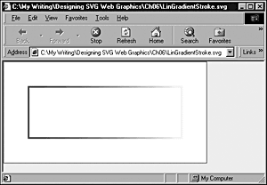
The key change is to define the stroke by referencing a previously defined gradient:
style="stroke:url(#MyFirstGradient); stroke-width:3; fill:none"
Varying the opacity within a gradient
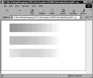
As I mentioned earlier, you can also define a stop-opacity property for each stop-color property in a linear gradient. In the following example, I have defined three rectangles that are identical in all color respects except for the opacity of the #FF6600 stop-color property on the left side of each gradient.
Listing 6.9 (LinGradientOpacity01.svg)
<?xml version="1.0" standalone="no"?> <!DOCTYPE svg PUBLIC "-//W3C//DTD SVG 1.0//EN" "http://www.w3.org/TR/2001/PR-SVG-20010719/ DTD/svg10.dtd"> <svg width="500" height="400"> <defs> <linearGradient id="MyFirstGradient"> <stop offset="5%" style="stop-color:#FF6600"/> <stop offset="95%" style="stop-color:#FFFFCC"/> </linearGradient> <linearGradient id="MyFirstOpacityGradient"> <stop offset="5%" style="stop-color:#FF6600; stop-opacity:0.5;"/> <stop offset="95%" style="stop-color:#FFFFCC"/> </linearGradient> <linearGradient id="MySecondOpacityGradient"> <stop offset="5%" style="stop-color:#FF6600; stop-opacity:0.1;"/> <stop offset="95%" style="stop-color:#FFFFCC"/> </linearGradient> </defs> <rect style="fill:none; stroke:red" x="1" y="1" width="498" height="298"/> <rect x="50" y="20" width="300" height="50" style="fill:url(#MyFirstGradient); stroke:none"/> <rect x="50" y="95" width="300" height="50" style="fill:url(#MyFirstOpacityGradient); stroke:none"/> <rect x="50" y="170" width="300" height="50" style="fill:url(#MySecondOpacityGradient); stroke:none"/> </svg>
In Figure 06.09, you can see how varying the stop-opacity of the left color (red) alters the visual appearance of the left side of the gradient.
Figure 06.09. The left end of three horizontal linear gradients, which show a stop opacity (from top to bottom) of 1, 0.5, and 0.1, respectively.
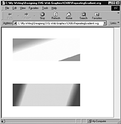
Repeating gradients
In the examples you have seen in this chapter, if the gradient is completed inside the outline of a graphics element, the color is simply "padded" out to the edge of the graphics element. This padding implicitly uses the default setting of the spreadMethod attribute, which has the value pad. However, the spreadMethod attribute has two other possible values that allow you to repeat gradients, but in two distinct ways.
You can also repeat SVG gradients. For example, in the following listing, you create two rectangles containing linear gradients which shows two ways in which a gradient can be repeated. In the first rectangle, you use the following code to cause the gradient to repeat:
<linearGradient id="MyRepeatingGradient" x1="50" y1="50" x2="100" y2="200" gradientUnits="userSpaceOnUse" spreadMethod="repeat">
If you study the following figure or, better, run the code, you see that the gradient makes a smooth transition from a reddish hue to pale yellow and then suddenly, step-wise, starts at the reddish hue again. Thus, the gradient is repeating in a direction from upper left to lower right.
However, in the lower rectangle, you reflect the gradient using this code:
<linearGradient id="MyReflectingGradient" x1="50" y1="250" x2="200" y2="300" gradientUnits="userSpaceOnUse" spreadMethod="reflect">
so that the gradient changes smoothly to a pale metallic pink color and then smoothly changes back to a dark maroon. Both changes are smooth because the second change is the mirror image of the first (see Figure 06.10).
Figure 06.10. Two rectangles showing different spread methods. The top shows a repeat method, and the bottom shows a reflect method.
Listing 6.10 (RepeatingGradient.svg)
<?xml version="1.0" standalone="no"?> <!DOCTYPE svg PUBLIC "-//W3C//DTD SVG 1.0//EN" "http://www.w3.org/TR/2001/PR-SVG-20010719/ DTD/svg10.dtd"> <svg width="500" height="400"> <defs> <linearGradient id="MyRepeatingGradient" x1="50" y1="50" x2="100" y2="200" gradientUnits="userSpaceOnUse" spreadMethod="repeat"> <stop offset="20%" style="stop-color:#FF6600"/> <stop offset="40%" style="stop-color:#FFFFCC"/> </linearGradient> <linearGradient id="MyReflectingGradient" x1="50" y1="250" x2="200" y2="300" gradientUnits="userSpaceOnUse" spreadMethod="reflect"> <stop offset="20%" style="stop-color:#990066"/> <stop offset="40%" style="stop-color:#FFCCFF"/> </linearGradient> </defs> <rect style="fill:none; stroke:red" x="1" y="1" width="498" height="398"/> <rect x="50" y="50" width="300" height="100" style="fill:url(#MyRepeatingGradient); stroke:none"/> <rect x="50" y="250" width="300" height="100" style="fill:url(#MyReflectingGradient); stroke:none"/> </svg>
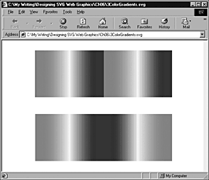
You can also see the difference between repeated and reflected gradients when you are using three color gradients, as shown in Listing 6.11.
Listing 6.11 (3ColorGradients.svg)
<?xml version="1.0" standalone="no"?> <!DOCTYPE svg PUBLIC "-//W3C//DTD SVG 1.0//EN" "http://www.w3.org/TR/2001/PR-SVG-20010719/ DTD/svg10.dtd"> <svg width="600" height="400"> <linearGradient id="reflected" x1="0%" y1="0%" x2="50%" y2="0%" spreadMethod="reflect" gradientUnits="objectBoundingBox"> <stop offset="10%" style="stop-color:rgb(255,0,0)"/> <stop offset="50%" style="stop-color:rgb(255,255,0)"/> <stop offset="90%" style="stop-color:rgb(0,0,255)"/> </linearGradient> <linearGradient id="repeated" x1="0%" y1="0%" x2="50%" y2="0%" spreadMethod="repeat" gradientUnits="objectBoundingBox"> <stop offset="10%" style="stop-color:rgb(255,0,0)"/> <stop offset="50%" style="stop-color:rgb(255,255,0)"/> <stop offset="90%" style="stop-color:rgb(0,0,255)"/> </linearGradient> <rect x="98" y="30" width="408" height="140" rx="0" ry="0" style="stroke:none;fill:url(#repeated)"/> <rect x="98" y="220" width="408" height="140" rx="0" ry="0" style="stroke:none;fill:url(#reflected)"/> </svg>
In Figure 06.11, you can see a repeated gradient in the top rectangle and a reflected gradient in the bottom one.
Figure 06.11. Repeated gradient (top) and reflected gradient shown using three color gradients.
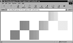
Gaining control over gradients
If you are creating gradients in Corel Draw 10 or a similar vector drawing package, the code for your SVG gradients is produced for you. But if you are serious about mastering SVG (and I suggest that you should be) and you try to create gradients by hand, establishing exactly where a gradient should be displayed relative to an SVG element can be quite difficult at times.
I suggest that you experiment with an SVG image like this one, which has a number of rectangles laid out in order to display different parts of a fairly elongated gradient:
Listing 6.12 (TestRects01.svg)
<?xml version="1.0" standalone="no"?> <!DOCTYPE svg PUBLIC "-//W3C//DTD SVG 1.0//EN" "http://www.w3.org/TR/2001/PR-SVG-20010719/ DTD/svg10.dtd"> <svg width="800" height="600"> <defs> <linearGradient id="MyBlueGradient" gradientUnits="userSpaceOnUse" x1="0" y1="50" x2="800" y2="50" > <stop offset="10%" style="stop-color:#FF0066"/> <stop offset="75%" style="stop-color:#EEEEFF"/> </linearGradient> </defs> <rect x="100" y="200" width="100" height="100" style="fill:url(#MyBlueGradient)"/> <rect x="200" y="100" width="100" height="100" style="fill:url(#MyBlueGradient)"/> <rect x="300" y="200" width="100" height="100" style="fill:url(#MyBlueGradient)"/> <rect x="400" y="100" width="100" height="100" style="fill:url(#MyBlueGradient)"/> <rect x="500" y="0" width="100" height="100" style="fill:url(#MyBlueGradient)"/> <rect x="600" y="100" width="100" height="100" style="fill:url(#MyBlueGradient)"/> </svg>
You can see in each of the displayed rectangles shown in Figure 06.12 how the gradient is affecting that part of the SVG viewport, assuming that the gradient will be made visible there. By experimenting with this type of test bed, you soon begin to get a feel for how an adjustment of one param-eter of a gradient changes the visual appearance.
Figure 06.12. A test group of rectangles for visualizing the appearance of a linear gradient.
To see how the same issues pan out on a diagonal linear gradient, look at Figure 06.13 of the following code:
Figure 06.13. Visualizing a diagonal gradient using repeating circular shapes.
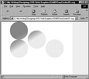
Listing 6.13 (FourCircles01.svg)
<?xml version="1.0" standalone="no"?> <!DOCTYPE svg PUBLIC "-//W3C//DTD SVG 1.0//EN" "http://www.w3.org/TR/2001/PR-SVG-20010719/ DTD/svg10.dtd"> <svg width="400" height="300"> <defs> <linearGradient id="MyBlueGradient" gradientUnits="userSpaceOnUse" x1="90" y1="50" x2="150" y2="150" > <stop offset="10%" style="stop-color:#FF0066"/> <stop offset="75%" style="stop-color:#EEEEFF"/> </linearGradient> </defs> <ellipse cx="100" cy="50" rx="50" ry="50" style="fill:url(#MyBlueGradient)"> </ellipse> <ellipse cx="100" cy="150" rx="50" ry="50" style="fill:url(#MyBlueGradient)"> </ellipse> <ellipse cx="200" cy="100" rx="50" ry="50" style="fill:url(#MyBlueGradient)"> </ellipse> <ellipse cx="300" cy="150" rx="50" ry="50" style="fill:url(#MyBlueGradient)"> </ellipse> </svg>
Notice that the upper-left circle is almost uniformly the deep pink color, with only a hint of the gradient in the lower-right area. Similarly, the lower-right circle is essentially a pale blue color. The gradient between deep pink and pale blue is present only on the diagonal on which the other two circles are placed. If you miscalculate the positioning of an element, you can find that it has a uniform color. If that happens, one cause is that you have placed the element in the wrong place to apply the rapidly graduating part of the gradient to the element.
The <radialGradient> Element
The second type of gradient provided in SVG is the radial gradient. It is defined within a <radialGradient> element nested within the <defs> element of an SVG document:
<radialGradient id="MyRadialGradient" gradientUnits="userSpaceOnUse" cx="100" cy="100" r="50" fx="100" fy="100"> <stop offset="20%" style="stop-color:#990066"/> <stop offset="70%" style="stop-color:pink"/> </radialGradient>
and is referenced by another SVG element occurring later in the document. The <radialGradient> element must have an id attribute to allow it to be referenced by any graphical element elsewhere in the SVG (see Figure 06.14).
Figure 06.14. A simple radial gradient with two stops.
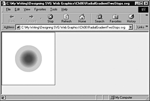
Listing 6.14 (RadialGradientTwoStops.svg)
<?xml version="1.0" standalone="no"?> <!DOCTYPE svg PUBLIC "-//W3C//DTD SVG 1.0//EN" "http://www.w3.org/TR/2001/PR-SVG-20010719/ DTD/svg10.dtd"> <svg width="200" height="200"> <defs> <radialGradient id="MyRadialGradient" gradientUnits="userSpaceOnUse" cx="100" cy="100" r="50" fx="100" fy="100"> <stop offset="20%" style="stop-color:#990066"/> <stop offset="70%" style="stop-color:pink"/> </radialGradient> </defs> <rect style="fill:none; stroke:#990066" x="1" y="1" width="198" height="198"/> <circle style="fill:url(#MyRadialGradient); stroke:none" cx="100" cy="100" r="50"/> </svg>
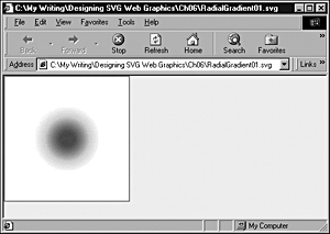
It is also possible to have more than two <stop> elements in a radial gradient, as shown in this example:
Listing 6.15 (RadialGradient01.svg)
<?xml version="1.0" standalone="no"?> <!DOCTYPE svg PUBLIC "-//W3C//DTD SVG 1.0//EN" "http://www.w3.org/TR/2001/PR-SVG-20010719/ DTD/svg10.dtd"> <svg width="200" height="200"> <g> <defs> <radialGradient id="MyRadialGradient" gradientUnits="userSpaceOnUse" cx="100" cy="100" r="50" fx="100" fy="100"> <stop offset="20%" style="stop-color:#990066"/> <stop offset="70%" style="stop-color:pink"/> <stop offset="100%" style="stop-color:#FFFF99"/> </radialGradient> </defs> <rect style="fill:none; stroke:#990066" x="1" y="1" width="198" height="198"/> <circle style="fill:url(#MyRadialGradient); stroke:none" cx="100" cy="100" r="50"/> </g> </svg>
In Figure 06.15, you can see the effect of adding an additional stop to the preceding radial gradient.
Figure 06.15. A radial gradient with three stop colors.
SVG Gradients
Gradients can produce some lovely visual effects, whether you are seeking subtle graduations of color or startling, vibrant or even shocking visual effects. To achieve the precise effect you are looking for, you need to understand how to control SVG gradients.
If you want to study how different stop color and stop opacities affect the visual appearance of SVG elements, one technique I find useful is to create linear (or, to a lesser extent, radial) gradients that encompass the whole screen. Then create a small SVG object a rectangle or circle, perhaps and animate it slowly across the gradient and study how the colors and opacities affect the SVG object. The gradient itself is invisible except where it impinges on the object. The slow movement of the object allows you to study how adjusting the parameters of the gradient whether they are offset, stop-color, or stop-opacity properties affects the visual appearance. By using that technique, you in effect isolate different parts of the gradient so that you can examine each one. The technique for animating an SVG object along a gradient is described in Chapter 8.
Multiple <stop> Elements
NOTE
SVG allows you to add as many <stop> elements as you want to a <linearGradient> or <radialGradient> element. In addition, you can set the stop-opacity properties for each <stop> element independently, thus giving a huge range of potential visual appearances.
SVG Gradients at Work
Take a look now at how you can put SVG gradients to work, by creating a banner or a top frame using an SVG gradient.
Size your SVG viewport to be 800 pixels wide. You should aim to create a vertical gradient that shades from a deep pink at the top to a pale blue at the bottom.
The source code looks like this:
Listing 6.16 (BannerGradient.svg)
<?xml version='1.0'?> <!DOCTYPE svg PUBLIC "-//W3C//DTD SVG 1.0//EN" "http://www.w3.org/TR/2001/PR-SVG-20010719/ DTD/svg10.dtd"> <svg width="800" height="600"> <defs> <linearGradient id="MyPinkGradient" gradientUnits="userSpaceOnUse" x1="0" y1="0" x2="0" y2="120" > <stop offset="10%" style="stop-color:#FF0066"/> <stop offset="75%" style="stop-color:#EEEEFF"/> </linearGradient> </defs> <rect x="0" y="0" width="800" height="100" style="fill:url(#MyPinkGradient);"/> </svg>
The gradient appears as shown in Figure 06.16.
Figure 06.16. A simple banner gradient.
You can build on that simple start by adding some blue lines over the lower part of the gradient, which looks like Figure 06.17.
Figure 06.17. A simple banner gradient with added blue lines at the bottom.
The code to produce Figure 06.17 looks like this:
Listing 6.17 (BannerGradient02.svg)
<?xml version='1.0'?> <!DOCTYPE svg PUBLIC "-//W3C//DTD SVG 1.0//EN" "http://www.w3.org/TR/2001/PR-SVG-20010719/ DTD/svg10.dtd"> <svg width="800" height="600"> <defs> <linearGradient id="MyPinkGradient" gradientUnits="userSpaceOnUse" x1="0" y1="0" x2="0" y2="120" > <stop offset="10%" style="stop-color:#FF0066"/> <stop offset="75%" style="stop-color:#EEEEFF"/> </linearGradient> </defs> <rect x="0" y="0" width="800" height="100" style="fill:url(#MyPinkGradient);"/> <g> <rect x="0" y="82" width="800" height="1" style="fill:#000066; stroke:#000066; stroke-width:1"/> <rect x="0" y="86" width="800" height="1" style="fill:#000066; stroke:#000066; stroke-width:1"/> <rect x="0" y="90" width="800" height="1" style="fill:#000066; stroke:#000066; stroke-width:1"/> <rect x="0" y="94" width="800" height="1" style="fill:#000066; stroke:#000066; stroke-width:1"/> <rect x="0" y="98" width="800" height="1" style="fill:#000066; stroke:#000066; stroke-width:1"/> </g> </svg>
As it stands, this code would produce a pleasant-looking top frame. But suppose that you want to take things a stage further and use that gradient as a basis for a slightly unusual page layout, perhaps for a splash page, leaving space for an animation in the central part of the page.
You could reuse the logo you created in Chapter 3, "Creating Static Graphics Elements," and produce an SVG Web page that looks like the one shown in Figure 06.18.
Figure 06.18. Combining the skeleton logo from Chapter 3 with the banner, which includes a linear gradient.
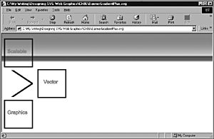
The code to produce Figure 06.18 looks like this:
Listing 6.18 (BannerGradientPlus.svg)
<?xml version='1.0'?> <!DOCTYPE svg PUBLIC "-//W3C//DTD SVG 1.0//EN" "http://www.w3.org/TR/2001/PR-SVG-20010719/ DTD/svg10.dtd"> <svg width="800" height="600"> <defs> <linearGradient id="MyPinkGradient" gradientUnits="userSpaceOnUse" x1="0" y1="0" x2="0" y2="120" > <stop offset="10%" style="stop-color:#FF0066"/> <stop offset="75%" style="stop-color:#EEEEFF"/> </linearGradient> </defs> <rect x="0" y="0" width="800" height="100" style="fill:url(#MyPinkGradient);"/> <g> <rect x="0" y="82" width="800" height="1" style="fill:#000066; stroke:#000066; stroke-width:1"/> <rect x="0" y="86" width="800" height="1" style="fill:#000066; stroke:#000066; stroke-width:1"/> <rect x="0" y="90" width="800" height="1" style="fill:#000066; stroke:#000066; stroke-width:1"/> <rect x="0" y="94" width="800" height="1" style="fill:#000066; stroke:#000066; stroke-width:1"/> <rect x="0" y="98" width="800" height="1" style="fill:#000066; stroke:#000066; stroke-width:1"/> </g> <!-- The logo from an earlier chapter is re-used here. --> <svg x="0" y="0" width="400" height="500"> <rect x="10" y="20" width="100" height="100" style="fill:none; stroke:#000099; stroke-width:4;"/> <rect x="130" y="130" width="100" height="100" style="fill:none; stroke:#000099; stroke-width:4;"/> <rect x="10" y="240" width="100" height="100" style="fill:none; stroke:#000099; stroke-width:4;"/> <line x1="35" y1="130" x2="110" y2="180" style="stroke-width:5; stroke:#000099"/> <line x1="35" y1="230" x2="110" y2="180" style="stroke-width:5; stroke:#000099"/> <rect x="20" y="130" width="100" height="100" style="fill:none; stroke:white; stroke-width:4;"/> <text x="20" y="70" style="font-size:18; stroke:#FF0066; fill:#FF0066;"> Scalable</text> <text x="150" y="180" style="font-size:18; stroke:#FF0066; fill:#FF0066;"> Vector</text> <text x="20" y="290" style="font-size:18; stroke:#FF0066; fill:#FF0066;"> Graphics</text> </svg> </svg>
SVG Patterns
SVG views plain color, gradients, and patterns as three types of paint servers that can be painted on an SVG canvas.
Listing 6.19 demonstrates a simple SVG pattern and Figure 06.19 illustrates it.
Figure 06.19. A simple SVG pattern.
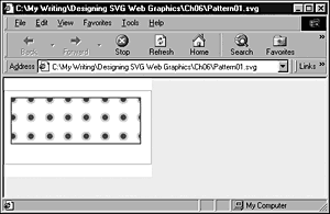
Listing 6.19 (Pattern01.svg)
<?xml version="1.0" standalone="no"?> <!DOCTYPE svg PUBLIC "-//W3C//DTD SVG 1.0//EN" "http://www.w3.org/TR/2001/PR-SVG-20010719/ DTD/svg10.dtd"> <svg width="6cm" height="4cm" viewBox="0 0 800 400"> <defs> <pattern id="CirclePattern" patternUnits="userSpaceOnUse" x="0" y="0" width="100" height="100" viewBox="0 0 10 10" > <circle cx="5" cy="5" r="2" style="stroke:pink; fill:green;"/> </pattern> </defs> <rect fill="none" stroke="blue" x="1" y="1" width="798" height="398"/> <rect fill="url(#CirclePattern)" style="stroke:green; stroke-width:5;" x="40" y="40" width="700" height="250" /> </svg>
In this chapter, you added some understanding of SVG gradients to your skills in SVG. Chapter 7, "Using SVG Filters," moves on to examine the SVG filters that give you another series of visual effects you can apply.
| CONTENTS | |
EAN: 2147483647
Pages: 26