Using Fields with the GridView Control In all the sample code in the previous section, the GridView control was used to automatically render an HTML table that contains a list of data items. However, there is a problem with allowing the GridView to render its columns automatically. The result does not look very professional. For example, the column headers are simply the names of the underlying database columns. Displaying the column name EntryDate as a column header seems, well, a little cheesy. We really need to be able to specify custom column headers. Another problem with enabling the GridView to render its columns automatically is that you give up any control over column formatting. For example, the BoxOfficeTotals column is displayed as a decimal amount without any currency formatting. The EnTRyDate column always displays in short-date and long-time format. Furthermore, it would be nice to be able to display the values of certain columns as images, drop-down lists, or hyperlinks. If you use the automatically generated columns, then you are stuck with the user interface you are given. The solution to all these problems is to specify explicitly the fields that a GridView displays. The GridView control supports the following types of fields: BoundField Enables you to display the value of a data item as text. CheckBoxField Enables you to display the value of a data item as a check box. CommandField Enables you to display links for editing, deleting, and selecting rows. ButtonField Enables you to display the value of a data item as a button (image button, link button, or push button). HyperLinkField Enables you to display the value of a data item as a link. ImageField Enables you to display the value of a data item as an image. TemplateField Enables you to customize the appearance of a data item.
The following sections examine how you can take advantage of each of these different types of fields. Note You can create custom fields that work with the GridView control. This option is explored in the final section of this chapter.
Using BoundFields A BoundField always displays the value of a data item as text when a row is in normal display mode. When a row is selected for editing, a BoundField displays the value of a data item in a single line text field. The most important three properties of the BoundField class are the DataField, DataFormatString, and HeaderText properties. The page in Listing 11.18 illustrates how to use these properties when displaying a list of movies (see Figure 11.13). Figure 11.13. Using BoundFields with the GridView control. 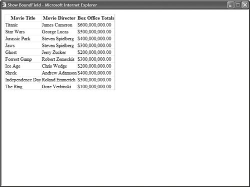
Listing 11.18. ShowBoundField.aspx <%@ Page Language="VB" %> <!DOCTYPE html PUBLIC "-//W3C//DTD XHTML 1.1//EN" "http://www.w3.org/TR/xhtml11/DTD/xhtml11.dtd"> <html xmlns="http://www.w3.org/1999/xhtml" > <head runat="server"> <title>Show BoundField</title> </head> <body> <form runat="server"> <div> <asp:GridView DataSource AutoGenerateColumns="false" Runat="server"> <Columns> <asp:BoundField DataField="Title" HeaderText="Movie Title" /> <asp:BoundField DataField="Director" HeaderText="Movie Director" /> <asp:BoundField DataField="BoxOfficeTotals" DataFormatString="{0:c}" HtmlEncode="false" HeaderText="Box Office Totals" /> </Columns> </asp:GridView> <asp:SqlDataSource ConnectionString="<%$ ConnectionStrings:Movies %>" SelectCommand="SELECT * FROM Movies" Runat="server" /> </div> </form> </body> </html>
|
Notice that the GridView control includes an AutoGenerateColumns property that is assigned the value False. If you don't disable automatically generated columns, then both columns represented by the BoundFields and all the columns from the data source are displayed redundantly. In Listing 11.18, BoundFields are used to display the Title, Director, and BoxOfficeTotals columns. The DataField property is used to represent the column that a BoundField displays. The HeaderText property determines the column header. The BoundField used to display the BoxOfficeTotals column includes a DataFormatString property. This format string formats the values of the BoxOfficeTotals column as a currency amount. Notice that the BoundField also includes an HtmlEncode property that is set to the value False. When formatting a field, you need to prevent the GridView from encoding the field. Warning When using the DataFormatString property, always set the HtmlEncode property to False. Otherwise, the formatting is not applied. This is a change from the previous version of ASP.NET.
Note For more information about string formatting, see the Formatting Types topic in the Microsoft .NET Framework SDK 2.0 documentation.
A BoundField supports several other useful properties: AccessibleHeaderText Enables you to add an HTML abbr attribute to the column header. ApplyFormatInEditMode Enables you to apply the DataFormatString to the field when the row is in edit display mode. ConvertEmptyStringToNull Enables you to convert an empty string "" into the value Nothing (null) when editing a column. DataField Enables you to specify the name of the field that the BoundField displays. DataFormatString Enables you to use a format string to format a data item. FooterStyle Enables you to format the column footer. FooterText Enables you to display text in the column footer. HeaderImageUrl Enables you to display an image in the column header. HeaderStyle Enables you to format the column header. HeaderText Enables you to display text in the column header. HtmlEncode Enables you to HTML-encode the value of a data item, which enables you to avoid script injection attacks. InsertVisible Enables you to not display a column when inserting a new record (does not apply to the GridView control). ItemStyle Enables you to format a data item. NullDisplayText Enables you to specify text that is displayed when a data item has the value Nothing (null). ReadOnly Enables you to prevent the data item from being edited in edit mode. ShowHeader Enables you to display the column header. SortExpression Enables you to associate a sort expression with the column. Visible Enables you to hide a column.
Using CheckBoxFields A CheckBoxField, as you can probably guess, displays a check box. When a row is not in edit mode, the check box is displayed but it is disabled. The page in Listing 11.19 illustrates how you can use a CheckBoxField (see Figure 11.14). Figure 11.14. Using the CHECKBOXFIELD with the GRIDVIEW control. 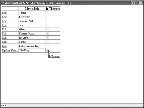
Listing 11.19. ShowCheckBoxField.aspx. <%@ Page Language="VB" %> <!DOCTYPE html PUBLIC "-//W3C//DTD XHTML 1.1//EN" "http://www.w3.org/TR/xhtml11/DTD/xhtml11.dtd"> <html xmlns="http://www.w3.org/1999/xhtml" > <head runat="server"> <title>Show CheckBoxField</title> </head> <body> <form runat="server"> <div> <asp:GridView DataSource DataKeyNames="Id" AutoGenerateColumns="false" AutoGenerateEditButton="true" Runat="server"> <Columns> <asp:BoundField DataField="Title" HeaderText="Movie Title" /> <asp:CheckBoxField DataField="InTheaters" HeaderText="In Theaters" /> </Columns> </asp:GridView> <asp:SqlDataSource ConnectionString="<%$ ConnectionStrings:Movies %>" SelectCommand="SELECT Id,Title,InTheaters FROM Movies" UpdateCommand="UPDATE Movies SET Title=@Title, InTheaters=@InTheaters WHERE Id=@Id" Runat="server" /> </div> </form> </body> </html>
|
The CheckBoxField inherits from the BoundField class, so it includes all the properties of the BoundField class. It also supports the following property: Using CommandFields You can use a CommandField to customize the appearance of the Edit, Delete, Update, Cancel, and Select buttons displayed by the GridView control. For example, the page in Listing 11.20 uses icons for the standard edit buttons (see Figure 11.15). Listing 11.20. ShowCommandField.aspx <%@ Page Language="VB" %> <!DOCTYPE html PUBLIC "-//W3C//DTD XHTML 1.1//EN" "http://www.w3.org/TR/xhtml11/DTD/xhtml11.dtd"> <html xmlns="http://www.w3.org/1999/xhtml" > <head runat="server"> <title>Show CommandField</title> </head> <body> <form runat="server"> <div> <asp:GridView DataSource DataKeyNames="Id" AutoGenerateColumns="false" Runat="server"> <Columns> <asp:CommandField ButtonType="Image" ShowEditButton="true" EditText="Edit Movie" EditImageUrl="Edit.gif" UpdateText="Update Movie" UpdateImageUrl="Update.gif" ShowCancelButton="true" CancelText="Cancel Edit" CancelImageUrl="Cancel.gif" ShowDeleteButton="true" DeleteText="Delete Movie" DeleteImageUrl="Delete.gif" /> <asp:BoundField DataField="Title" HeaderText="Movie Title" /> <asp:BoundField DataField="Director" HeaderText="Movie Director" /> </Columns> </asp:GridView> <asp:SqlDataSource ConnectionString="<%$ ConnectionStrings:Movies %>" SelectCommand="SELECT Id,Title,Director FROM Movies" UpdateCommand="UPDATE Movies SET Title=@Title, Director=@Director WHERE Id=@Id" DeleteCommand="DELETE Movies WHERE Id=@Id" Runat="server" /> </div> </form> </body> </html>
|
Figure 11.15. Using a CommandField with the GridView control. 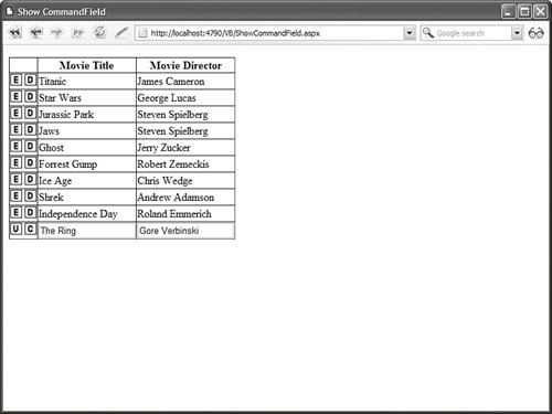
Notice that you do not enable the AutoGenerateEditButton or AutoGenerateDeleteButton properties when using a CommandField. Instead, you use the CommandField to set up the standard editing buttons explicitly. The CommandField supports the following properties: ButtonType Enables you to specify the type of button displayed by the CommandField. Possible values are Button, Image, and Link. CancelImageUrl Enables you to specify an image to display for the Cancel button. CancelText Enables you to specify the text to display for the Cancel button. CausesValidation Enables you to disable validation when an edit button is clicked. DeleteImageUrl Enables you to specify an image to display for the Delete button. DeleteText Enables you to specify the text to display for the Delete button. EditImageUrl Enables you to specify an image to display for the Edit button. EditText Enables you to specify the text to display for the Edit button. InsertImageUrl Enables you to specify an image to display for the Insert button. InsertText Enables you to specify the text to display for the Insert button. NewImageUrl Enables you to specify an image to display for the New button (does not apply to GridView). NewText Enables you to specify the text to display for the New button. SelectImageUrl Enables you to specify the image to display for the Select button. SelectText Enables you to specify the text to display for the Select button. ShowCancelButton Enables you to display the Cancel button. ShowDeleteButton Enables you to display the Delete button. ShowEditButton Enables you to display the Edit button. ShowInsertButton Enables you to display the Insert button (does not apply to GridView). ShowSelectButton Enables you to display the Select button. UpdateImageUrl Enables you to specify the image to display for the Update button. UpdateText Enables you to specify the text to display for the Update button. ValidationGroup Enables you to associate the edit buttons with a validation group.
Using Button Fields You use a ButtonField to display a button in a GridView. You can use a ButtonField to represent a custom command or one of the standard edit commands. For example, the GridView in Listing 11.21 contains two ButtonFields that a user can click to change the display order of the movie category records (see Figure 11.16). Listing 11.21. ShowButtonField.aspx| [View full width] <%@ Page Language="VB" %> <!DOCTYPE html PUBLIC "-//W3C//DTD XHTML 1.1//EN" "http://www.w3.org/TR/xhtml11/DTD/xhtml11.dtd"> <script runat="server"> Sub grdMovieCategories_RowCommand(ByVal sender As Object, ByVal e As  GridViewCommandEventArgs) Dim index As Integer = Int32.Parse(CType(e.CommandArgument, String)) Dim id As Integer = CType(grdMovieCategories.DataKeys(index).Values("Id"), Integer) Dim position As Integer = CType(grdMovieCategories.DataKeys(index).Values ("Position"), Integer) Select Case e.CommandName Case "Up" position = position - 1 Case "Down" position = position + 1 End Select srcMovieCategories.UpdateParameters("Id").DefaultValue = id.ToString() srcMovieCategories.UpdateParameters("Position").DefaultValue = position.ToString() srcMovieCategories.Update() End Sub </script> <html xmlns="http://www.w3.org/1999/xhtml" > <head runat="server"> <title>Show ButtonField</title> </head> <body> <form runat="server"> <div> <asp:GridView DataSource DataKeyNames="Id,Position" AutoGenerateColumns="false" OnRowCommand="grdMovieCategories_RowCommand" Runat="server"> <Columns> <asp:ButtonField Text="Move Up" CommandName="Up" /> <asp:ButtonField Text="Move Down" CommandName="Down" /> <asp:BoundField DataField="Position" HeaderText="Position" /> <asp:BoundField DataField="Name" HeaderText="Category Name" /> </Columns> </asp:GridView> <asp:SqlDataSource ConnectionString="<%$ ConnectionStrings:Movies %>" SelectCommand="SELECT Id, Name, Position FROM MovieCategories ORDER BY Position" UpdateCommand="UPDATE MovieCategories SET Position=@Position WHERE Id=@Id" Runat="server"> <UpdateParameters> <asp:Parameter Name="Id" /> <asp:Parameter Name="Position" /> </UpdateParameters> </asp:SqlDataSource> </div> </form> </body> </html> GridViewCommandEventArgs) Dim index As Integer = Int32.Parse(CType(e.CommandArgument, String)) Dim id As Integer = CType(grdMovieCategories.DataKeys(index).Values("Id"), Integer) Dim position As Integer = CType(grdMovieCategories.DataKeys(index).Values ("Position"), Integer) Select Case e.CommandName Case "Up" position = position - 1 Case "Down" position = position + 1 End Select srcMovieCategories.UpdateParameters("Id").DefaultValue = id.ToString() srcMovieCategories.UpdateParameters("Position").DefaultValue = position.ToString() srcMovieCategories.Update() End Sub </script> <html xmlns="http://www.w3.org/1999/xhtml" > <head runat="server"> <title>Show ButtonField</title> </head> <body> <form runat="server"> <div> <asp:GridView DataSource DataKeyNames="Id,Position" AutoGenerateColumns="false" OnRowCommand="grdMovieCategories_RowCommand" Runat="server"> <Columns> <asp:ButtonField Text="Move Up" CommandName="Up" /> <asp:ButtonField Text="Move Down" CommandName="Down" /> <asp:BoundField DataField="Position" HeaderText="Position" /> <asp:BoundField DataField="Name" HeaderText="Category Name" /> </Columns> </asp:GridView> <asp:SqlDataSource ConnectionString="<%$ ConnectionStrings:Movies %>" SelectCommand="SELECT Id, Name, Position FROM MovieCategories ORDER BY Position" UpdateCommand="UPDATE MovieCategories SET Position=@Position WHERE Id=@Id" Runat="server"> <UpdateParameters> <asp:Parameter Name="Id" /> <asp:Parameter Name="Position" /> </UpdateParameters> </asp:SqlDataSource> </div> </form> </body> </html>
|
Figure 11.16. Using ButtonFields with the GridView control. 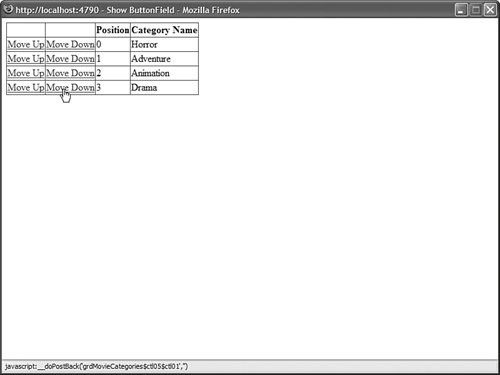
When you click either the Move Up or Move Down buttons in the page in Listing 11.21, the GridView control's RowCommand event is raised. This event is handled by the grdMovieCategories_RowCommand() method. The grdMovieCategories_RowCommand() retrieves the index of the row containing the button that was clicked. The row index is grabbed from the GridViewCommandEventArgs's CommandArgument property passed as the second parameter to the event handler. The grdMovieCategories_RowCommand() method updates the position of a record by setting the SqlDataSource control's Update parameters and calling the SqlDataSource control's Update() method. A ButtonField supports the following properties: ButtonType Enables you to specify the type of button displayed by the CommandField. Possible values are Button, Image, and Link. CausesValidation Enables you to disable validation when the button is clicked. CommandName Enables you to associate a standard edit command with the ButtonField. Possible values include Delete, Edit, Update, and Cancel. DataTextField Enables you to use a data column to specify the button text. DataTextFormatString Enables you to format the button text. Text Enables you to specify the button text. ValidationGroup Enables you to associate the button with a validation group.
Notice that you can use CommandName to associate a ButtonField with one of the standard edit commands. For example, you can create a Delete button by assigning the value Delete to the CommandName property. Using HyperLinkField You use a HyperLinkField to create a link to another page. A HyperLinkField is particularly useful when you need to build two page Master/Detail forms. For example, the page in Listing 11.22 displays a list of movie categories, and the page in Listing 11.23 displays a list of movies that match the selected category. Listing 11.22. Master.aspx <%@ Page Language="VB" %> <html xmlns="http://www.w3.org/1999/xhtml" > <head runat="server"> <title>Master</title> </head> <body> <form runat="server"> <div> <asp:GridView DataSource AutoGenerateColumns="false" Runat="server"> <Columns> <asp:HyperLinkField HeaderText="Movie Categories" DataTextField="Name" DataNavigateUrlFields="Id" DataNavigateUrlFormatString="Details.aspx?id={0}" /> </Columns> </asp:GridView> <asp:SqlDataSource ConnectionString="<%$ ConnectionStrings:Movies %>" SelectCommand="SELECT Id, Name FROM MovieCategories" Runat="server" /> </div> </form> </body> </html>
|
Listing 11.23. Details.aspx <%@ Page Language="VB" %> <!DOCTYPE html PUBLIC "-//W3C//DTD XHTML 1.1//EN" "http://www.w3.org/TR/xhtml11/DTD/xhtml11.dtd"> <html xmlns="http://www.w3.org/1999/xhtml" > <head runat="server"> <title>Details</title> </head> <body> <form runat="server"> <div> <asp:GridView DataSource Runat="server" /> <asp:SqlDataSource ConnectionString="<%$ ConnectionStrings:Movies %>" SelectCommand="SELECT Title,Director FROM Movies WHERE CategoryId=@CategoryId" Runat="server"> <SelectParameters> <asp:QueryStringParameter Name="CategoryId" QueryStringField="id" /> </SelectParameters> </asp:SqlDataSource> </div> </form> </body> </html>
|
The page in Listing 11.22 includes a GridView control that contains a HyperLinkField. The HyperLinkField creates a link to the Details.aspx page and passes the movie category ID as a query string parameter. The HyperLinkField looks like this: <asp:HyperLinkField HeaderText="Movie Categories" DataTextField="Name" DataNavigateUrlFields="Id" DataNavigateUrlFormatString="Details.aspx?id={0}" />
The DataNavigateUrlFields property represents the fields used with the DataNavigateFormatString. The DataNavigateFormatString plugs the value of the ID column from the DataNavigateUrlFields into the {0} placeholder. Note The DataNavigateUrlFields property accepts a comma-separated list of column names. You can use multiple placeholders in the DataNavigateUrlFormatString.
When you link to the page in Listing 11.23, the list of matching movies is displayed. Notice that the SqlDataSource control includes a QueryStringParameter that represents the movie category ID query string parameter. You also can use HyperLinkFields when working with frames. For example, the page in Listing 11.24 employs a GridView to display a list of movies. The page also includes an iframe (inline frame), which displays details for a particular movie. The iframe displays the page contained in Listing 11.25 (see Figure 11.17). Figure 11.17. Displaying a single-page Master/Detail form. 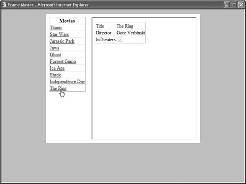
Listing 11.24. FrameMaster.aspx <%@ Page Language="VB" %> <!DOCTYPE html PUBLIC "-//W3C//DTD XHTML 1.0 Transitional//EN" "http://www.w3.org/TR/xhtml1/DTD/xhtml1-transitional.dtd"> <html xmlns="http://www.w3.org/1999/xhtml" > <head runat="server"> <style type="text/css"> html { background-color:silver; } .content { width:500px; margin:auto; background-color:white; } .column { padding:10px; float:left; } #FrameDetails { width:100%; height:400px; } </style> <title>Frame Master</title> </head> <body> <form runat="server"> <div > <div > <asp:GridView DataSource AutoGenerateColumns="false" Runat="server"> <Columns> <asp:HyperLinkField HeaderText="Movies" DataTextField="Title" DataNavigateUrlFields="Id" DataNavigateUrlFormatString="FrameDetails.aspx?id={0}" Target="FrameDetails" /> </Columns> </asp:GridView> <asp:SqlDataSource ConnectionString="<%$ ConnectionStrings:Movies %>" SelectCommand="SELECT * FROM Movies" Runat="server" /> </div> <div > <iframe name="FrameDetails" ></iframe> </div> <br style="clear:both" /> </div> </form> </body> </html>
|
Listing 11.25. FrameDetails.aspx <%@ Page Language="VB" %> <!DOCTYPE html PUBLIC "-//W3C//DTD XHTML 1.0 Transitional//EN" "http://www.w3.org/TR/xhtml1/DTD/xhtml1-transitional.dtd"> <html xmlns="http://www.w3.org/1999/xhtml" > <head runat="server"> <title>Frame Details</title> </head> <body> <form runat="server"> <div> <asp:DetailsView DataSource Runat="server" /> <asp:SqlDataSource ConnectionString="<%$ ConnectionStrings:Movies %>" SelectCommand="SELECT Title, Director, InTheaters FROM Movies WHERE Id=@MovieId" Runat="server"> <SelectParameters> <asp:QueryStringParameter Name="MovieId" QueryStringField="id" /> </SelectParameters> </asp:SqlDataSource> </div> </form> </body> </html>
|
Notice that the HyperLinkField contained in Listing 11.24 includes a Target property. The Target property contains the name of the iframe. When you click a movie link, the FrameDetails.aspx page opens in the named iframe. The HyperLinkField supports the following properties: DataNavigateUrlFields Represents the field or fields from the data source to use with the DataNavigateUrlFormatString. DataNavigateUrlFormatString Represents a format string that can be used to create the hyperlink. DataTextField Represents a field from the data source to use for the hyperlink label. DataTextFormatString Represents a format string that can be used to format the hyperlink label. NavigateUrl Represents a fixed link to another page. Target Represents the target of a link. Possible values include _blank, _parent, _self, and _top. You can also supply the name of a frame or iframe. Text Represents fixed text to display as the label for the hyperlink.
Using ImageField You use an ImageField to display an image stored on the server's hard drive. You can't use an ImageField to display images stored in a database table. The page in Listing 11.26 illustrates how you can use the ImageField when creating a simple photo gallery (see Figure 11.18). Listing 11.26. ShowImageField.aspx| [View full width] <%@ Page Language="VB" %> <!DOCTYPE html PUBLIC "-//W3C//DTD XHTML 1.1//EN" "http://www.w3.org/TR/xhtml11/DTD/xhtml11.dtd"> <script runat="server"> Protected Sub frmPhoto_ItemInserting(ByVal sender As Object, ByVal e As FormViewInsertEventArgs) ' Get the FileUpload control Dim upPhoto As FileUpload = CType(frmPhoto.FindControl("upPhoto"),FileUpload) srcImages.InsertParameters("FileName").DefaultValue = upPhoto.FileName ' Save contents to file system Dim savePath As String = MapPath("~/Photos/" + upPhoto.FileName) upPhoto.SaveAs(savePath) End Sub </script> <html xmlns="http://www.w3.org/1999/xhtml" > <head runat="server"> <title>Show ImageField</title> </head> <body> <form runat="server"> <div> <asp:GridView DataSource AutoGenerateColumns="false" ShowHeader="false" Runat="server"> <Columns> <asp:ImageField DataImageUrlField="FileName" DataImageUrlFormatString="~/Photos/{0}" DataAlternateTextField="AltText" ControlStyle-Width="200px" /> </Columns> </asp:GridView> <asp:SqlDataSource ConnectionString="<%$ ConnectionStrings:Photos %>" SelectCommand="SELECT FileName, AltText FROM Photos" InsertCommand="INSERT Photos (FileName, AltText) VALUES (@FileName, @AltText)" Runat="server"> <InsertParameters> <asp:Parameter Name="FileName" /> </InsertParameters> </asp:SqlDataSource> <hr /> <asp:FormView DefaultMode="Insert" DataSource OnItemInserting="frmPhoto_ItemInserting" Runat="server"> <InsertItemTemplate> <h1>Add Photo</h1> <asp:Label Text="Photo:" AssociatedControl Runat="server" /> <br /> <asp:FileUpload Runat="server" /> <br /> <asp:Label Text="Alternate Text:" AssociatedControl Runat="server" /> <br /> <asp:TextBox Text='<%# Bind("AltText") %>' Columns="50" Runat="server" /> <br /> <asp:Button Text="Add New Photo" CommandName="Insert" Runat="server" /> </InsertItemTemplate> </asp:FormView> </div> </form> </body> </html>
|
Figure 11.18. Using an ImageField with the GridView control. 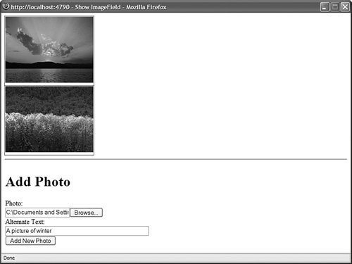
The GridView in Listing 11.26 contains an ImageField that looks like this: <asp:ImageField DataImageUrlField="FileName" DataImageUrlFormatString="~/Photos/{0}" DataAlternateTextField="AltText" ControlStyle-Width="200px" />
The DataImageUrlField property contains the name of a field from the data source that represents the path to an image on the server hard drive. The DataImageUrlFormatString enables you to format this path. Finally, the DataAlternateTextField enables you to specify the value of the alt attribute used by the <img> tag. Web Standards Note Always supply an alt attribute for your <img> tags so that blind users of your web application can interpret an image's meaning. In the case of purely decorative images, create an empty alt attribute (alt="").
An ImageField supports the following properties: AlternateText Enables you to specify fixed alternate text. DataAlternateTextField Enables you to specify a field that represents the alternate text. DataAlternateTextFormatString Enables you to format the alternate text. DataImageUrlField Enables you to specify a field that represents the image path. DataImageUrlFormatString Enables you to format the image path. NullImageUrl Enables you to specify an alternate image when the DataImageUrlField is Nothing (null).
Using TemplateField A TemplateField enables you to add any content to a GridView column that you need. A TemplateField can contain HTML, DataBinding expressions, or ASP.NET controls. TemplateFields are particularly useful when you are using a GridView to edit database records. You can use a TemplateField to customize the user interface and add validation to the fields being edited. For example, the page in Listing 11.27 contains a GridView that enables you to edit the records contained in the Movies database table. TemplateFields are used to render the user interface for editing the movie title and category columns (see Figure 11.19). Figure 11.19. Using TemplateFields with the GridView control. 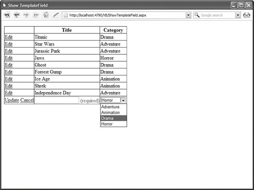
Listing 11.27. ShowTemplateField.aspx <%@ Page Language="VB" %> <!DOCTYPE html PUBLIC "-//W3C//DTD XHTML 1.1//EN" "http://www.w3.org/TR/xhtml11/DTD/xhtml11.dtd"> <html xmlns="http://www.w3.org/1999/xhtml" > <head runat="server"> <title>Show TemplateField</title> </head> <body> <form runat="server"> <div> <asp:GridView DataSource DataKeyNames="Id" AutoGenerateColumns="false" AutoGenerateEditButton="true" Runat="server"> <Columns> <asp:TemplateField HeaderText="Title"> <ItemTemplate> <%# Eval("Title") %> </ItemTemplate> <EditItemTemplate> <asp:TextBox Text='<%# Bind("Title") %>' Runat="server" /> <asp:RequiredFieldValidator ControlToValidate="txtTitle" Text="(required)" Runat="server" /> </EditItemTemplate> </asp:TemplateField> <asp:TemplateField HeaderText="Category"> <ItemTemplate> <%# Eval("Name") %> </ItemTemplate> <EditItemTemplate> <asp:DropDownList DataSource DataTextField="Name" DataValueField="Id" SelectedValue='<%# Bind("CategoryId") %>' Runat="server" /> </EditItemTemplate> </asp:TemplateField> </Columns> </asp:GridView> <asp:SqlDataSource ConnectionString='<%$ ConnectionStrings:Movies %>' SelectCommand="SELECT Movies.Id, Title, CategoryId, Name FROM Movies JOIN MovieCategories ON MovieCategories.Id = Movies.CategoryId" UpdateCommand="UPDATE Movies SET Title=@Title, CategoryId=@CategoryId WHERE Id=@Id" Runat="server" /> <asp:SqlDataSource ConnectionString='<%$ ConnectionStrings:Movies %>' SelectCommand="SELECT Id, Name FROM MovieCategories" Runat="server" /> </div> </form> </body> </html>
|
The GridView in Listing 11.27 contains two TemplateFields. The first TemplateField enables you to display and edit the value of the Title column. The contents of the ItemTemplate are displayed when a row is not selected for editing. The contents of the EditItemTemplate are displayed when the row is selected for editing. The EditItemTemplate for the Title column includes a RequiredFieldValidator control. This RequiredFieldValidator control prevents a user from updating a record without entering a value for the Title column. The second TemplateField displays the value of the movie category column. The EditItemTemplate contains a DropDownList control, which enables you to change the movie category associated with the record being edited. A TemplateField supports the following six types of templates: AlternatingItemTemplate The contents of this template are displayed for every other row rendered by the GridView. EditItemTemplate The contents of this template are displayed when a row is selected for editing. FooterTemplate The contents of this template are displayed in the column footer. HeaderTemplate The contents of this template are displayed in the column header. InsertItemTemplate The contents of this template are displayed when a new data item is inserted (does not apply to the GridView control). ItemTemplate The contents of this template are displayed for every row rendered by the GridView.
| 