Overview of the List Controls
| All five of the List controls inherit from the base ListControl class. This means that all the List controls share a common set of properties and methods. In this section, you are provided with an overview of the common features of the List controls. Declaring List ItemsThe List controls render a list of options. Each option is represented by an instance of the ListItem class. For example, you can use the page in Listing 10.1 to render a set of options for selecting your favorite movie (see Figure 10.1). Figure 10.1. Displaying a list of movies.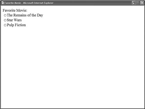 Listing 10.1. FavoriteMovie.aspx
The page in Listing 10.1 contains a RadioButtonList control. This control contains three ListItem controls which correspond to the three radio buttons. All the List controls use the ListItem control to represent individual list items. The ListItem control supports the following five properties:
You use the Text property to indicate the text that you want the option to display, and the Value property to indicate a hidden value associated with the option. For example, the hidden value might represent the value of a primary key column in a database table. The Selected property enables you to show a list item as selected. Selected radio buttons and check boxes appear checked. The selected option in a DropDownList is the default option displayed. Selected options in a ListBox appear highlighted. And, in the case of a BulletedList control, the selected property has no effect whatsoever. The Enabled property has different effects when used with different List controls. When you set a ListItem control's Enabled property to the value False when using the DropDownList or ListBox controls, the list item is not rendered to the browser. When you use this property with a CheckBoxList, RadioButtonList, or BulletedList control, then the list item is ghosted and non-functional. Binding to a Data SourceYou can bind any of the List controls to a data source. The List controls support both declarative databinding and programmatic databinding. For example, the page in Listing 10.2 contains a DropDownList control that is bound to the Movies database table with declarative databinding (see Figure 10.2). Figure 10.2. Displaying list items with declarative databinding.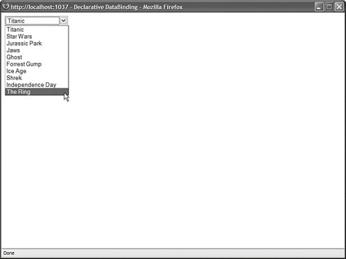 Listing 10.2. DeclarativeDataBinding.aspx
Notice that the DropDownList control's DataSourceID property points to the ID of the SqlDataSource control. When you open the page in Listing 10.2, the SqlDataSource control retrieves the records from the Movies database table. The DropDownList control grabs these records from the SqlDataSource control and creates a ListItem control for each data item. You also should notice that the DropDownList control has both its DataTextField and DataValueField properties set. When the DropDownList control creates each of its list items, it uses the values of the DataTextField and DataValueField properties to set the Text and Value properties of each list item. As an alternative to declarative databinding, you can programmatically bind any of the List controls to a data source. For example, the page in Listing 10.3 binds a ListBox control to a collection which represents a shopping cart (see Figure 10.3). Listing 10.3. ProgrammaticDataBinding.aspx
Figure 10.3. Show list items with programmatic binding.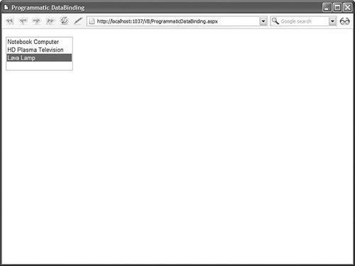 In Listing 10.3, the ListBox is bound to the collection in the Page_Load() method. Notice that the DataTextField and DataValueField properties of the ListBox control represent properties of the CartItem class. Note A List control's DataTextField and DataValueField properties can refer to any public property of a class, but you cannot bind a List control to a public field. Determining the Selected List ItemDisplaying options with the List controls is all very nice, but at some point you need to be able to determine which option a user has selected. The List controls support three properties that you can use to determine the selected list item:
For example, the page in Listing 10.4 enables you to select an item from the DropDownList control and display the value of the selected item's Text property (see Figure 10.4). Figure 10.4. Selecting an item from a DropDownList control.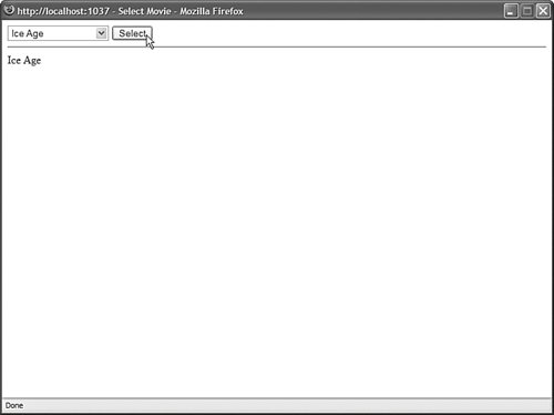 Listing 10.4. SelectMovie.aspx
The SelectedItem property is used to retrieve the selected ListItem control from the DropDownList control. The value of the selected item's Text property is displayed in the Label control. You can use these properties when you want to associate a List control with another DataBound control. For example, the page in Listing 10.5 contains a DropDownList control that displays a list of movie categories and a GridView control that displays a list of movies that match the selected category (see Figure 10.5). Figure 10.5. Master/Details form with a list control.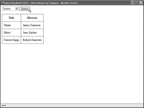 Listing 10.5. ShowMoviesByCategory.aspx
The DropDownList control is bound to the srcMovieCategories SqlDataSource control, and the GridView control is bound to the srcMovies SqlDataSource control. The srcMovies SqlDataSource control includes a ControlParameter, which represents the SelectedValue property of the DropDownList control. When you select a movie category from the DropDownList control, the selected value changes and the GridView control displays a list of matching movies. Appending Data ItemsYou can mix the list items that you declare in a List control and the list items that are added to the control when it is bound to a data source. This is useful when you want to display a default selection. For example, imagine that you are creating a form in which you want to require a user to pick an item from a List control. In this situation, you should add a default item to the List Control so you can detect whether a user has actually picked an item. You can mix declarative list items with databound list items by assigning the value true to the AppendDataBoundItems property. The page in Listing 10.6 illustrates how you can add a default list item to a List control (see Figure 10.6). Figure 10.6. Displaying a default list item.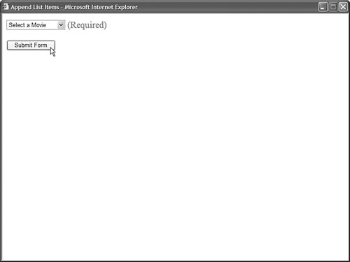 Listing 10.6. AppendListItems.aspx
The page in Listing 10.6 includes both a DropDownList control and a RequiredFieldValidator control. The DropDownList control includes a list item that displays the text "Select a Movie." The Value property of this list item is set to the empty string. If you attempt to submit the form without selecting a list item other than the default list item, then the RequiredFieldValidator displays an error message. Notice that the DropDownList control includes an AppendDataBoundItems property which is set to the value true. If you neglect to set this property, then the databound list items overwrite any declarative list items. Enabling Automatic PostBacksAll the List controls, except for the BulletedList control, support a property named the AutoPostBack propertyg. When this property is assigned the value true, the form containing the List control is automatically posted back to the server whenever a new selection is made. For example, the page in Listing 10.7 contains a DropDownList control that has its AutoPostBack property enabled. When you select a new item from the DropDownList control, the page is automatically posted back to the server and the Label control displays the selected item. Listing 10.7. AutoPostBackListControl.aspx
When you enable the AutoPostBack property, a JavaScript onchange() event handler is added to the List control. The onchange event is supported by all recent browsers including Firefox 1.0 and Opera 8.0. Notice that the DropDownList control has a SelectedIndexChanged event handler named ddlMovies_SelectedIndexChanged(). The SelectedIndexChanged event is raised whenever you make a new selection in the List control (independent of the AutoPostBack property). The ddlMovies_SelectedIndexChanged() method displays the selected list item in a Label control. Web Standards Note You should avoid using the AutoPostBack property because it creates accessibility problems for persons with disabilities. If you can't use a mouse, and you are interacting with a website through the keyboard, having a page post back to the server whenever you make a selection change is a very frustrating experience. Using the Items CollectionAll the list items rendered by a List control are contained in the List control's list item collection. This collection is exposed by the Items property. You can work directly with the list items in this collection. For example, you can add or remove particular list items or you can change the order of the list items. The page in Listing 10.8 contains two ListBox controls and two button controls. When you click the Add button, a list item is moved from the first ListBox to the second ListBox control. When you click Remove, the list item is moved back to the original List control (see Figure 10.7). Figure 10.7. Using the ListPicker to select list items.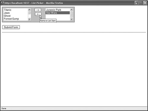 Listing 10.8. ListPicker.aspx
The first ListBox in Listing 10.8 is bound to the Movies database table. You can use the ListBox controls to pick your favorite movies by moving movie titles from the first ListBox to the second ListBox. When you click the Add button, the btnAdd_Click() method executes. This method grabs the selected item from the All Movies ListBox and adds it to the Favorite Movies ListBox. The Remove button does exactly the opposite. Notice that both the btnAdd_Click() and btnRemove_Click() methods call the ClearSelection() method of the ListBox class. This method iterates through all the list items and sets the Selected property for each list item to the value False. If multiple list items are selected, an exception is thrown. Note One problem with the page discussed in this section is that the page must be posted back to the server each time you move an item from the first ListBox to the second ListBox. At the end of this chapter, you learn how to create a MultiSelectList control, which uses a client-side script to get around this limitation. |