Creating an Interactive Chart without VBA
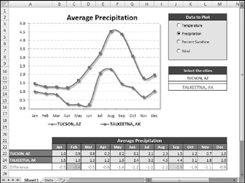
The final example, shown in Figure 18-29, is a useful application that allows the user to choose two U.S. cities (from a list of 284 cities) and view a chart that compares the cities by month in any of the following categories: average precipitation, average temperature, percent sunshine, and average wind speed.

Figure 18-29: This application uses a variety of techniques to plot monthly climate data for two selected U.S. cities.
The most interesting aspect of this application is that it uses no VBA macros. The interactivity is a result of using Excel's built-in features. The cities are chosen from a drop-down list, using Excel's Data Validation feature, and the data option is selected using four Option Button controls, which are linked to a cell . The pieces are all connected using a few formulas.
This example demonstrates that it is indeed possible to create a user-friendly, interactive application without the assistance of macros.
| CD-ROM | This workbook, named |
The following sections describe the steps I took to set up this application.
Getting the data to create an interactive chart
I did a Web search and spent about five minutes locating the data I needed at the National Climatic Data Center. I copied the data from my browser window, pasted it to an Excel worksheet, and did a bit of clean-up work. The result was four 13-column tables of data, which I named PrecipitationData , TemperatureData , SunshineData , and WindData . To keep the interface as clean as possible, I put the data on a separate sheet (named Data).
Creating the Option Button controls for an interactive chart
I needed a way to allow the user to select the data to plot and decided to use OptionButton controls from the Forms toolbar. Because option buttons work as a group , the four OptionButton controls are all linked to the same cell: cell O3. Cell O3, therefore, contains a value from 1 to 4, depending on which option button is selected.
I needed a way to obtain the name of the data table based on the numeric value in cell O3. The solution was to write a formula (in cell O4) that uses Excel's CHOOSE function:
=CHOOSE(O3,"TemperatureData","PrecipitationData","SunshineData","WindData")
Therefore, cell O4 displays the name of one of the four named data tables. I then did some cell formatting behind the OptionButton controls to make them more visible.
Creating the city lists for the interactive chart
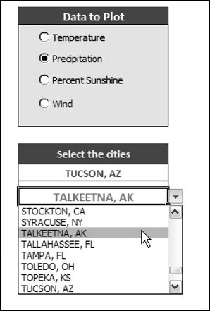
The next step is setting up the application: creating drop-down lists to enable the user to choose the cities to be compared in the chart. Excel's Data Validation feature makes creating a drop-down list in a cell very easy. First, I did some cell merging to create a wider field. I merged cells J11:M11 for the first city list and gave them the name City1 . I merged cells J13:M13 for the second city list and gave them the name City2 .
To make working with the list of cities easier, I created a named range, CityList , which refers to the first column in the PrecipitationData table.
Following are the steps that I used to create the drop-down lists:
-
Select J11:M11. (Remember, these are merged cells.)
-
Choose Data
 Data Validation to display Excel's Data Validation dialog box.
 -
Select the Settings tab in the Data Validation dialog box.
-
In the Allow field, choose List.
-
In the Source field, enter =CityList .
-
Click OK.
-
Copy J11:M11 to J13:M13. This duplicates the Data Validation settings for the second city.
Figure 18-30 shows the result.

Figure 18-30: Use the Data Validation drop-down list to select a city.
Creating the interactive chart data range
The key to this application is that the chart uses data in a specific range. The data in this range is retrieved from the appropriate data table by using formulas that utilize the VLOOKUP function. (See Figure 18-31.)

Figure 18-31: The chart uses the data retrieved by formulas in A23:M24.
The formula in cell A23, which looks up data based on the contents of City1 , is:
=VLOOKUP(City1,INDIRECT(DataTable),COLUMN(),FALSE)
The formula in cell A24 is the same except that it looks up data based on the contents of City2 :
=VLOOKUP(City2,INDIRECT(DataTable),COLUMN(),FALSE)
After entering these formulas, I simply copied them across to the next 12 columns .
| Note | You may be wondering about the use of the COLUMN function for the third argument of the VLOOKUP function. This function returns the column number of the cell that contains the formula. This is a convenient way to avoid hard-coding the column to be retrieved and allows the same formula to be used in each column. |
Below the two city rows is another row of formulas that calculate the difference between the two cities for each month. I used Conditional Formatting to apply a different color background for the largest difference and the smallest difference.
The label above the month names is generated by a formula that refers to the DataTable cell and constructs a descriptive title: The formula is:
="Average " & LEFT(DataTable,LEN(DataTable)-4)
Creating the interactive chart
After completing the previous tasks , the final step - creating the actual chart - is a breeze . The line chart has two data series and uses the data in A22:M24. The chart title is linked to cell A21. The data in A22:M24 changes, of course, whenever an OptionButton control is selected or a new city is selected from either of the Data Validation lists.
EAN: 2147483647
Pages: 319