More Pivot Table Examples
To demonstrate the flexibility of pivot tables, I've created some additional pivot tables. The examples use the bank account data and answer the questions posed earlier in this chapter (see "A Pivot Table Example").
Question 1
What is the daily total new deposit amount for each branch?
Figure 18-11 shows the pivot table that answers this question.
-
The Branch field is in the Column Labels section.
-
The Date field is in the Row Labels section.
-
The Amount field is in the Value section and is summarized by Sum.
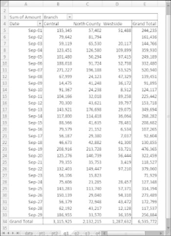
Figure 18-11: This pivot table shows daily totals for each branch.
Note that the pivot table can also be sorted by any column. For example, you can sort the Grand Total column in descending order to find out which day of the month had the large amount of new funds. To sort, just right-click any cell in the column to sort and choose Sort from the shortcut menu.
Question 2
How many accounts were opened at each branch, broken down by account type?
Figure 18-12 shows a pivot table that answers this question.
-
The AcctType field is in the Column Labels section.
-
The Branch field is in the Row Labels section.
-
The Amount field is in the Value section and is summarized by Count.
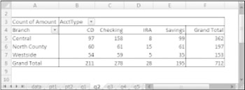
Figure 18-12: This pivot table uses the Count function to summarize the data.
The most common summary function used in pivot tables is Sum. In this case, I changed the summary function to Count. To change the summary function to Count, right-click any cell in the Value area and choose Summarize Data By ![]() Count from the shortcut menu.
Count from the shortcut menu.
Question 3
What's the dollar distribution of the different account types?
Figure 18-13 shows a pivot table that answers this question. For example, 253 of the new accounts were for an amount of $5,000 or less.
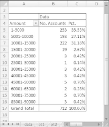
Figure 18-13: This pivot table counts the number of accounts that fall into each value range.
This pivot table is unusual because it uses only one field: Amount.
-
The Amount field is in the Row Labels section (grouped).
-
The Amount field is also in the Values section and is summarized by Count.
-
A third instance of the Amount field is the Values section, summarized by Percent of Total.
When I initially added the Amount field to the Row Labels section, the pivot table showed a row for each unique dollar amount. I right-clicked one of the Row Labels and chose Group. Then I used Excel's Grouping dialog box to set up bins of $5,000 increments.
The second instance of the Amount field (in the Values section) is summarized by Count. I right-clicked a value and chose Summarize Data By ![]() Count.
Count.
I added another instance of Amount to the Values section, and I set it up to display the percentage. I used the Show Values As tab of the Data Field Settings dialog box and specified % of Total. To display the Data Field Settings dialog box, right-click any cell and choose Summarize Data As ![]() More Options.
More Options.
Question 4
What types of accounts do tellers open most often?
Figure 18-14 shows that the most common account opened by tellers is a Checking account.
-
The AcctType field is in the Row Labels section.
-
The OpenedBy field is in the Report Filters section.
-
The Amount field is in the Values section (summarized by Count).
-
A second instance of the Amount field is in the Values section (summarized by Percent of Total).
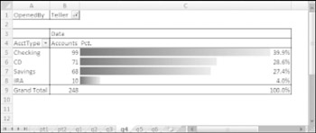
Figure 18-14: This pivot table uses a Report Filter to show only the Teller data.
This pivot table uses the OpenedBy field as a Report Filter and is showing the data only for Tellers. I sorted the data so that the largest value is at the top, and I also used conditional formatting to display data bars for the percentages.
| Cross Ref | Refer to Chapter 21 for more information about conditional formatting. |
Question 5
How does the Central branch compare to the other two branches?
Figure 18-15 shows a pivot table that sheds some light on this rather vague question. It simply shows how the Central branch compares with the other two branches combined.
-
The AcctType field is in the Row Labels section.
-
The Branch field is in the Column Labels section.
-
The Amount field is in the Values section.
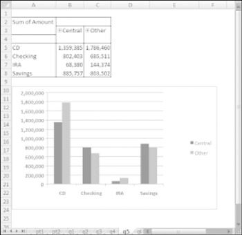
Figure 18-15: This pivot table (and pivot chart) compares the Central branch with the other two branches combined.
I grouped the North County and Westside branches together and named the group Other. The pivot table shows the amount, by account type. I also created a pivot chart for good measure.
Question 6
In which branch do tellers open the most checking accounts for new customers?
Figure 18-16 shows a pivot table that answers this question. At the Central branch, tellers opened 23 checking accounts for new customers.
-
The Customer field is in the Report Filters section.
-
The OpenedBy field is in the Report Filters section.
-
The AcctType field is in the Report Filters section.
-
The Branch field is in the Row Labels section.
-
The Amount field is in the Values section, summarized by Count.
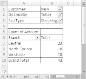
Figure 18-16: This pivot table uses three report filters.
This pivot table uses three report filters. The Customer field is filtered to show only New, the OpenedBy field is filtered to show only Teller, and the AcctType field is filtered to show only Checking.
EAN: 2147483647
Pages: 212