Creating PivotTables and PivotCharts from Queries
Microsoft Access 2002 (Office XP) introduced two very useful new features for tables, queries, and forms-PivotTables and PivotCharts. These are additional views of a table, query, or form that you can design to provide analytical views of your data. These views are built into the objects; they’re not implemented via a separate ActiveX control as is the old and venerable Microsoft Graph feature.
You learned in this chapter that you can build a crosstab query to pivot the values in a column to form dynamic column headings. However, crosstab queries have a major drawback-you can include only one calculated value in the intersection of your row headings and single column heading. PivotTables in Access are very similar to the PivotTable facility in Microsoft Excel. You can categorize rows by several values, just like you can in a crosstab query, but you can also include multiple column categories and multiple raw or calculated values in each intersection of rows and column. As its name implies, you can also pivot the table to swap row headings with column headings.
A PivotChart is a graphical view of the data that you included in your PivotTable. You can build a PivotChart without first defining the PivotTable, and vice versa. When you design a PivotChart, you’re also designing or modifying the related PivotTable to provide the data you need for your chart. When you modify a PivotTable, you’ll also change (or destroy) the related PivotChart you have already designed.
As you explore the possibilities with PivotTables and PivotCharts, you’ll find powerful capabilities to “slice and dice” your data or “drill down” into more detail. Unlike a 00 crosstab query that’s built on summarized data, you can begin with a table or query that contains very detailed information. The more detail you have to begin with, the more you can do with your PivotTable and PivotChart.
| Caution | You might be tempted to design a very detailed query that returns thousands of rows for your user to work with. However, the filtering capabilities inside a PivotTable aren’t nearly as efficient as defining a filter in your query to begin with. If you’re loading hundreds of thousands of rows over a network, your PivotTable or PivotChart might be very, very slow. You should provide enough detail to get the job done, but no more. You should limit the fields in your query to those focused on the task at hand and include filters in your underlying query to return only the subset of the data that’s needed. |
Building a Query for a PivotTable
Although you can build a PivotTable directly on a table in your database, you most likely will need a query to provide the level of detail you want to pivot. Let’s build a query in the HousingDataCopy.accdb database that provides some interesting detail.
Start a new query with tblFacilities and add tblReservations, tblEmployees, and tblDepartments. (Be sure to remove the extra relationship between the EmployeeNumber field in tblEmployees and the ManagerNumber field in tblDepartments.) Create an expression to display the employee name in the first field:
EmpName: tblEmployees.LastName & ", " & tblEmployees.FirstName & (" " + tblEmployees.MiddleName) In the query grid, include the Department field from tblDepartments, the ReservationID field from tblReservations (we’re going to use this field later to count the number of reservation days), the FacilityName field from tblFacilities, and the RoomNumber field from tblReservations. Add an expression in the next field to calculate the actual charge per day. You could use the DailyRate field from tblReservations, but that’s not an accurate reflection of how much the room costs per day when the employee stays a week or more. Your expression should look like this:
DailyCharge: CCur(Round(tblReservations.TotalCharge / (tblReservations.CheckOutDate-tblReservations.CheckInDate), 2))
Remember that you can calculate the number of days by subtracting the CheckInDate field from the CheckOutDate field. Divide the TotalCharge field by the number of days to obtain the actual daily rate. This division might result in a value that has more than two decimal places, so asking the Round function to round to two decimal places (the 2 parameter at the end) takes care of that. Finally, the expression uses the CCur (Convert to Currency) function to make sure the query returns a currency value.
Now comes the fun part. Each row in tblReservations represents a stay of one or more days. In this example, we ultimately want to be able to count individual days to find out the length of stay within any month. To do that, we need to “explode” each single row in tblReservations into a row per day for the duration of the reservation. In this sample database, you’ll find what we call a “driver” table-ztblDates-full of dates to accomplish this feat. The table contains date values, one per day, for dates from January 1, 1992, to December 31, 2035. We created this table to “drive” the complete list of dates we need (at least, complete enough for our purposes) against the rows in tblReservations in order to provide the explosion.
Include this table in your query and notice that there’s no join line to any of the tables. When you add a table with no join defined to another table or set of records, the query returns the Cartesian product of the two sets of records-every row in the first table or set of records is matched with every row in the second table or set of records. For example, if there are 90 rows in one set and 12 rows in the second set, the query returns 1080 rows (90 times 12). In this case, each reservation will now be matched with each of the separate date values in ztblDates.
As we mentioned earlier, you should try to limit the output of a query that you’ll use to build a PivotTable to only the rows you need to solve the problem. Let’s say the facilities manager is interested in data for June, July, and August of 2007. Add the DateValue field from ztblDates and enter Between #6/1/2007# And #8/31/2007# under this field on the Criteria line. You have now limited the explosion of rows to dates in the months of interest.
The final step is to further limit the rows created based on the CheckInDate and CheckOutDate fields in tblReservations. Any reservation that crosses the time span of interest is going to be for a few days or a few weeks. Add the CheckInDate and CheckOutDate fields from tblReservations and clear the Show check box under both. On the Criteria row under CheckInDate, enter <=ztblDates.DateValue. Under CheckOutDate, enter >ztblDates.DateValue.
This forces the query to keep any rows where the DateValue field from ztblDates is within the time span of each reservation row. Voilà! You now have one row per date for each reservation. Your query should now look like Figure 8–55.
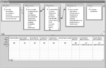
Figure 8–55: This complex query generates the data you need for a PivotTable.
To better understand how this query expands each reservation into one row per day, take a look at Table 8–2. The table represents expanded rows after applying the final two criteria on CheckInDate and CheckOutDate.
| ReservationID | CheckInDate | CheckOutDate | DateValue |
|---|---|---|---|
| 55 | August 6, 2007 | August 12, 2007 | August 6, 2007 |
| 55 | August 6, 2007 | August 12, 2007 | August 7, 2007 |
| 55 | August 6, 2007 | August 12, 2007 | August 8, 2007 |
| 55 | August 6, 2007 | August 12, 2007 | August 9, 2007 |
| 55 | August 6, 2007 | August 12, 2007 | August 10, 2007 |
| 55 | August 6, 2007 | August 12, 2007 | August 11, 2007 |
The end result is that the query selects only the rows from ztblDates that are within the date range of the individual reservation. Because there’s one (and only one) row for every date of interest coming from ztblDates, you end up with one row per day that’s within the span of days in each reservation. Figure 8–56 shows you the Datasheet view of your query. You can find this query saved as qxmplReservationsByDay in the sample database.
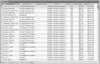
Figure 8–56: The reservations for June, July, and August are expanded into one row per day.
Designing a PivotTable
Now that you have the data you need, you’re ready to start building a PivotTable. From Design or Datasheet view, switch to PivotTable view by clicking the small arrow below the View button and then clicking PivotTable View in the list. (You can find the View button on both the Home tab and the Design contextual tab.) You should see a blank PivotTable design area as shown in Figure 8–57. If you don’t see the field list as shown in Figure 8–57, click the Field List command in the Show/Hide group of the Design contextual tab below PivotTable Tools.
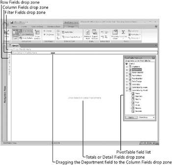
Figure 8–57: You can design PivotTables using the PivotTable design window.
In general, you should use as columns those fields that have the fewest values. If you place too many values across your PivotTable, you’ll find that you must scroll left a long way to see all the details. In this case, we’re interested in statistics by month, and we know there are only three months of data in the underlying recordset. You’ll still be able to show the details by day, if you like, because the recordset includes information by date-you can expand any Months field to show all the days in the month. We might want to see the data organized by department and facility. It might also be interesting to provide an easy way to filter on employee name, but we don’t need the data from that field displayed in the table.
Expand the DateValue By Month list and drag and drop Months on the Column Fields drop zone. Drag and drop the Department field and the FaciltyName field on the Row Fields drop zone. Drag and drop the EmpName field on the Filter Fields drop zone. Finally, drag and drop the ReservationID and DailyCharge fields on the Totals or Detail Fields drop zone. Notice that fields you choose now appear in bold in the PivotTable Field List window. Within the PivotTable, you can click on any plus sign (+) to expand a category or display details, or any minus sign (−) to contract a category or hide details. If you expand Months in the Column Fields drop zone, the PivotTable automatically adds a Days field to the Columns area. You can also expand the categories in the PivotTable Field List window by clicking on the plus sign next to each category. Your PivotTable should look like Figure 8–58.
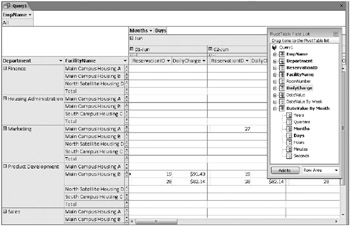
Figure 8–58: This PivotTable shows fields added to all drop zones.
Now would be a good time to take a quick look at the buttons available on the Design contextual tab below PivotTable Tools, which you saw previously in Figure 8–57. Table 8–3 shows you the details.
| Button | Usage |
|---|---|
| | When highlighted, indicates automatic filtering is active for the PivotTable. You can click this button to remove all filters. If you define a filter, this button becomes highlighted again. |
| | You can select a column or row field and then click this button to define a filter to display only the first or last number or percentage of rows. This feature works similarly to the Top Values property of a query. |
| | You can select a column, row, or detail/total field and then click this button to insert an aggregate function. The list of available functions includes those you can use in totals queries except for First and Last. (See Table 8–1 on page 437.) The functions available in AutoCalc are appropriate to the field data type and location on the grid. (For example, you can’t use a Sum function in a text field.) |
| | You can click on a column or row field and then click this button to insert a subtotal based on the values in that field. You must define an AutoCalc field before you add a subtotal. |
| | You can click this button to insert an expression in the detail/total area that calculates an additional value based on the fields in the recordset. |
| | After you insert AutoCalc total fields, you can click in a field and then click this button to convert the value to a percentage of the row, column, or grand totals. |
| | Click on a row or column field and click this button to collapse all subcategories for this field and show summaries only. |
| | Performs the opposite of Collapse Field. |
| | Hides the details for the selected row or column and shows only totals. |
| | Performs the opposite of Hide Details. |
| | Refetches the underlying data. You might need to do this if others are sharing the data and updating it. |
| | Exports your PivotTable in XML format to an HTML (.htm , .html) file and opens it in Excel. |
| | Opens or closes the PivotTable field list. |
| | Opens or closes the Properties window. |
You’re going to need some total calculations for your PivotTable. Click the Reservation ID column heading, click the AutoCalc button to display the list of available functions, and click Count. Click the DailyCharge column heading, click AutoCalc, and click Sum. Click the DailyCharge column heading again, and then click Hide Details to show only totals. Your PivotTable should now look like Figure 8–59. (We closed the PivotTable Field List window to show you more of the PivotTable.)
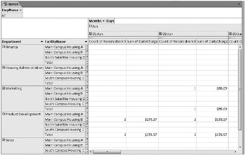
Figure 8–59: The PivotTable now shows two totals calculations and we are hiding all the details.
There are literally hundreds of properties you can set in a PivotTable. Let’s change the captions of the two totals fields to something more meaningful. Click on the Count Of ReservationID field and then click the Property Sheet button in the Tools group of the Design contextual tab below PivotTable Tools to open the Properties window as shown in Figure 8–60.
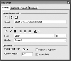
Figure 8–60: You can change a field’s caption in the Properties window for a field in a PivotTable.
As you can see, you can modify the text format on the first tab. You can also click the arrow to the right of Select to choose any other element you have defined thus far. The Properties window changes depending on the type of element you choose. Click the Captions tab and change the caption to Room Days. Go back to the Format tab, select Sum of Daily Charge (Total) from the Select list, click the Captions tab again, and change the caption to Revenue.
You can spend a couple of days playing around in this PivotTable to see what else you can do. One last thing we might want to do before turning this into a PivotChart is to actually pivot the table. You do that by grabbing the fields in the column area and moving them to the row area and vice versa. We decided we’d rather see details about departments first, then facility usage within department, so we placed Department to the left of FacilityName when we moved the fields. You can see the final result in Figure 8–61.
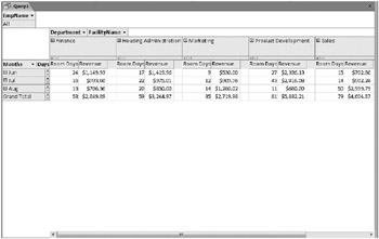
Figure 8–61: You can look at the data in a PivotTable another way by “pivoting” the rows and columns and displaying totals only.
If you switch to Design view, you can open the property sheet for the query and set the Default View property to PivotTable. We saved this query as qxmplReservationByDayPT in the sample database. You should save this query under a new name so that you can start fresh building a PivotChart in the next section.
Designing a PivotChart
Designing a PivotChart is almost as easy as building a PivotTable. You will most likely use PivotCharts in reports (as an embedded subform), but you can also create a PivotChart view of a table, query, or form. As mentioned earlier in the discussion on PivotTables, you most often need to start with a query to pull together the information you need.
To start building a new PivotChart from scratch, open the qxmplReservationsByDay sample query again and switch to PivotChart view. You can see the PivotChart design window in Figure 8–62. (If necessary, click Field List in the Show/Hide group on the Design contextual tab to display the Chart Field List window.)
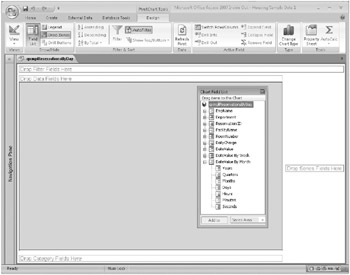
Figure 8–62: We are beginning to design a PivotChart on a query.
Notice that the filter area is still near the upper-left corner of the window. However, the area for data fields is now along the top of the gray chart drawing area in the center. Drop fields that you want to use for data points along the bottom axis in the bottom-left corner. Drop fields that you want to use for the vertical axis in the right center area. To begin designing your PivotChart, expand DateValue By Month in the field list and drag and drop Months onto the Category Fields drop zone. Next, drag and drop Department onto the Series Fields drop zone on the right.
| Inside Out-Switching into PivotChart View | You can switch directly into PivotChart view from the Design view or Datasheet View of any query. If you haven’t previously defined the PivotTable, you can still create your chart by dragging and dropping fields from the field list. Keep in mind that any change you make in PivotChart view also changes what you see in PivotTable view. If you want to keep separate PivotTable and PivotChart views, you should save two versions of your query. |
We don’t have anything charted yet, so drag the DailyCharge field from the field list to the Data Fields drop zone along the top of the chart. Notice that the chart assumes we want to Sum the field. If you had added the ReservationID field, you would have to click on the Sum of ReservationID field, click the AutoCalc button, and change the calculation to Count. Your PivotChart should now look like Figure 8–63.
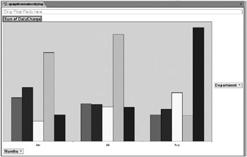
Figure 8–63: You can create totals and display them using a PivotChart.
This doesn’t look all that informative yet, but we’re starting to make some progress. It would be nice to add a title, a legend (description of each of the colored bars), and a vertical axis with some values. You might also want to display the actual value of each bar at the top of it. Let’s get started.
First, open the Properties window (click the Property Sheet button in the Tools group of the Design tab) and select Chart Workspace from the Select list on the General tab as shown in Figure 8–64. (Notice as you go through this exercise that the tabs available in the Properties window change as you select different objects on your PivotChart.)
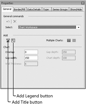
Figure 8–64: In the Properties window you can add a title and legend to the PivotChart workspace.
Click the Title and Legend buttons on the left under Add to create these elements on your PivotChart. Click on the Chart Workspace title you just added (or select Title from the Select list on the General tab), click the Format tab, and change the caption to something like Revenue by Month and Department. Notice that you can also change the font, font size, font color, and position of the title on this tab.
Go back to the General tab and select Chart Workspace again. Click the Series Groups tab to see the settings in Figure 8–65. On this tab, you can select one or more items in the Series box and create a separate set of plot bars by placing them in their own group. For each group, you can also add an axis and specify its location. Click on group 1 in the Groups box under Add Axis, select Left in the Axis Position list, and click the Add button to create the axis.
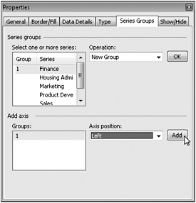
Figure 8–65: On the Series Groups tab you can add an axis to your PivotChart.
Finally, go back to the General tab and select the five values in the Select list for the Department field one at a time, beginning with Finance. You’ll see Add Data Label, Add Trendline, and Add Errorbar buttons as shown in Figure 8–66. Click the Add Data Label button for each department name to add the total value at the top of each column.
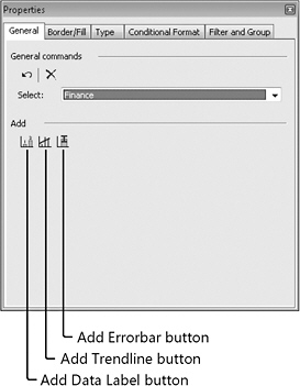
Figure 8–66: Use the Add Data Label button to display labels on data points on your PivotChart.
Your PivotChart should now like Figure 8–67.
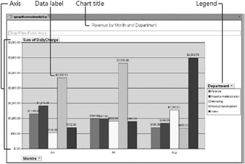
Figure 8–67: The completed PivotChart shows revenue totals by month and department.
| Inside Out-Manipulating the Caption of a Data Field in a PivotChart | If you think about it, you went to some trouble to assign a different caption to Sum of DailyCharge when you built the sample PivotTable. There’s actually no way to correct the caption of a data field in PivotChart view. We recommend that you save what you’ve done so far, and then switch to PivotTable view, hide the details, and change the caption for Sum of DailyCharge to Revenue as you did earlier. When you switch back to PivotChart view, you’ll find the new caption displayed. You can find this chart saved as qxmplReservationByDayPC in the sample database. |
If you want to see what your PivotChart might look like plotted in a different way, you can click the Change Chart Type button in the Type group of the Design contextual tab below PivotChart Tools to open the Properties window with the PivotChart workspace selected and the focus on the Type tab. The chart we’ve been building thus far is a simple column chart, but you can choose from Bar, Line, Smooth Line, Pie, Scatter, and several other options. Be aware that changing the chart type often throws away some detail settings, so you might have to tweak properties again to get exactly what you want.
Now that you understand the fundamentals of building complex select queries and working with PivotTables and PivotCharts with Access, you’re ready to move on to updating sets of data with action queries in the next chapter.
EAN: 2147483647
Pages: 234


