Enhancing the Look of a Form
The employees forms you’ve built thus far in Design view and Layout view look fairly plain. They use default fonts and a background color that’s inherited from the color you have defined in Windows for three-dimensional (3-D) objects (sometimes called the Button Face color). In this section, you’ll learn about additional enhancements you can make to your form’s design. To follow along with the rest of this chapter, you can use either the form you created in Design view, the form you created in Layout view, or one of the example forms saved in the database. We used the form we created using Design view for the remainder of this chapter. Open your form in Design view to continue with the next examples.
Lines and Rectangles
Access 2007 comes with two drawing tools, the Line tool and the Rectangle tool, that you can use to enhance the appearance of your forms. You can add lines to separate parts of your form visually. Rectangles are useful for surrounding and setting off a group of controls on a form.
On your employees form, it might be helpful to add a line to separate the primary information about the employee in the first column from personal information in the second column. To make sufficient room for the line, you should move the controls in the first column to the left. The easiest way to do this is to switch to Design view, select all the affected controls and labels, and then move them as a group. Start by clicking the top ruler just above the right edge of the controls, and then drag inside the ruler toward the left until the selection indicator touches all the controls in the left column. (If you can’t see the rulers, be sure that the Ruler button is selected in the Show/Hide group on the Arrange tab.) Release the mouse button, and all the controls and labels in the left column will be selected. To be sure you move all these controls as a group, click the Group button in the Control Layout group on the Arrange tab. Access shows you that the controls are now grouped by placing a rectangular line around all the controls. Rest the mouse pointer on the square in the upper-left corner of the group so that the pointer changes to a pointer with a crosshairs shape (see Figure 12–34), and slide the entire group left a bit.
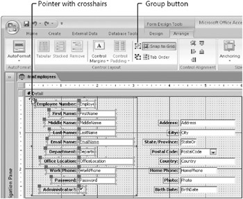
Figure 12–34: You can group a set of controls and then move them together.
Next, on the Design tab, in the Controls group, click the Line tool. To draw your line, click near the top of the form between the two columns, about two grid rows below the top edge, and drag toward the form’s bottom edge. If the line isn’t exactly vertical, you can drag the bottom end left or right to adjust it. You can also set its Width property to 0, in the property sheet to make it perfectly vertical. (As you might imagine, setting the Height property to 0, makes the line horizontal.) Use the Line Thickness button in the Controls group on the Design tab to make the line a little thicker if you want. (Or, change the Border Width property in the property sheet.) Click the button, and choose the thickness you want. Your form should now look similar to the one shown in Figure 12–35.
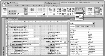
Figure 12–35: Use the Line tool to draw a line on a form; use the Border Thickness button to adjust the line width.
| Inside Out-Ensuring Your Lines Are Straight | When drawing a line on your form, you can make your line exactly horizontal or exactly vertical if you hold down the Shift key as you click and draw the line. |
You can add emphasis to the form by drawing a rectangle around all the controls. To do this, you might first need to move all the controls down and to the right a bit and make the Detail section slightly wider and taller. First, expand your form by about 0.5 inch across and down. Click the Select All button in the Controls group on the Design tab, and then drag all the controls so that you have about 0.25 inch of space around all the edges. (This might seem like too much space, but we’ll use the extra space to have some fun later.) Select the Rectangle tool in the Controls group, click where you want to place one corner of the rectangle, and drag to the intended location of the opposite corner. When you draw a rectangle around all the controls, your form will look similar to the one shown in Figure 12–36.
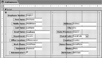
Figure 12–36: Use the Rectangle tool to place a rectangle with a default etched look on the employees form.
Note that the rectangle control actually covers and is on top of all the other controls. However, because the default rectangle is transparent with an etched special effect, you can see the other controls through the rectangle. (You might need to click the form or another control so that you can see the etched look of the rectangle.) If you prefer a solid rectangle, you can select the rectangle control and then use the Fill/Back Color button in the Font group on the Design tab to select the color you want. (A light gray will work best.) When you add a solid control like this after you’ve created other controls, the solid control will cover the previous controls. You can select the control and click Send To Back in the Position group on the Arrange tab to reveal the covered controls and keep the solid control in the background.
Go ahead and make the rectangle a solid light gray and send it to the back. Now switch to Form view, and see how your form looks up to this point. Your employees form should look similar to the one shown in Figure 12–37.

Figure 12–37: The employees form in Form view has a line and a solid rectangle added.
Colors and Special Effects
You can also use color and special effects to highlight objects on your form. For example, you can make all the controls appear to “float” on a raised surface on the form. To do so, switch to Design view, and select the rectangle you just created. Click the arrow on the Special Effect button in the Controls group on the Design tab, and then click Special Effect: Raised to change the rectangle from Etched to Raised. Your form in Form view will look similar to the one shown in Figure 12–38.
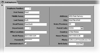
Figure 12–38: The rectangle behind the controls appears raised above the surface of the form background.
Next, switch to Design view if you changed to Form view, select the Rectangle tool again, and set Back Color to dark gray and Special Effect to Sunken using the buttons in the Font and Controls groups. Draw a second rectangle so that it forms a border about halfway between the edge of the first rectangle and the edge of the grid. Click Send To Back in the Position group on the Arrange tab to send this latest rectangle to the background. Switch to Form view to see the result. The first gray rectangle now appears to float on the form, surrounded by a “moat” of dark gray, as shown in Figure 12–39.
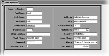
Figure 12–39: The first light gray rectangle appears to float on the form using special effects.
You can find this form saved as frmXmplEmployee4 in the sample database.
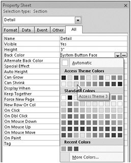
| Inside Out-Using System Colors and the Color Palette | Although you can certainly pick from a broad palette of colors for any design object, you might want to design your forms so that they always inherit colors from the options the user has set in the Windows Display dialog box. In fact, if you select the Detail section of the employees form you’ve been building, open the Property Sheet window, and find the Back Color property, you’ll find the property set to System Button Face. This special option tells Access to use the color set in Windows for button faces and other 3-D objects. In any color property, Access lists 31 system color names that you can use to set colors in your forms and controls to match those set in Windows objects. All these color names begin with the word System. You can also see in the Back Color property (or, for that matter, any color property) a list of 20 additional options. These include Alternate Row, Background Form, Background Light Header, Background Dark Header, Borders/Gridlines, Text Black, Text Description, Text Light, Text Dark, Highlight, and Access Theme 1, Access Theme 2, and so on, up to Access Theme 10. These are shades of the color scheme you chose in Access Options-shades of blue for the Blue or Silver theme, and shades of gray and black for the Black theme, and with a shade of orange in all themes for Highlight. If you click the Build button on the Back Color property line or click the arrow next to the Font Color or Fill/Back Color commands in the Font group on the Design tab, Access opens a color palette where you can see the color defined for each of these options, as shown here: Under Recent Colors on the color palette, Access displays up to 10 recently used colors. Click one of these to enter the code or name for that color in the color property. If you want to create your own custom color, you can click More Colors to open the Colors dialog box. In the Colors dialog box, you can choose from a wider selection of colors on the Standard tab or define a custom color on the Custom tab by adjusting individual RGB values or selecting the color you want from a color rainbow palette. |
Fonts
Another way you can enhance the appearance of your forms is by varying the fonts and font sizes you use. When you select any control that can display text or data, Access makes font, font size, and font attribute controls available in the Font group on the Design tab so that you can easily change how the text in that control looks. Click the arrow next to the Font Name combo box to open a list of all the available fonts, as shown in Figure 12–40. Select the font you want for the control.
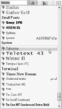
Figure 12–40: This is a partial list of fonts available to you in the Font Name combo box.
| Note | The font list shows all fonts currently installed on your computer. Use the Fonts folder in Windows Control Panel to add or remove fonts. A double-T icon next to the font name in the list indicates a TrueType font that is suitable for both screen display and printing. A printer icon next to the font name indicates a font designed for your printer but that might not look exactly the same when displayed on your screen. A font with no icon indicates a font designed for your screen; a screen font might look different when you print it. |
If you want to add some variety, you can use bold or italic type in a few key places. In this case, select all the labels on the form, and select a serif font such as Times New Roman.
You can add a label to the header of the form to display a title such as Employees. You can either do this manually or use a button on the Ribbon designed specifically for this task. If you’d like Access to do most of the work, click the Title button in the Controls group on the Design tab. Access opens the header and footer section, places a new label in the header section, and sets the caption to the name of your form. Double-click the new label to select the existing text, type Employees in the label, and press Enter.
To do this same task manually, you need to first open the header and footer of the form by clicking the Form Header/Footer button in the Show/Hide group on the Arrange tab. Grab the bottom edge of the footer, and close it up so that it has zero height. Expand the header to give yourself some room to work. Choose the Label tool in the Controls group on the Design tab, draw a label about 1.5 inches wide and 0.5 inch high, type the word Employees in the label, and press Enter.
Set the label in the header to the Tahoma font (a sans serif font), bold, italic, and 18 points in size. Double-click one of the sizing boxes to size the control to fit, and drag the right edge to the right if all the letters don’t show in the label. You can see a portion of this work under way in Figure 12–41.
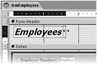
Figure 12–41: Adjust the size of the label to fit the form header title.
You can create a special “shadowed” effect behind this label in the header by doing the following:
-
Copy the label you just created to the Clipboard, and paste it in the header.
-
Change the font color of the pasted label to white, and then click the Send To Back button in the Position group on the Arrange tab.
-
Turn off the Snap To Grid command if it is on in the Control Layout group on the Arrange tab, and use the arrow keys to move the white label so that it is slightly lower and to the right of the first label.
-
Click the Form Header bar to select that section, and set the background color to light gray to provide some contrast.
When you finish, the form should look similar to the one shown in Figure 12–42. (You can find this form saved in the sample database as frmXmplEmployee5.)
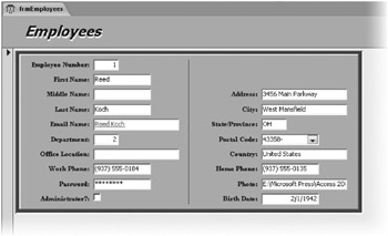
Figure 12–42: The employees form now has a title and some different fonts for variety.
| Inside Out-More Is Not Always Better When It Comes to Fonts | A form with too many fonts or font sizes will look busy and jumbled. In general, you should use only two or three fonts per form. Use one font and font size for most bound data displayed in controls. Make label text bold or colored for emphasis. Select a second font for controls in the headers and perhaps a third (at most) for information in the footers. |
EAN: 2147483647
Pages: 234
