| The text- related Property Inspector allows you to set all the attributes you set via menu in the preceding exercise: the typeface, font size , style, and spacing between letters . You can also define text as superscript or subscript, set line spacing, set text color , and create live links between text and URLs in this panel. You can set character attributes in advance so that as you type, the text tool applies them automatically, or you can apply character attributes to existing text. The text tool always uses whatever settings currently appear in the Text Tool Property Inspector (Figure 2.64). Figure 2.64. When you have selected the text tool in the Toolbox (or a text block on the Stage), the Property Inspector displays the type attributes to be created by the text tool (or applied to the current text selection). 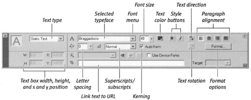 For the following exercises, keep the Property Inspector open (choose Window > Property Inspector if it's not already open ). To select text to apply character attributes: Do one of the following: -
With the text tool selected, drag over existing text to highlight just a portion of text. -
With the arrow tool selected, click a text box to select all the text within it.  Tip Tip
The following exercises assume that you have selected text to modify. To choose an installed typeface: -
In the Property Inspector, click the scroll arrows to the right of the Font field. A scrolling list of your installed fonts appears, together with a font-preview window (Figure 2.65). Figure 2.65. through the font list in the Property As you move the pointer Inspector, you see a preview of each font installed on your system. 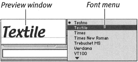 -
Move the pointer over a font name . The preview window displays the name in the selected font. -
Click to select the currently highlighted font. The selected font name appears in the Font field. -
Press Enter or click outside the Font field to confirm the new font and close the scrolling list. To enter a font by name: -
In the Property Inspector, double-click (or click and drag) in the Font field to highlight the current font name. -
Enter the name of the font you want to use. -
Press Enter or click outside the Font field to confirm the new font and close the scrolling list. You can enter the names of fonts that are not installed on your system. Flash will substitute the current system default font for any missing fonts. (The font name appears in parentheses in your list of fonts followed by the words System Default Font .) You'll learn more about working with missing fonts and choosing substitute fonts in Chapter 16. Tip -
Although the Font field is not case-sensitive, you do need to type accurately. If you make a mistake in typing the name of an installed font, Flash assumes that it's dealing with a missing font and substitutes the system default font.
To set font size: -
In the Property Inspector, double-click (or click and drag) in the Font Size field to highlight the current value. -
Enter the desired point size. -
Press Enter. Tips -
For easy entry of new font sizes, click the triangle to the right of the Font Size field. A slider pops open. Drag the slider's lever to choose a value between 8 and 96 points. Flash previews the changes on the Stage as you drag the slider lever. Click outside the slider to confirm the new font size. -
For even quicker changes, just click and drag the slider triangle. When you release the slider's lever, Flash confirms the new font size automatically. -
To enter font sizes outside the slider's range, you must type the value in the Font Size field.
To choose a text color: -
In the Property Inspector, click the text-color box (note that text in Flash is considered to be a fill). The pointer changes to an eyedropper, and a set of swatches appears (Figure 2.66). Figure 2.66. Choose a color for text created with the text tool from the Property Inspector's text (fill)-color box. 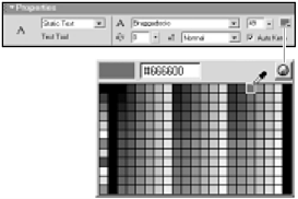 -
To select a color, do one of the following: -
To select the color directly below the tip of the eyedropper, with the eyedropper tool, click a swatch or an item on the Stage. -
Enter a value in the hexadecimal-color field. -
To define a new color, click the Color Picker button. (For more information on defining colors, see Chapter 3.) To choose a type style: In the Property Inspector, do one of the following: -
To create boldface type, click the Bold button (Figure 2.67). Figure 2.67. Access bold and italic styles by clicking the Bold and Italic buttons in the text related Property Inspector.  -
To create italic type, click the Italic button. -
To create type that is both boldface and italic, click the Bold and Italic buttons. -
When creating bold and italic styles, Flash simply modifies the current typeface; Flash doesn't select a bold or italic typeface in the family of fonts you've chosen . Tip
Flash allows you to control tracking the amount of space between letters and words in a chunk of selected text. To apply tracking: -
Within a text box in a Flash document, select the text to track. -
In the Property Inspector's Character Spacing field, enter the desired point size. A negative value reduces the space between the letters; a positive value increases it (Figure 2.68). Figure 2.68. Enter a negative tracking value to bring characters closer together. Enter a positive value to space characters out. Enter 0 to use a font's built-in tracking value.  -
Press Enter. Tip -
To change tracking interactively, in the Property Inspector's Character Spacing field, click the triangle to the right of the field. A slider pops open. Drag the slider's lever to a value between -59 and 59. Flash previews the changes on the Stage as you drag the slider lever. Then press Enter. -
For even quicker changes, just click and drag the slider triangle. When you release the slider's lever, Flash confirms the new tracking value; you don't need to press Enter. -
You can increase tracking of selected text in 0.5-point increments by choosing Text > Tracking > Increase or by pressing  -Option-right arrow (Mac) or Alt-Ctrl-right arrow (Windows). -Option-right arrow (Mac) or Alt-Ctrl-right arrow (Windows). -
To decrease tracking in 0.5-point increments, press -Option-left arrow (Mac) or Alt-Ctrl-right arrow (Windows). -
Add the Shift key to the keyboard shortcuts for narrower and wider tracking; this method increases or decreases space in 2-pixel increments. -
You can also track interactively by using the keyboard shortcuts. The space between letters continues to expand or contract as long as you hold down the key combination. -
To reset the font's original letter spacing, choose Text > Tracking > Reset or press -Shift-up arrow (Mac) or Alt-Ctrl-up arrow (Windows)
What Is Kerning? While tracking affects the space between characters and words in an entire line or paragraph of text, kerning affects the space between a pair of letters. Because of the way fonts are constructed , with each letter being a separate element, some pairs of letters look oddly spaced when you type them. The space between a capital T and a lowercase o , for example, may seem too large because of the white space below the crossbar of the T . To make the characters look better, you can reduce the space between them, or kern in the pair. Some letters may seem to be too close togethersay, a t and an i . You can kern out the pair so that it looks better. Font designers often build into their fonts special information about how to space troublesome pairs of letters. Flash takes advantage of that embedded kerning information when you check the Auto Kern checkbox in the text-related Property Inspectors. It's a good idea to turn kerning on to make your type look its best. You can kern manually in Flash instead of using the embedded kerning or in addition to it. Select the character pair that you want to kern; then use Flash's Tracking feature to bring the letters closer together or move them farther apart. |  |