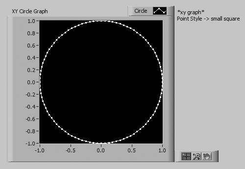
Activity 8-3: Using an XY Graph to Plot a Circle
| You will build a VI that plots a circle.
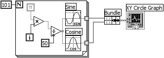
Sine Function
Cosine Function Sine and Cosine functions (Mathematics>>Elementary & Special Functions>> Trigonometric Functions palette) calculate the sine and cosine, respectively, of the input number. In this exercise, you use the function in a For Loop to build an array of points that represents one cycle of a sine wave and one cycle of a cosine wave.
Bundle Function Bundle function (Programming>>Cluster & Variant palette) assembles the sine array (X values) and the cosine array (Y values) to plot the sine array against the cosine array.
Pi Constant Pi constant (Programming>>Numeric>>Math & Scientific Constants palette) is used to provide radian input to Sine and Cosine functions.
Using the Graph Palette
Standard Operate Mode
Zoom Button The graph palette is the little box that contains tools allowing you to pan (i.e., scroll the display area), focus in on a specific area using palette buttons (called zooming), and move cursors around (we'll talk about cursors shortly). The palette, which you can make visible by selecting Graph Palette from the Visible Items submenu of the chart or graph pop-up menu, is shown in Figure 8.42. Figure 8.42. Graph palette
Pan Button The remaining three buttons let you control the operation mode for the graph. Normally, you are in standard mode, meaning that you can click on the graph cursors to move them around. If you press the pan button, you switch to a mode where you can scroll the visible data by dragging sections of the graph with the pan cursor. If you click on the zoom button, you get a pop-up menu that lets you choose from several methods of zooming (focusing on specific sections of the graph by magnifying a particular area). Here's how these zoom options work:
Zoom by Rectangle Zoom by Rectangle. Drag the cursor to draw a rectangle around the area you want to zoom in on. When you release the mouse button, your axes will rescale to show only the selected area.
Zoom by Rectangle in X Zoom by Rectangle in X, with zooming restricted to X data (the Y scale remains unchanged).
Zoom by Rectangle in Y Zoom by Rectangle in Y, with zooming restricted to Y data (the X scale remains unchanged).
Zoom to Fit Zoom to Fit. Autoscales all X and Y scales on the graph or chart, such that the graph shows all available data.
Zoom In About a Point Zoom In About a Point. If you hold down the mouse on a specific point, the graph will continuously zoom in until you release the mouse button.
Zoom Out About a Point Zoom Out About a Point. If you hold down the mouse on a specific point, the graph will continuously zoom out until you release the mouse button.
For the last two modes, Zoom In and Zoom Out About a Point, shift-clicking will zoom in the other direction. Note that this feature requires a VI to be in run mode, and will not work when a VI is in edit mode. Graph CursorsLabVIEW graphs have cursors to mark data points on your plot to further animate your work. Figure 8.43 shows a picture of a graph with cursors and the cursor legend visible. You won't find cursors on charts, so don't bother to look. Figure 8.43. Graph cursors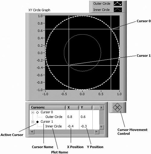 You can view the Cursor palette by selecting Visible Items>>Cursor Legend from the graph's pop-up menu. When the cursor legend first appears, it is empty. Pop up on the cursor legend and select a mode from the Create Cursor>> shortcut menu. The following cursor modes are available:
You cannot change a cursor's mode after it is created. If you want a cursor of a different mode, you must first delete the existing cursor and then create another cursor of the desired mode.
Active Cursor (Inactive) A graph can have as many cursors as you want. The cursor legend helps you keep track of them, and you can stretch it to display multiple cursors. What does this cursor legend do, you ask? You can label the cursor in the first column of the cursor legend. The next column shows the X position, and the next after that shows the Y position.
Active Cursor (Active) Click on the Active Cursor diamond to the left of the cursor name to make a cursor active, and selected for movement (the diamond will be solid black when the cursor is active and unfilled (white) when the cursor is inactive). Note that more than one cursor can be active at the same time.
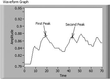
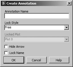
Cursor Movement Control When you click a button on the Cursor Movement Control, all active cursors move. You can move the active cursors up, down, left, and right. You can also move cursors around programmatically using property nodes, which you'll learn about in Chapter 13. You can also drag a cursor around the graph with the Operating tool. If you drag the intersection point, you can move the cursor in all directions. If you drag the horizontal or vertical lines of the cursor, you can drag only vertically or horizontally, respectively. Pop up on the cursor label inside the cursor legend to attributes like cursor style, point style, and color. You can also select a plot from the Snap To>> pop-up submenu to lock the cursor to a plot. Locking restricts cursor movement so it can reside only on plot points, but nowhere else in the graph. To delete a cursor, pop-up on the cursor label in the cursor legend and choose Delete Cursor. Graph AnnotationsGraph annotations are useful for highlighting data points of interest on a graph. An annotation appears as a labeled arrow that can be used to describe features in your data, as shown in Figure 8.44. Figure 8.44. Graph annotations You can create and modify annotations interactively with the mouse, as well as programmatically using property nodes, which are discussed in Chapter 13. When the VI is in run mode, you can create an annotation by selecting Create Annotation from the graph's pop-up menu (in edit mode, all annotation options are available from the graph's Data Operations>> pop-up submenu). Selecting Create Annotation will open the Create Annotation dialog, which is used for defining the new annotation's label (Annotation Name) and some basic attributes, as shown in Figure 8.45. Figure 8.45. Create Annotation dialog
Annotation Cursor Annotations have three parts: the label, the arrow, and the cursor. The label and arrow are easy to identify, but the annotation cursor is a little bit harder to seeit's right under the tip of the annotation's arrow. Popping up on an annotation's cursor provides access to options for editing the annotation's properties, as well as deleting the annotation. An annotation's label may be moved relative to its cursor by clicking on it and dragging it to a new location. When moved, the arrow will always point from the annotation's label to its cursor. You can also move the annotation cursor, depending on the setting of its Lock Style attribute. The Lock Style can be one of the following:
Finally, to delete an annotation, select the Delete Annotation option from the annotation cursor's pop-up menu. You can also delete all annotations on a graph by selecting the Delete All Annotations option from the graph's pop-up menu. |


EAN: 2147483647
Pages: 294