6.2. THE PATTERNS Because this book deals with interactive software, most of these patterns describe ways to interact with the datamoving through it; sorting, selecting, inserting or changing items; and probing for specific values or sets of values. A few deal only with static graphics: information designers have known Alternating Row Colors, Multi-Y Graph, and Small Multiples for a while now, but they translate well to the world of software. And don't forget the patterns elsewhere in this book. From Chapter 2, recall Alternative Views and Extras On Demand, both of which can help you structure an interactive graphic. Chapter 3 offers Annotated Scrollbar and Animated Transition, which help users stay oriented within large and complex data spaces. The first group of patterns can apply to most varieties of interactive graphics, regardless of the data's underlying structure. (Some are harder to learn and use than others, so don't throw them at every data graphic you createData Brushing and Local Zooming, in particular, are "power tools," best for sophisticated computer users.) Overview Plus Detail Datatips Dynamic Queries Data Brushing Local Zooming
Next is a set of patterns for tables and lists. Row Striping Sortable Table Jump to Item New-Item Row
Cascading Lists and Tree Table are useful for hierarchically structured data. If you use a tree view (also known as an outline view), consider these too. Cascading Lists Tree Table
The remaining patterns describe ways to construct data graphics for multidimensional datadata that has many attributes or variables. Multi-Y Graph Small Multiples Treemap
54. overview plus detail Figure 6-11. From http://wildfire.usgs.gov 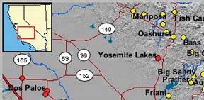
6.2.1.1. what Place an overview of the graphic next to a zoomed "detail view." As the user drags a viewport around the overview, show that part of the graphic in the detail view. 6.2.1.2. use when You show a data set drawn as a large information graphicespecially an image or a map. You want users to stay oriented with respect to the "big picture," but you also want them to zoom down into the fine details. Users will browse through the data, inspect small areas, or search for points of interest. High-level overviews are necessary for finding those points of interest, but users don't need to see all available detail for all data points at oncezooming in on a small piece is sufficient for getting fine detail. 6.2.1.3. why It's an age-old way of dealing with complexity: present a high-level view of what's going on, and let the users zoom from that view into the details as they need to, keeping both levels visible on the same page for quick iteration. Edward Tufte uses the terms "micro and macro readings" to describe a similar concept for printed maps, diagrams, and other static information graphics. The user has the large structure in front of them at all times, while being able to peer into the small details at will: "the pace of visualization is condensed, slowed, and personalized." Similarly, users of Overview Plus Detail can scroll methodically through the content, jump around, compare, contrast, move quickly, or move slowly. Finally, the overview can serve as a "You are here" sign. A user can tell at a glance where they are in the context of the whole data set by looking for the viewport on the overview. 6.2.1.4. how Show an overview of the data set at all times. It can be an inset panel, as in the example at the top of the pattern. It also could be a panel beside the detail view, or even another window, in the case of a multiwindow application like Photoshop (see the examples in Figure 6-12). On that overview, place a viewport. They're usually red boxes, by convention, but they don't have to bethey just need to be visible at a glance, so consider the other colors used in the overview panel. If the graphic typically is dark, make it light; if the graphic is light, make it dark. Make the viewport draggable with the pointer, so users can grab it and slide it around the overview. The detail view shows a magnified "projection" of what's inside the viewport. The two should be synchronized. If the viewport moves, the detail view changes accordingly; if the viewport is made smaller, the magnification should increase. Likewise, if the detail view has scrollbars or some other panning capability, the viewport should move along with it. The response of one to the other should be immediate, within a tenth of a second (the standard response time for direct manipulation). 6.2.1.5. examples Figure 6-12. Photoshop places the image canvas (the "detail view") on the left, and the overview on the right. The Navigator window shows a view of the whole image, with a red box showing the size and scroll position of the image's canvas window. 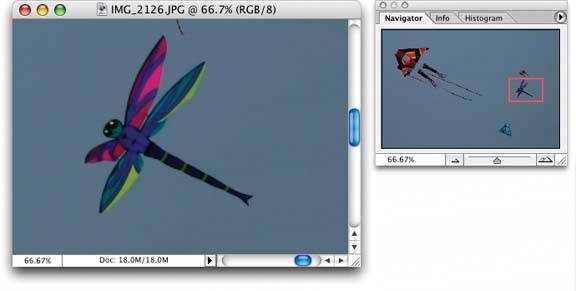
Figure 6-13. In the signal-processing software shown here, the overview panel is on the bottom of the window. The "You Are Here" aspect is particularly important for users who deal with long, complex signals. 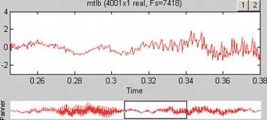
55. datatips Figure 6-14. From http://nfl.com/teams/depthcharts/NE 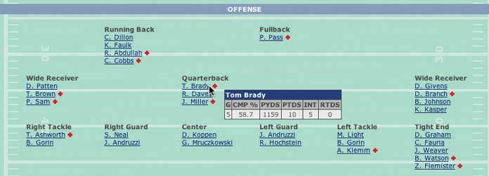
6.2.2.1. what As the mouse rolls over a point of interest on the graphic, put the data values for that point into a tooltip or some other floating window. 6.2.2.2. use when You show an overview of a data set, in almost any form. There's more data "hidden behind" specific points on that graphic, such as the names of streets on a map, the values of bars in a bar chart, or data about players on a football team depth chart. The user can "point at" places of interest with a mouse cursor or a touch screen. 6.2.2.3. why Looking at specific data values is a common task in data-rich graphics. Users will want the overview, but they also might look for particular facts that aren't present in the overview. Datatips let you present small, targeted chunks of context-dependent data. They put that data right where the user's attention is focused: the mouse pointer. If the overview is reasonably well organized, users find it easy to look up what they needand you don't need to put it all on the graphic. Also, some people might just be curiouswhat else is here? What can I find out? Datatips offer an easy, rewarding form of interactivity. They're quick (no page loading!), they're lightweight, and they offer intriguing little glimpses into an otherwise invisible data set. If you find yourself trying to use a datatip to show an enlargement of the data that it hovers over, rather than extra data, consider using the Local Zooming pattern instead. 6.2.2.4. how Use a tooltip-like window to show the data associated with that point. It doesn't technically have to be a "tooltip"all that matters is that it appears where the pointer is, it's layered atop the graphic, and it's temporary. Users will get the idea pretty quickly. Inside that window, format the data as appropriate. Denser is usually better, since a tooltip window is expected to be small; don't let the window get so large that it obscures too much of the graphic while it's visible. And place it well. If there's a way to programmatically position it so that it covers as little content as possible (again, see the NFL graphic above), try that. You might even want to format the datatip differently, depending on the situation. An interactive map might let the user toggle between seeing place names and seeing latitude/longitude coordinates, for example. If you have a few data sets plotted as separate lines on one graph, the datatips might be labeled differently for each line, or have different kinds of data in them. An alternative way of dynamically showing hidden data is to reserve some panel on or next to the graphic as a static data window. As the user rolls over various points on the graphic, data associated with those points appear in the data window. It's the same idea, but it uses a reserved space rather than a temporary datatip. The user has to shift her attention from the pointer to that panel, but you never have a problem with the rest of the graphic being hidden. Furthermore, if that data window can retain its data, the user can view it while doing something else with the mouse. 6.2.2.5. examples Figure 6-15. A small snippet from a large graph. Each bar represents a state; the location of the bar's center along the X axis indicates the number of cancer-related deaths per state, and the width of each bar shows that figure's confidence interval (ever taken a statistics class?). When the mouse pointer hovers over any bar, a datatip appears. The actual numbers are shown, so the user doesn't have to go scrolling down a long graph to find those numbers. 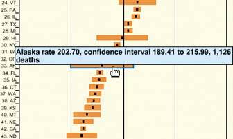
Figure 6-16. You can use datatips to selectively label maps wherever the user puts the mouse, as in this web application from http://thebanmappingproject.org. 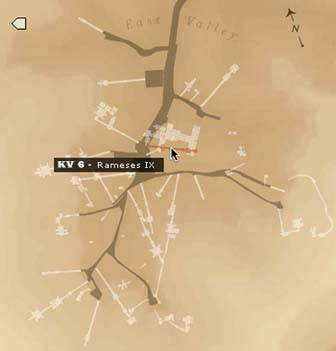
56. dynamic queries Figure 6-17. From http://hivegroup.com 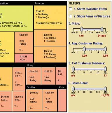
6.2.3.1. what Provide ways to filter the data set immediately and interactively. Employ easy-to-use standard controls, such as sliders and checkboxes, to define which parts of the data set get shown. As soon as the user adjusts those controls, the results appear on the data display. 6.2.3.2. use when You show the user a large, multivariate data set, of any shape, with any presentation. Users need to filter out some of the data to accomplish any of several objectivesto get rid of irrelevant parts of the data set, to see which data points meet certain criteria, to understand relationships among the various data attributes, or simply to explore the data set and see what's there. The data set itself has a fixed and predictable set of attributes (or parameters, variables, dimensions, whatever term you prefer) that interest users. They usually are numeric and range-bounded; they also might be sortable strings, dates, categories, or enumerations (sets of numbers representing nonnumeric values). Or they might be visible areas of data on the information display itself, which can be selected interactively. 6.2.3.3. why First, dynamic queries are easy to learn. No complicated query language is necessary at the user's end; well-understood controls express commonsense Boolean expressions like "price > $70 AND price < $100". They lack the full expressive power of a query languageonly simple queries are possible without making the UI too complicated. But in most cases, it's enough. That's a judgment call you have to make. Second, the immediate feedback encourages open-ended exploration of the data set. As the user moves a slider thumb, for instance, she sees the visible data contract or expand. As she adds and removes different subsets of the data, she sees where they go and how they change the display. She can concoct long and complex query expressions incrementally, by tweaking this control, then that one, and then another. Thus, a continuous and interactive "question-and-answer session" is carried on between the user and the data. The immediate feedback shortens the iteration loop so that exploration is fun, and a state of flow is possible. (See Chapter 1, Incremental Construction.) Thirdand this is a little more subtlethe presence of labeled dynamic-query controls clarifies what the queryable attributes are in the first place. If one of the data attributes is a number that ranges from 0 to 100, for instance, the user learns that just by seeing a slider that has 0 at one end and 100 at the other end. 6.2.3.4. how The best way to design a dynamic query depends on your data display, the kinds of queries you think should be made, and your toolkit's capabilities. As mentioned, most programs map data attributes to ordinary controls that live next to the data display. This scenario allows querying on many variables at once, not just those encoded by spatial features on the display. Plus, most people know how to use sliders and buttons. Other programs afford interactive selection directly on the information display. Usually the user draws a box around a region of interest, and the data in that region is removed (or retained while the rest of the data is removed). This is direct manipulation at its most direct, but it has the disadvantage of being tied to the spatial rendering of the data. If you can't draw a box around itor otherwise select points of interestyou can't query on it! See the Data Brushing pattern for the pros and cons of a similar technique. Back to controls, then. Picking controls for dynamic queries resembles the act of picking controls for any kind of form: the choices arise from the data type, the kind of query to be made, and the available controls. Some common choices include: Sliders to specify a single number within a range. Double sliders or slider pairs to specify a subset of a range: "show data points that are greater than this number, but less than this other number." Radio buttons or dropdown (combo) boxes to pick one value out of several possible values. You also might use them to pick entire variables or data sets. In either case, "All" frequently is used as an additional metavalue. Checkboxes to pick an arbitrary subset of values or boolean variables. Text fields to type in single values, perhaps to be used in a Fill-in-the-Blank context (see Chapter 7, Getting Input From Users). Remember that text fields leave more room for errors and typos than do sliders and buttons.
6.2.3.5. examples The example at the top of this pattern shows a set of six filters for a treemap (see the Treemap pattern in this chapter). The checkboxes, filters 1 and 2, screen out entire swaths of data with two very simple canned queries: is this item available, and does it have a picture? The remaining filters use double sliders. Each has two independently movable slider "thumbs" that let a user define a range. The Price slider sets a range of about $80 to about $1000, and as the user moves either end of the range, the whole treemap shifts and changes to reflect the new price range. The same is true for the other sliders. That example resembles several other implementations, such as the following examples. Figure 6-18. Spotfire is a visualization program often used by biotechnology researchers. The "Query Devices" panel is on the right of the window, like the previous example. It too uses checkboxes and double sliders (see the two-toned yellow slider near the middle), plus radio buttons and single sliders. At least eight variables are represented in this dynamic query panel. As the user manipulates the controls, the data in all three of the tables and graphs update themselves. 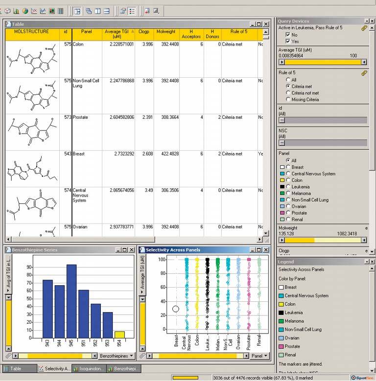
Figure 6-19. This web application lets the user browse through a large set of German expressionist prints. Using the buttons at the bottom of the window, a user can filter out all prints except the woodcuts, for example, or show only portraits by Heckel and Mueller. (The square checkboxes reading "All Themes," etc. unset the round multiple-selection buttons below themthe ones that look like radio buttons, but aren't.)
This interface is powerful enough for an enterprising user to discern themes and relationships among the prints by narrowing down the set in various ways. See http://www.moma.org/exhibitions/2002/brucke. 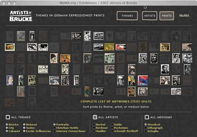
57. data brushing Figure 6-20. BBN Cornerstone 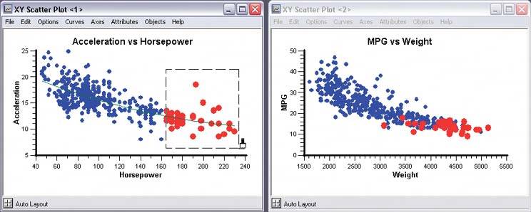
6.2.4.1. what Let the user select data items in one view; show the same data selected simultaneously in another view. 6.2.4.2. use when You show two or more information graphics at a time. You might have two line plots and a scatter plot, a scatter plot and a table, a diagram and a tree, or a map and a table, whateveras long as each graphic shows the same data set. 6.2.4.3. why Data brushing offers a very rich form of interactive data exploration. First, the user can select data points by using an information graphic itself as a "selector." Sometimes it's easier to find points of interest visually than by less direct means, like Dynamic Queriesyou can see and manipulate outliers on a plot immediately, for instance, while figuring out how to define them numerically could take a few seconds, or longer. "Do I want all points where X > 200 and Y > 5.6? I can't tell; just let me draw a box around that group of points." Second, by seeing the selected or "brushed" data points simultaneously in the other graphic(s), the user can observe those points in at least one other graphical context. That context can be invaluable. To use the outlier example again, the user might want to know where those outliers are in a different data space, indexed by different variablesand by learning that, he might gain immediate insight into the phenomenon that produced the data. A larger principle here is coordinated or linked views. Multiple views on the same data can be linked or synchronized so that certain manipulationslike zooming, panning, and selectiondone to one view are shown in the others simultaneously. Coordination reinforces the idea that the views are simply different perspectives on the same data. Again, the user focuses on the same data in different contexts, which can lead to insight. 6.2.4.4. how First, how will users select or "brush" the data? It's the same problem you'd have with any selectable collection of objects: users might want one object or several, contiguous or separate, selected all at once or incrementally. Consider these ideas: Drawing a rubber band box around the data points (this is very common) Single-selection by clicking with the mouse Selecting a range (if that makes sense) by shift-clicking, as one can often do with lists Adding and subtracting points by control-clicking, also like lists Drawing an arbitrary "lasso" shape around the data points Inverting the selection via a menu item, button, or key
If you go exclusively with a rubber-band box, consider leaving the box onscreen after the selection gesture. Some systems, like Cornerstone (Figures 6-20 and 6-21), permit interactive resizing of the brushing box. Actually, the user can benefit from any method of interactively expanding or reducing the brushed set of points because he can see the newly-brushed points "light up" immediately in the other views, which creates more possibility for insight. As you can see, it's important that the other views react immediately to data brushing. Make sure that the system can handle a fast turnaround. If the brushed data points appear with the same visual characteristics in all the data views, including the graphic where the brushing occurs, then the user can more easily find and recognize them as brushed. They also form a single perceptual layer (see the "Preattentive Variables" section in this chapter's introduction). Color hue is the preattentive variable most frequently used for brushing, probably because you can see a bright color so easily when your attention is focused elsewhere. 6.2.4.5. examples Figure 6-21. Both this screenshot and the one at the top of this pattern are taken from Cornerstone, a statistics and graphing package. The three windows here represent a scatter plot, a histogram of the residuals of one of the plotted variables, and a table of the raw data. All views afford brushing; you can see the brushing box around two of the histogram's columns. Both plots show the brushed data in red, while the table shows it in gray. If you "brushed" a car model in the table, you would see the dot representing that model appear red in the top plot, plus a red strip in the histogram. 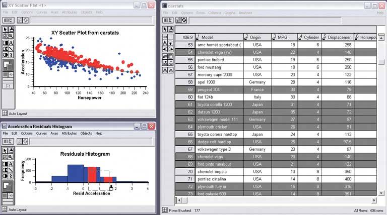
Figure 6-22. Sigmaplot permits the selection of single points. Notice that both this and Cornerstone use special mouse cursors to indicate the brushing mode. 
Figure 6-23. Google Maps. It's a bit of a stretch to call this technique "data brushing," but the concept is similar: selection in one view causes the other view to reveal something about that data simultaneously. When the user clicks on a waypoint in the directions, a closeup of that waypoint is magnified on the map. (Incidentally, this is a nice use of Local Zooming, which brings us to the next pattern…) 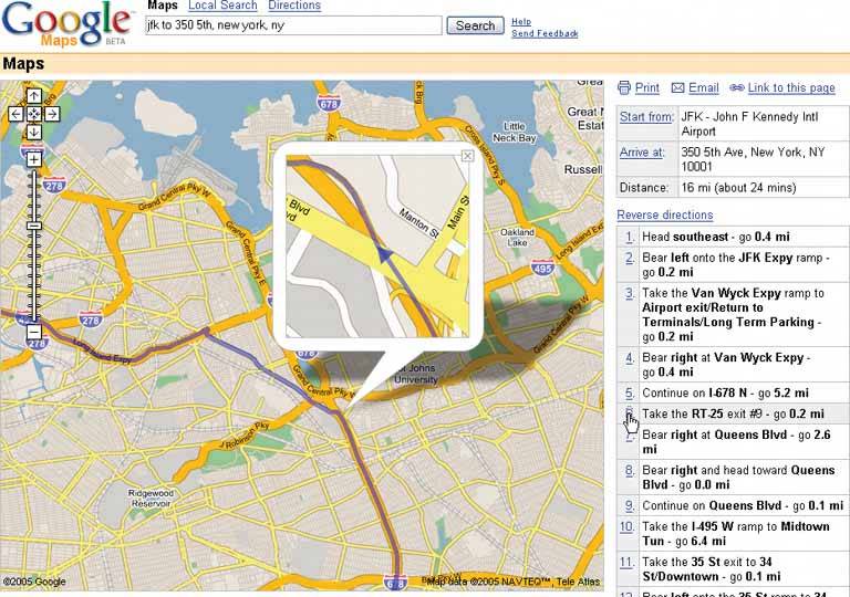
58. local zooming Figure 6-24. The DateLens calendar 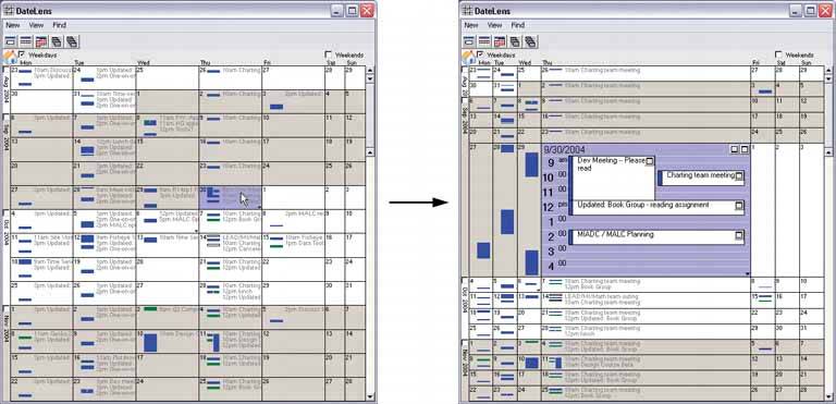
6.2.5.1. what Show all the data in a single dense page, with small-scale data items. Wherever the mouse goes, distort the page to make those data items large and readable. 6.2.5.2. use when You show a large data set using any organizational formplots, maps, networks, and even tableson either a large or a small screen. The user can "point at" places of interest with a mouse cursor or touchscreen. Users will browse through the data or search for points of interest within that organizational structure (e.g., finding a date in a calendar). High-level overviews are necessary for finding those points of interest, but users don't need to see all available detail for all data points at oncezooming in is sufficient for getting fine detail. Some forms of local zooming, especially fisheye lenses, are appropriate only if your users are willing to learn a new interaction technique to gain proficiency with a particular application. Using local zooming requires patience. Programmers in particular seem to learn them well. 6.2.5.3. why Ordinary zooming works well for most high-density information graphics, but it takes away context: a fully zoomed view no longer shows an overview of the whole dataset. Local zooming focuses on local detail while retaining context. The user remains in the same conceptual space. One possible cost of local zooming, however, is distortion of that conceptual space. Notice how the introduction of a fisheyea local zoom that maintains topological continuity between the zoomed area and the rest of the viewchanges the landscape in Figure 6-24. Suddenly the overview doesn't look the way it did before: landmarks have moved and spatial relationships have changed ("it used to be halfway down the right side of the screen, but it's not there anymore"). Other kinds of local zooming don't introduce distortion, but hide parts of the overview. With a virtual magnifying glass, for instance, the user can see the zoomed area and part of the larger context, but not what's hidden by the magnifying glass "frame." The Overview Plus Detail pattern is a viable alternative to local zooming. It too offers both detail (focus) and a full overview (context) in the same page, but it separates the two levels of scale into two side-by-side views, rather than integrating them into one distorted view. If local zooming is too difficult to implement, or too hard for users to interact with, fall back to Overview Plus Detail. The Datatips pattern is another viable alternative. Again, you get both overview and detail, but the information shown isn't really a "zoom" as much as a description of the data at that point. A Datatip is an ephemeral item layered over the top of the graphic, whereas Local Zooming can be an integral part of the graphic, and as such you can print and screen-capture it. 6.2.5.4. how Fill all the available space with the whole data set, drawn very small. Stretch it to fill the window dynamically (see Liquid Layout). Remove detail as necessary. If text is an important structural element, use tiny fonts where you can; if the text still won't fit, use abstract visual representations like solid rectangles or lines that approximate text. Offer a local zoom mode. When the user turns it on and moves the pointer around, enlarge the small area directly under the pointer. What the enlargement actually looks like depends on the kind of information graphic you useit doesn't have to be literal, like a magnifying glass on a page. The DateLens, in Figure 6-24, uses both horizontal and vertical enlargement and compression. But the TableLens, shown in Figure 6-25, uses only a vertical enlargement and compression because the data points of interest are whole rows, not a single cell in a row. A map or image, however, need to control both directions tightly in order to preserve its scale. In other words, don't stretch or squish a map. It's harder to read that way. Local zoom lenses can be finicky to "drive" because the user might aim at very tiny hit targets. They don't look tinythey're magnified under the lens!but the user actually moves the pointer through the overview space, not the zoomed space. A small motion becomes a big jump. So when the data points are discrete, like table cells or network nodes, you might consider using Magnetism (Chapter 8) to aid the user in moving from one focal point to another. Fisheye views, in particular, are the subject of much academic research in the visualization field. Fisheye views have a lot of promise, but we don't know much about how to make them most effective in production UIs. We're starting to learn that they don't work well for inexperienced computer users, for instance. 6.2.5.5. examples The DateLens, shown at the top of the pattern, is a calendar application that works on both the desktop and the PocketPC. It shows an overview of your calendareach row is a weekwith blue blocks where your appointments are. For details, click on a cell. That cell then expands, using an Animated Transition (Chapter 3), to show the day's schedule. In this design, the entire graphic compresses to allow room for the focused day, except for the row and the column containing that cell. (That actually provides useful information about the week's schedule, and about other weeks' Thursday appointments.) Figure 6-25. The Inxight TableLens permits the user to open arbitrary numbers of rows and move that "window" up and down the table. This screenshot shows four magnified rows. Note that the only enlargement here is in the vertical direction. 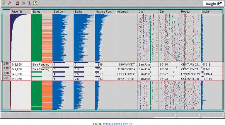
Figure 6-26. A more lens-like example comes to us courtesy of AT&T. This web page shows a low-resolution map of the country. As the user moves the mouse, a literal lens moves with it, magnifying the map to show detailed cellular coverage in that area. See http://attwireless.com/media/swf/maps/gsmawonnet-nat.swf. 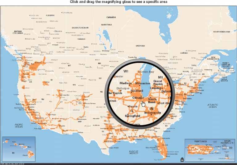
59. row striping Figure 6-27. iTunes 
6.2.6.1. what Use two similar shades to alternately color the backgrounds of the table rows. 6.2.6.2. use when You use a table, but the table's rows are difficult to separate visually, especially when there are many columns (or multiple lines to a row). 6.2.6.3. why Blocks of gentle color define and delineate the information contained inside them, even when you can't use whitespace to separate the data into "chunks." Cartographers and graphic designers have known this for ages. (Remember that colored backgrounds are also effective in defining Titled Sections.) When someone looks at a table with a single background color, they will tend to see the columns as coherent objects, due to proximitythe table entries in a column are closer to one another than they are to the other entries in their rows. But you want the viewer to read the table "rowwise" as well as columnwise. By coloring adjacent rows differently, you turn the rows into coherent visual objects, too. (This act takes advantage of the Gestalt principles of continuity and closure; see Chapter 4.) Specifically, row striping helps a user: Follow a row from left to right and back again, without confusing the rows See the "footprint" of the table itself, separately from its containing page
6.2.6.4. how Pick a pair of quiet, low-saturation colors that are similar in value, but not identical. (In other words, one needs to be a wee bit darker than the other.) Good choices are light blue and white, beige and white, or two similar shades of grayassuming the text on top of them is dark, anyway. Generally, one of the colors is your page's background color. Alternate the color from row to row. If the rows are thin, you also could experiment with grouping the rows: the first three are white, the next three are blue, etc. This pattern virtually eliminates the need for horizontal lines between the rows (though you could use lines, if they are very thin and inconspicuous). If your columns are aligned with one another, you don't need vertical lines or a heavy border around the tablethe viewer's sense of visual closure kicks in, and the row colors define the edges of the table for you. 6.2.6.5. examples Figure 6-28. The women's top finishers in the 2004 Boston marathon, taken from http://boston.com 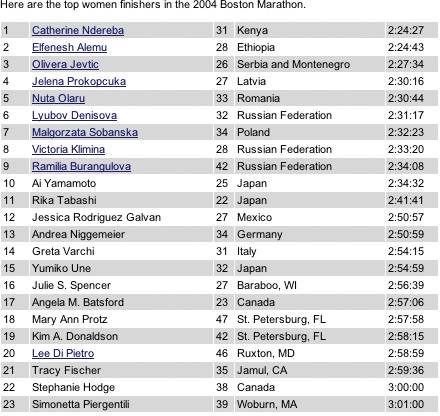
Figure 6-29. But look what happens when the gray row backgrounds are stripped away. The columns suddenly become much stronger visually, and each row is harder to read from left to right. Some designers, however, find this design cleaner and more pleasing. There is no absolutely correct answer about whether to use Row Striping. 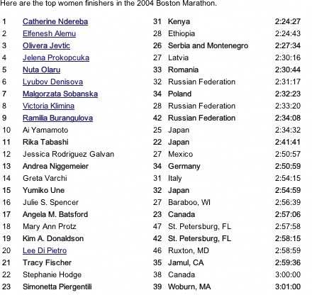
60. sortable table Figure 6-30. Windows Explorer 
6.2.7.1. what Show the data in a table, and let the user sort the table rows according to the column values. 6.2.7.2. use when The interface shows multivariate information that the user may want to explore, reorder, customize, search through for a single item, or simply understand on the basis of those different variables. 6.2.7.3. why Giving the user the ability to change the sorting order of a table has powerful effects. First, it facilitates exploration. A user can now learn things from the data that he may never have seen otherwisehow many of this kind? what proportion of this to that? is there only one of these? what's first or last? Suddenly finding specific items becomes easier, too; a user need only remember one attribute of the item in question (e.g., its last-edited date), sort on that attribute, and look up the value he remembers. Furthermore, if the sort order is retained from one invocation of the software to another, the user now can effectively customize the UI for his preferred usage patterns. Some users want the table sorted first to last; some last to first; and some by a variable no one else thinks is interesting. It's good to give users that kind of control. Finally, the clickable-header concept is familiar to many users now, and they may expect it even if you don't provide it. 6.2.7.4. how Choose the columns (i.e., the variables) carefully. What would a user want to sort by or search for? Conversely, what doesn't need to be shown in this table? What can be hidden until the user asks for more detail about a specific item? The table headers should have some visual affordance that can be clicked on. Most have beveled, button-like borders, or blue underlined text. You should use up-or-down arrows to show whether the sort is in ascending or descending order. (The presence of an arrow shows which column was last sorted ona fortuitous side effect!) Consider using rollover effects, like highlighting or cursor changes, on the headers to reinforce the impression of clickability. Use a stable sort algorithm. What this means is that if a user sorts first by name, and then by date, the resulting list will show ordered groups of same-date items, each sorted by name within the group. In other words, the table retains the current sort order in the next sort, to the extent possible. Subtle, but very useful. If your UI technology permits, users can reorder the columns by dragging and dropping. Java Swing has this feature. 6.2.7.5. examples Figure 6-31. Inxight's TableLens is a table whose rows compress down into tiny bars, the length of which represent the values of the table cells. (Users can click on specific rows to see ordinary-looking table rows, but that's not what I want to talk about here.) One of the wonderful things about this visualization is its ability to sort on any columnwhen the data is highly correlated, as in this example, the user can see that correlation easily.
The dataset shown here is houses for sale in Santa Clara County, California. In this screenshot, the user has clicked on the Bedroom column header, thus sorting on that variable: the more bedrooms, the longer the blue bar. Previously, the stable-sorted table was sorted on Square Foot (representing the size of the house), so you see a secondary "sawtooth" pattern there; it sorts all houses with four bedrooms, for instance, by size. The Baths variable almost mirrors the Square Foot attribute, and so does Price, which indicates a rough correlation. It makes intuitive sensethe more bedrooms a house has, the more bathrooms it's likely to have, and the bigger it's likely to be.
You can imagine other questions you can answer by this kind of interactive graphic. Does ZIP code correlate to price? How strong is the correlation between price and square footage? Do certain realtors work only in certain cities? How many realtors are there? 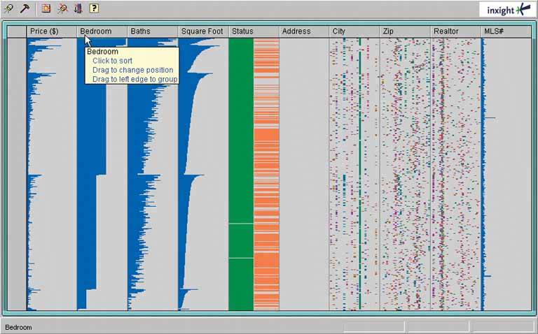
61. jump to item Figure 6-32. From the Mac OS X Finder 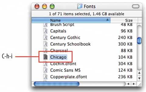
6.2.8.1. what When the user types the name of an item, jump straight to that item and select it. 6.2.8.2. use when The interface uses a scrolling list, table, dropdown, combo box, or tree to present a long set of items. These items are usually sorted, either alphabetically or numerically. The user wants to select one particular item quickly and accurately, and preferably with the keyboard. This pattern often is used in file finders, long lists of names, and dropdown boxes for state or country selection. You also can use it for numberssuch as years or dollar amountsor even calendar time, like months or days of the week. 6.2.8.3. why People aren't good at scanning down long lists of words or numbers. But computers are. Let them do what they're good at! Another nice thing about this technique is that it lets the user keep her hands on the keyboard. As a user moves through a form or dialog box, she might find it nice to select from a list simply by typing the first few characters of the item she wantsthe system then picks the item for her, and she can continue on to the next thing. No scrolling or clicking is necessary; the user's hand never has to move from the keyboard to the mouse. 6.2.8.4. how When the user types the first letter or number of the item she's looking for, jump to the first item that matches what the user typed: automatically scroll the list so that the item is visible, and select it. As the user types more characters in rapid succession, keep changing the selection to the first exact match for the whole user-typed string. If there is no match, stay put at the nearest match, and don't scroll back to the top of the list. You may want to beep at the user to tell her that there's no matchsome applications do, some don't. Martijn van Welie, in his patterns collection, defined a pattern very similar to this one entitled Continuous Filter.[1] [1] See http://www.welie.com/patterns/gui/index.html.
6.2.8.5. example Figure 6-33. A variant of Jump to Item is used by the GNU Emacs incremental-search facility. After the user enters i-search mode via Control-S, each typed character brings the user to the first instance of that cumulative string in the document. It doesn't matter that the original material wasn't sorted.
Once an occurrence of the string is found, the user can find subsequent ones by hitting Control-S repeatedly. In some ways, this incremental search is more convenientand certainly fasterthan typical desktop "Find" dialog boxes, which don't update continuously as you type the search string.
Furthermore, recent versions of Emacs highlight all other instances of that string in the document, in addition to scrolling to the first one. This gives the user lots of extra contextual information about the search they're performing: is it a common string, or not? Are they clustered together, or scattered? 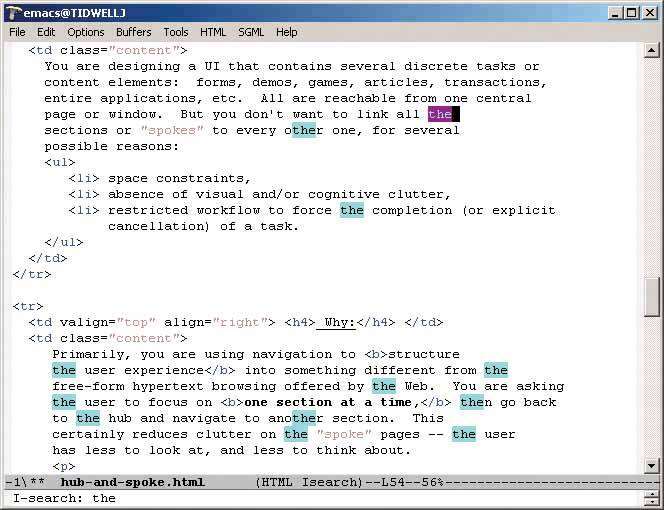
62. new-item row Figure 6-34. An editable table in Outlook 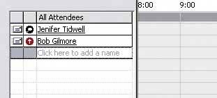
6.2.9.1. what Use the last row in the table to create a new item in place. 6.2.9.2. use when The interface contains a table, list, tree view, or any other vertical presentation of a set of items (one item per row). At some point, the user needs to add new items to it. But you don't have a lot of room to spare on the UI for extra buttons or options, and you want to make item creation very efficient and easy for the user. 6.2.9.3. why By letting the user type directly into the end of the table, you put the act of creation into the same place where the item will ultimately "live." It's conceptually more coherent than putting it in some other part of the UI. Also, it makes the interface more elegant when you don't have an entirely different UI for item creation. It uses less screen real estate, reduces the amount of navigation that needs to be done (thus eliminating a "jump" to another window), and is less work for your users. 6.2.9.4. how Give the user an easy and obvious way to initiate a new object from the first empty table row. A single mouse click in that row might start editing, for instance, or the row might contain a "New Whatever" pushbutton, or it might contain a dummy item as shown in Figure 6-34. At that point, the UI should create the new item and put it in that row. Each column in the table (if it's a multicolumn table) should then be editable, thus letting the user set up the values of that item. The cells could have text fields in them, dropdown lists, or whatever else is necessary to set the values quickly and precisely. As with any form-like user input, Good Defaults (Chapter 7) helps save the user work by prefilling those values; the user doesn't have to edit every column. There are still some loose ends to clean up, though. What happens if the user abandons the new item before finishing? You can establish a valid item right from the beginningif the user abandons the edits anytime, the item still exists until the user goes back and deletes it. Again, Good Defaults helps by prefilling valid values if there are multiple fields. Depending on how it's implemented, this pattern can resemble Input Prompt (Chapter 7). In both cases, a dummy value is set up for the user to edit into a real value, and that dummy value is worded as a "prompt" that shows the user what to do. 6.2.9.5. example Figure 6-35. This cell phone contact list affords the addition of new entries via a New-Item Row. The last row is selectable in the same way other entries are selectable, and clicking the "Select" button below it leads to an editing screen that lets you enter data for the new entry. 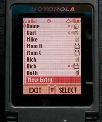
63. cascading lists Figure 6-36. Font dialog box from TextEdit 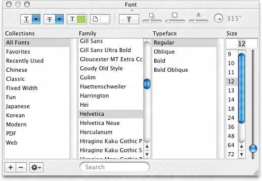
6.2.10.1. what Express a hierarchy by showing selectable lists of the items in each hierarchy level. Selection of any item shows that item's children in the next list. 6.2.10.2. use when Your data is tree-shaped. The hierarchy might be deep, and it might have many items on each level. A tree view (outline) would work, but the user would scroll up and down a lot to see all the items, and he wouldn't get a good overview of the items at higher levels in the hierarchy. The hierarchy may be literal, such as a filesystem, or conceptualthis pattern often is used to let a user navigate and choose items within categories, or make a series of interdependent choices, as with the fonts in the example above. 6.2.10.3. why By spreading the hierarchy out across several scrolled lists, you show more of it at once. It's that simple. Visibility is helpful when you deal with complex information structures. Also, laying the items out in lists organizes them nicelya user can more easily keep track of where he is than he could with an outline format, since the hierarchy levels are in nice, predictable fixed-position lists. 6.2.10.4. how Put the first level of the hierarchy in the left-most list (which should use single-selection semantics). When the user selects an item in it, show that item's children in the next list to the right. Do the same with the child items in this second list, and show its selected item's children in the third list. Once the user reaches items with no childrenthe "leaf" items, as opposed to "branches"you might want to show the details of the last-selected item at the far right. The Mac Finder example in Figure 6-37 shows a representation of an image file; you might instead offer a UI for editing an item, reading its content, or whatever is appropriate for your particular application. A nice thing about this pattern is that you can easily associate buttons with each list: delete the current item, move up, or move down. Many toolkits let you do this in tree controls via direct manipulation, but for those that don't have treeviews, this is a viable alternative. 6.2.10.5. examples Figure 6-37. This Mac OS X Finder screenshot is an extreme example, with seven levels. But it shows that the pattern scales well, letting the user drill down into deep filesystem hierarchies while staying oriented. (Warning: this pattern can be confusing for people who aren't comfortable with the concept of a hierarchy, especially when the hierarchy is this deep.) 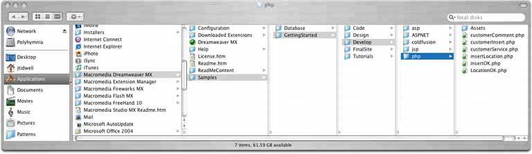
Figure 6-38. It may not look like one, but this Excel chart-type chooser is a two-level cascading list, expressed with two different visual formats. Rather than a literal hierarchy, it uses items grouped into categories. The user's selection in the "Chart sub-type" list includes the item's name and a short description. Also note the use of Card Stack and Illustrated Choices in this dialog box. 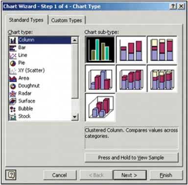
Figure 6-39. NeXTStep originally used this technique in its own File Viewer, circa 1990 or so (screenshot from http://www120.pair.com/mccarthy/nextstep/intro.htmld/Workspace.html). 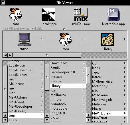
64. tree table Figure 6-40. Outlook Express's news reader 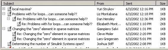
6.2.11.1. what Put hierarchical data in columns, like a table, but use an indented outline structure in the first column to illustrate the tree structure. 6.2.11.2. use when The UI displays multivariate information, so a table works well to show the data (and perhaps allow them to be sorted, as in Sortable Table). But the items are organized primarily as a hierarchy, so you also want a tree to display them most of the time. Your users are relatively sophisticated with respect to GUI usage; this is not an easy pattern for naïve computer users to understand (and the same can be said about most hierarchical views, including trees and Cascading Lists). 6.2.11.3. why Combining the two data-viewing approaches into one view gives you the best of both worlds, at the cost of some visual and programming complexity. You can show the hierarchy of items, plus a matrix of additional data or item attributes, in one unified structure. 6.2.11.4. how The examples show what you need to do: put the tree (really an outline) in the first column, and the item attributes in the subsequent columns. The rowsone item per rowusually are selectable. Naturally, you can combine this pattern with Sortable Table to produce a more browsable, interactive structure. Sorting on the columns disrupts tree ordering, so you'll need to provide an extra button or some other affordance to re-sort the table into the order the tree requires. This technique seems to have a home in email clients and news readers, where threads of discussion form treelike structures. 6.2.11.5. example Figure 6-41. The Firefox browser uses a distinctive-looking tree table in one of its dialog boxes. The separatorshorizontal lineshelp visually group the items in different categories, which isn't a bad idea at all. 
65. multi-y graph Figure 6-42. From http://nytimes.com 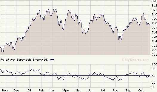
6.2.12.1. what Stack multiple graph lines, one above the other, in one panel; let them all share the same X axis. 6.2.12.2. use when You present two or more graphs, usually simple line plots, bar charts, or area charts (or any combination thereof). The data in those graphs all share the same X axis, such as a timeline, but otherwise they're "apples and oranges"they describe different things. You want to encourage the viewer to find "vertical" relationships among the data sets showncorrelations, similarities, unexpected differences, and so on. 6.2.12.3. why Aligning the graphs along the X axis first tells the viewer that these data sets are related, and then it lets the user make side-by-side comparisons of the data. In Figure 6-42, the proximity of the two graphs makes visible the similarity in the curves' shapes; you can see the that the hills and valleys generally line up, and the grid lines enable precise observation. For instance, the vertical grid line for "August" lines up peaks in both curves. You could have done this by superimposing one graph upon the other. But by showing each graph individually, with its own Y axis, you enable each graph to be viewed on its own merits, without visual interference from the other. Also, these data sets have very different Y values: one ranges from 7.1 to 8.2, while the other ranges from 20 to over 80! You couldn't even put them on the same Y axis without one of them looking like a flat line. You'd need to draw another Y axis along the left side, and then you'd have to choose a scaling that didn't make the graph look too odd. Even so, direct superimposition encourages the viewer to think that data sets use the same Y scale, and compare them on that basis"apples to apples," instead of "apples to oranges." If that's not the case, then superimposing them sometimes can be misleading. 6.2.12.4. how Stack one graph on top of the other. Use one X axis for both, but separate the Y axes into different vertical spaces. If the Y axes need to overlap somewhat, they can, but try to keep the graphs from visually interfering with each other. Sometimes you don't need Y axes at all; maybe it's not important to let the user find exact values (or maybe the graph itself contains exact values, like labeled bar charts). In that case, simply move the graph curves up and down until they don't interfere with each other. Label each graph so its identity is unambiguous. Use vertical grid lines if possible; they let viewers follow an X value from one data set to another, for easier comparison. They also make it possible to discover an exact value for a data point of interest (or one close to it) without making the user take out a straightedge and pencil. 6.2.12.5. examples Figure 6-43. An interactive multi-Y graph constructed in MATLAB. You can manipulate the three data traces' Y axes, color-coded on the left, with the mouseyou can drag the traces up and down the graph, "stretch" them vertically by sliding the colored axis endcaps, and change the displayed axis range by editing the Y axis limits in place.
Here's why that's interesting. You might notice that the traces look similar, as if they were correlatedall three drop in value just after the vertical line labeled 1180, for instance. But just how similar are they? Move them and see… 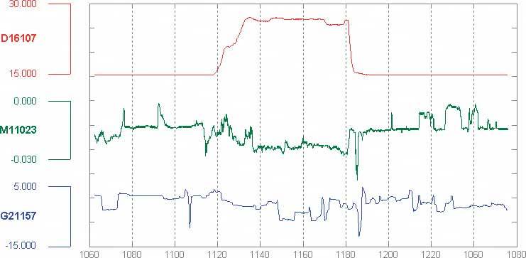
Figure 6-44. Your eyes are very good at discerning relationships among visually rendered data items. By stacking and superimposing these differently scaled plot traces, a user might gain valuable insight into whatever phenomenon produced this data. 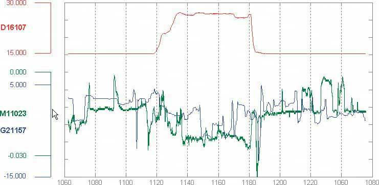
66. small multiples Figure 6-45. From http://geography.uoregon.edu/shinker/paclim2001 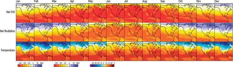
6.2.13.1. what Create many small pictures of the data using two or three data dimensions. Tile them on the page according to one or two additional data dimensions, either in a single comic-strip sequence, or in a 2D matrix. 6.2.13.2. use when You need to display a large data set with more than two dimensions or independent variables. It's easy to show a single "slice" of the data as a pictureas a plot, table, map, or image, for instancebut hard to show more dimensions than that. Users might have to look at one plot at a time, flipping back and forth among them to see differences. When using small multiples, you need to have a fairly large display area available. PDAs and other tiny screens rarely do this well, unless each individual picture is very tiny. But most users will see them on a large screen, or on printed paper. 6.2.13.3. why Small multiples are data-richthey show a lot of information at one time, but in a comprehensible way. Every individual picture tells a story. But when you put them all together and demonstrate how each picture varies from one to the next, an even bigger story is told. As Edward Tufte put it, "Small multiple designs, multivariate and data bountiful, answer directly by visually enforcing comparisons of changes, of the differences among objects, of the scope of alternatives."[2] (Tufte named and popularized small multiples in his famous books about visualization.) [2] Envisioning Information, Section 3.3.2.5.
Think about it this way. If you can encode some dimensions in each individual picture, but you need to encode an extra dimension that won't fit in the pictures, how could you do it?
Sequential presentation -
Express that dimension as if it varies across time. You can play it like a movie, or use Back/Next buttons to see one graph at a time, for example.
3D presentation -
Place the pictures along a third spatial axis, the Z axis.
Small multiples -
Reuse the X and Y axes at a larger scale. Side-by-side placement of pictures lets a user glance from one to the other freely and rapidly. She doesn't have to remember what was shown in a previous screen, as required by a sequential presentation (although a movie can be very effective at showing tiny differences between frames). She also doesn't have to decode or rotate a complicated 3D plot, as would be required if you place 2D pictures along a third axis. Sequential and 3D presentations sometimes work very well, but not always, and they often don't work in a noninteractive setting at all. 6.2.13.4. how Choose whether to represent one extra data dimension or two. With only one, you can lay out the images vertically, horizontally, or even line-wrapped, like a comic stripfrom the starting point, the user can read through to the end. With two extra data dimensions, you should use a 2D table or matrixexpress one data dimension as columns, and the other as rows. Whether you use one dimension or two, label the small multiples with clear captionsindividually, if necessary, otherwise along the sides of the display. Make sure the user understands which data dimension varies across the multiples, and whether you encode one or two data dimensions. Each image should be similar to the others: use the same size and/or shape, the same axis scaling (if you use plots), and the same kind of content. When you use small multiples, you try to bring out the meaningful differences between the things being shown. Try to eliminate the visual differences that don't mean anything. Of course you shouldn't use too many small multiples on one page. If one of the data dimensions has a range of 1 to 100, you probably don't want 100 rows or columns of small multiples, so what do you do? You could "bin" those 100 values into, say, 5 bins containing 20 values each. Or you could use a technique called "shingling," which resembles binning, but allows substantial overlap between the bins. (Yes, that means some data points will appear more than once, but that may be a good thing for users trying to discern patterns in the data; just make sure it's labeled well so they know what's going on.) Note that some small-multiple plots with two extra encoded dimensions are called "trellis plots" or "trellis graphs." William Cleveland, a noted authority on statistical graphing, uses this term, as do the software packages S-PLUS and R. 6.2.13.5. examples The North American climate graph, at the top of the pattern, shows many encoded variables. Underlying each small-multiple picture is a 2D geographic map, of course, and overlaid on that is a color-coded "graph" of some climate metric, like temperature. With any one picture, you can see interesting shapes in the color data; they might prompt a viewer to ask questions about why blobs of color appear over certain parts of the continent. The small multiples as a whole encode two additional variables: each column is a month of the year, and each row represents a climate metric. Your eyes probably followed the changes across the rows, noting changes through the year, and comparisons up and down the columns are easy, too. Figure 6-46. A more abstract two-dimensional trellis plot, also called a "coplot" in William Cleveland's Visualizing Data, appears in this screenshot. Created with the R software package, this example shows a quantity measured along four dimensions: latitude, longitude, depth, and magnitude. The values along the depth and magnitude dimensions overlapthis is the "shingling" technique mentioned earlier. See http://www.sph.umich.edu/~nichols/biostat_bbag-march2001.pdf. 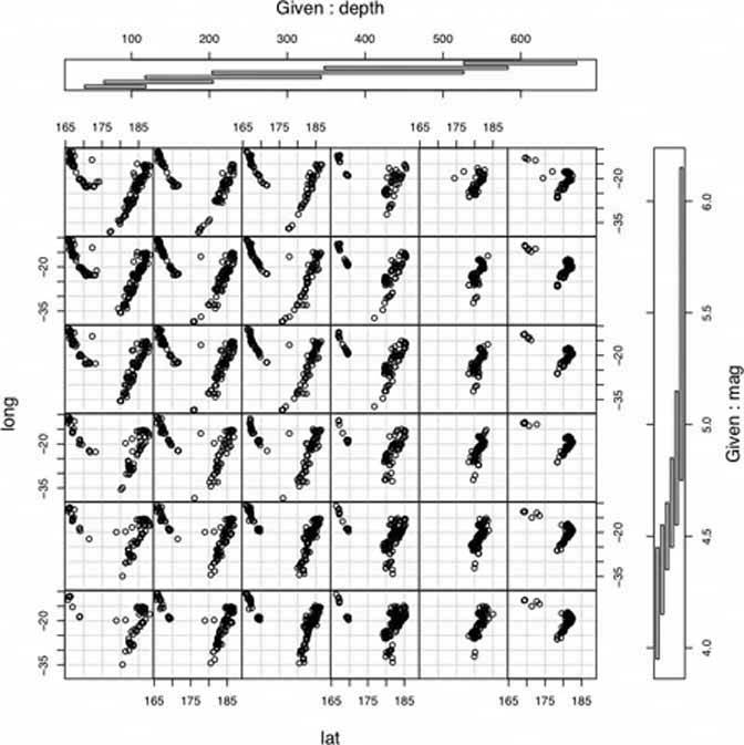
Figure 6-47. Here's a more commercial example. Web sites that sell physical products often use small multiples. The Levis web site uses it to display a choice of jean styles. Because each photograph is so similar to the otherswith the same background (except for one special one), approximate pose, and scalethe differences picked out by your eyes actually represent meaningful differences in the jean models.
But wait. The fact that the poses are slightly different actually may work to the benefit of this small multiples display. It gives the whole picture a slight roughness, like the natural variations in a piece of fabric; the display is not perfectly uniform, and that makes it feel more relaxed. The different poses also might make individual jeans models slightly more memorable to the user, and easier to pick out of the "lineup" when the user returns to the site later. 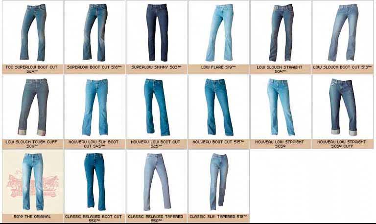
67. treemap Figure 6-48. SmartMoney's Map of the Market, at http://smartmoney.com/marketmap 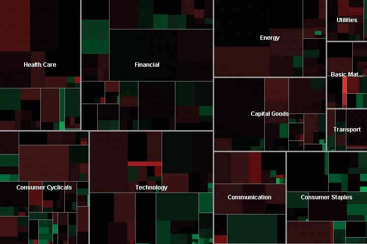
6.2.14.1. what Express multidimensional and/or hierarchical data as rectangles of various sizes. You can nest those rectangles to show the hierarchy, and color or label them to show additional variables. 6.2.14.2. use when Your data is tree-shaped. Alternatively, it may be multivariateeach item has several attributes, like size and category, that permit items to be grouped according to those attributes. Users want to see an overview of many data pointsmaybe hundreds or thousandsand they use screens large enough to accommodate a large display. Your users should be patient and motivated enough to learn to use an unusual interface. Treemaps are not always easy to read, especially for people who haven't seen them before. Furthermore, they work better onscreen than they do on paper because datatips, dynamic queries, and other interactive mechanisms can help users understand the data. 6.2.14.3. why Treemaps encode many data attributes into a single dense diagram. By taking advantage of position, size, containment, color hue and/or value, and labeling, a treemap packs a lot of information into a space that encourages the human visual system to seek out trends, relationships among variables, and specific points of interest. Look at the the SmartMoney treemap in Figure 6-48, which shows the current performance of 500 publicly traded stocks. It shows the relative sizes of different market sectors, and of companies within those sectorsthe blocks of solid color are individual companies. You can instantly see that in that day's market, the big gainers in bright green were small companies (shown as small rectangles), and the big losers in bright red also were small companies. The category Consumer Staples is mostly green, indicating that it did well today; Energy and Health Care are mostly red, so they didn't do as well. But overall, the color is a dark neutral, meaning that the market as a whole was quiet. This treemap makes it very easy to get an instant overview and spot outliers. It encourages you to see relationships between size and color, size and position, and position and colorall of which give you different kinds of insight into the market. It would take you forever to get that insight from a long table of stock prices. 6.2.14.4. how The critical step in designing a treemap is deciding which visual variables encode which data attributes.
Rectangle size -
Usually rectangle size encodes a number, such as size, price, or percentage. Make each rectangle's area proportional to that number. If the number has too great a range, you'll end up with some enormous rectangles and some microscopic rectangles, in which case you either could let the user zoom in on them for a closer look, or he could filter out the large ones to let the small ones scale up. Dynamic Queries (a pattern in this chapter) often are used for that. See Figure 6-17 for an example of dynamic queries used in conjunction with a treemap.
Grouping and nesting -
If your data already is inherently hierarchical, like a taxonomic tree or a filesystem, then you should group and nest the rectangles accordingly. If not, see whether the data items have a natural grouping or categorization that is meaningful to the user. Do they have several possible categorizations? You might consider giving the user a choice on how to group them. Do they have no obvious categorization at all? Then you could take a numeric attribute, like price, and "bin" it into categories ($0 to $5, $5 to $10, etc.). Or you could not group the data items at all. Consider, though, whether some other data display may be more appropriate; grouping is one of the treemap's strengths.
Color -
You can use color to represent a numeric or otherwise ordered value, as in the SmartMoney example in Figure 6-48, or categorization. For a numeric value, choose two colors for the "endpoints" of the range of possible values, like red and green, white and blue, or yellow and red; shades of color between those endpoints represent values in between. For a categorization, use a different hue to represent each category. (If the shades are too similar, though, viewers may assume an ordering where there isn't one.)
Position -
A rectangle's position within the treemap is partially dictated by where it belongs in the hierarchy or categorization. But within a category, you might still have freedom to decide where a given rectangle goes. Some treemaps place the largest rectangles in the upper left of a category, and then space-fill the rest of the category so that the smallest rectangles are in the lower right. This establishes a nice rhythm on the page, and helps the user to visually compare the number of small or large rectangles in each main category. In this case, position doesn't encode yet another variable; instead, it's redundant with size and grouping. However, other treemap implementations do encode an orderby age, or alphabetical by name, for example. It depends on how many variables you want to encode at once. Most treemaps allow users to drill down to the actual data items. Mouse rollovers, for instance, usually produce large tooltips that describe the item in full (see the Datatips pattern in this chapter). You usually have to elide some text anyway to fit the descriptions into the treemap blocks, so this is a good practice. Furthermore, a single or double click often brings the user to some other page or window about that item. Extras On Demand thus fits into these treemap designs. As for implementation, it is not trivial to write code to lay out a treemap in a pleasing way. Fortunately, many algorithms exist for drawing a treemap. Some are in academic papers; some are in open-source software or freeware; and others are in products. The different algorithms vary according to how they choose the rectangles' aspect ratios (i.e., the proportion between width and height; the squarer, the better), how they fill the space for a given category, and their stability with respect to data changes. Ben Shneiderman invented the treemap in 1990, and he and his colleagues at the University of Maryland have since refined the technique. A history of the treemap, along with many links to papers and implementations, is available at http://www.cs.umd.edu/hcil/treemap-history/. 6.2.14.5. examples Figure 6-49. The Newsmap web application illustrates the "news landscape" as described by Google News. At any given moment, the Newsmap can collect Google's top headlines and draw a treemap in which the largest blocks represent the most reported stories. The encodings here are:
- Block size: "popularity" of news item; how many news outlets report this story
- Color hue: topic
- Top-level grouping: also topic
- Color value (darkness/lightness): age
Because the headlines' text sizes are proportional to block size, which in turn is proportional to popularity, your eyes are immediately drawn to the biggest news items. (What did you read first? Perhaps the "False warnings" headline, and then "Please Work for Free!"?) The treemap thus is an automatically-constructed visual hierarchy. See http://www.marumushi.com/apps/newsmap/newsmap.cfm. 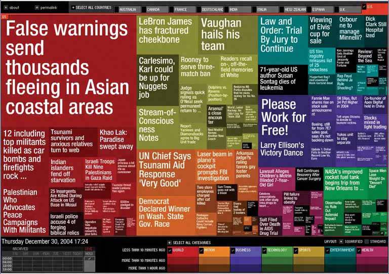
Figure 6-50. From the Hive Group comes a small collection of similar treemap visualizations: items available for purchase from Amazon, world population data, etc. This screenshot shows an example of someone looking for camera lenses on Amazon. Each block represents one product that Amazon sells. At the right is a set of Dynamic Queries (again, see the pattern of that name) that lets the user filter out some of the myriad items.
The user can set some of the encodings described in the Newsmap exampleblock size, color hue, and groupingwith the bar on top ("Group by," "Size represents," and "Color represents"). That kind of customizability is handy in this kind of application. After all, many data attributes are associated with each producttoo many to be encoded by the available three or four visual variables. The treemap designers didn't know which attributes each user would be most interested in. They made a good default guess, and put in a simple learnable UI for users to do their own thing. See http://hivegroup.com. 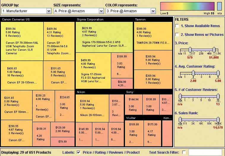
|