Section 5.1. PUSHING THE BOUNDARIES
5.1. PUSHING THE BOUNDARIESSome application idioms give you freedom to design nonstandard buttons and controls. Visual editors, media players, applications intended mostly for experts, instant messaging, games, and anything that's supposed to be fun and interesting all have users who might be curious enough to figure out how to use unusual but well-designed interface elements. Where can you be more creative? Consider the items on the first list above; visible buttons and menus usually are easier to use than keyboard actions. Generalizing from those items, actions could be:
How much creativity can you get away with before the application becomes too hard to figure out? Figure 5-1. GarageBand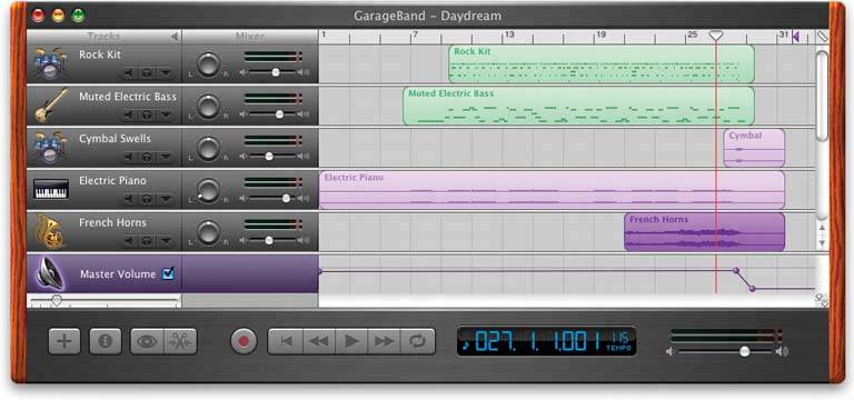 For a real-life example, look at the GarageBand application, shown in Figure 5-1. A lot is going on in this interface. Some objects are obviously buttons, like the player controlsrewind, play, fast forward, etc.and the scrollbar arrows. You will find some sliders and knobs, too. But look harder at the far right of the window, between the red line and the wood-grain edge. To your eyes, what pieces of the interface look clickable? Why? If you want, you can look ahead to Figure 5-2 and cheat. (And if you already know GarageBand, please bear with me.) Figure 5-2. GarageBand actions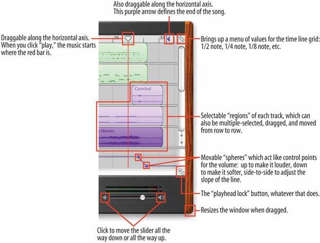 Figure 5-2 shows which objects on the interface perform actions. You clearly couldn't have known what they all do, since this book doesn't give you the benefit of tooltips, rollover cursors, or experimentation. But did you figure out that some of these objects could be clicked or manipulated? I'm guessing you did. How? You probably know that interfaces that look like this offer a lot of functionality through direct manipulation, so you have good grounds for just assuming that every interesting visual feature does something. You might know that sliders, like the volume slider at the bottom, sometimes have "jump buttons" at the endsand you might have recognized the volume slider itself from iTunes. You might guess that tiny squarish icons tend to be buttons, often for presentation-related actions; Word and Powerpoint use a lot of them. You might have seen a vertical line topped with an inverted triangle in some other contextmaybe movable, maybe not. (See the Guides pattern in Chapter 8.) But didn't this triangle look like it was movable? When an object looks like it might let you do something, such as click or drag it, then we say it "affords" performing that action. Traditional raised-edge buttons afford pushing; a slider thumb affords dragging; a text field affords typing; a blue underlined word affords clicking. And anything that reacts to the mouse cursor affords something, although you can't necessarily tell what! Figure 5-2 points out the affordances in the GarageBand interface. This is an important concept. In software interfaces, the user doesn't get many sensory clues about what can be tweaked or handled: visuals give most of the clues, and mouse rollovers do the rest. Use them to communicate affordances well. Here's some specific design advice:
|
EAN: 2147483647
Pages: 75
- ERP Systems Impact on Organizations
- ERP System Acquisition: A Process Model and Results From an Austrian Survey
- Distributed Data Warehouse for Geo-spatial Services
- Intrinsic and Contextual Data Quality: The Effect of Media and Personal Involvement
- A Hybrid Clustering Technique to Improve Patient Data Quality