Displaying Images
The Image component allows the display of images. It has a single property, the image we want to draw, which the component holds as a bitmap.
Bitmap b = Resources.GetBitmap(Resources.BitmapResources.Background); Image i = new Image(b);
This code creates a bitmap and then constructs an image based on it. We can then add the image to a StackPanel or Canvas and use it as part of a display.
Creating a Custom Image-A Meter with a Dial
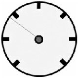
We can perform further customization of the components, and learn more about how to do this, by creating an image with an additional component on top. The aim of the class MeterDialPanel is to draw an indicator needle on a background graphic to allow a device to display a dial.
Figure 7-17 shows how we can construct a dial from a simple bitmap back panel and a line to indicate the value position. We create another display element, based on the Panel again, containing a NeedleValue property that we can change to move the needle around. The render behavior of this element first draws the bitmap background, and then calculates the position of the line that represents the needle.
public override void OnRender(DrawingContext dc) { if (Visibility == Visibility.Visible) { // get the offset into the bitmap of our container int left, top; Parent.GetLayoutOffset(out left, out top); dc.Bitmap.StretchImage( left, top, dialGraphic, width, height, 0xff); int centreX = left + width/2; int centreY = top + height/2; int angle = 225 - (int) ((270 * needleValue) / 100f); int needleX = centreX + (int) ((width * Microsoft.SPOT.Math.Cos(angle)) / 2000f); int needleY = centreY - (int) ((height * Microsoft.SPOT.Math.Sin(angle)) / 2000f); dc.Bitmap.DrawLine( needleColor, needleThickness, centreX, centreY, needleX, needleY); } } 
Figure 7-17: A dial display.
This range of movement of this meter needle is 270 degrees, with the needle value ranging from 0 to 100. The code uses the Sin and Cos methods from the Microsoft.SPOT.Math library. These are interesting in that they produce integer results that are 1000 times greater than the actual value. This behavior reflects the way in which the libraries have been optimized for speed and memory usage, and the values produced are adequate for our needs.
Custom-Panel Size Behavior
A custom panel may need to take part in the management of the display area that it occupies. In the case of our meter display, the desired size of the display area will be the dimensions of the bitmap given as the back of the meter dial. The panel can get control of the size behavior by overriding two methods.
Bitmap dialGraphic; int width; int height; protected override void MeasureOverride( int availableWidth, int availableHeight, out int desiredWidth, out int desiredHeight) { desiredWidth = dialGraphic.Width; desiredHeight = dialGraphic.Height; } protected override void ArrangeOverride( int arrangeWidth, int arrangeHeight) { width = arrangeWidth; height = arrangeHeight; } We call the method MeasureOverride first during the layout process to tell an element the size that is available for it to occupy, and to allow the element to request the dimensions that it desires. Then, we call the ArrangeOverride method to tell an element the size allocated for this component. In the case of our dial, the first method receives the width and height of the dial bitmap. Then, when we call the ArrangeOverride method to deliver the actual space available, the Width and Height properties of the element are set to these values and used in subsequent render operations. If you wish to add your own custom elements, you will have to override these methods and provide appropriate behavior.
There is not enough space to include the complete code of the MeterDialPanel class, but a fully working version and sample code are at the Web site for this book.
The Panel Class
The StackPanel and Canvas classes are also based on the Panel class, which contains the Children collection that holds references to all the elements that are displayed on the Panel. The Rectangle and Line classes are based on the Shape class, which can be extended to create other shapes, if required.
The art of using the display classes is to find the class that you need to use and then investigate the properties and methods that it provides to allow you to get the desired effect. If you want a behavior or data member that a class in the hierarchy does not provide, you can extend the most appropriate class and add the extra items yourself, as we have seen earlier.
EAN: 2147483647
Pages: 118