Setting an Element's Border The border property allows you to set a rule (line) around your box on all four sides of any color and thickness, and you can select from a variety of line styles (Table 6.3). In addition, using additional border properties, you can set the borders on any of the four sides independently, giving you amazing design versatility. Table 6.3. Border ValuesVALUE | COMPATIBILITY |
|---|
<border-width> | IE4, FF1, S1, O3.5, CSS1 | <border-style> | IE4, FF1, S1, O3.5, CSS1 | <border-color> | IE4, FF1, S1, O3.5, CSS1 |
In this example (Figure 6.8), borders have been set around the menu options; a simple red line border has overridden the form text field's 3D border; and the drop box has a festive multistyle, multicolor border. Figure 6.8. A tacky harlequin-style multi-color, multi-style border has been added around the drop box. 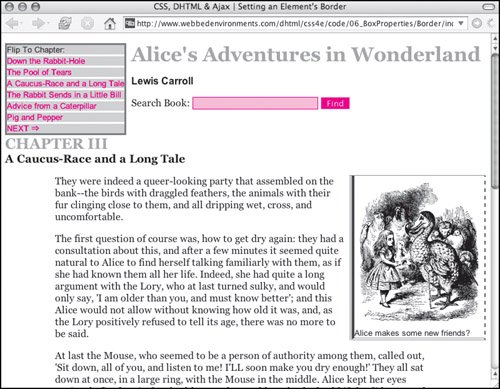
To set the border: | | 1. | border:
To set the border on all four sides, type the border property name, followed by a colon (:), in the CSS declaration block (Code 6.5).
Code 6.5. There are several border property types you can use to customize your design.| [View full width] <!DOCTYPE html PUBLIC "-//W3C//DTD XHTML 1.0 Strict//EN" "http://www.w3.org/TR/xhtml1/DTD/  xhtml1-strict.dtd"> <html xmlns="http://www.w3.org/1999/xhtml"> <head> <meta http-equiv="Content-Type" content="text/html; charset=utf-8" /> <title>CSS, DHTML & Ajax | Setting an Element's Border</title> <style type="text/css" media="screen"> <!-- body { font-size: 1em; font-family: Georgia, "Times New Roman", times, serif; color: #000000; background-color: #fff; margin: 8px; } h1, h2 { color: #999; margin: .5em 0em; } h2 { clear: both; } img { margin: 4px; display: block; } form { margin: 4px 0px; } input.formText { border: 1px solid red; background-color: #fcc; } #navigation { margin-right: 8px; border: 3px solid #666; background-color: #ccc; float: left; font: small Arial, Helvetica, sans-serif; } input.formButton { border: 1px solid #fcc; background-color: #f00; color: white; } # navigation a { border-top: 3px solid #fff; text-decoration: none; display: block; color: red; } # navigation a:hover { border-top-width: 3px; border-top-style: solid; border-top-color: #999; color: red; background-color: #fff; } # copy p { margin: 1em 5em; } .author { margin-top: 0cm; font: bold 1em Arial, Helvetica, sans-serif; } .chapterTitle { display: block; font-size: smaller; color:black; } .dropBox { border-style: solid dashed double ridge; border-width: 1px 2px 4px 8px; border-color: red green blue purple; margin: 0px 0px 8px 8px; float: right; font: small Arial, Helvetica, sans-serif; } --></style> </head> <body> <div > Flip To Chapter: <a href="#">Down the Rabbit-Hole </a> <a href="#">The Pool of Tears </a> <a href="#">A Caucus-Race and a Long Tale </a> <a href="#">The Rabbit Sends in a Little Bill </a> <a href="#">Advice from a Caterpillar </a> <a href="#">Pig and Pepper </a> <a href="#">NEXT ⇒ </a> </div> <div > <h1>Alice's Adventures in Wonderland</h1> <p >Lewis Carroll</p> <form action="#" method="get" > Search Book: <input type="text" name="searchTerm" size="24" /> <input type="submit" name="findSearchTerm" value="Find" /> </form> <h2>CHAPTER III <span >A Caucus-Race and a Long Tale</span> </h2> </div> <div > <div > <img src="/books/3/292/1/html/2/alice09a.gif" height="236" width="200" alt="Alice in Wonderland" /> Alice makes some new friends? </div> <p>They were indeed a queer-looking party that assembled on the bank--the birds with draggled feathers, the animals with their fur clinging close to them, and all dripping wet , cross, and uncomfortable.</p> </div> </body> </html> xhtml1-strict.dtd"> <html xmlns="http://www.w3.org/1999/xhtml"> <head> <meta http-equiv="Content-Type" content="text/html; charset=utf-8" /> <title>CSS, DHTML & Ajax | Setting an Element's Border</title> <style type="text/css" media="screen"> <!-- body { font-size: 1em; font-family: Georgia, "Times New Roman", times, serif; color: #000000; background-color: #fff; margin: 8px; } h1, h2 { color: #999; margin: .5em 0em; } h2 { clear: both; } img { margin: 4px; display: block; } form { margin: 4px 0px; } input.formText { border: 1px solid red; background-color: #fcc; } #navigation { margin-right: 8px; border: 3px solid #666; background-color: #ccc; float: left; font: small Arial, Helvetica, sans-serif; } input.formButton { border: 1px solid #fcc; background-color: #f00; color: white; } # navigation a { border-top: 3px solid #fff; text-decoration: none; display: block; color: red; } # navigation a:hover { border-top-width: 3px; border-top-style: solid; border-top-color: #999; color: red; background-color: #fff; } # copy p { margin: 1em 5em; } .author { margin-top: 0cm; font: bold 1em Arial, Helvetica, sans-serif; } .chapterTitle { display: block; font-size: smaller; color:black; } .dropBox { border-style: solid dashed double ridge; border-width: 1px 2px 4px 8px; border-color: red green blue purple; margin: 0px 0px 8px 8px; float: right; font: small Arial, Helvetica, sans-serif; } --></style> </head> <body> <div > Flip To Chapter: <a href="#">Down the Rabbit-Hole </a> <a href="#">The Pool of Tears </a> <a href="#">A Caucus-Race and a Long Tale </a> <a href="#">The Rabbit Sends in a Little Bill </a> <a href="#">Advice from a Caterpillar </a> <a href="#">Pig and Pepper </a> <a href="#">NEXT ⇒ </a> </div> <div > <h1>Alice's Adventures in Wonderland</h1> <p >Lewis Carroll</p> <form action="#" method="get" > Search Book: <input type="text" name="searchTerm" size="24" /> <input type="submit" name="findSearchTerm" value="Find" /> </form> <h2>CHAPTER III <span >A Caucus-Race and a Long Tale</span> </h2> </div> <div > <div > <img src="/books/3/292/1/html/2/alice09a.gif" height="236" width="200" alt="Alice in Wonderland" /> Alice makes some new friends? </div> <p>They were indeed a queer-looking party that assembled on the bank--the birds with draggled feathers, the animals with their fur clinging close to them, and all dripping wet , cross, and uncomfortable.</p> </div> </body> </html>
|
| | | 2. | 1px
Type a border-width value, followed by a space. This value can be one of the following (Table 6.4):
A length value; a value of 0 prevents the border from appearing A relative-size keyword, such as thin, medium, or thick inherit will cause the element to use the same border styles as its parent element
Table 6.4. Border-Width ValuesVALUE | COMPATIBILITY |
|---|
<length> | IE4, FF1, S1, O3.5, CSS1 | thin | IE4, FF1, S1, O3.5, CSS1 | medium | IE4, FF1, S1, O3.5, CSS1 | thick | IE4, FF1, S1, O3.5, CSS1 | inherit | IE4, FF1, S1, O3.5, CSS1 |
| 3. | solid
Type the name of the style you want to assign to your border. Table 6.5 shows a complete list of available border styles.
Alternatively, you can type none, which prevents the border from appearing.
Table 6.5. Border-Style ValuesVALUE | APPEARANCE | COMPATIBILITY |
|---|
dotted |  | IE4[*], FF1, S1, O3.5, CSS1 | dashed | 
| IE4[*], FF1, S1, O3.5, CSS1 | solid | 
| IE4, FF1, S1, O3.5, CSS1 | double | 
| IE4, FF1, S1, O3.5, CSS1 | groove | 
| IE4, FF1, S1, O3.5, CSS1 | ridge | 
| IE4, FF1, S1, O3.5, CSS1 | inset | 
| IE4, FF1, S1, O3.5, CSS1 | outset | 
| IE4, FF1, S1, O3.5, CSS1 | none | | IE4, FF1, S1, O3.5, CSS1 | inherit | | IE4, FF1, S1, O3.5, CSS1 |
[*] IE 5.5 for Windows
| 4. | red;
Type a color value, which is the color you want the border to be (Table 6.6). This can be the name of the color or an RGB value.
Table 6.6. Border-Color ValuesVALUE | COMPATIBILITY |
|---|
<color> | IE4, FF1, S1, O3.5, CSS1 | transparent | IE4[*], FF1, S1, O3.5, CSS1 | inherit | IE4[*], FF1, S1, O3.5, CSS1 |
[*] Mac Only
| 5. | border-top: 3px solid #fff;
You aren't stuck with having the same border on all four sides. You can set each side individually (top, bottom, left, and/ or right). If those options aren't enough, check out the sidebar "Other Ways to Set a Border."
|
 Tips Tips
Most browsers that do not support other border properties usually support the simple border property. You do not have to include all the individual border attributes in your definition list, but if you don't, their defaults will be used.
Rounding Border Corners (Mozilla Only) If you're tired of square corners in your designs, but don't want to resort to graphics to create borders, Mozilla-based browsers (Netscape 6+, Firefox, and Camino) have a proprietary CSS property that allows you to set the corner radius for borders (Table 6.7). Although not implemented in Microsoft Internet Explorer, Apple Safari, or Opera, this Mozilla extension can be useful and does not interfere with how borders will appear in those other browsers. Table 6.7. -Moz-Border-Radius ValuesVALUE | COMPATIBILITY |
|---|
<length> | FF1 | <percentage> | FF1 |
Other Ways to Set a Border CSS gives you the freedom to define aspects of the border's appearance one side at a time, as follows: border-style: solid dashed double ridge; border-width: 1px 2px 4px 8px ; border-color: red green blue purple;
The values for these are shown in Tables 6.4 through 6.6. As with margins, you can include one to four values for each of these properties to set each border side independently, as follows: One value sets the property for all four sides. Two values set the property for the top/bottom and left/right sides. Three values set the top property, the left/right properties (the same), and the bottom property. Four values set the property for each side individually, in this order: top, right, bottom, and left.
This method is especially useful for overriding the values set by the single border property. Your final option for setting a border on a single side (as if you really needed another option!) is to set the individual properties for a specific side (top, bottom, left, right): border-top-width: 3px; border-top-style: solid; border-top-color: #f00;
|
In this example (Figure 6.9), the borders of several elements have been rounded off, including the border of the form input text field. Each corner of the drop box has a different radius set. Figure 6.9. Mozilla-based browsers such as Firefox and Netscape are the only ones that show rounded corners. In this example, the menu, form text field, and drop box are rounded. 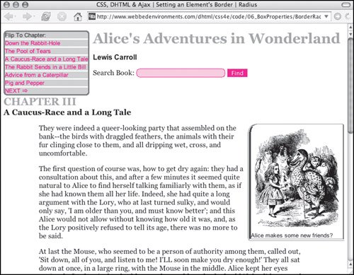
To set rounded corners for Mozilla browsers: | | 1. | border: 1px solid red;
Set up the border or background for the element using any of the methods previously discussed (Code 6.6).
Code 6.6. After you set a border or background color for an element, you can set the border radius, and Mozilla browsers will show rounded corners.| [View full width] <!DOCTYPE html PUBLIC "-//W3C//DTD XHTML 1.0 Strict//EN" "http://www.w3.org/TR/xhtml1/DTD/ xhtml1-strict.dtd"> <html xmlns="http://www.w3.org/1999/xhtml"> <head> <meta http-equiv="Content-Type" content="text/html; charset=utf-8" /> <title> CSS, DHTML & Ajax | Setting an Element's Border | Radius</title> <style type="text/css" media="screen"> <!-- body { font-size: 1em; font-family: Georgia, "Times New Roman", times, serif; color: #000000; background-color: #fff; margin: 8px; } h1, h2 { color: #999; margin: .5em 0em; } h2 { clear: both; } img { margin: 4px; display: block; } form { margin: 4px 0px; } input.formText { border: 1px solid red; -moz-border-radius: 5%; background-color: #fcc; } input.formButton { border: 1px solid #fcc; background-color: #f00; color: white; } #navigation { -moz-border-radius: 5%; border: 3px solid #666; background-color: #ccc; float: left; font: small Arial, Helvetica, sans-serif; margin-right: 8px; } #navigation a { border-top: 3px solid #fff; text-decoration: none; display: block; color: red; } #navigation a:hover { border-top-width: 3px; border-top-style: solid; border-top-color: #999; color: red; background-color: #fff; } #copy p { margin: 1em 5em; } .author { margin-top: 0cm; font: bold 1em Arial, Helvetica, sans-serif; } .chapterTitle { display: block; font-size: smaller; color:black; } .dropBox { border-style: solid dashed double ridge; border-width: 1px 2px 4px 8px ; border-color: red green blue purple; -moz-border-radius-topleft: 25px; -moz-border-radius-topright: 5px; -moz-border-radius-bottomleft: 20px; -moz-border-radius-bottomleft: 8px; margin: 0px 0px 8px 8px; float: right; font: small Arial, Helvetica, sans-serif; } --></style> </head> <body> <div > Flip To Chapter: <a href="#">Down the Rabbit-Hole </a> <a href="#">The Pool of Tears </a> <a href="#">A Caucus-Race and a Long Tale </a> <a href="#">The Rabbit Sends in a Little Bill </a> <a href="#">Advice from a Caterpillar </a> <a href="#">Pig and Pepper </a> <a href="#">NEXT ⇒ </a> </div> <div > <h1>Alice's Adventures in Wonderland</h1> <p >Lewis Carroll</p> <form action="#" method="get" > Search Book: <input type="text" name="searchTerm" size="24" /> <input type="submit" name="findSearchTerm" value="Find" /> </form> <h2> CHAPTER III <span >A Caucus-Race and a Long Tale</span> </h2> </div> <div > <div > <img src="/books/3/292/1/html/2/alice09a.gif" height="236" width="200" alt="Alice" /> Alice makes some new friends? </div> <p> They were indeed a queer-looking party that assembled on the bank--the birds with draggled feathers, the animals with their fur clinging close to them, and all dripping wet, cross, and uncomfortable.</p> </div> </body> </html>
|
| 2. | -moz-border-radius:
After the border definition, type the -moz-border-radius property name, followed by a colon (:).
| | | 3. | 5%;
Type a border-radius value, followed by a semicolon. This value can be one of the following:
A length value, which sets the radius of an imaginary circle at the corner, used to round it off. The larger the value, the rounder the edge. A percentage (0% to 50%), which uses the size of the element to set the corner radius. Higher values produce rounder corners, with 50% joining corners into a semi-circle.
You can include up to four values, separated by a space:
- One value sets all four-corner radii the same.
- Two values set the radius for the top-left/bottom-right and bottom-left/top-right corners.
- Three values set the corner radius for the top left, bottom left/top right (the same), and the bottom right corners.
- Four values set the radius for each corner individually, in this order: top left, top right, bottom right, and bottom left.
| 4. | -moz-border-radius-topleft: 25px;
Each corner's border radius can also have all its values set independently (topleft, topright, bottomleft, bottomright) without having to specify the other corner radii. This method is especially useful for overriding the border values set by the single -moz-border-radius property.
|
Tips One problem with the way rounded corners are implemented is that the browser does not anti-alias them, so rather than smooth curves, we get blocky curves. CSS3 includes the border-radius property (no "-moz"), but no browsers have implemented it, not even Firefox.
|