Understanding an Element s Box
Understanding an Element's BoxThe term elements refers to the various parts of an HTML document that are set off by HTML container tags. The following is an HTML element: <p>Alice</p> This is another HTML element: <div><p><b>Alice<img src="alice11.gif"> </b></p></div> The first example is an element made of a single tag. The second example is a collection of nested tags, and each of those nested tags is in turn an individual element. Remember that nested tags are referred to as the children of the tags within which they are nested; those tags in turn are referred to as the parents (see "Inheriting Properties from a Parent" in Chapter 2). Parts of the BoxAll HTML elements have four sides: top, bottom, left, and right (Figure 6.1). These four sides make up the element's box, to which CSS properties can be applied. Each side of the box has the following properties: Figure 6.1. An element's box has a margin, a border, and padding on four sides around its central content. You can define the element's width and height or leave it to the browser's discretion.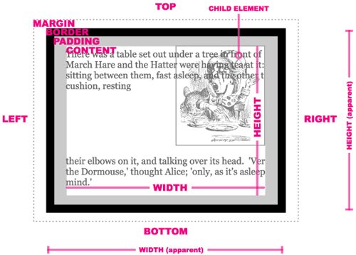
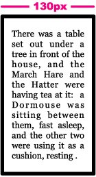
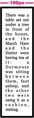
Limitations of the "Box" ModelSo far it's fairly simple: All elements are rectangular "boxes" with a margin, border, padding, and content that has a width and height. But remember, this is Web designit can never be that simple, right? Right. The problems begin when you realize that not all browsers define boxes the same way. According to the W3C definition of a box created using CSS, the width and height define the width and height of only the content area (the area where images and other objects are displayed). The apparent width and height, or the total width and height that the element takes up in the design, include the content area plus the padding and border sizes. So, the apparent width would be calculated in the following way: width(content) + left padding + right padding + left border + right border = width(apparent) Unfortunately, Microsoft Internet Explorer through version 5.5 defined width and height values as the apparent width and height (including padding and borders). This effectively subtracts the padding and border sizes to determine the content width and height: width(apparent) - left padding - right padding - left border - right border = width(content) So, given the following CSS: #object1 { border: 5px solid #000; padding: 10px; width: 100px; }browsers using the W3C standard (Firefox, Safari, Opera) will set the content area to 100 pixels wide, but will have an apparent width of 130 pixels (Figure 6.2): 100 + 5 + 5 + 10 + 10 = 130 Figure 6.2. The box rendered by W3C-compliant browsers, including Safari, Firefox, and Opera, as well as Internet Explorer 6+ (if you're using Strict DTD), will be 130 pixels wide. Whereas Internet Explorer 5.5 and earlier will set a content area 70 pixels wide and an apparent width of 100 pixels (Figure 6.3): 70 + 5 + 5 +10 + 10 = 100 Figure 6.3. The same box rendered by Internet Explorer 5.5 and earlier and Internet Explorer 6+ using Transitional DTD will be 100 pixels wide. This is a problem, and it gets worse. Recent versions of Internet Explorer (6 and later) fix this problem by following the W3C standards. However, remember our discussion about Quirks mode in Chapter 1 (see "Setting Your DTD")? If you are using the transitional DTD for your page, which is still very common, Internet Explorer 6 and later (including 7) revert to the "quirky" version of the box model. So what's a good Web designer to do? You have several options:
|
 Tips
Tips
EAN: 2147483647
Pages: 230